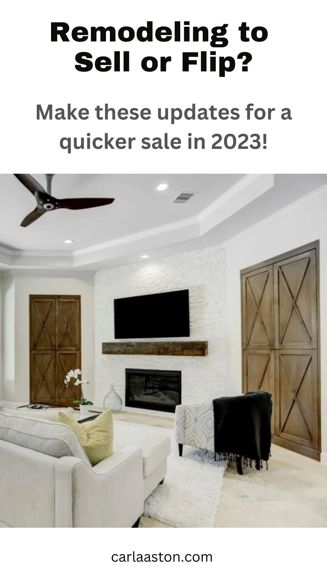
We all know it will be getting tougher to sell your home for the price you want in 2023 and probably for the next few years. Those days of dropping your home on the market and having buyers in the door that day making offers are gone…..for now.
After consulting with new homeowners and house flippers a lot in the last few months, I’ve got a few tips to share today about where you should spend your money, beyond the kitchen, primary bath and paint.
3 Remodeling Tips for Selling a House in 2023
Add contrast to keep it interesting. Everything all in white feels a little too unfinished.
Design something special into smaller spaces like laundry rooms, pantries, mudrooms, closets.
Paint the ugly stone! Designing around ugly stone on the exterior or on a fireplace wall won’t do you any favors. You’ve left the elephant in the room.
Here are more details and examples, below.
1) ADD CONTRAST to Keep it Interesting
I think in the past, painting everything white, before you sell, has seemed to work. However, doing all white everywhere is getting a little old and makes a house look almost unfinished, rather than just having the homeowner see it as a clean slate.
It actually can be a little daunting, thinking about how to furnish it.
I had someone reach out to me with this home, newly purchased, regarding where to start with furnishings and decor. It was such a plain, white box, they were just stumped!
If everything is all white, it can sometimes look unfinished or like there will be too much to do. carlaaston.com
So what can you do to make your house more interesting so that it doesn’t just look like a basic white box?
Do some finishes in varying neutral tones and add in some high contrast so everything doesn’t look washed out. You don’t have to do everything in white.
Add in a wood tone like the color of the wood floor or some darker finishes in other places of the home, like the stair railing, mantel, beams, cabinetry or hood in the kitchen, doors, etc.
This consult I did last year was about a home that was just a little too white. They wanted some contrast, drama and wondered where to put some dark finishes. The fireplace was one area that was found to be the perfect place to add contrast. It also helped camouflage the big tv above it.
Before adding dark contrast at the fireplace
After - Love the combination here of the live edge wood mantel with charcoal gray tile on the fireplace.
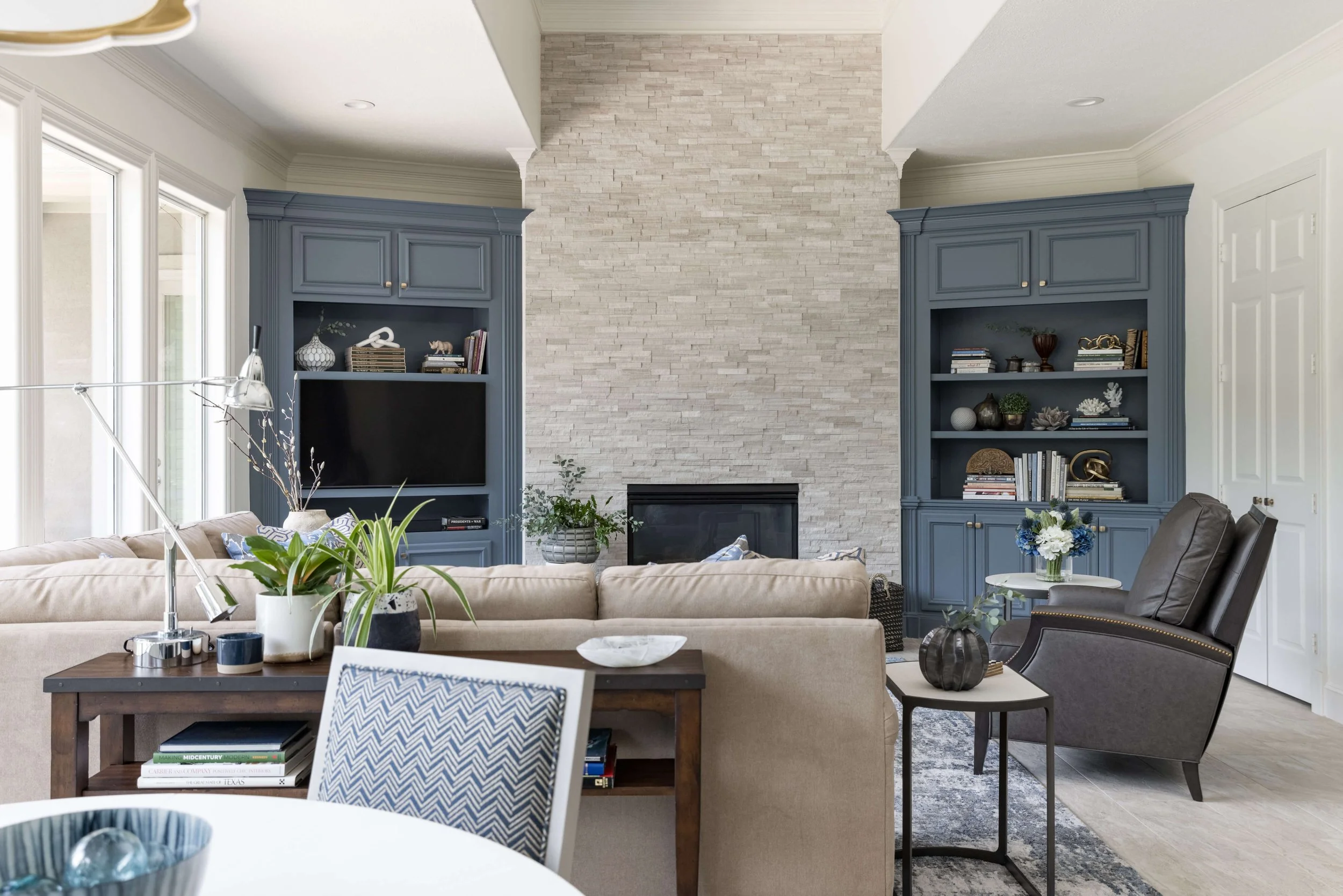
Built-in bookcases can be a great place to add contrast to a home and help it look more upgraded.
Adding something to the inside back, painting them a darker color, treating the cabinet doors with an onlay or design pattern all help make a home look special.
Here’s are some before and after pics of built-ins on a recent remodel job. The dark blue-gray paint adds so much sophistication.
BEFORE - Plain, cream colored bookcases
AFTER - The dark painted built-in bookcases look smart in this family room redo. carlaaston.com
Check out this before and after from one of my past projects, below.
I love the dark wood and the X design on these cabinet doors. The tv equipment is hidden on the left side behind those doors, the right side doors are just dummy panels to create symmetry.
The wood doors and mantel really add warmth to this creamy white room.
BEFORE - The angles and architectural inconsistency here made for a not-so-pleasing focal point to this room.
AFTER - Matching, symmetrical wood cabinet doors and mantel add warmth and distinction to this creamy white living room. Designer: Carla Aston, Contractor: CA Design Build.
2) Pay attention to smaller spaces.
Laundry rooms, pantries, mudrooms and closets are something you can’t ignore these days. People have seen so many knocked-out small spaces like this on Instagram and Pinterest that they look for these to be special in an updated home.
It is a good idea to up-level the look of spaces to really get buyers’ attention. Builder basic in these areas just doesn’t cut it in a competitive market.
When this consultation client of mine moved in to this home, we selected a fun tile for the floor, painted everything a soft white and did a nice window treatment. It was a simple but special upgrade.
Laundry room with a fun floor and a simple window treatment. carlaaston.com
All new cabinetry with a full size stackable washer/dryer and wine fridge made this laundry room always feel tidy with everything behind cabinet doors.
Laundry room with built-in cabinetry and appliances for a tidy, upgraded look. carlaaston.com
This pantry, below, wasn’t so special until we put a barn door on it, which greatly improved the function as well as the look. No door swing to get in the way!
Those shallow shelves on the side of the pantry are great for cans, jars and bottles to save room for bigger items on the open shelves.
Pantry with barn door to eliminate space for the door swing. carlaaston.com
Shallow shelving in a pantry keeps bottles, cans and jars organized without having to buy 25 different clear plastic containers to stock everything! :-) carlaaston.com
Sometimes just adding a full length mirror and some new flooring in a closet can give it a more desirable feel.
A full length mirror in this closet blocks the view straight in and visually lengthens this bathroom as well as coming in handy for dressing. carlaaston.com
3. Paint your ugly stone!
If you have ugly stone, don’t just try to ignore it. It will be noticed and it might be something that will turn someone off completely.
Here’s a good general rule for stone exteriors, fireplaces, etc.
If you wouldn’t pick that stone today for your house, then cover it up with paint.
Here’s a remodel job I worked on a few years ago. We ended up actually moving the fireplace to another wall, but at the beginning of the job, we were just going to deal with stone and lighten it up with a whitewash or paint.
A fireplace stone like this can be really off-putting for a buyer. It looks like an expensive redo to them.
While there could be a proper place for it in a gray or greige home or a dark rustic environment (ahem….maybe), here, it was not a good look and certainly not a look desired by most in this area shopping for homes.
This dark, overbearing fireplace didn’t fit into the new design scheme for this home. Painting the stone or whitewashing it would lighten it up and give it a fresher look.
Here’s another example of a dark stone fireplace that was just too heavy for this home’s new look. I would have at least painted it or whitewashed it if we didn’t end up just tearing down the stone and putting up new stone tile.
This dark fireplace could have been painted for a less expensive facelift.
In this project I worked on a few years ago, we painted the stucco and stone to get a lighter color overall. The house was very earth toned and the homeowners wanted something more up to date, lighter and fresher looking.
Painting the stone and stucco all one color actually made the house look bigger and have more presence. It was set far back from the road and needed a brighter look overall.
Exterior painting in progress - painting stone and stucco for a cleaner look. carlaaston.com
Here was the painted stone fireplace on the back patio, below. It looks great!
Painted stone exterior fireplace. carlaaston.com
See more remodeling design tips below, good for whether you are selling or staying!
Related Posts:
Pin this image below to PInterest to save for later reference.


If you are considering a remodeling project in the next year, you should be planning now. I’ve got some features here you might want to make sure you include in yours. And check out my guide at the bottom of the post for lots more info.