

There is a lot more of this home we are remodeling and I’m sharing the kitchen and butler’s pantry today. The sheetrockers are still working and texture will be starting, so things are moving along on site.
I’m so happy to see the walls closed up, it just represents a lot of work completed!
Today, I’m sharing the part of the home I actually started with on the design, the kitchen and butler’s pantry.
Kitchen Design
This kitchen was a good size, and very defined by the barrel vault ceiling. The client wanted a big island and wanted to open up the kitchen more to the family room, which I really liked.
Even though the kitchen had this 16’ high ceiling, it felt rather confined in the layout of the home, as an interior space. The shorter cabinets and the bulky light tray running down the side walls felt like it sort of squashed the height of this room.

BEFORE - Kitchen with barrel vault ceiling

BEFORE - Kitchen

BEFORE - Kitchen

Original floor plan - Kitchen with bedroom across the hall
Here was the floor plan we settled on, flipped on it’s side below. It’s now more open to the family room (with a new beam across that opening) and there will be stools at the island.

Although I love cabinets to the ceiling, that is out of the question here, as the vault curves to 16’. We have tall ones though at 10’, with an even taller hood to break up the horizontal line of the cabinetry. We’re doing creamy white to blend with the walls so the cabinets won’t have a tendency to cut off the height of the ceiling, which is what I felt they did in the original kitchen with the tray and the continuous line.

We’re doing a statement slab material, Blue Ijen, on counters and backsplash and I love the look. This will create some nice contrast in the space.

This slate blue color of the slab works so well with the furnishings they already have. Here’s a pic of the barstools that we are reusing here, that we did in their home 8 years ago.

The island was a bit of a challenge too, as they had barstools now in their home and wanted to re-use them. We debated doing a low bar, flush with the island, as I really don’t like that elevated look of a 42” high bar, unless it can be detailed on the sides so you don’t see that awkward little step up. (Go back to the before pic of the side of the high bar to see what I mean.)
I sketched up this sort of telescoping look with waterfall sides, with the walnut wood bar seeming to fit in on top of the island. (It is a great place to put the outlets too, you know.)

It presents a substantial amount of walnut, without having to do more wood cabinets. I think it really makes the wood feel like a special accent piece.
We’re incorporating touches of black too, which is perfect for the lighting in this space to add some punctuation. These tall sconces protrude from the wall 18”, so they can light the countertop below.


Preliminary drawing for kitchen hood area - by Staci Nugent
I sketched out the crown detail here, as I don’t want a protrusion that a typical crown has. We’re going with a straight, flush trim piece to reduce the horizontal “cap” that a standard crown moulding adds to cabinets that don’t go to the ceiling.

Crown detail at upper cabinets
You might be wondering about lighting in this space. It was a challenge coming up with a good solution. If you go back up to the very start of this post, that curly Tuscan chandelier was the only overhead light in the whole kitchen! I never saw this kitchen at night, with that light on, but I’m sure it was not optimum.
We’re actually not centering the island in the space, but moving it closer over to the family room. I did not want to hang some light fixtures in a barrel vault off-center, over the island. That would look odd.
As my clients do like some modern, clean-lined design, I opted to introduce that in the lighting. I wanted to add something to the ceiling, I almost toyed with beams, but I really didn’t want anything heavy or traditional. I found these fixtures from Sonneman that could create a unique, sleek look, adding interest while having a just a hint at what doing a beam across the vault would do.
These are 1” x 1”, super thin LED, and span 8’. They mount from each end, so they won’t rotate with air blowing on them, something that might happen with a center mounted fixture.

Here was my concept sketch for this lighting, it just felt like the perfect solution. (This sketch was before I decided the range wall needed some sconces and some breathing room around the hood.)

We will have a warm, medium brown oak floor throughout, which will continue in here but we are also using walnut as an accent wood. In the kitchen it will be used as the island bar with waterfall sides and as cabinet pulls. The hood was going to be metal, but I changed to a painted wood with brass trim to get the exact slate blue color I wanted. (The ceiling fan is for the adjacent family room.)

Finally, I had this rendering done. Not sure the stools are quite showing bar height, but you get the idea. I love how this room shaped up. It feels very up to date but preserves the bones of the house without getting too bogged down with heavy details.
Since this, I decided to thin the waterfall walnut bar a bit, going down from 3” here to 2”. Also, I am not doing a book match on the backsplash, never like that much. The lights should be a little smaller, not looking 1” x 1”, but overall this renderer did really well for the money I paid. It gives the general idea. :-)
That stone looks more blue in real life and that walnut is a richer, redder tone than the floor, I have to say.

Here’s how the space looks now with that bulky tray and the mouldings gone. I love it! (I shared this pic on Instagram stories and the designers who follow me were all thumbs up and smiley faces!)

Butler’s Pantry Design
We soon realized that pantry storage was going to be tight. There were no closets nearby or any place to find significant storage with the way the house was laid out, so the decision was made to use the bedroom across the hall, backing up to the dining room, as a butler’s pantry.
We could turn the jack and jill bathroom into a single, larger bathroom and closet for a somewhat larger bedroom. There are more bedrooms upstairs.
This new butler’s pantry needed some good storage for extra bulky items that the smaller pantry in the kitchen could not handle. We also wanted it to work with the dining room as an entertaining space showcasing wine and other collections.
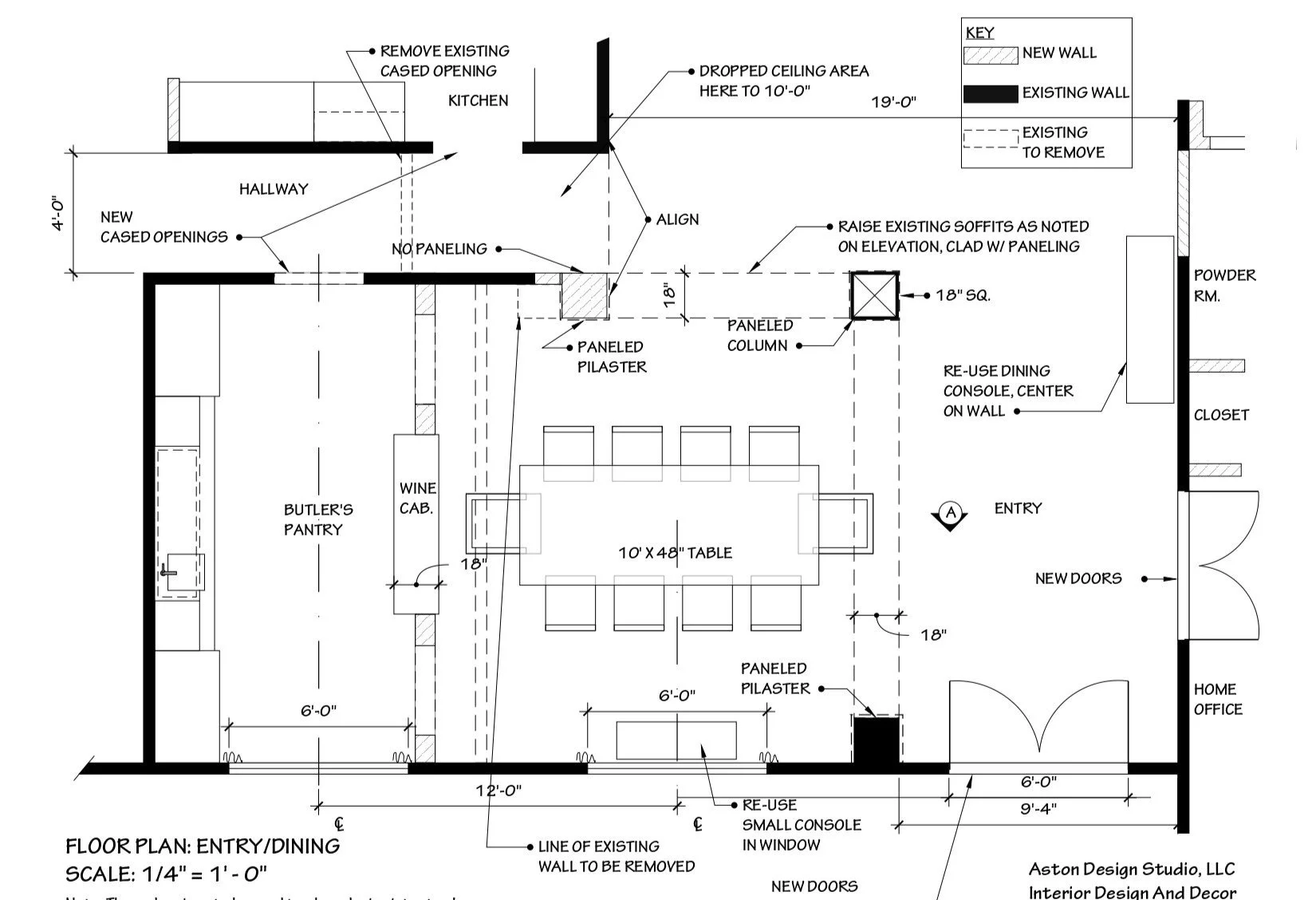
We didn’t need it to be quite as large as the bedroom, and we needed a bit more space in the dining room so that the table they have will work in the room. We moved the wall 2’ to shrink the bedroom a bit and expand the dining and added two openings to make this room more open to the dining room.
Here is the plan, below. We went through lots of options here to get this just right for the client and make the most sense architecturally.

When I initially designed this area, I envisioned a kind of see-through glass wine enclosure. At first the cost seemed too high and the full glass a little sterile. However, as time went on and the design was developed I thought this space was really a great place to splurge. Going all in with a beautiful wood cabinet with glass panels enabling you to peek through to the luxurious bar and cabinetry, would be a perfect solution.
On the bar side of the butler’s pantry, we decided on two full height cabinets for storage and a counter in the middle with a sink and undercounter refrigeration. A mirrored backsplash and bistro shelving help finish out the wall.

I start designing with hand sketches, as you probably can see, as that is just the way I can put materials and details together best. I wanted a layer of walnut wrapping the interior section of the bar, like sketched below. (My drawings always look a little wonky, but it really helps me think through how it will be built.)

This space will be color drenched in a dark, moody color with walnut and brass accenting the cool toned blue-gray. I’m so excited to see this built out. I think it will be just the best space for entertaining with style!
I really loved the repetition of the arches from the living room fireplace wall here. Everything feels very intentional, like it would have been designed this way from the beginning.

Here’s the floor plan of the dining area and how it flows into the butler’s pantry. Since this was issued, we were able to remove the columns and soffit there, surrounding the dining room. You can see how it looks now, at the link below.
Contractor: CA DesignBuild, Shaun Bain, Gus Bruno
CAD Drawings: Staci Nugent
If you missed the living/dining/hallway design, you might want to check that out here. I’ll be sharing more about the bathrooms, study, etc. later.
I’ve been busy this winter and spring with remodeling projects and I am sharing one of those today. These will be coming together this summer and fall, but I thought you might want to see some of what’s been cooking!