I recently had a consultation that concerned opening up a wall between living room and family room. There were a few challenges here and some considerations that needed attention to think this out so it wouldn’t look awkward.
First of all, there was a fireplace on the wall and there was another opening already to the side of the wall in question.
Photos of Wall between living room and family room
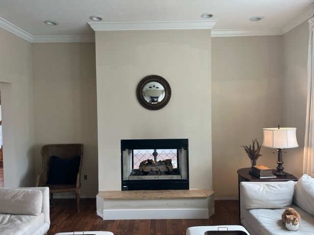
This is the wall in question, the homeowner wants to punch through each side here with arched openings to the living room. That room has a piano, and they would love to here the music flowing into this room too and have a more open feel.
You can see there is a see-through fireplace here.
This is looking at the room from the kitchen, fireplace on the left, tv above a console on the right.
One of the challenges here was that there was an opening into this room in the kitchen, so if an opening was added on each side of the fireplace, there would be two openings side by side, which is a little odd.
Normally, I would consolidate two openings like that. I might be tempted to pull the kitchen down that wall, closing that existing opening and filling with kitchen cabinetry. Then they could use the arched opening as the main walk way opening then.
However, that is a lot of remodeling and consideration of other factors.
The other consideration here is what is going on with the wall behind in the living room. I wanted to see how the fireplace was dealt with in there (I could see paneling on the wall through that opening) and how the furniture works in there for traffic flow.
The homeowner sent me this pic then.
The challenge here then becomes what happens with the return air that is obviously located there and how would the paneling work on this wall.
Also, you can almost see that opening into the kitchen to the far right there, so how would those two openings look side by side here. Again, that’s not usually a typical scenario.
It does look like furniture layout is fine once that small chest is moved,
Solution for these openings
The homeowner confirmed that a contractor had been to her home and confirmed that the openings were possible as far as structure goes and that the return air could be moved.
She just wasn’t sure how it would look.
I wasn’t that concerned about the look in the family room. After considering the two side-by-side openings there by the kitchen, I decided that since there was an arched opening and definite division of the two space between kitchen and family room, that it would look okay in here.
With the living room, I was more concerned about the paneling and working the openings to consider how that would block out.
Fireplace wall in living room sketch | Carla Aston, Designer
I definitely thought that the openings should be smaller sized with the height falling just under the top rail of the paneling. Room for the door casing and then a small space above that would really look best here.
I like spacing left on the sides of each opening too, so that there is wall paneling all around the openings.
The main purpose is to make this wall look intentionally designed and built into the house, not something that was done later. I want the two openings to relate to fireplace wall so the one on the right doesn’t compete with the main opening to the kitchen.
Here’s the family room side, with the openings just cased with trim.
She asked about some picture frame moulding added to the sheetrock walls, and that could be done over a new fireplace mantel as shown.
I rather like the clean sheetrock look though and I suggested she might consider a tone on tone plaster finish on the fireplace section there to give a more casual vibe, as compared to the living room.
Fireplace wall in family room sketch | Carla Aston, Designer
TV Wall on opposite side of family room
She also asked about this wall, she thought it looked rather plain and wanted to create some more interest with some kind of applied moudling. She also was considering removing the sconces.
The back door swings right against that wall on the left of the tv, so that had to be considered and left open.
I proposed some applied moulding in three big panels instead of chopping it up into smaller sizes. I think this would work well with the moulding applied above the fireplace.
TV wall in family room sketch | Carla Aston, Designer
Another option here is to just build a cabinet that has some height so that it has a more vertical appearance here overall and adds depth to the overall wall.
She could decorate each side with some art to fill those blank spaces. This would work well if she considered the plaster fireplace look, thereby having no applied moulding in this room.
Opt 2 - TV wall in family room sketch | Carla Aston, Designer
This consultation was done via email with my Designed in a Click® service. If you have any upcoming projects you’d like some input on, this is a great way to get a designer’s opinion at a reasonable price. :-)
Here’s a collection of a few to see what they’re all about.
This blogpost was thoughtfully written by me, Carla Aston, and not by AI, ghostwriters, or guest posters.


This living room rug is very distinctive and luxurious and it inspired a whole new overall design plan. I couldn’t wait to pull some pieces together to work with this gorgeous rug. Come and see what I found…..