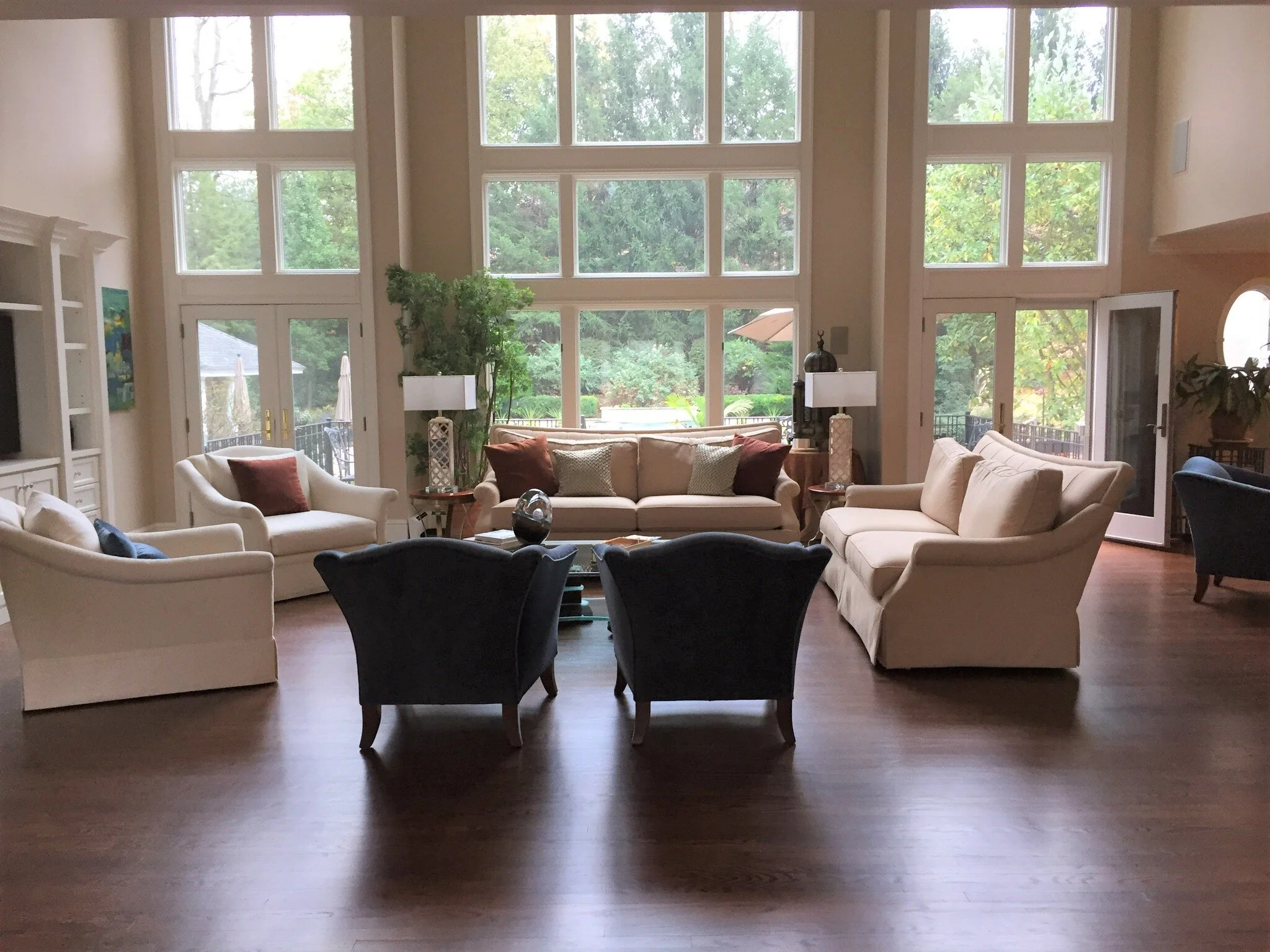
I worked on a large living room project last month, giving this homeowner direction on how to create a more up to date and clean lined look. This space was more than ample, with two seating groups and very tall windows in a two story, open room.
What a luxury to not have to worry about space, right?
What was missing was an intimate and cozy feel, a sense of cohesiveness, and some furniture pieces that felt more modern yet also imparted some style.
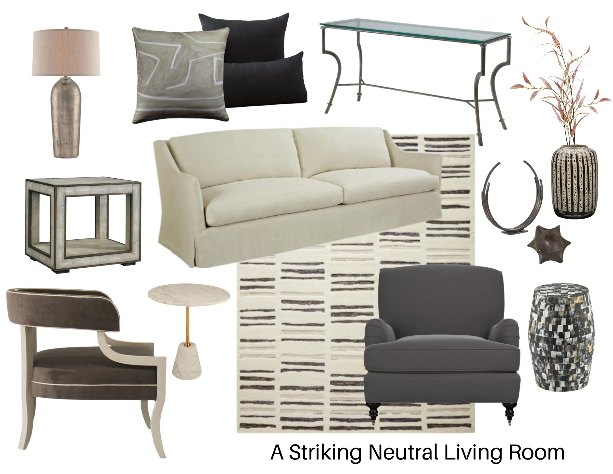
I did this mini project all with links to retail products and believe me that is hard for me. I love creating more customized looks with furniture, especially with upholstery. With no real product samples in hand for all this furniture, these were suggestions that I thought all worked well together, but the homeowner would have to be in charge of getting samples and checking all those details.
My blog contains affiliate links. Any purchases, at no additional charge to you, render me a small percentage, are most appreciated and make this blog possible. :-)
Here was this living room’s challenge.
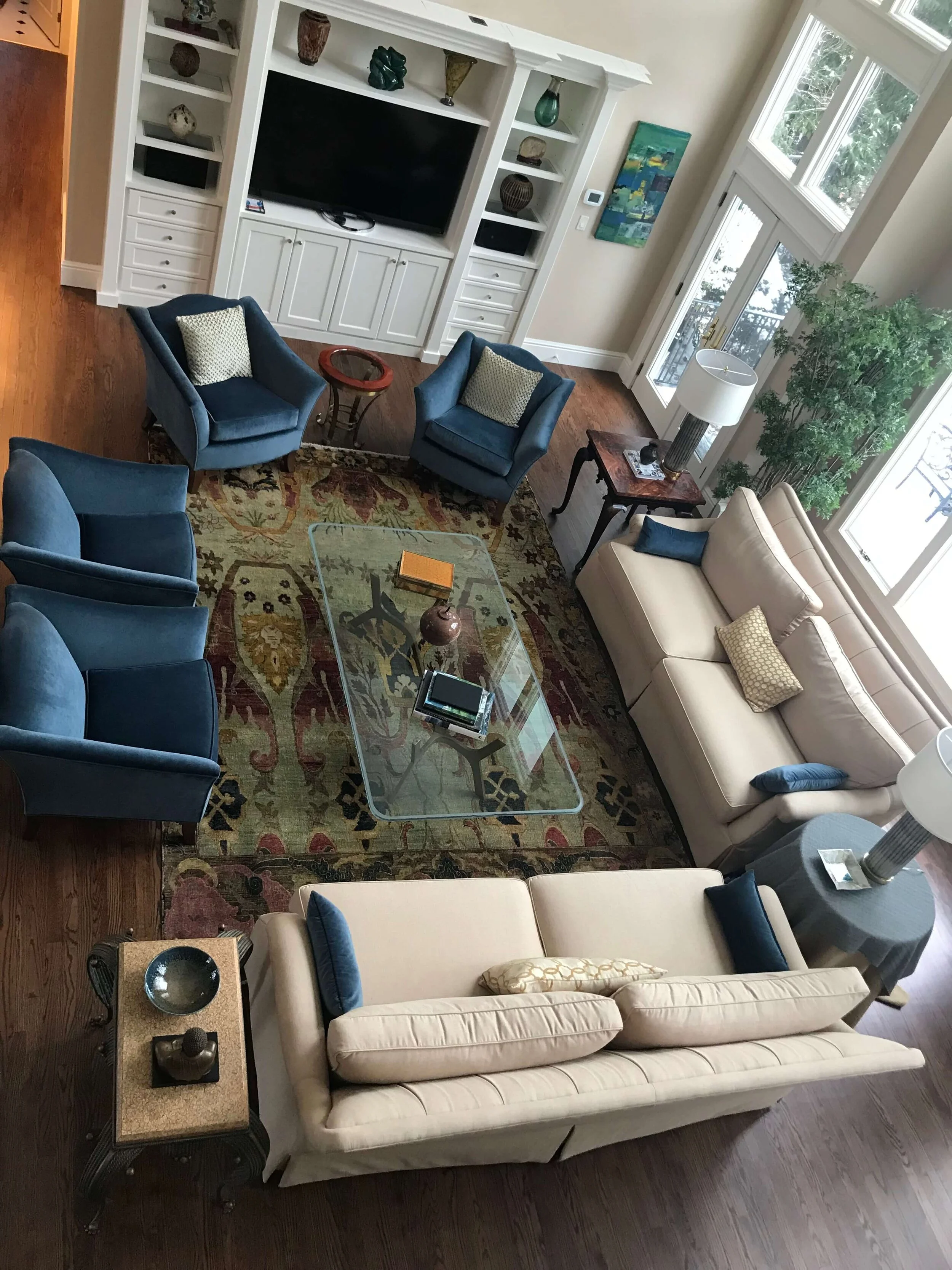
Pic of large living room that needed a cohesive design plan and some new furnishings.
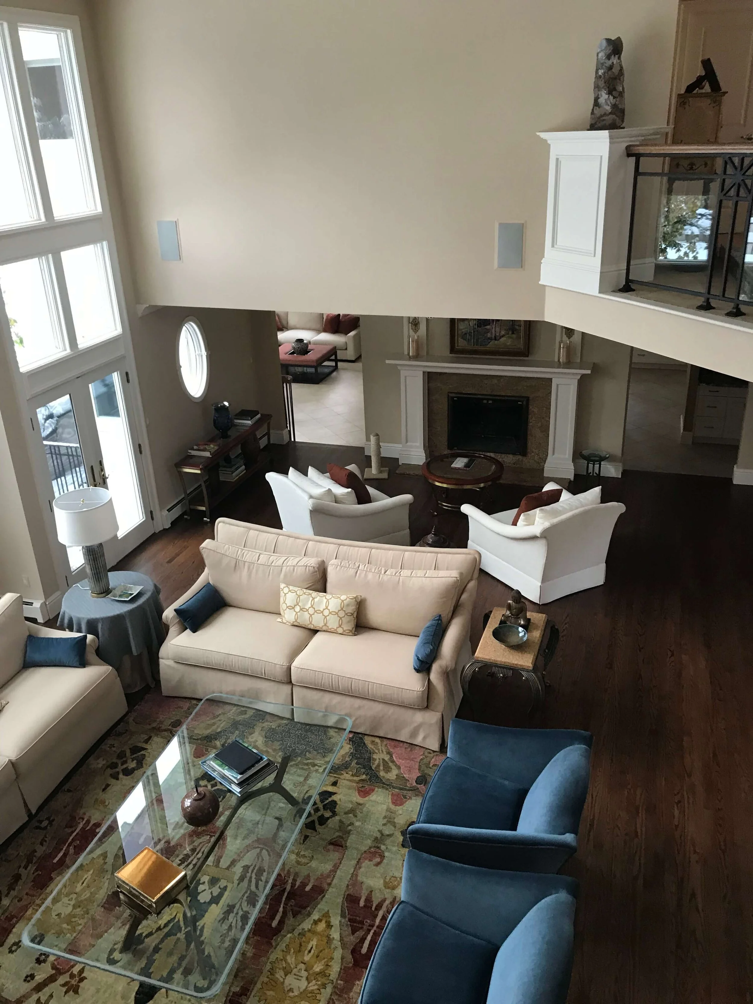
This living room had space for two seating groups, with one of them close to the fireplace.
This was a well used room where they watched tv and they enjoyed having a cozy place by the fireplace too. A more modern look was desired, and the furniture could mostly be replaced.
I did love the coffee table and thought it would fit in well with the new design. The warm wood and rather mid-century look base with the large glass top was actually the springboard for the first item I chose.
The rug would ground this large living room space
The first item I shopped for was the rug. It needed to be a big one and I wanted it to be bold.
This rug would be seen from upstairs and all through this room, through the glass top table, so it needed to be a strong design statement. I looked at other more trad rugs and they all sort of washed out to be a more muddy look.
I just thought this was where a modern pattern should reside and set the tone. I also thought that the rug needed to be light, to contrast with the dark wood floor. This dark expanse of flooring needed to be broken up visually, and it also needed some softness in a big way.
Here was what I chose.
My next selection was the upholstery. I wanted two large sofas, placed where the existing ones were in the room. I wanted the light softness of the rug to expand on the dark brown floor and fill up that space even more. They were an extension of the rug really.
Next, we needed some contrast, a dark charcoal velvet on the two slightly more traditional lounge chairs. The curves of an English arm are quite timeless and I feel like they are always in style. It’s sort of a nod to “we haven’t gone totally contemporary here”. :-)
Some low backed, more open chairs in front of the tv, would be great to pick up and move around the room as needed. The interesting shape of the arm repeats the glass top table base I put behind the sofa in the window.
Okay, you can’t see the base that well behind the sofa as placed, but I know it is there and it was intentionally chosen. :-)
Next were some pillows, in a modern pattern, of course, with a solid dark gray mixed in too. This whole room’s design is more about a striking high contrast now that evokes a more modern style and the solid pillows and simple graphic pattern reflect that direction perfectly.
Two matching end tables on either end of the sofa that sat in front of the window with some tall matching lamps would be perfect. I loved this shagreen table with an outlined effect repeating that strong contrast I was seeking here.
I added in a bold look stool table for between the two English arm chairs and a marble side table between the two low back arm chairs in front of the tv. I love all the natural materials here and how they are combining.
I added a suggestion to paint the tv cabinet a charcoal gray to match the chair velvet fabric. I love putting a black tv on a dark wall or surface, and here the white cabinetry needed a bit of customizing. Dark paint would really do the trick.
Lastly, for this space, I would love to see some draperies, something in a nice textural sheer fabric, just in the center window, hung all the way up above the high window. Yes, this space needed some long drapery panels to soften the look and cozy up the room.
I couldn’t resist adding a few accessories, the large vase, the circle sculpture and star shape object. They would be perfect grouped together on the console.
Cozy seating group by the fire
Just to refresh your memory without scrolling all the way up, here’s the living room with that extra seating area over by the fireplace, below.
She was wanting to retile the surround there, and I suggested a white marble. It will brighten up that area and marble is timeless. Calacatta or Danby marble have more warmth to them, and with a fireplace, you don’t have to get too fancy with tile shape. Even a 12 x 12 looks great on a surround like this because it is more about the marble than the shape of the tile. And with Calacatta and Danby there is enough veining and variation to make it interesting in a big piece.
I also thought some new chairs, in a rounded tub chair look would make for a more enveloping grouping, and I loved the idea of four chairs around a round coffee table. Two of the chairs could really be nestled up flanking the fireplace, and the big sofa could scoot in some to make room for a group of four.
I love the idea of a round rug here, to pull this grouping together and this one from Jaipur that I used in the rectangular version in my Showhouse room last fall, would be perfect.
Modern , light, soft, and it wouldn’t fight with the larger rug in the room. See how this kind of grouping would come together?
How To Start Designing Your Own Room
If you’ve stuck with this post down to the end here, I’d like to share a little bit of why I bolded some of the text within this post, above.
I’m often asked how to start designing a room.
With this description I went into here in this post, it shows, where I started, with the one existing piece of furniture that I felt had real value in the room and could fit in nicely with the direction this homeowner wanted to go.
I usually do a floor plan first too, but since I was basically repeating this layout, that wasn’t really necessary here for this type of conceptual design I was doing here.
Then, I identified the idea of what I wanted to look for, BEFORE I looked for it. I don’t just randomly start hunting stuff down on the internet. I’d waste a lot of time there if I did that.
I do that because the design reasoning is solid, it’s a given almost. The particular piece is the flexible item.
So, I knew I wanted a more modern sofa with cleaner lines while still adding a softness (to expand on the rug). I needed a light fabric and it needed to be large and long, to fill that room. Those parameters were the design criteria that defined that selection.
I went through each piece, identifying what was essential……size, style, color, finish, all those elements are considered and then used that to narrow the filter of what I’m looking for.
Sometimes there are adjustments to be made along the way, because every piece affects the others (which is why I hate revisions as I explained at the bottom of this post :-).
I start loading items up in a moodboard, because that is a quick way to see the juxtaposition of items and the design is easy to tweak that way.
And that, design lovers, is how I approach a design plan!
If you’d like a full room design plan with some links to buy on your own, contact me via email for a custom quote on your space.
Check out my email Q&A service - Designed in a Click
Pin these images below to save for reference later! Thank you!


