I’m sharing a recent design consultation today, a living room full of family heirlooms and antiques that wasn’t quite coming together for the homeowner. She was ready to get another opinion on how to make it all work in their new home.
It’s a really gorgeous room and she has lots of interesting and beautiful pieces.
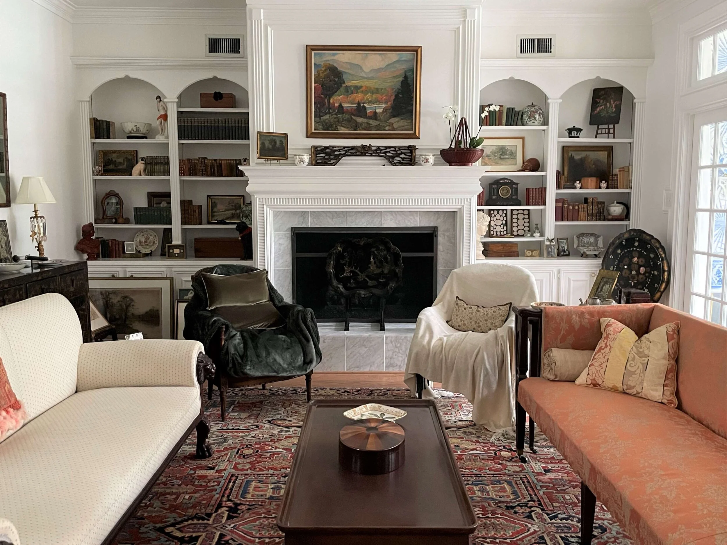
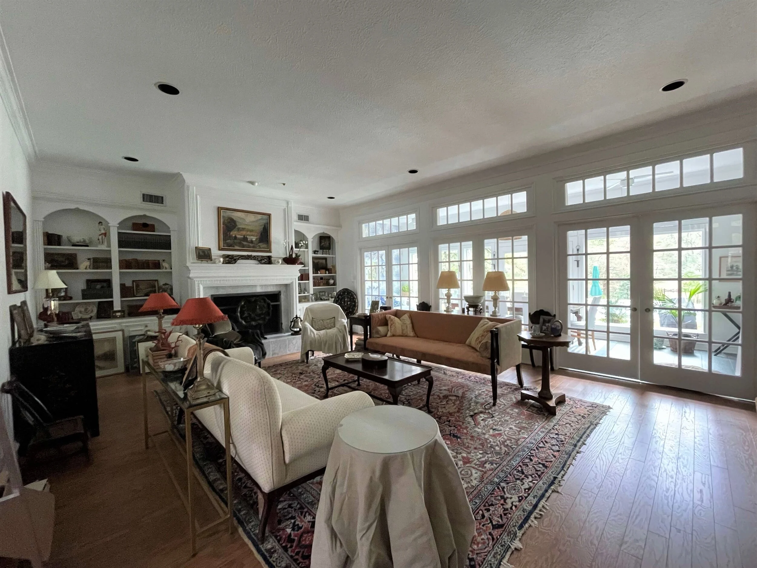
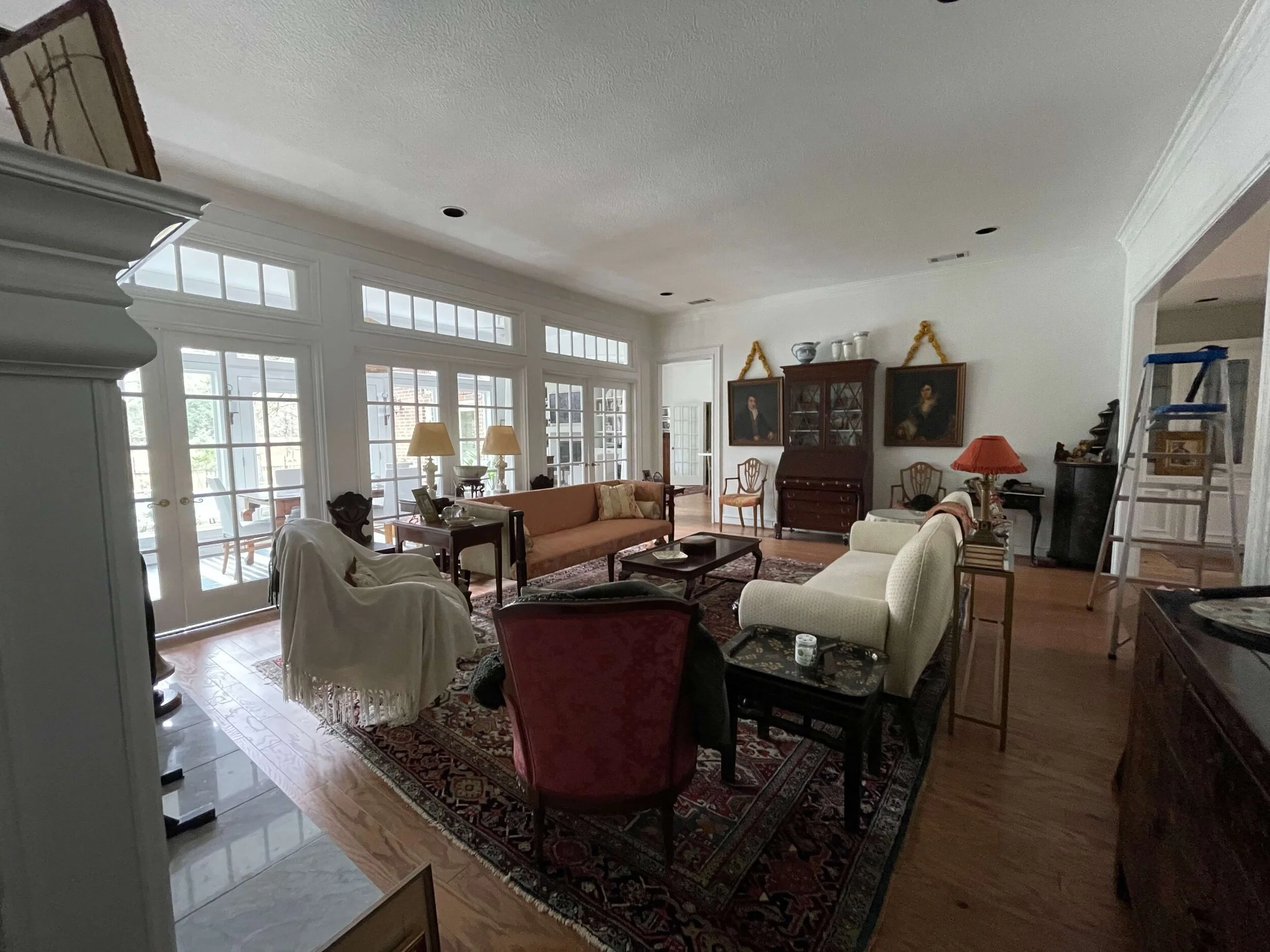
Here are the photos of the living room with the antiques and traditional furnishings she wanted to make work here.
This ample living room has lovely French doors across the back. A fireplace wall with built-ins anchors one end of the room.
Filled with traditional furniture, family heirlooms and antiques that have meaning and history, this living room just needed a few tweaks to make it all work beautifully.
Here were the questions and answers For This Living Room
1) Would BM Grey Owl on walls, grey-blue velvet on the lion sofa, white slipcover on the orange sofa, a blue and white pattern on the bergere chairs and 4 white curtain panels with blue or grey/silver greek key tape make this room look finished? Open to suggestions!
I love the idea of painting this room, it needs some depth and richness. Grey Owl is nice. You might consider going slightly darker, like to BM Harbor Gray. Whatever you do, sample it on the wall, you can order sticky paint samples from Samplize.
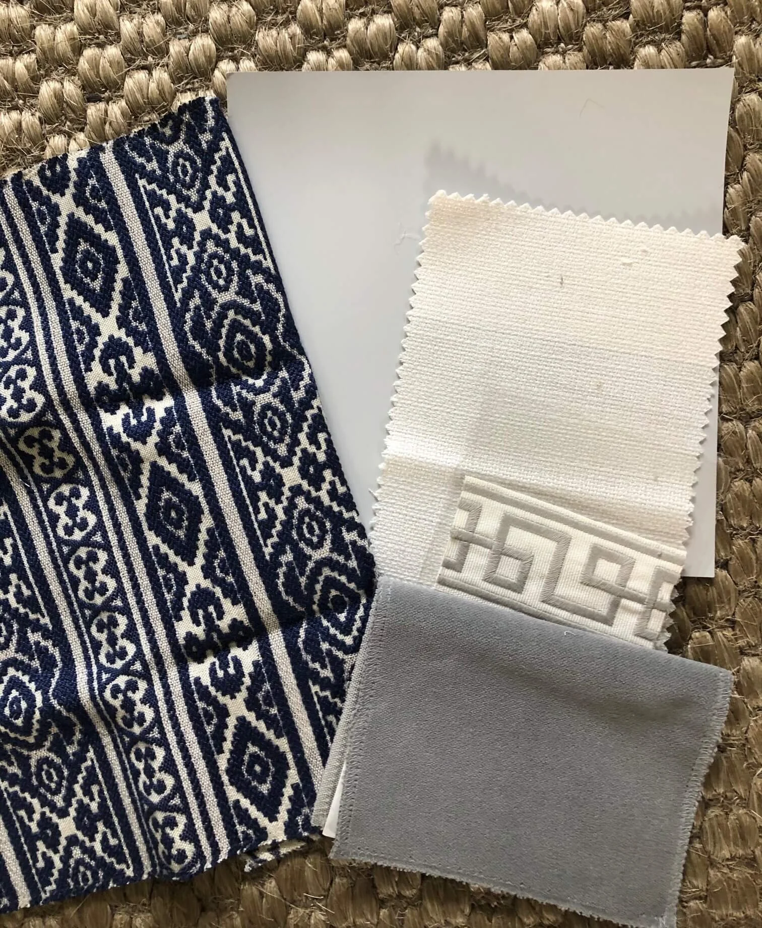
I also agree with your upholstery suggestions, the drapery too. I have a combination of what you described, in a pic, below.
Color combination for living room upholstery, paint and drapery.
I would also consider painting the two cabinets beside the fireplace to match the walls. I like the idea of reducing the white on this wall and it will bring the gray over to this side of the room.
Also, all your items are aged and dark on the shelves, which I love. And while I love to see white backdrops with this kind of antique item, if there are a lot of the items pushed together, like in your bookcases, I think edging the stark contrast down, between the aged dark look and the bright white a bit, would help.
I would paint all the cabinetry, inside the open shelving and out, cabinets below, all of it.
Paint the built-ins on each side of the bookcase to match the new wall color. This whole wall is looking a bit stark and it would be nice to bring down the contrast between the white and the dark items on the bookshelves.
You should really get your fabrics settled, your tape trim, etc. before deciding on the paint color. And make sure you compare the greek key trim to the white woodwork you have on your trim and doors there. Most fabrics are not bright white, so you don't want it to be too off compared to your white woodwork.
You might consider matching the gray wall color for your drapery fabric, as there won't be any gray over on that wall (because of all the doors and trim) except for a small band at the top of the window. If you do gray to match the wall color on your fabric, then that color will wrap the entire room.
2) Would adding a custom sisal/jute rug help anchor the Persian rug and fill in the pass through area from entry to kitchen/sunroom?
I wouldn't worry about adding an extra textural rug, I think once everything is done, this room will feel more tied together. It could be done, just to add some texture and softness, but I'd get the rest finished before you determine if you will need that.
I don't think you need a rug at the walkway area, unless perhaps you want to do a runner there. I like that it separates the seating group from the wall with the secretary some.
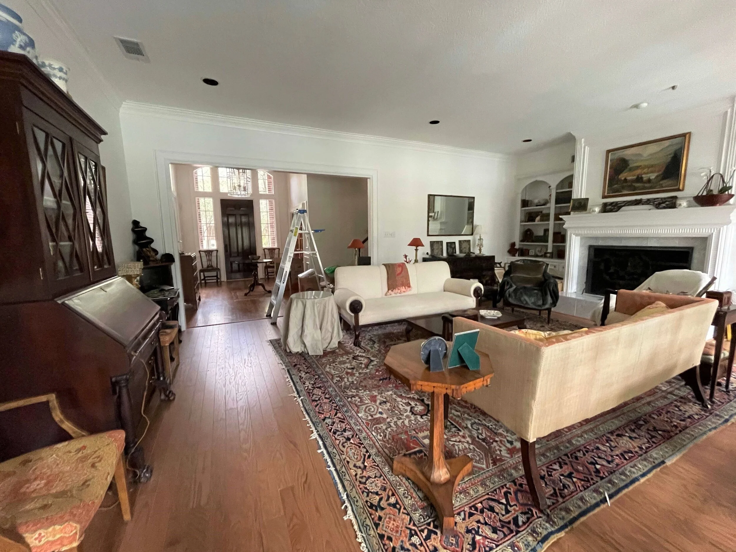
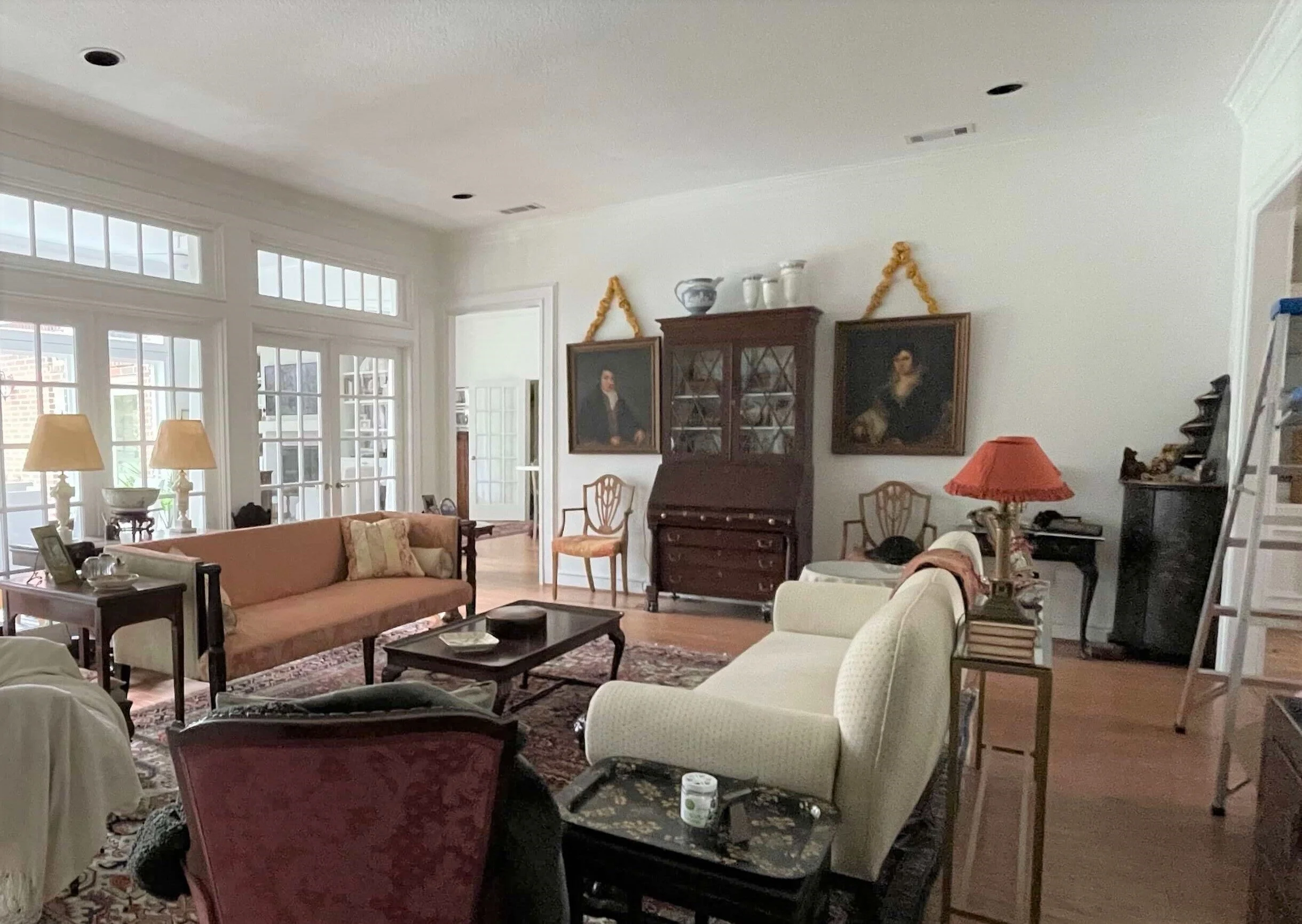
The living room looking back the other direction with the secretary and portraits on the back wall.
3) I centered the sofas and the rug with the middle French door. The secretary and the fireplace are also aligned. With a walkway in front of the secretary, I couldn’t see any other option than a walkway and a seating area. Would adding a central hanging light fixture help anchor the seating area? Open to suggestions again!
The seating group looks perfect where it is, good job.
I would move the secretary to be centered between the door opening edge and the corner cabinet on that wall. It is so far away from the seating group that it is a wall standing on its own. Therefore, marrying it to align with items on the other side of the room is making it look rather off-center and the grouping not looking like a natural fit on that wall, which it really is.
I also think you should remove that extra small table that is between the corner cabinet and the chair there. That's just too many small things on that wall, and not necessary. Maybe that would work in lieu of the draped table you have at the end of the sofa? I'd prefer a small table there.
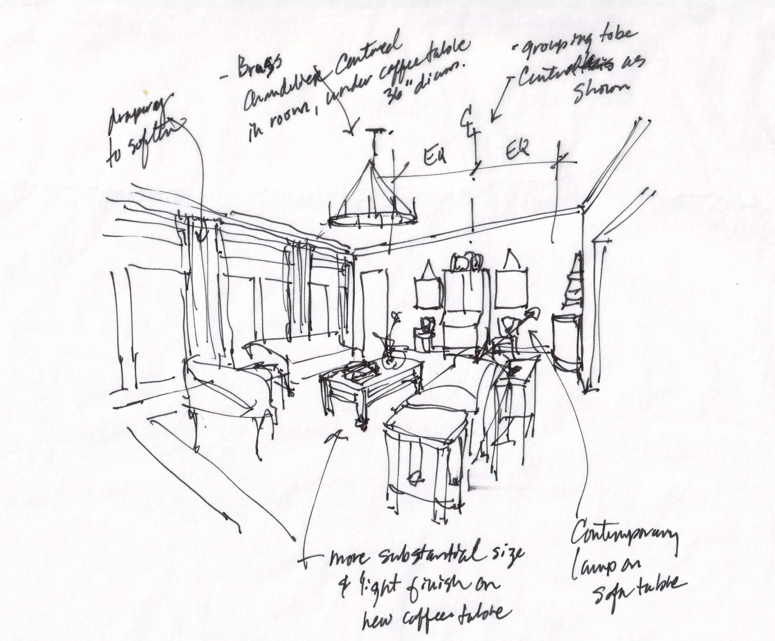
See my sketch below, of how I think this wall should look.
Quick sketch showing furniture / art placement on back wall, new chandelier, new coffee table and a contemporary lamp on the sofa table.
4) Is there something you’d take away from the room immediately?
I had a few more thoughts to add:
Adjust the objects on top of the secretary to be grouped more together to make more of a solid mass.
Turn the rectangular mirror vertically (laying on the horizontal likens it to a dresser mirror, vertically it looks more like a console in a living or dining room). It will have more prominence hung vertically, then you can hang smaller pieces of art that it looks like you have, on each side of the mirror for more interest over there.
Move the orange lamp shade lamps to that console in the corner with the mirror. I like the idea of a spot of color over there and the lamps look a bit tiny on the sofa table. They'll be better against the wall.
I would do some new lampshades on the marble or alabaster lamps you have on the other console by the window. Maybe some custom covered drum shades?
Living room view with antique and heirloom furnishings
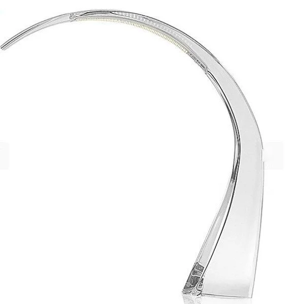
Add in some contemporary pieces. While you might not be a fan of contemporary, I feel like with all the traditional and antique furniture you have, you need a little mix to lighten up the mood. A single modern lamp (for a little asymmetry too) on the sofa table, would be nice and unexpected. This crystal Taj LED lamp by Kartel is amazing!
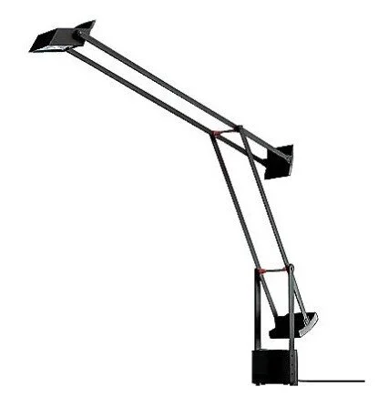
And of course, there is always the iconic Tizio.
The iconic Tizio task lamp for an architectural, modern look, works in almost any interior.
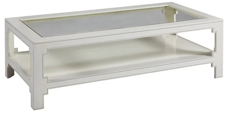
I feel like everything looks a little "leggy", nothing is going to the floor. To combat that without getting any new upholstery pieces, I'd get a more substantial coffee table with some clean lines (again, trying to add in a more contemporary look just to update things). I feel like the coffee table is a little diminutive in this room and is just sort of more of the same. This piece needs to be more substantial and hold piles of your beautiful books and an orchid. :-)
You have some super interesting objects to display, I'd like to see more "stuff" on the coffee table, but the stuff will need a bigger base. A larger table will also help to just anchor the room, as will adding a chandelier above it. This coffee table is 60 x 30 and I like the light finish. It’s a nice contrast to the dark wood furniture you have.
This simple but finely finished light wood coffee table would be the perfect compliment to all the darker wood furniture in this living room.
I would love to see a coffered ceiling in this room, but the lighting looks like it would need to be dealt with to be centered in the coffers, and I'm not sure you would want to do that much construction.
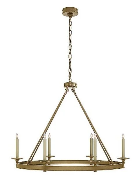
To get by without that, I'd definitely paint the ceiling and add a brassy light fixture. This one has clean lines while being still somewhat traditional. I'd hang it at 7'-2" off the floor (to the bottom of the fixture), that way you'd get a little bit of chain there and people could still walk under it. Looks like you have a 10' ceiling.
A simple look brassy chandelier will work nicely in the living room filled with antiques.
I rather like mostly solid fabrics in this room, but if you go for a pattern in the blues, I like the use of navy. It lends itself to the color in the rug and goes with everything. This pattern, pictured here, is from Kravet and I think it would look great on those chairs. You could even do a solid seat and this only on the back.
I think going gray in here and getting rid of some of the creamy warm fabrics will make the shapes of the furniture stand out and that lovely rug become the main focus of pattern and color.
This living room filled with heirloom furniture just needs a bit of tweaking to become a beautifully designed room!
I sure hope I see pictures of the end result. There’s lots of room for her own tweaks here and there too.
After all, with so many beautiful pieces and such a lovely room as a starting point, she really can’t go wrong!
If you need designer’s take on your project, check out my Designed in a Click email consultation service.
Did you check out my take on interior design trends for 2021? I think it works hand-in-hand with this post really well.
Pin this image below to Pinterest to save this for reference later!
How to make antiques, vintage and heirloom furniture and furnishings work in a new living room! carlaaston.com





I’ll bet I’ve got a few trends here that you hadn’t thought of or seen anywhere else. These trends are what I’ve seen from the front lines of working with clients, contractors, products, and hearing from a lot of my readers who are trying to DIY things themselves. I’ve taken a look back at 2020 to see what will continue on and how that year has changed our homes, forever. Take a look….