As some of you might know, I shared a bunch of free advice last April and May when we were all locked down and at home, staring at our big, blank walls. I answered lots of questions here on my blog and on Instagram and I was actually quite amazed at how many came in.
Apparently big, blank walls are a problem for many people and well, I certainly understand. I live in an area with lots of big, tall plain walls in homes with two story spaces. Those walls can go on for days and it is hard to know how to fill them and what to fill them with!
Well, I’ve been working on a new eBook Guide that assembles all my tips and advice as well as some of the sketches I did for those problem walls. It’s linked down below.
I do have one more blank wall situation here that I’m sharing today. I had to laugh at what this reader called her problem.
‘How do I make this not so ……”wally”.’ :-)
Never has there been a more appropriate description for lots of big white wall space!
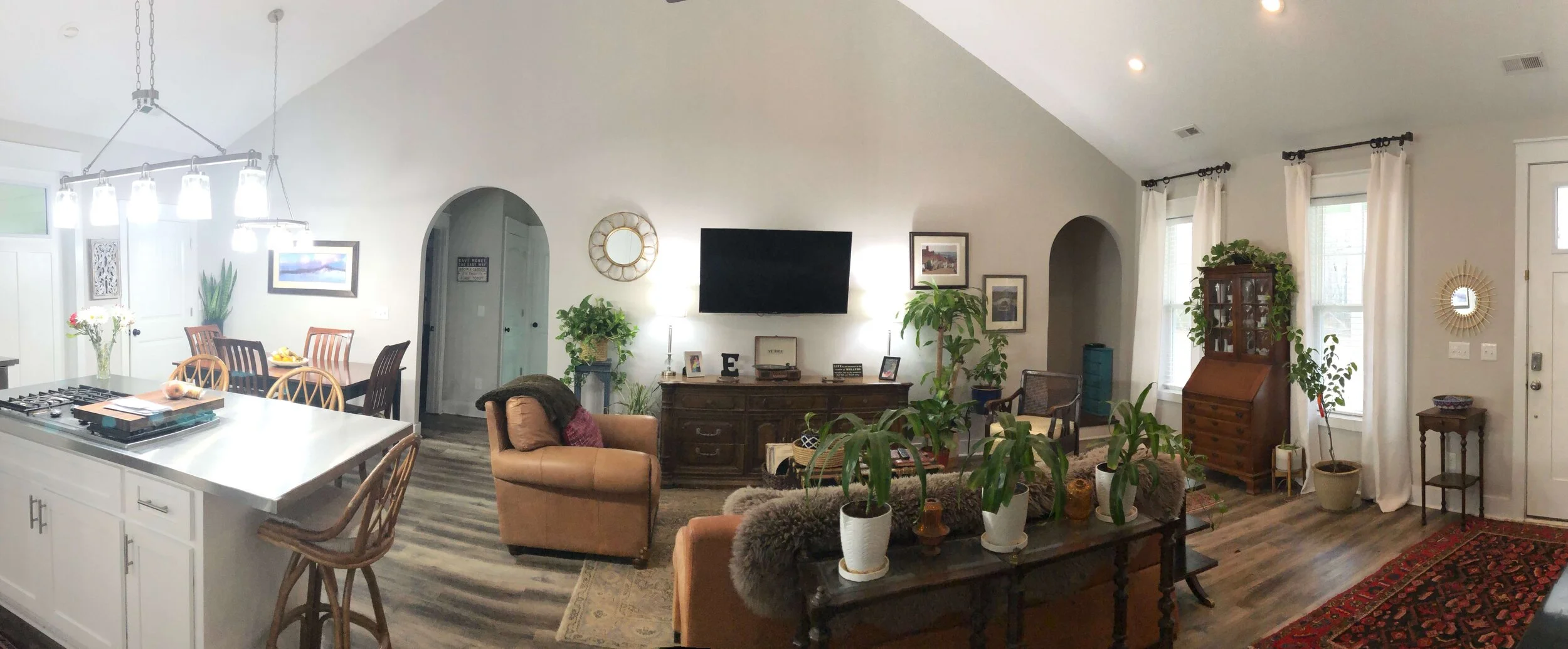
Big, white wall in an open plan room. The homeowner didn’t know what to do to make it look better.
First of all, isn’t that vaulted ceiling nice? And I like the arched openings too. The room has some character going already.
However, I think the reason it feels a little “wally” is all the plain sheetrock on the walls and ceiling.
And really, I don’t mind the white sheetrock walls, but the ceiling could stand some kind treatment, to give it some gravitas and to outline and accentuate the vault.
I think a center beam is in order here and then a few cross beams angling down to the outside walls would really help define the shape of the room. Adding wood with the beams up there will warm up the upper part of the space and feel more balanced overall.
The vaulted ceiling in this open plan room is a nice feature.
Hanging the tv on the wall over a console can sometimes leave an unfinished look and lots of space around the tv that feels empty.
The arched openings on this wall add some charm to the space.
Right now, the darker furniture and flooring contrasts heavily with the white walls and it would be nice to mix it up a bit and use the wood to delineate and warm up the ceiling too.
This is an open plan space, so the wall in question goes from living room to the kitchen / dining area. The arched openings aren’t symmetrically placed at all, so we can’t really do any kind of architectural treatment there that would make sense.
We have to think about a piece of furniture or maybe a built-in for the tv to make a big change in this space.
I suggested a tall piece of furniture, something like this cabinet.
Another option is something like this cabinet.
It could also be built as custom cabinetry here on this wall. Then I would recommend a stained wood finish, or some kind of custom painted finish, like stained wood on the inside of the open shelves and painted wood on the outside, etc. (Lots of room to play around there.)
I’m just not typically a huge fan of media consoles as they often leave awkward open wall spaces to fill around them, much like this one does here.
More height could be added to this piece too, since the ceiling does peak there, by decorating with some large, bulky items on top to extend the visual height of the cabinet too.
So, this is how a piece of furniture would look there on that wall.
Some kind of tall cabinet for the tv would be in order for this big white wall. The space needs something with height and weight to fill the void and anchor the seating group.
Relocating a few of the dark-framed pieces from the other end of the wall to create a collage down by the dining area, would fill that wall space better.
Is this really about what to hang on the walls or is there something more that needs to be done?
One of the biggest Issues I saw when doing all the freebie advice was that people thought that just hanging some new wall decor on the walls would do the trick and fix all their design problems.
As you can see, it usually takes much more than that and often takes a deeper look to really get a proper solution. Like the wall above, it wasn’t really about wall decor at all, was it? Adding more wall decor on that wall pictured above wouldn’t really help, in fact, it would have looked cluttered and busy.
With all those freebie advice scenarios, people sent me pictures of empty walls asking "What do I do with this wall?”. Really, once some furniture was rearranged or maybe some mouldings added, it was less about wall decor than about tending to the overall design of the room.
With my new guide, I explain all that and more. :-)
You might want to check it out!


