I put out the call for your problem empty walls and you delivered! This was fun!
Today I’m sharing 3 of those here, with my recommendations.
My blog contains affiliate links. Any purchases, at no additional charge to you, render me a small percentage, are most appreciated and make this blog possible. :-)
Big Empty Wall #1
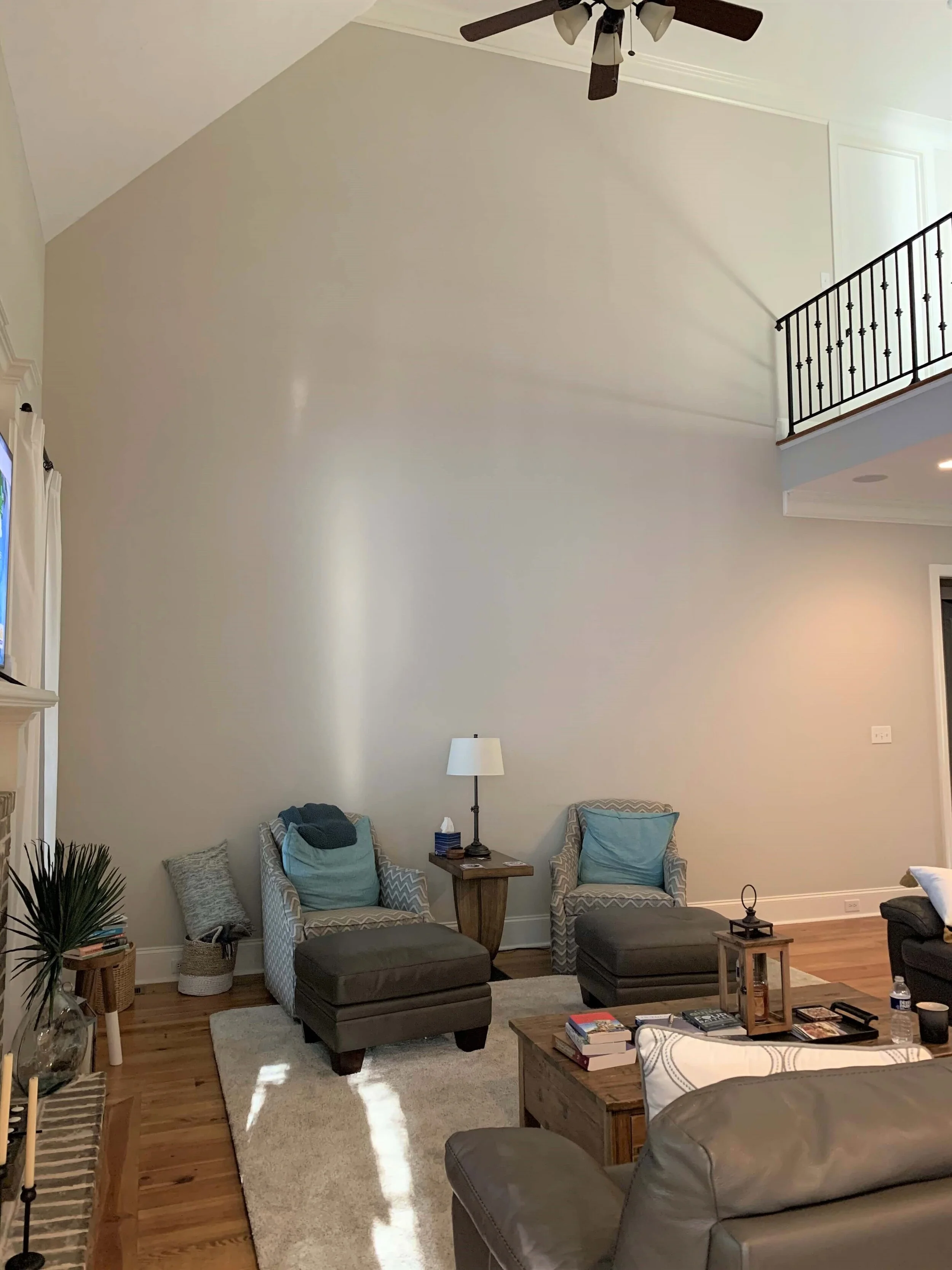
This was probably the biggest wall of all, a two-story space in a main living room. I have seen this many times before, as we have these big tall two story spaces all over the suburbs of Houston.
It makes the room feel open and spacious, but really, it is sometimes just too overwhelming. Any furniture looks small here, especially those two chairs.
If you hang multiple pieces of art along here, you’d need a whole art gallery to fill this space!
How do you decorate this two story high empty wall in a big living room space?
Without addressing the overall space with any remodeling we could do, like adding moulding to break up that wall, I think another possibility would be to add a tall cabinet behind those two chairs.
We need height here and seating alone just isn’t going to give you the height needed.
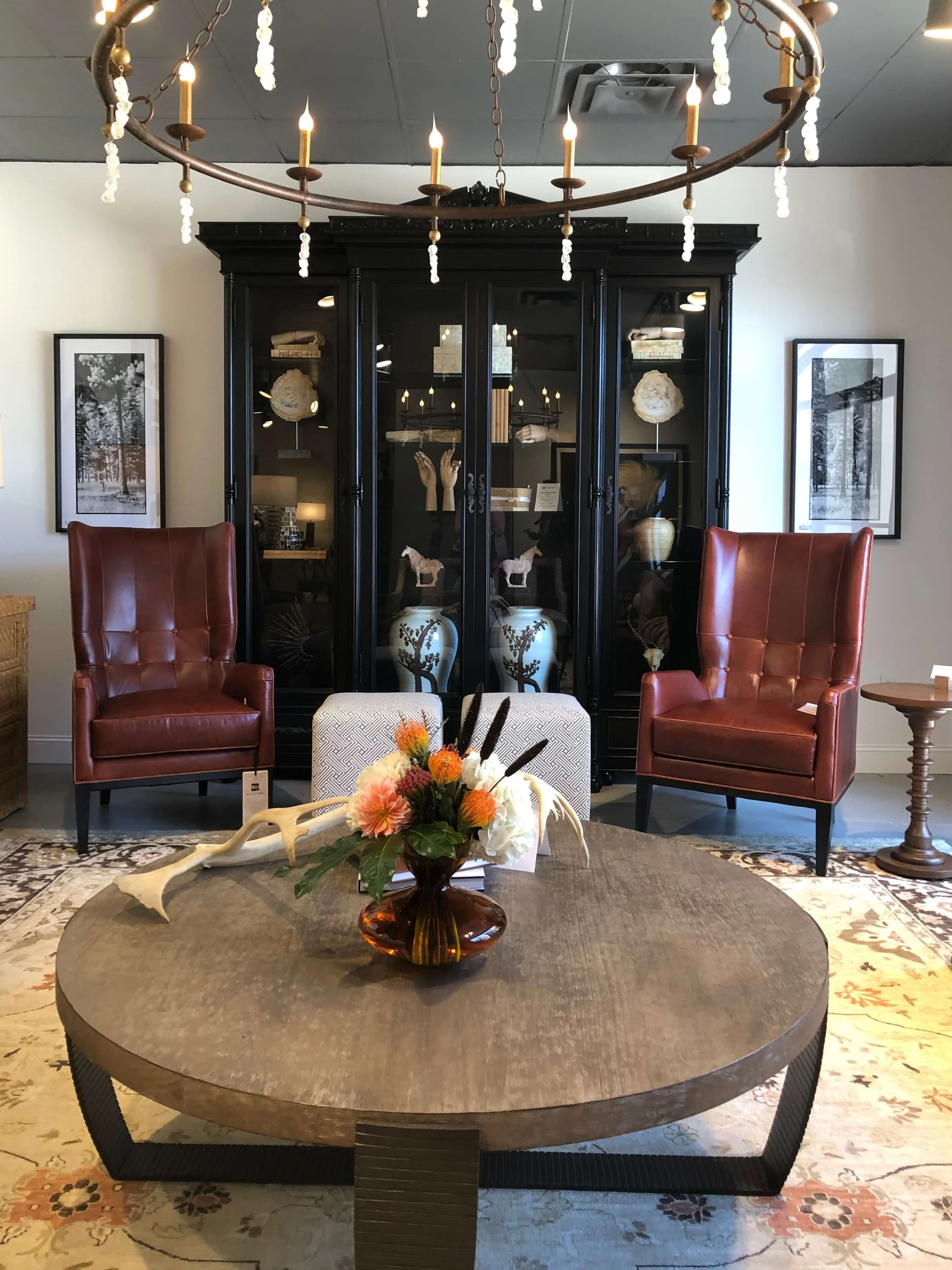
Here’s an example of what I’m talking about.
A display cabinet, seen at Highpoint Market, with two chairs in front is a great way to address a tall empty wall space.
This is a photo I took last fall at High Point Market in a showroom. This is great example of how to fill a wall and provide a nice backdrop for a more intimate seating arrangement.
You can even add width to the cabinet by hanging some art around it. Then add even more height to the top by decorating with some large vases, ginger jars, or baskets. That would also be more interesting to look down upon from the balcony above.
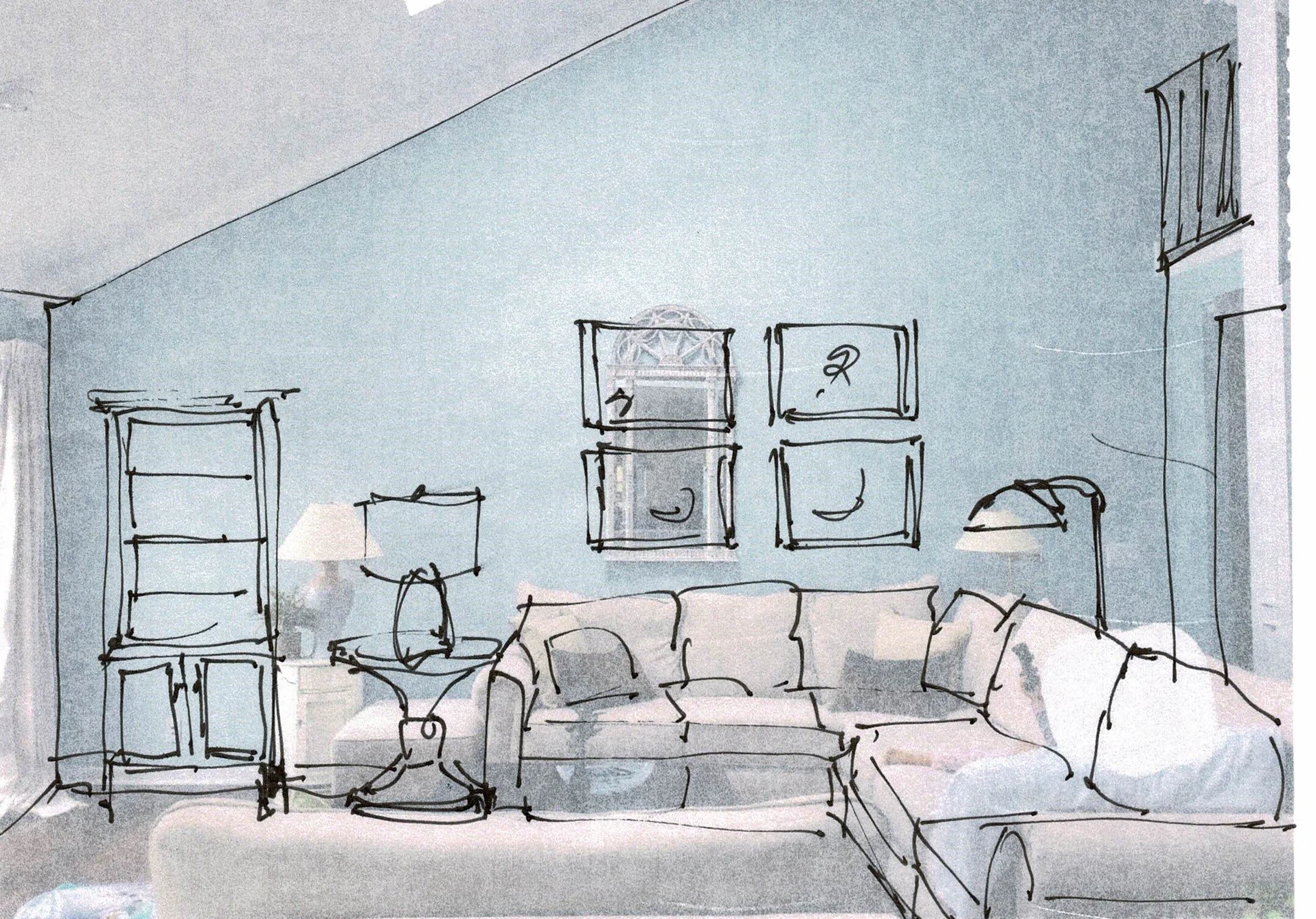
Here’s my sketch of what that would look like in this space.
Big empty wall filled with tall furniture, art and accessories.
You can see, you don’t really have to address the whole wall here, you just have to bring the focus down to a more intimate level.
Some kind of tall cabinet here would work well. It keeps the eye down at the first floor level and adds some much needed depth and detail to that massive wall.
Empty Wall #2
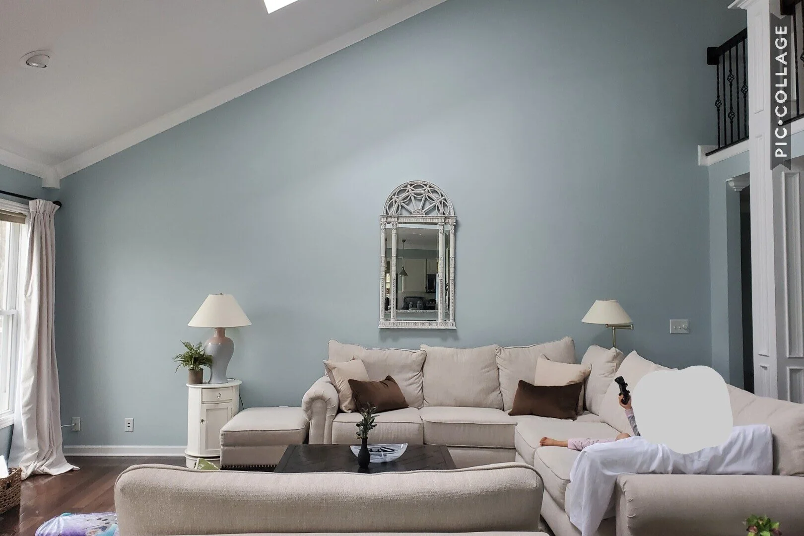
This wall is wide and angled and looks really empty.
In my previous post I mention how the arrangement of furniture and lamps can break up the expanse of a large wall into workable spaces.
That can really help in this case.
Here’s a large wide, angled wall space needing wall decor.
I like a tall bookcase on the end, to balance the big sectional. A larger end table and lamp also provide interest and affect the wall shapes. The floor lamp behind the sofa should be taller and more substantial.
A quad of art pieces works well here, hung over the sofa. Big art pieces are sometimes really pricey and a grouping of four smaller ones can actually cover more square footage and break up a big space nicely.
A tall bookcase on the far left of the wall helps balance the large sectional upholstery and fills the wall there. Taller lamps and a substantial side table help frame in the art over the sofa.
It’s a big wall, so the arrangement of furnishings and art here goes a long way to building a pleasing look. It looks more thoughtfully designed, no? :-)
Empty Wall #3
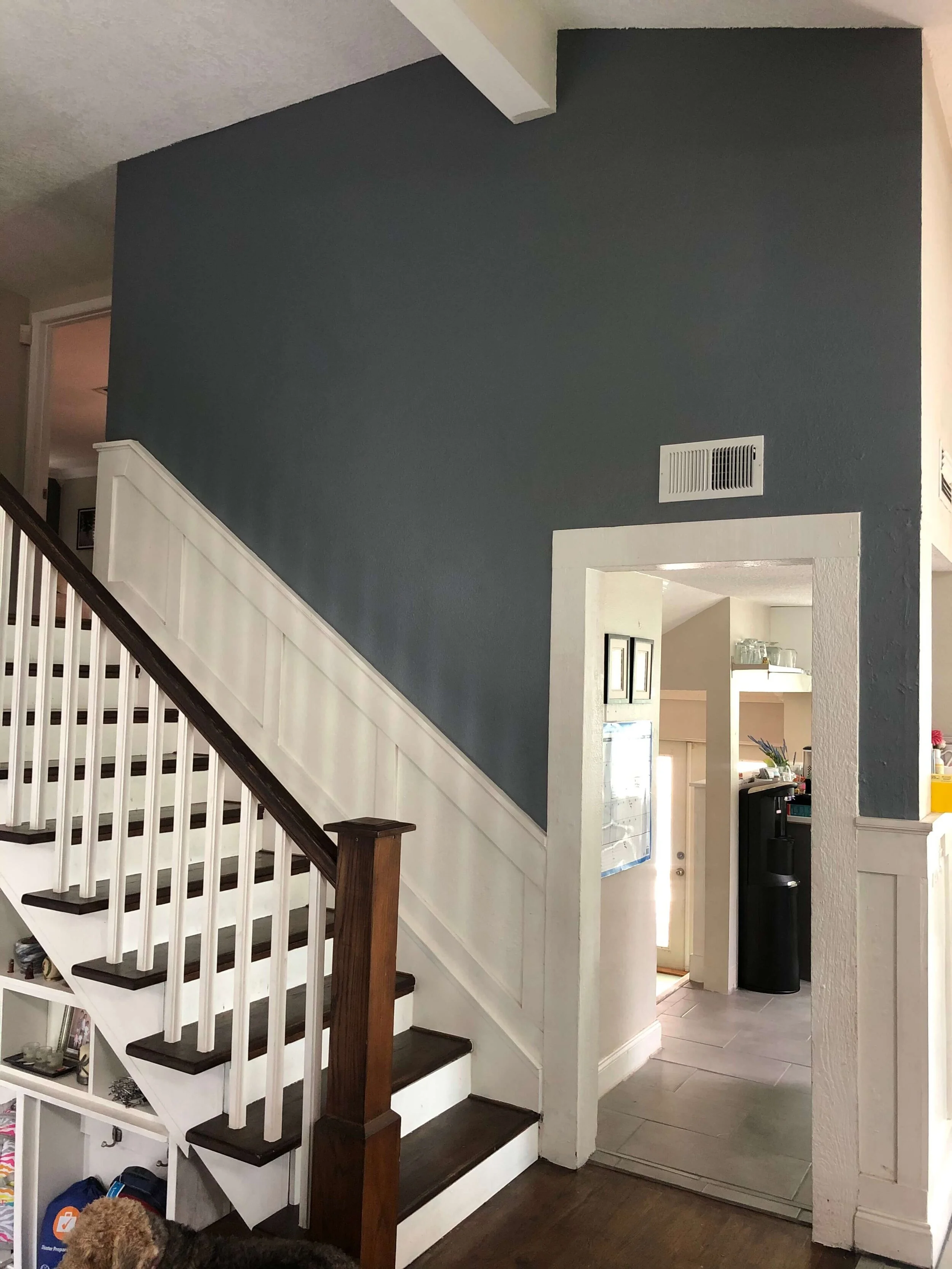
Lastly, here’s the familiar stair wall. These can really present a problem sometimes because of the angles and awkward wall shapes created.
Stair walls often give people problems with how to hang art.
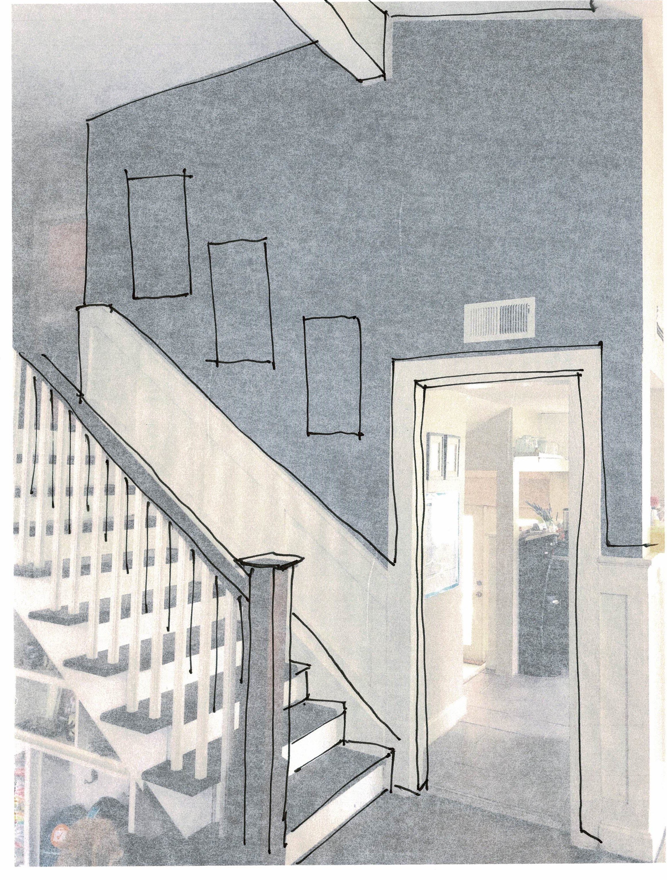
If I were this homeowner, I’d keep it simple. Doing gallery walls on these stairs can tax even the most geometrically accomplished individual. :-)
I’d do three vertical type pieces and then march them up the stairs at the same distance off the stair, spaced along the wall as shown. I like odd numbers and three will work just fine here.
Stair walls dictate wall decor marching up with the stairs. In this case, 3 vertical pieces work well.
I’d also go a step further and get a special vent cover for that one above the door frame. It’s just very obvious there and needs a touch of finesse to make the whole wall more pleasing.
I just used one of these on a job where the vent was exactly like this, above the closet door in a master bathroom. It was directly across from the entrance to the bathroom, immediately visible when you walked in! We had to make it special and these vent covers will do just that.
It comes in a brushed nickel finish, so that would kind of blend into the dark gray wall better than white. You don’t want the vent to overpower the artwork!
It just needs to look like it was thoughtfully addressed. :-)
I hope you all enjoyed this! I sure did!
I wrote a handy guide on this topic! Check out my comprehensive wall decorating guide, linked below.
It’ll be a great addition to your library, so that you will never again confront a blank wall you can’t handle all by yourself! With 131 pages and 36 case studies, you’re sure to have your blank walls filled in no time!

