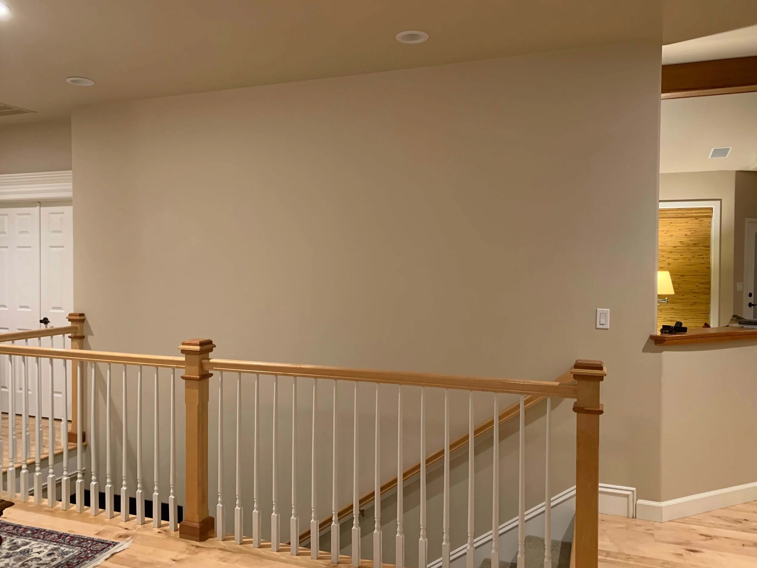
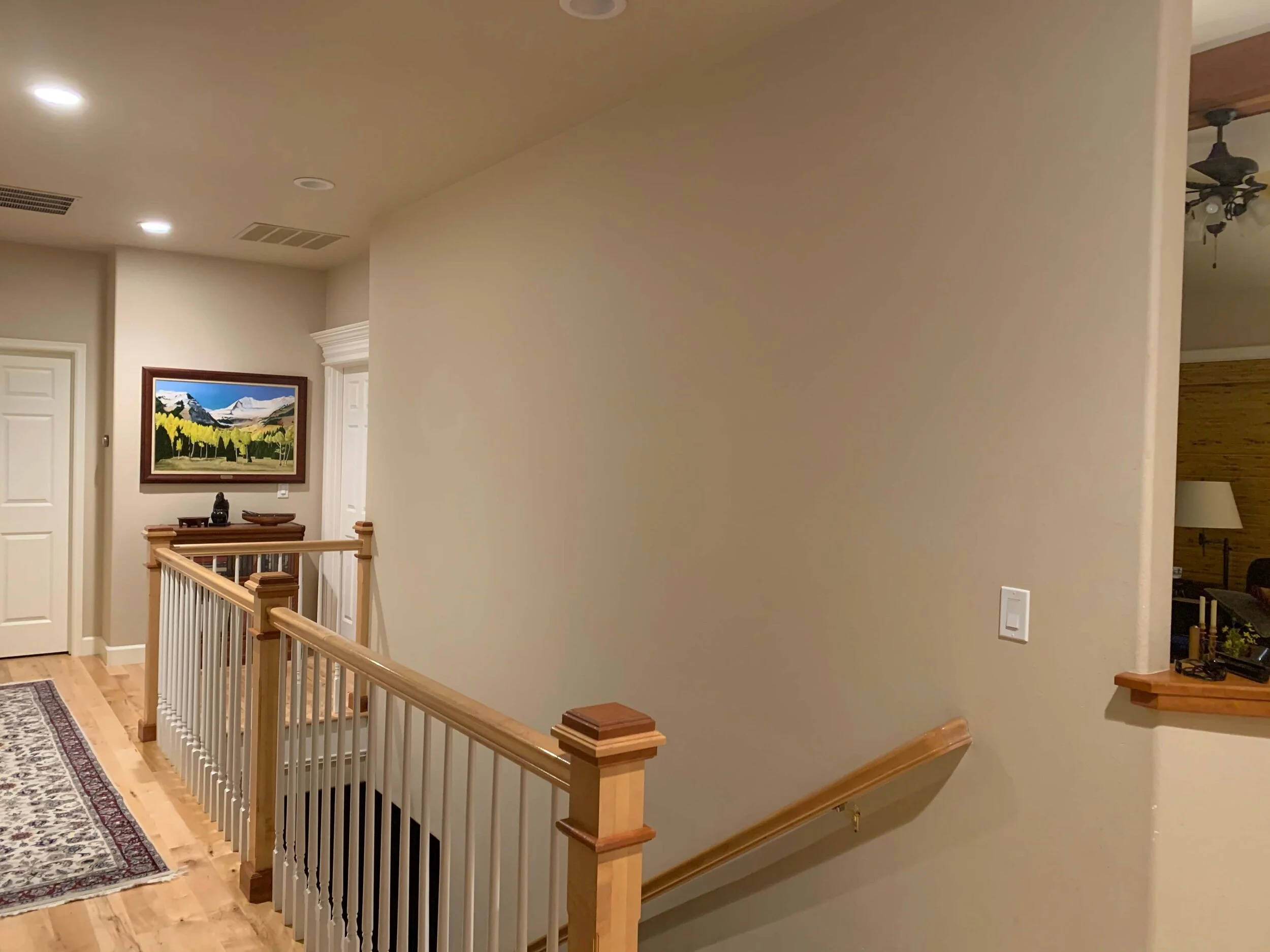
There were a couple of instances in my recent wall decor dilemma solutions, where I didn’t use any wall decor. Why? Because placing more stuff on the walls wasn’t really going to solve anything and would just create clutter and waste money.
This was one of those decor dilemmas.
I didn’t get it done in time to post on the weekend, so I’m sharing it here now and I’d love for you to see if you could figure something out that wouldn’t involve the paneling. I couldn’t!
And I didn’t want to do a gallery wall either. That would take an incredible amount of framed pieces and if she had nothing before there, it would mean acquiring meaningless pieces collected just to fill a wall.
And that’s just not how I design.
This homeowner sent me that pic of her wall, above, but I requested additional images so I could really understand the space better. This was a tough one, as I told her, when I responded.
You can see there is the stair railing that comes up, creating an angle and then there’s an opening notched out at the lower part of the wall.
What to do with this big blank stair wall?
Front door and entry hall directly across from big, blank stair wall.
“AH HA!!”, I yelled out loud when I saw this pic above!
Want to know why????
Because I couldn’t tell from the first photo and all the rest if this was a back hallway or an open living room or what. I needed the context of how this wall is seen in the home.
I finally saw that this wall was really a focal point when you walked in the front door! This was kind of a key area that really did deserve some attention and some $$$.
Not only that, I saw something else.
I saw lots of heavy white trim and paneled doors in the entry.
Basically the wall that was completely opposite the big blank wall, the front door entry, almost looked like it was full of painted white paneling.
My solution to the big blank wall dilemma
I had been noodling with the idea of paneling the big wall, since I just could not bring myself to fill that wall with a bunch of wall decor. I had wanted to suggest it, but didn’t want to recommend spending so much money there in a place that maybe wasn’t all that important in the home.
However, when I saw it’s prominence, I knew that paneling that wall with trim and painting it out white would add so much to that space. It would make a spectacular statement of quality at the entrance of the home.
I knew that it would then echo the look of the entry doors, so as almost to create a bookend effect in the foyer. :-)
Yep, this felt really comfortable. This was the solution.
They could also wrap the mouldings and white paint under the bar area there on the right. I love paneling under bar height walls anyway.
Then on this end, the white paint and crown could tuck neatly into the inside corner and stop there……my favorite place to transition materials and paint colors. :-)
She could even add electrical in the middle of each panel for a sconce if she wanted. That would be cool.
I really like the light, warm wood so much better next to the white than the neutral beige color here. So, that works well.
I can see it! Can’t you?
Want to see how I handled some other big blank walls in a couple of jobs of mine in a similar fashion?
Adding trim to this big stair wall broke up the big space, adding the opportunity to have wallcovering panels to bring interest and design to this wall.
This curved stair wall received picture frame moulding and wallcovering inside the panels to add interest and fill the big, blank wall.
Here’s another job where I was really wanting to add something to the walls, but the angles and open nature of this space made it difficult.
The back wall of this dining room had a low angled ceiling. Moulding was added to frame in some grasscloth look wallcovering.
Here’s something I spotted at a design show I attended. Marble look wallpaper inside the framed moulding.
Pin this post to Pinterest for me, please, to help me spread the word about design dilemma solutions located here on my blog! Much appreciated. :-)
Need more wall decorating advice? I have the perfect handy guide that addresses issues like this and soooo many others. Check it out here.
Subscribe to my blog for more decorating and design insider tips and advice, sent right to your inbox twice a week.


