In one of my recent email consultations, the homeowner had questions about furniture pieces for the living and dining room in her open plan space.
I’m a big fan of having color and design details repeat around the room, so that a space feels more cohesive and balanced. It ties things together and makes a room feel intentionally designed.
This homeowner made a great start purchasing some quality sofas, a rug, and some leather chairs for the living room. They needed a bit of advice on a few other items for that space and then needed help with the dining room area so that it all worked well together and felt balanced.
Come and see how I worked through this space with a few recs for the living room and then how I mixed things up a bit for the dining room.
My blog contains affiliate links. Any purchases, at no additional charge to you, render me a small percentage, are most appreciated and make this blog possible. :-)
Pics of the living room, furniture and colors selected
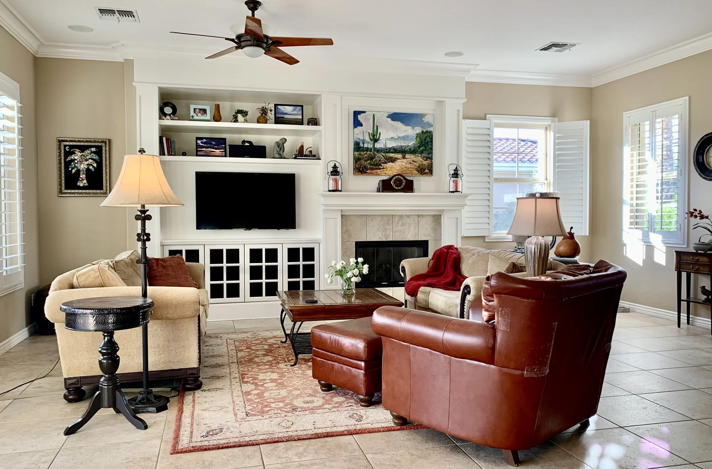
Here was her living room. They wanted to widen the seating group to make it feel like it was more centered in the room. They were going with double sofas again.
Living room to be updated with new furnishings. carlaaston.com
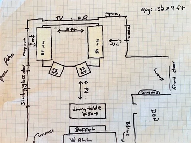
She sent me this dimensioned plan and it she did a great job with it. It really helped me visualize this room and see the relationships of the spaces.
Floor plan sketch showing furniture bought so far. carlaaston.com
Here are the fabrics and rug that they had selected. The sofas were to be in the light fabric.
The pretty rug they chose for the living room. carlaaston.com
Here are the fabrics they chose for the space. The light fabric is for the two sofas and the leather for the two chairs. carlaaston.com
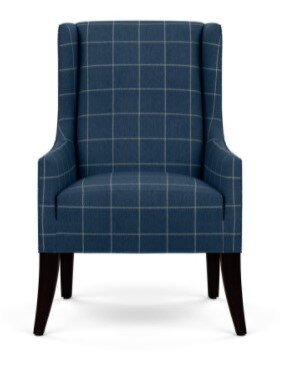
These are the two chairs that will be in the living room seating group. They’ll be in the blue leather with that warm wood tone, shown above.
You can see they are going a little more transitional and clean lined with this update.
Living Room Furniture Pieces Still In Question
Here are the two coffee tables they were considering. One is square, a 48” x 48”. It would fit nicely between the two sofas.
The other one was more to their liking. As a rectangle, it would only work with the sofas more spread apart, like on the plan, with the short ends of the coffee table facing the sofas.
Option for the coffee table, a 48” x 48” square. carlaaston.com
They preferred this coffee table, with the inlay top. carlaaston.com
I told them that I liked that table a bit better too, but I did not like the idea of having the table positioned with the short sides to the sofas. I recommended they go with the square table. It would be fine and the brassy base would be a good finish to bring into the space as an accent color.
She wanted some side table suggestions for this space, so I selected these. They’re both simple and clean lined and they mix in a painted wood finish side table and then a gilded metal finish with some glass. We don’t want everything to be the same wood tone.
I made sure they were ample enough to hold drinks, etc. and then the height worked well with the arm heights on the upholstered pieces.
Dining Room And Entry Hall Pics
Here was the existing console they had in the dining niche. They loved it and wanted to keep it. The console with the scene was in the entry hall. It was also to stay.
Console to stay in the new furnishings update. carlaaston.com
This console in the entry was to stay in this update. carlaaston.com
This table was the one they wanted for the dining room. They were likely going to do more of a greige toned wood finish, not so dark, but I liked the rounded ends and the fact that they were doing a wood finish for the table.
She wanted suggestions for dining chairs, considering everything they had selected so far.
Dining Room Recommendations
I dove in and really went to town on this part, because I thought with a little change in what they’d planned to keep, things might work out much better.
Here was my recommendation:
Niche wall area at dining room - I would definitely do paint or wallcovering inside the niche at the dining area to bring some color over here and make the niche area seem more special. I would not go neutral, I'd repeat the blue to make it the room feel like that color is bouncing throughout the space. I think it will tie everything together.
Try some grasscloth to add some texture, like a Thibaut grasscloth in a blue/gray color tone. Thibaut has lots of colors to choose from. I put some in this powder room in a blue/-green color, so you can see how the texture adds a lot to the space.
I like this wallcovering from Thibaut, but by all means, sample this, or any you may like, and check it out yourself.
Dining head chairs - I'm not sure if you are looking at an Ethan Allan furniture store, but this would be a nice head chair. (Something similar in style from another store would be fine).
One of the fabric choices is a blue plaid, you'd have to see how it worked with your rug and other chairs, but with only two chairs in the color, at each end of the table, it might work. I do like the plaid, it sort of has a more casual feel about it, really comfortable and inviting, but a solid would work well too.
You could even pull it up to the seating area if you ever need to, for extra seating there. I also like the black legs not matching the wood.
Dining side chairs - Then I rather like this more open look in a light color for the side chairs, it makes the darker transitional table feel more fresh. I love the blue graphic fabric on these, it feels modern and current and the pattern doesn't overwhelm the chair, but it's just enough. Wood finish is Cotton. (Of course, you'd have to check real life samples to see if these fabric colors do work.
Dining room host chair
Dining room side chair
Rug under dining table - You might consider a jute rug under this table, to add some softness and texture there. It's just sort of a simple layer that goes with everything.
I'm never that fond of dining tables on top of tile, so this might help cushion things there and give the space a more designated presence. With this one, I like the diamond shapes, they work to repeat the shapes on the console you have there and would kind of blend into the floor color, which I like in this case.
Lamps on console - I like these buffet lamps on top of the console, they're quite tall and I like the white marble and brass combo. I feel like they dress up the console a bit.
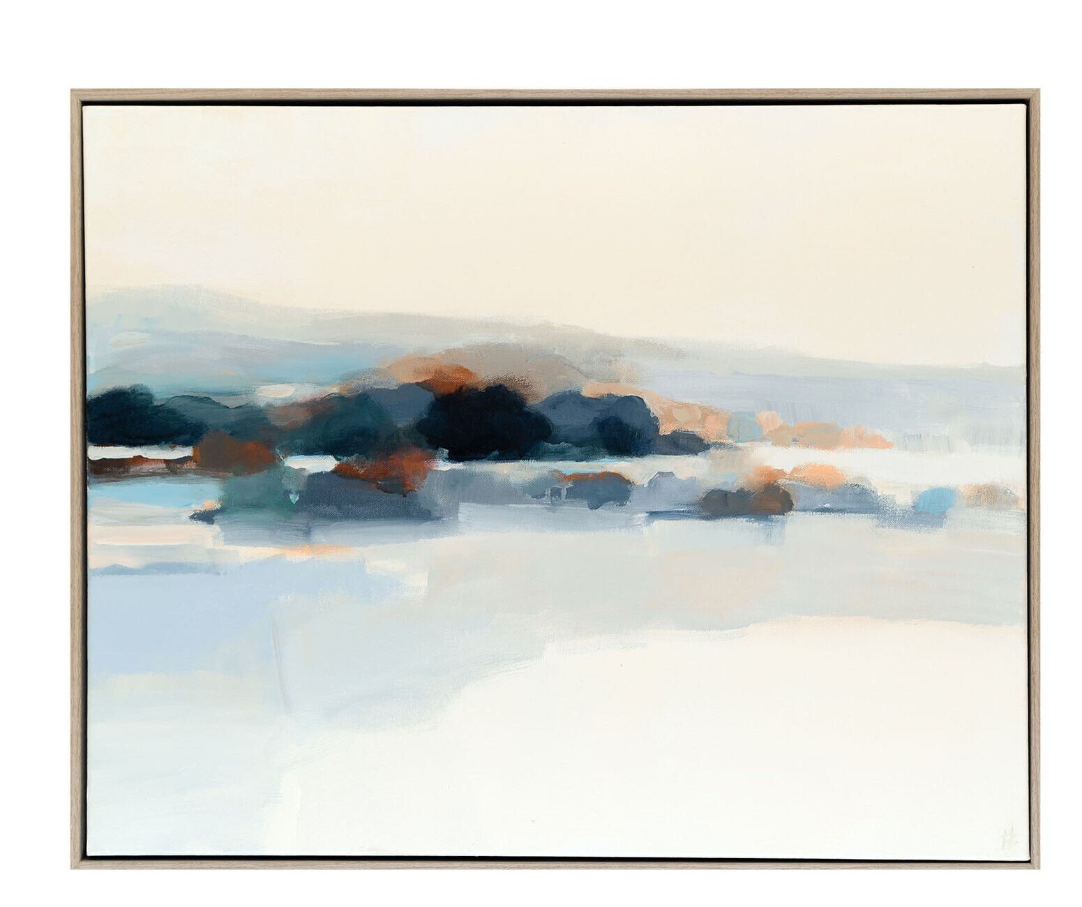
Art above the console - Some art like this, not too big so you can see a lot of the textural grasscloth behind.
New chandelier - I like this as a chandelier over the dining table, it repeats the curve of the end of your dining table, which is nice. I like the simple shape too and the touch of brass here. It's 30" diam, so check it with your table width.
This chandelier is smaller, but I like it too. The angles repeat the rug and console angles.
Dress up the existing console - Lastly, you might try some brassy hardware on the console there. I feel like it is a little too casual, and adding the brass might dress it up a bit. That would repeat the brass on the coffee table and then you can add some brassy / yellow elements more in the space, with pillows and accessories.
See how I introduced yellow into this living room with white and blue-gray? It's a nice accent and repeats the gilded and brass accents.
Using the homeowner’s existing console, this is how the combination would look. Nice, but I thought I could improve it a bit. carlaaston.com
Option to move the dining console
The only thing I might have done differently here, now that it is all feeling more put together, is to do a painted piece for the dining room console. Once I put the grasscloth texture behind the dark wood piece, I felt like it needed the crispness there of a light painted piece of furniture.
I really like the combination here of painted furniture to wood furniture in this space, with the wood tone table. I think a painted piece would be more striking and less muddy overall there on that wall.
To be honest, I'm not crazy about the console in your entry hall, and I do like the buffet console in the dining room, just not so much paired with that new table.
So, I'd move the dining room console to the entry hall and get a new piece for the dining room, if I had that option. Something like this light painted console just feels like it is more related to the dining table you have selected.
I really like the crispness of this whitewashed wood finish on the console with the textured grasscloth behind. carlaaston.com
I'd do an area rug in the entry too, to bring some more of that blue over here. (Not sure about size of your entry hall there or if this would fit, but a rug in a blue and beige in a modern pattern would be a nice mix with your other rug.)
Now, this change is not a major big deal, it's just as I'm looking at how it is all put together, that would be something I might have done if those console pieces were not already existing here.
Entry hall furnishings proposed for the living room chairs. carlaaston.com
Color, materials, finishes and design details have been strategically placed in this open plan space to create an intentional design that will feel balanced. I can’t wait to see how it turns out. :-)
If you need some design direction for your project, check out my Designed in a Click email consultation service.
Want to check out some more of these online consultations where we had a large living and dining room combination and needed to tie it all together? I’ve got a few of them right here. :-)
Pin this image to Pinterest to save for later reference!










I worked on a living room project last month, giving this homeowner direction on how to create a more up to date and clean lined look. This space was more than ample, with two seating groups and very tall windows in a two story, open room. See how I pulled this space together for her, with a remote consultation.