When I toured The New American Home, a contemporary new build, as part of my KBIS trip, I couldn’t help but have a few ideas of my own for furnishing it.
I would imagine that someone who would purchase a home like this would have a bold personality, would have a rather generous budget and would want to make a statement with their furniture. After all, they’ve already made a pretty big statement with the architecture. :-)
So, here’s what I put together for the main open area, the living/dining/kitchen space, of this contemporary new build.
First, let’s review the overall look of this space from the tour.
My blog contains affiliate links. Any purchases, at no additional charge to you, render me a small percentage, are most appreciated and make this blog possible. :-)
TNAH 2023 - view looking down from the loft above into the living room, dining and kitchen.
Fireplace wall in the living room - TNAH 2023.
Living Room
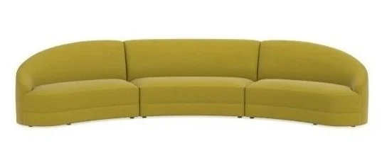
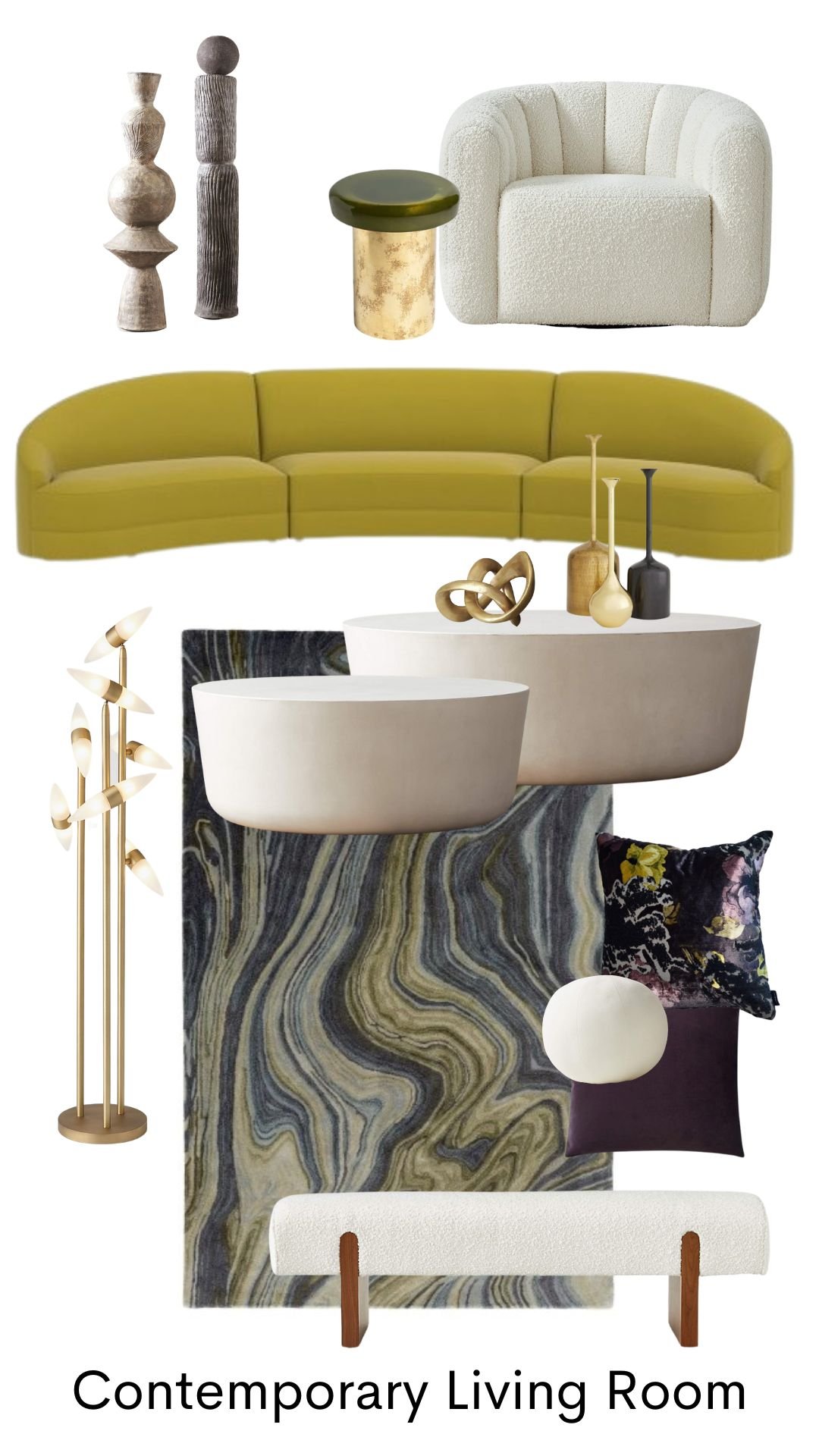
I started the whole process by considering the seating, or the sofa really. I wanted it to be curved to offset the boxy, squared off look of the room and elements within. This is the PERFECT place to have curvy furniture in my opinion….in a contemporary, boxy space.
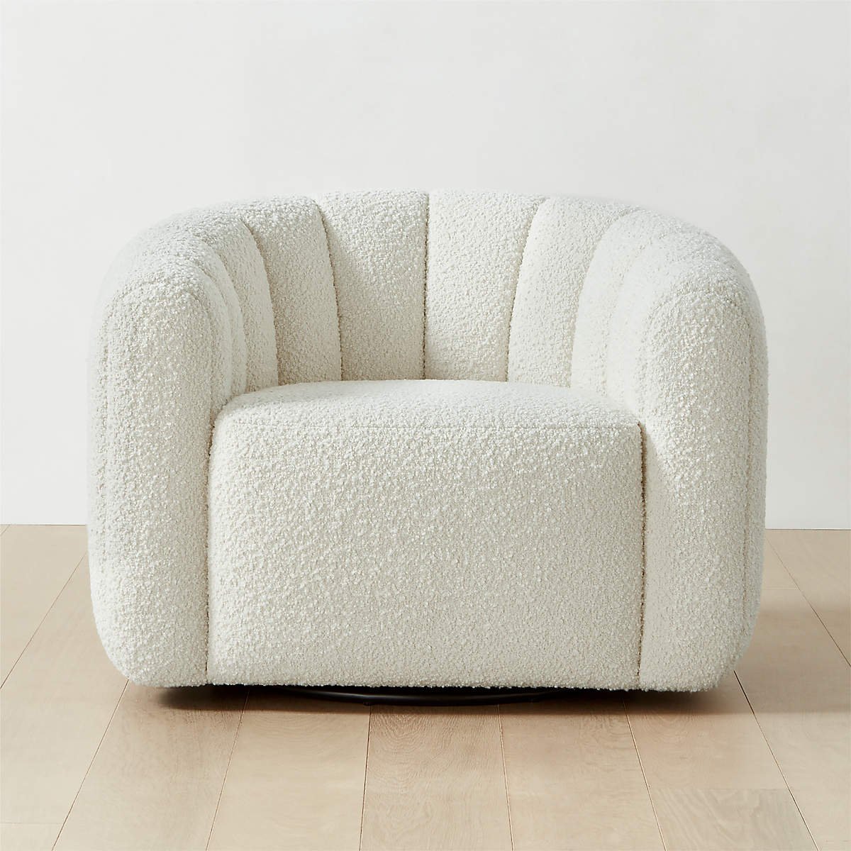
I loved this sofa, above. I looked at doing a curve sectional, but decided I wanted some bulky, curvy swivels since the back sliders open up to the patio. I wanted them to be able to swivel toward the view outside.
I’d probably keep the two metal framed gray chairs they had in the seating group, they really fit the scheme I was creating here just fine.
Next was the rug. It needed to be dramatic and since the floor was a rather neutral terrazzo (which I do love) it needed to be dark for contrast. Let’s face it, the rug they have in there is just plain on plain and rather boring for a big space like this. :-)
I found this one that echoes the look of the fireplace. Perfect!! It would need to be custom sized to get the size we need.
Next was the coffee table selection.
We have lots of space here to fill, so you know I’m going to go for multipes. I also want to contrast with the dark rug, so I’m going to go with white. I like round tables in this square space with the curved furniture.
This table above comes in a large and small version, just right for the two I need for this seating group.
The fireplace needs something in front to tie it to the seating group, so I’d do two benches like this in the white boucle. Love the touch of wood here on the legs.
That long fireplace needs the length of two of these benches but it still needs something more.
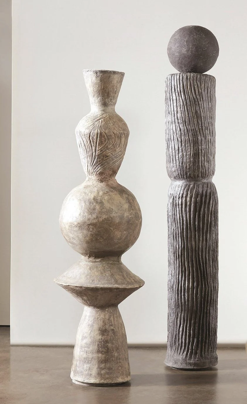
Some wood totems on the far end will add a sculptural moment. These are around 6’ tall.
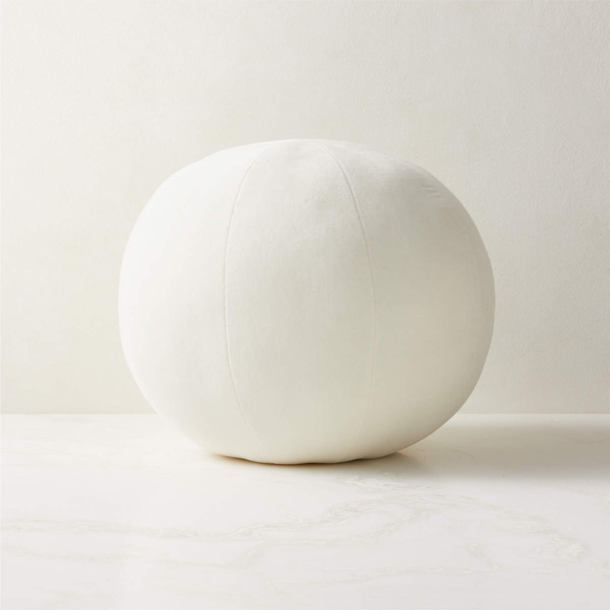
Pillows in a bold purple velvet and a white ball pillow because it is so on trend. :-)
Accessories will look smashing with some big coffee table books on those white round tables. A cool floor lamp beside the sofa will be nice along with this gem of a stool/side table to sit between the two swivels.
All in all with the living room, I’m loving the high contrast here. I think the white items with the dark rug sort of help repeat the look of the architectural finishes and enhance it.
Dining Room and Kitchen
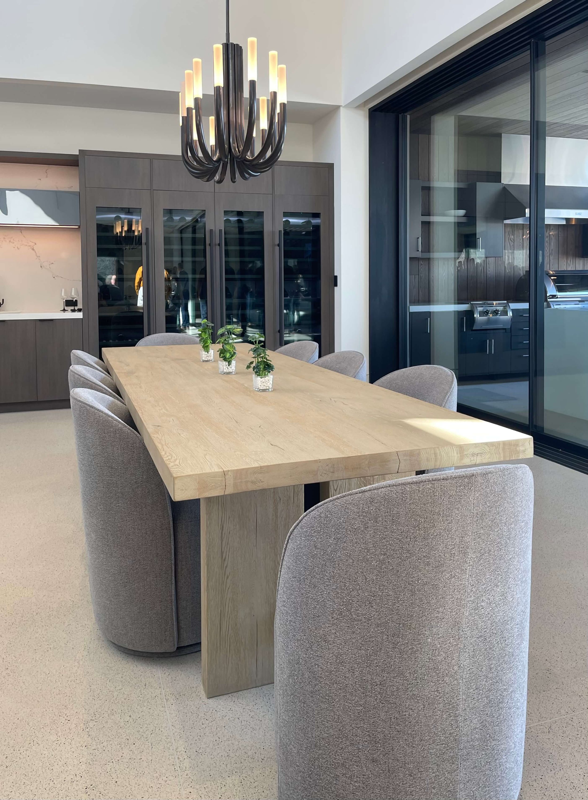
Here was the dining room. It is nice, but if we had a bold homeowner who wanted to go with some color and contrast, I have some recommendations.
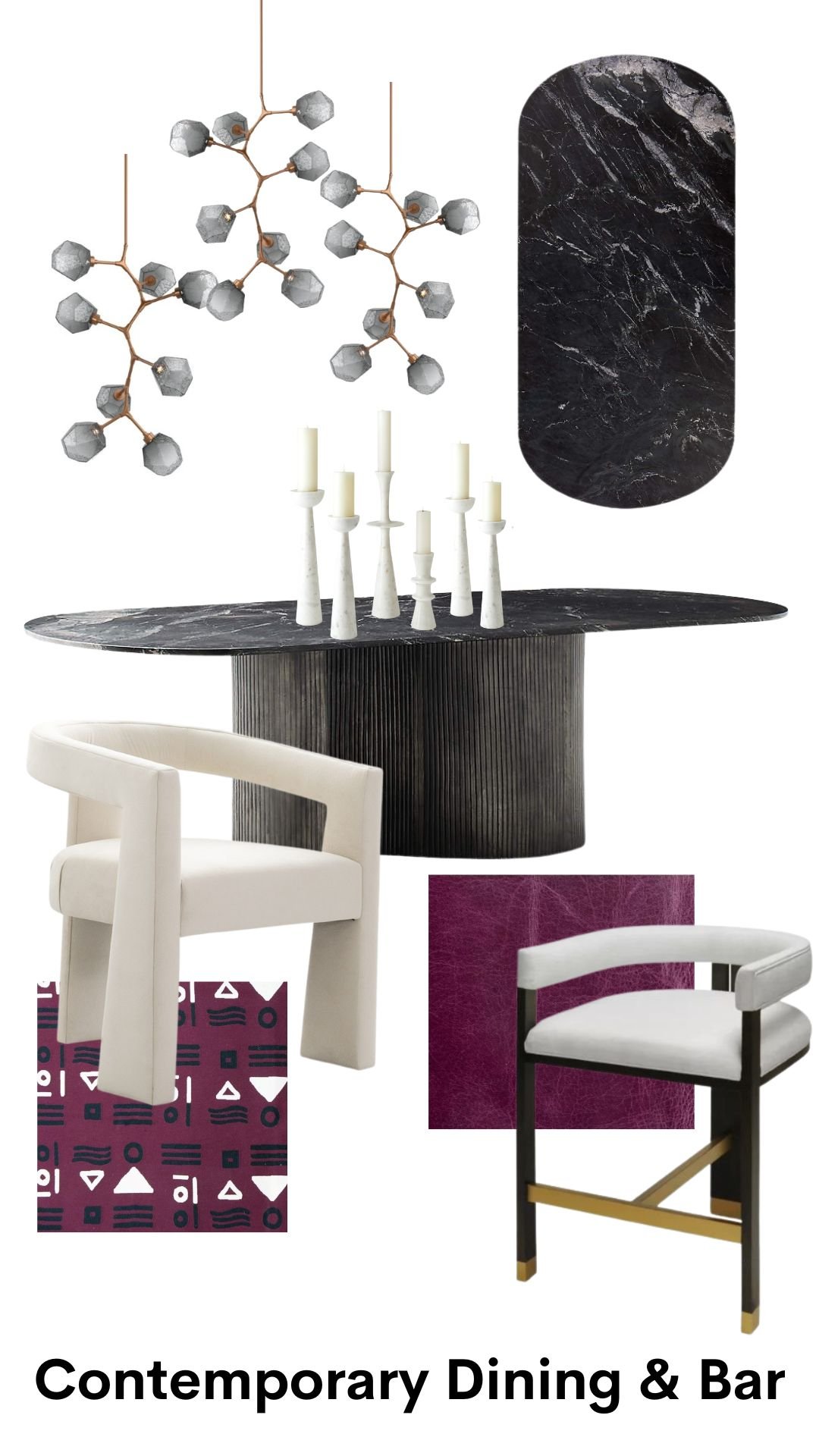
I’d start here with a statement table. Since the floor is all light toned, I want something dark and dramatic. A black marble would be perfect. Love the serpentine metal base here as well.
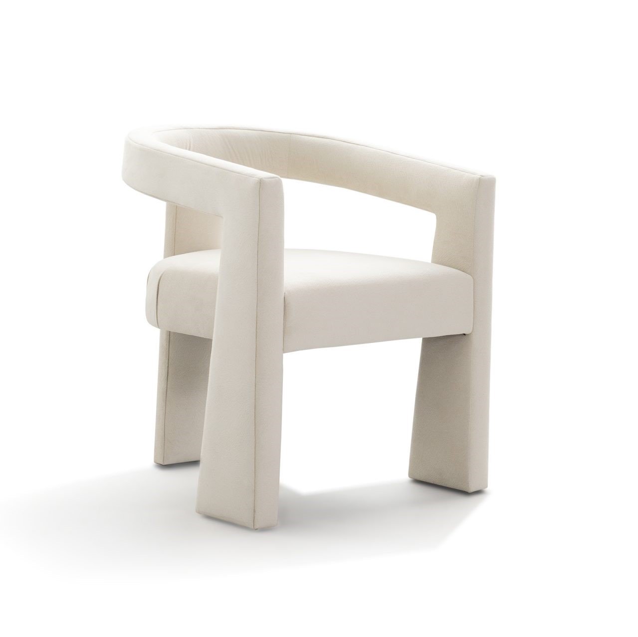
Then, some funky chairs. These are the Bell Bottom chair from Nathan Anthony. I used them in my living in the online showhouse I did back in 2020. They look great in crazy fabrics.
Modern geometric plum colored fabric for the bell bottom dining chairs.
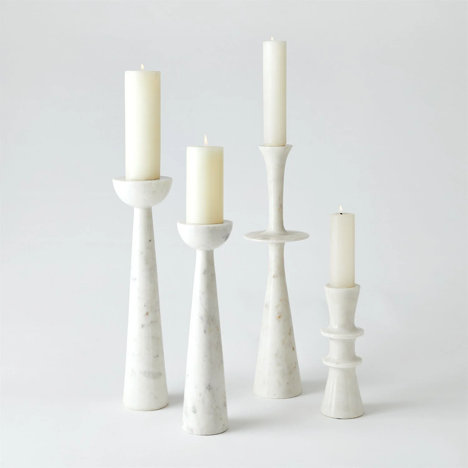
Multiple, sculptural white candlesticks on the table, relating to the totems and contrasting with the black marble.
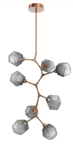
I love these fixtures from Hammerton. I’d hang three at varying heights above the table. I want height here, to fill up that space more. I like the smoke glass look, kind of retro. Yes, they would need to hang from that two story ceiling, but Hammerton does a lot of custom lighting and this home would be worth it.
I’d do these over the island and bar, about 3 or 4 fixtures so that it is just a staggered row of these cubes.
Installed like these similar fixtures in the Austin hotel I visited last summer.
Bar stools in a plum leather would be fun.
Would love to do a plum leather on the barstools to add some color to the kitchen.
Here’s the combination.
If you’re going to have a house like this, you might as well make a statement with it, right? :-)
You can check out all my photos from the tour at this link.


