I’m sharing some of the design features from a boutique hotel I stayed in recently. These are all so good, I am sure you might want to incorporate a few of these design tricks in your home.
The Colton House Hotel in Austin, TX was a real treat! I feel like they created a beautiful experience for their guests and they might have had an eye out for some Instagram shares too. It is just that pretty!
My blog contains affiliate links. Any purchases, at no additional charge to you, render me a small percentage, are most appreciated and make this blog possible. :-)
1) Mix old and new for a space that doesn’t feel like it came out of a catalog.
All new things are fun to acquire but a few antiques or vintage items add so much personality. This antique door made a warm, interesting statement in the lobby.
This antique wood door adds personality and a warm aesthetic in the lobby. Colton House Hotel, Austin | carlaaston.com
2) You can mix a white, light and bright aesthetic with vivid color and a moody vibe.
While there was a crisp white envelope through most of the hotel, the smaller, more intimate spaces had a dark, dramatic, moody vibe. They combined these two looks so well, see how in the photos below.
In the hallways upstairs, the low painted wainscot and doors were nice accents. Colton House Hotel, Austin | carlaaston.com
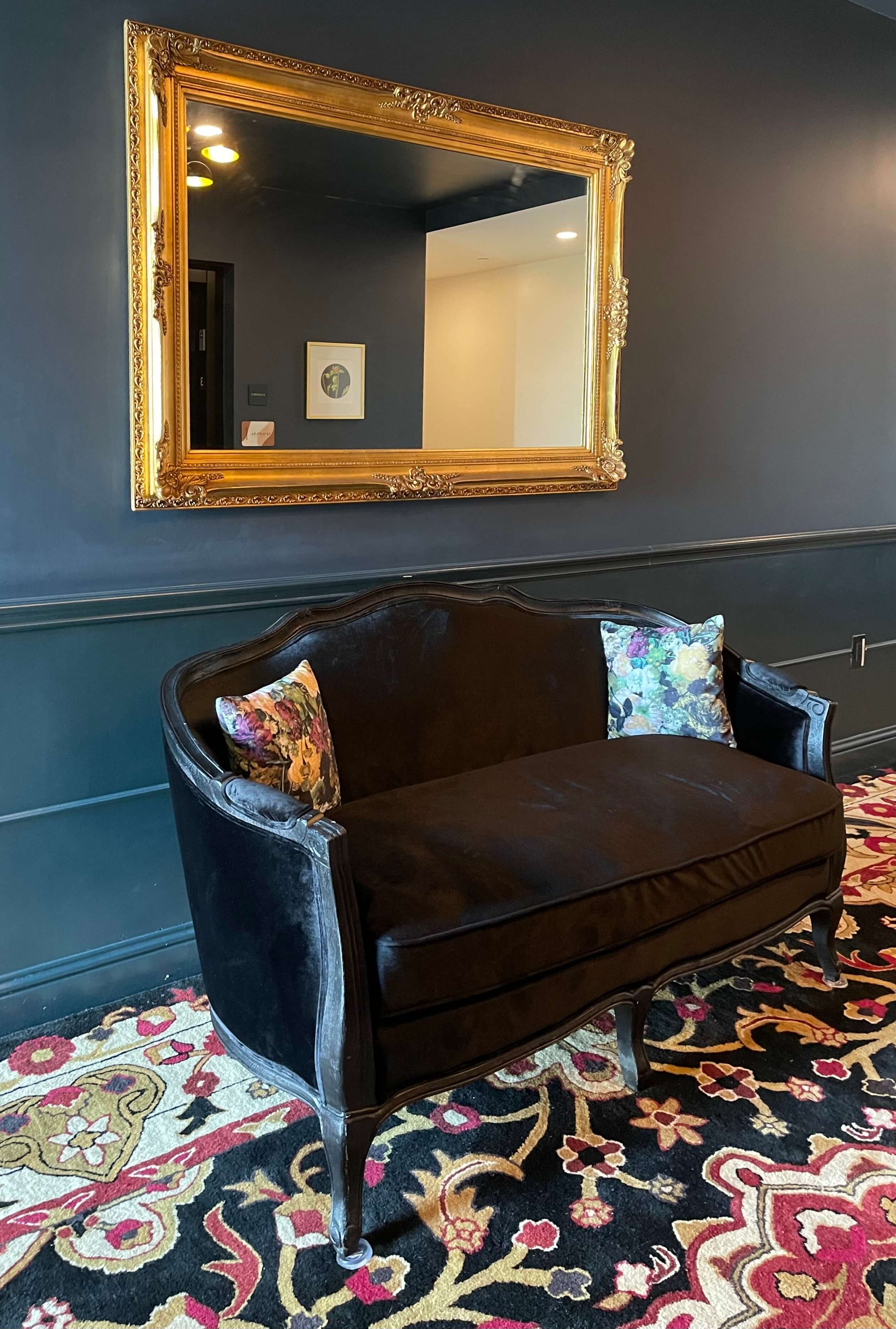
The elevator lobbies were all painted dark with a richly upholstered settee and colorful rugs. Colton House Hotel, Austin | carlaaston.com
I often tell people the best way to add bold color to an open plan house is to do color on the walls in the more intimate spaces, powder rooms, dining rooms, bedrooms, studies or home offices, etc. Then tie that color in with other design elements in the more open spaces and you will have a colorful home without painting the whole place a bold color.
That’s exactly what they did here.
Library lounge, conference room, elevator lobbies, and accent walls in the rooms were the places for bold color. The rest of the environment was white.
The bold accent wall in the guest room brought just enough of the dark color scheme into the rooms. Colton House Hotel, Austin | carlaaston.com
The dark blue color created a moody library lounge in the Colton House Hotel, Austin. carlaaston.com
3) Add wood for warmth.
The wood paneled wall in the bar did a lot to warm up the cocktail/coffee bar that had a concrete floor and white walls. Love the modern bubble lights staggered in front.
Wood paneled wall in the bar added warmth and made a beautiful backdrop. Colton House Hotel, Austin | carlaaston.com
The rustic wood shelf in the coffee bar in the room added warmth to the gray cabinetry and tile. Colton House Hotel, Austin | carlaaston.com
The inlaid wood table adds warmth to the vividly painted conference room. Colton House Hotel, Austin | carlaaston.com
4) Rugs can go a long way to add color and pattern.
Color doesn’t all have to go on the walls. This rug made a big statement in the lobby.
A bold red custom rug in the lobby set the tone for the design style in the rest of the hotel. Colton House Hotel, Austin | carlaaston.com
I loved how the corridors were all about the gorgeous rug pattern and they weren’t cluttered up with other wall decor. Colton House Hotel, Austin | carlaaston.com
5) Repetition of some decorating elements creates an interior that is tied together and creates a distinct impression.
In this hotel, the rug style was repeated throughout, but in different colors and slightly different patterns. It was very effective in tying things together and in bringing lots of color to the interiors. These were all custom made wool rugs and so worth the investment.
This gorgeous custom wool runner made this corridor at the entrance of the Colton House Hotel, Austin. | carlaaston.com
A more traditional navy colorway was used the lobby. Colton House Hotel, Austin | carlaaston.com
Red and brown colors were used in the guest room for a traditional look. Colton House Hotel, Austin | carlaaston.com
This turquoise tone on tone rug had the effect of an overdyed look in the conference room. Colton House Hotel, Austin | carlaaston.com
The vintage trunks and luggage use throughout were really cool and effective styling props. They were found in various spots around the hotel.
Loved this stack of trunks under the open stairs in the bar. People always want open stairs and then ask what to put under them. Well, here ya go! Colton House Hotel, Austin | carlaaston.com
Vintage trunks and colorful rugs are repeating design elements in this boutique hotel. Colton House Hotel, Austin | carlaaston.com
Old trunks held children’s books in the library. A pair of trunks made the coffee table in this seating group. Colton House Hotel, Austin | carlaaston.com
Old trunks held children’s books in the library. Colton House Hotel, Austin | carlaaston.com
6) Add importance to a pendant or chandelier with a ceiling medallion.
This also a great way to mix traditional and contemporary styles, like they did here.
Modern light fixture with traditional ceiling medallion, Colton House Hotel, Austin | carlaaston.com
Modern light fixture with traditional ceiling medallion, Colton House Hotel, Austin | carlaaston.com
7) Velvet and trim makes everything feel more luxurious.
I always say that there is no way to get more vivid color in a space that to use that color in velvet. Something about the depth of it makes it feel richer and more vivid than any other type of fabric or finish.
There are performance velvets now, that wear really well, so they can be used in more places than ever before.
The fringe trim on these velvet covered chairs in the lobby added some elegance and reminded me a bit of some of the “fancy” furniture in old western saloons. Colton House Hotel, Austin | carlaaston.com
The vivid red velvet on a bench in the upstairs lounge makes a real color statement. Colton House Hotel, Austin | carlaaston.com
Close up of velvet drapery with trim. Colton House Hotel, Austin | carlaaston.com
The upstairs library lounge in the cocktail/coffee bar with red velvet upholstery. Colton House Hotel, Austin. Isn’t this just the best perch, ever?? carlaaston.com
The trim on these velvet draperies stood out in the white envelope of the room. It added a touch of femininity and made things a bit fancy. :-) Colton House Hotel, Austin | carlaaston.com
8) When in doubt of an upholstery fabric, use leather.
Whenever I’m putting together a scheme and it just doesn’t feel complete, it is because I haven’t added leather yet. To me, leather is a neutral grounding element and can be appropriate for any space.
In this hotel, in spite of all the “fancy”, leather was most appropriate.
Brown leather in the bar made perfect sense. Colton House Hotel, Austin | carlaaston.com
These modern black leather chairs in the guest room were comfy and contrasted with the more trad bistro table. Colton House Hotel, Austin | carlaaston.com
9) Mirrors make great wall decor, but watch what they will reflect.
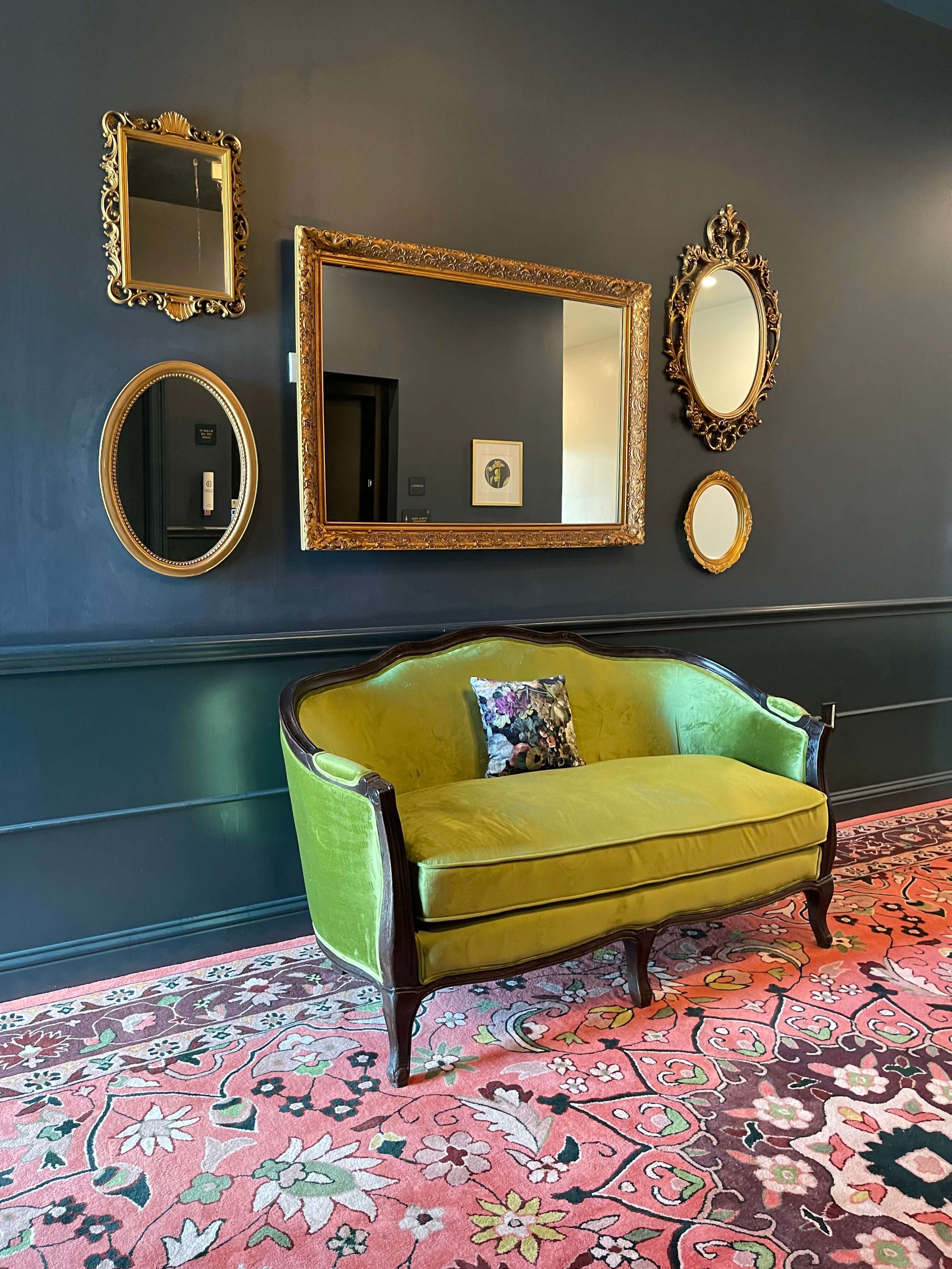
I really like this collection of old mirrors hung gallery-style in the elevator lobby on each floor. While they didn’t reflect much, just the elevator doors, I imagine the thought was for them to reflect the people standing there. Everyone likes to look at themselves in the mirror before going out and these mirrors provide that last look.
(And check out that vivid velvet sofa.)
Mirrors in the elevator lobby provide a place to check yourself upon leaving the room, just like a foyer mirror in your own home. Colton House Hotel, Austin | carlaaston.com
See how this mirror in the gallery above reflects all the light from the windows from across the room? I always love hanging a mirror across from a window, especially in a dark space that needs some extra natural light. Colton House Hotel, Austin | carlaaston.com
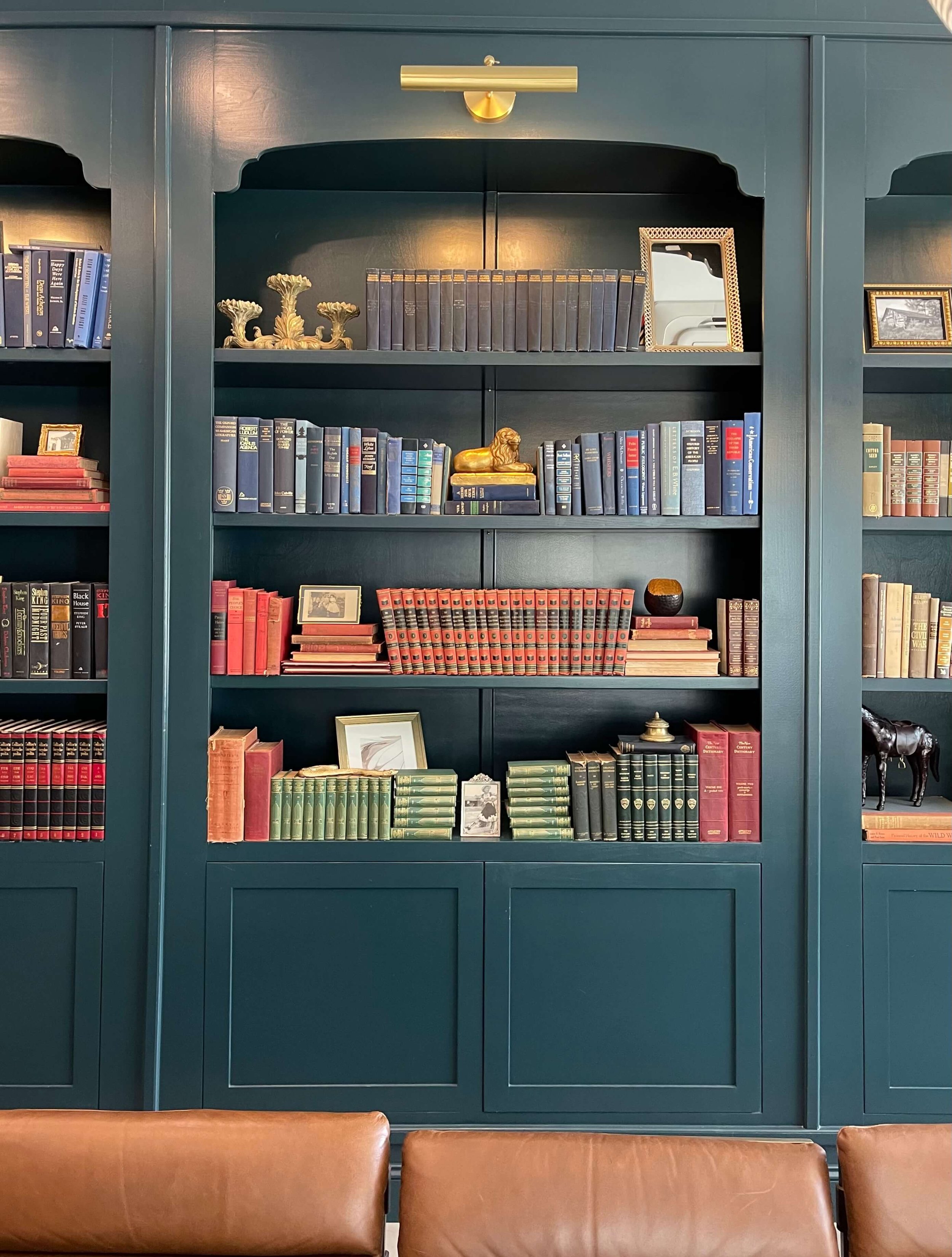
10) Vintage books can add personality to any project.
I loved seeing the vintage books used in this hotel. They’re interesting, they can be had inexpensively and they can fill a new room with soul.
I know from hitting up many of the thrift stores in my area for a bookshelf styling I have coming up that you can buy books like these for a few dollars, even less sometimes. See how they just a little bit of damage to covers exist, the aged look adds to the ambience of the spaces.
Coffee table styling with vintage books. Do you think this collection of books share a bit about the location of this hotel? Colton House Hotel, Austin | carlaaston.com
11) Match the drapes to the wall for a more enveloping space.
When you do a moody, dark room and have a wall of windows, have the drapery match the walls so that vibe just continues all around the space.
The drapery of the library lounge matches the color of the walls and built-ins. Colton House Hotel, Austin | carlaaston.com
12) Bookshelf Styling - wallpaper the backs?
When you have lots of cool interesting items to display, you don’t need pattern, texture or contrasting color inside or on the back wall of the bookshelves. You’ve got “interesting” covered with the objects themselves. :-)
Colton House Hotel, Austin | carlaaston.com
13) Display picture frames in bookshelves minimally.
Everyone wants to put photos of their family in bookshelves. I love how these are scattered about here and don’t overwhelm the bookcase. They play a supporting role in the styling, they aren’t in the majority.
Save some photos for a gallery wall or to scatter in more personal spaces of your home.
Bookshelves in conference room filled mainly with colorful vintage books and some photos in frames. Colton House Hotel, Austin | carlaaston.com
Want to see my less-than-one-minute video tours of this hotel? You can check them out here. And give me a follow on Instagram if you haven’t already. :-)
Designers or Design Lovers, do you want to learn to take beautiful photos with your phone like I’ve done here? After all, you never know when you might want to snap a pic of special detail or room.
I learned from one of the best. Linda Holt’s course is a so handy for helping create great photos of interiors that you can then turn into reels or videos. Here is the link.


