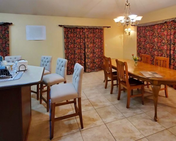
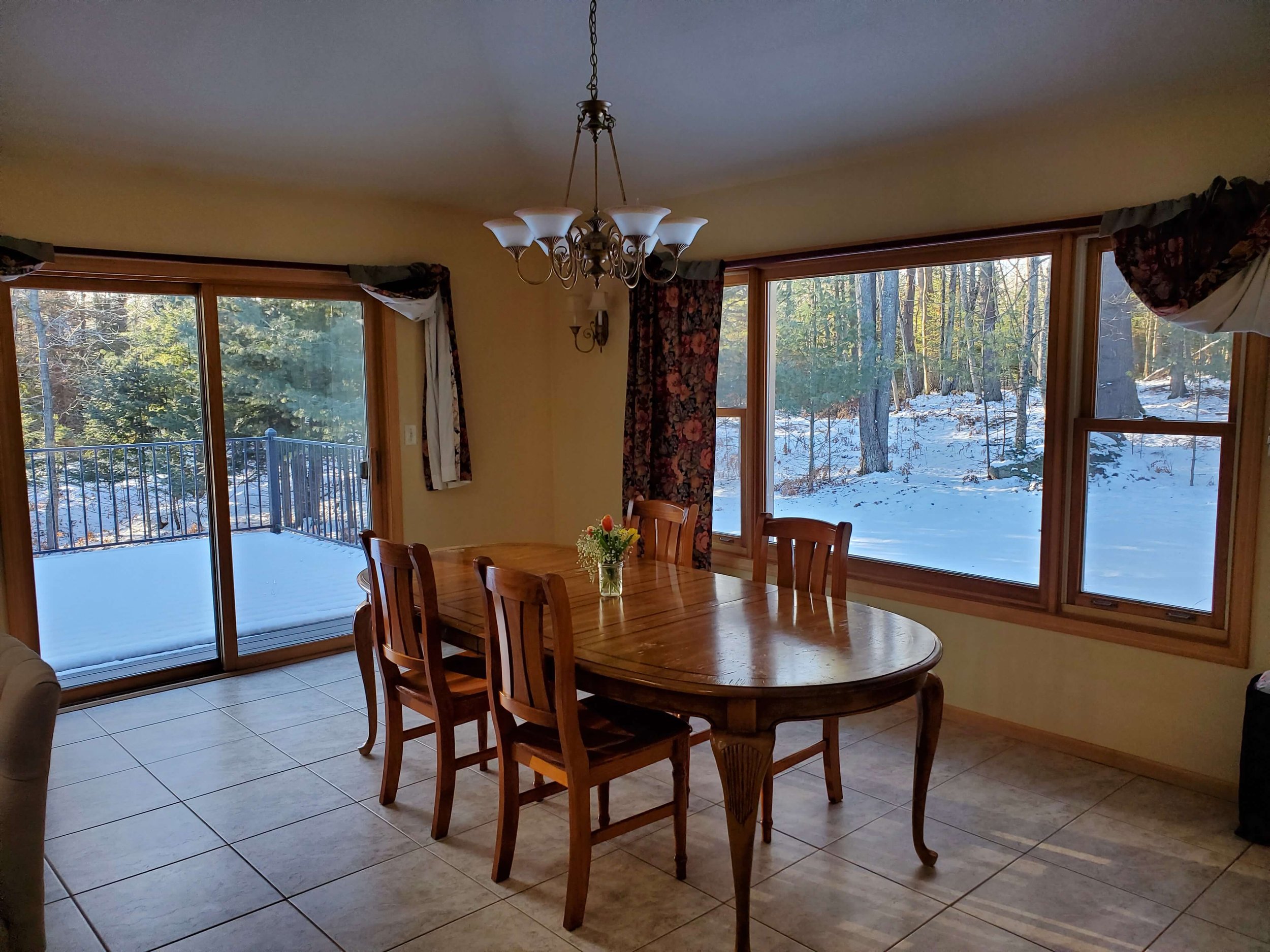
This dining room was open to the kitchen, both are in one room. I often see kitchens with breakfast rooms, sometimes open to family rooms or living rooms too.
More and more these days, people have their only dining space right by the kitchen, as formal dining is not used as much. Such was the case with this home.
The kitchen is getting a remodel here, so the homeowners wanted to make sure their dining room wasn’t left out of the new, elevated look they would achieve with their redo.
My blog contains affiliate links. Any purchases, at no additional charge to you, render me a small percentage, are most appreciated and make this blog possible. :-)
Here are the before pics of the dining room and kitchen.
In this recent Designed in a Click consultation, the homeowner wanted a fresh look with new furniture, lighting and window treatments. They were getting wood fooring in here and painting the walls and trim in a light, cool tone color palette.
They had bold slate blue tile as their new backsplash selected, so blue would be good to repeat over here.
Material Finishes for kitchen - wood floor, white countertop, slate blue backsplash
I worked on their living room redo, prior to this consultation, so I do understand the look they were going for. :-)
The Furniture Selections
I like to start with was the table. I love to mix tables and chairs where one is dark and one is light. I also like to do head chairs in a more fully upholstered option to mix things up even more, if the scenario calls for it.
I went with a light finish on the table with a touch of brass. It has a leaf, so it can expand too.
A wood chair will add some warmth and elevate the look and the upholstered head chair would be a comfy spot for lounging too. I love the terracotta color here since I will go in with the blue in a bigger way in this space.
Since this is rather a complete fresh start, I wanted to add a dynamic rug. This one incorporated the colors and had a bold pattern that made a more modern statement.
This rug, below, would be a good, more budget-friendly option.
This chandelier echoes the look of the table to me and I love the sconces that read contemporary here.
Softness at the windows with drapery panels that repeat the color of the tile would look great and be consistent on each window. These are linen panels from The Shade Store in Midnight Blue Luxe Linen.
A small console, like this one in a painted finish, with some colorful art above it would help fill out this space nicely.
The upholstered leather counterstools add a more comfy vibe here and contribute to the upgraded look. I like these in the chestnut leather with the Heritage Gray leg.
And here’s how it looks all put together!
Slate Blue and Terracotta Dining Room - Furnishings Storyboard
Slate Blue and Terracotta Dining Room - Furnishings Storyboard
See their living room I helped them with and you can check out my email consultation service too.
Shop the post, below!
This blogpost was thoughtfully written by me, Carla Aston, and not by AI, ghostwriters, or guest posters.


