I just LOVE it when a client takes my suggestions (especially about decorating above the cabinets) and we create a space that we both can be proud of. It makes my job so worthwhile and is truly fun and rewarding. When someone takes great care in doing exactly what I’ve advised, it makes me so happy. :-)))))
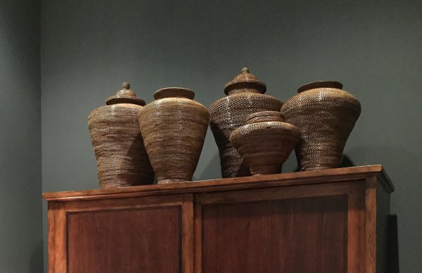
I have a former client who has moved down into Houston and it’s a little harder for me to run by her house, since I’m about an hour away. This week she got in some big wicker ginger jars for the top of her cabinet in the study that I designed for her. I picked them out online, she ordered them and now we are positioning them on top of the cabinet. She sent me a couple of pics while setting them up this week and I thought I’d share with you.
This fits in exactly with my very, very popular post…..How to Decorate The Top Of A Cabinet (and how not too).
You really should read that post if you have questions about decorating above the cabinets. It talks about how to cluster like objects and how large, bulky items look best up high on top of a cabinet. It gives examples of how the items can extend the height of a piece of furniture and give it a taller mass in the space. Just like we were doing here.
Here's the before pic of the space.
Here is my sketch of the design plan.
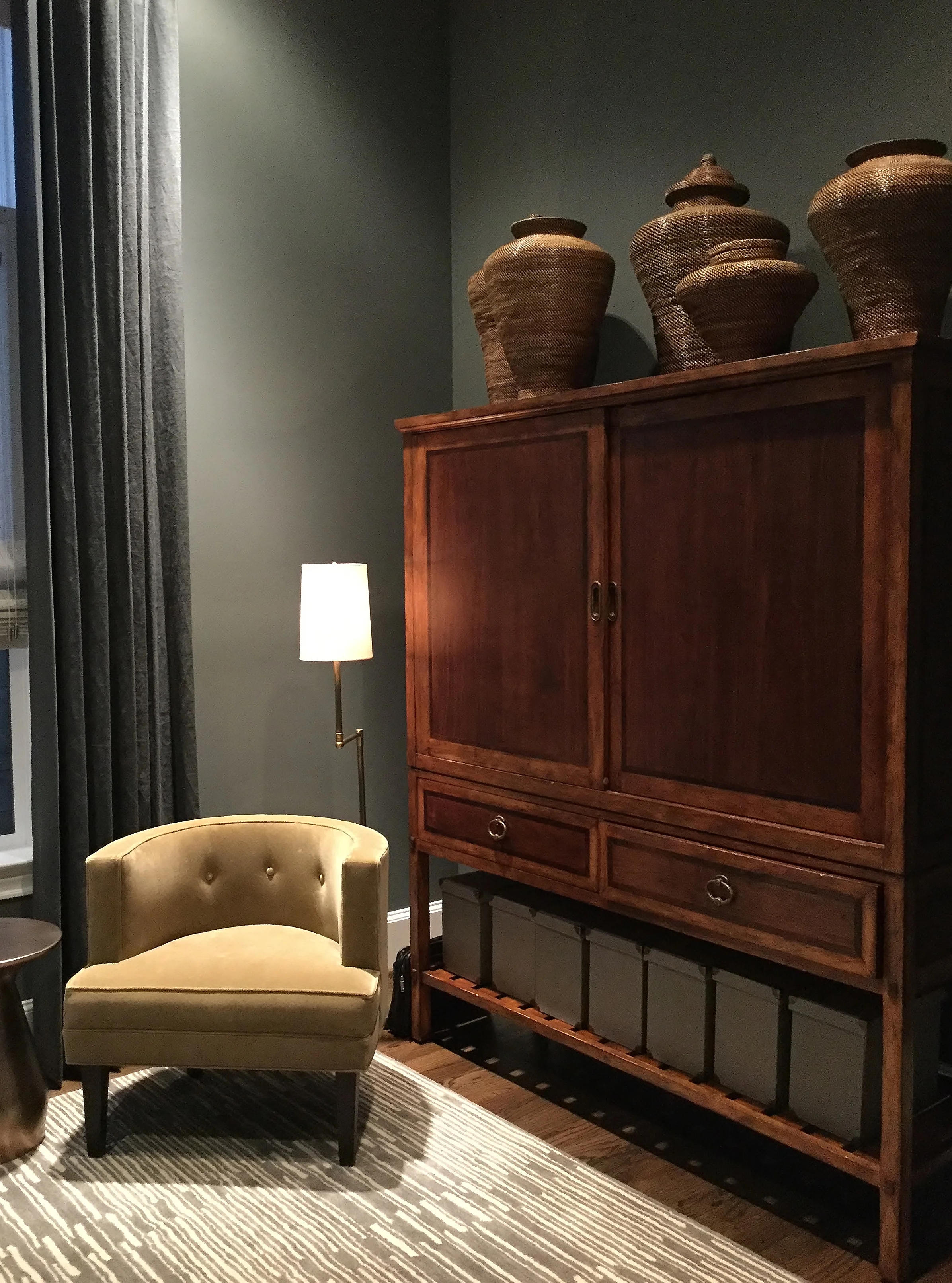
We took a plain, front room in the house and made it a cozy, masculine study or home office with dark gray walls and tall drapery panels to soften the windows and accentuate the real attribute of the space, the ceiling height. We added a nice wood ceiling fan in Koa wood, softened the room with a muted gray striped rug and added some brassy, warm touches with the drapery hardware, the floor lamp, and the small side table. The little velvet accent chair also goes a long way to warm up this cool toned room.
Koa wood ceiling fan compliments the wood of the cabinet
The homeowner’s existing cabinet is a real feature in this space and you see it from the entry hall quite prominently. It’s beautiful in this room and we chose the dark walls specifically to have that orange toned wood cabinet appear rich and special. We are going to add more of that color tone with a caramel leather desk chair from Crate and Barrel, when it comes in. It will create balance to have that color repeated on the other side of the room.
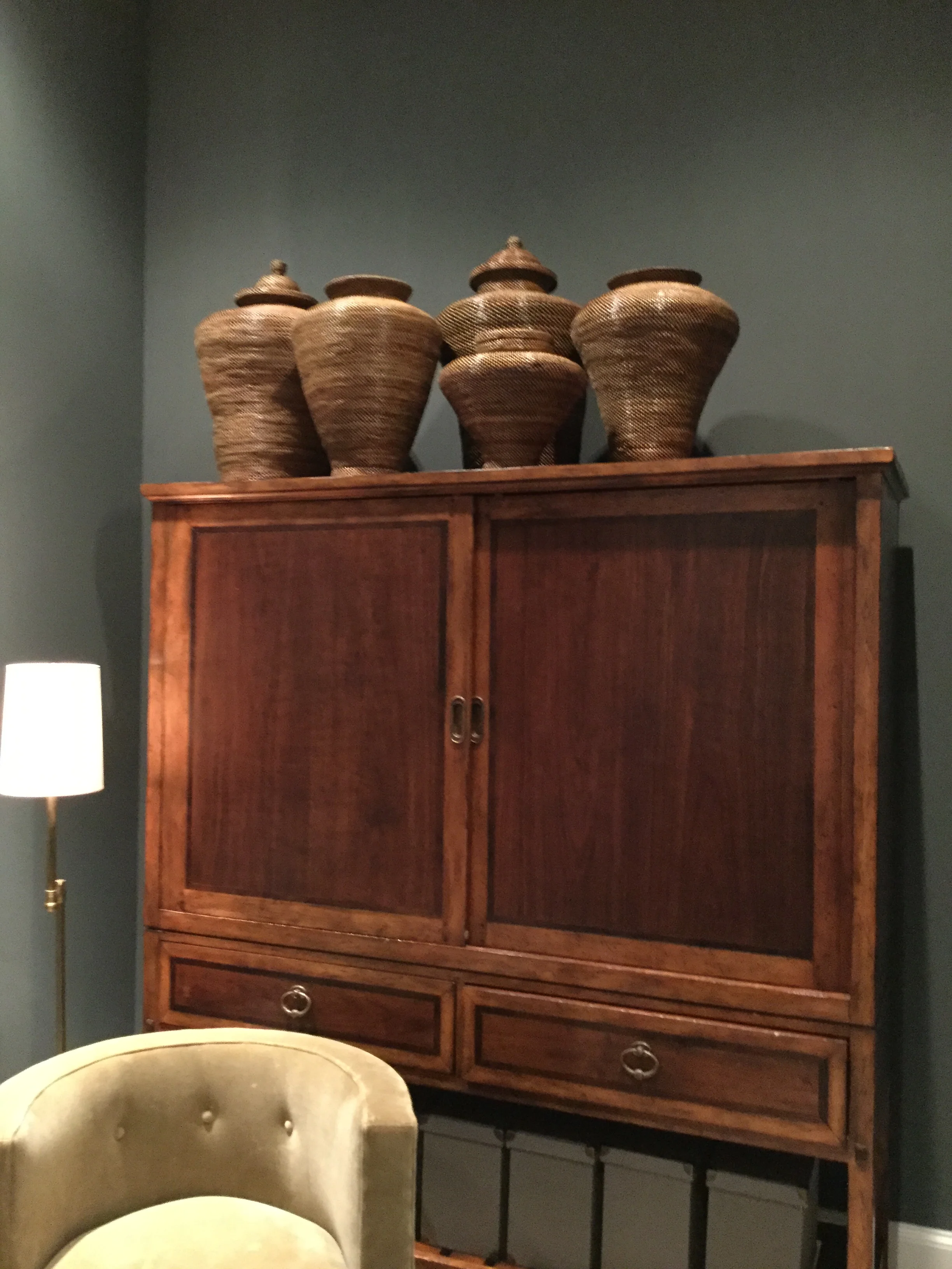
This cabinet was actually shorter than I remembered when I did that sketch. We definitely needed to extend the height by adding some bulky pieces to the top in the same color tone of the wood cabinet. Those ginger jars from WS were a perfect fit and she bought just the right amount.
When they came in she sent me photos of them arranged at the top. I coached via texting. :-)
“Push them together more.”
“Scootch them a little to the right.”
“Move that one to the back more.”
Ha ha…..at least we both have perfectionist tendencies. :-)
Finally, it was just right!
Do you see how these big, bulky shapes in the same color tone as the wood cabinet extend the visual height of the piece? They add a little extra detail and embellishment, but not enough to detract from the overall mass they help create.
I love it. Just the right decorating above the cabinets!
Decorating above the cabinets | Related Articles:
My blog may contain affiliate links. Any purchases, at no additional charge to you, are most appreciated and make this blog possible. :-)


In response to this post and this one too, I keep getting questions in my inbox and here on DESIGNED from people wanting advice about decorating above the cabinets.