

STOP! Don't get out the step ladder yet!
(Sorry to startle you. It's just that I have to stress something to you before we climb up on the counters with our accessories in tow.)
Before you decide to display something up high, stop and take a moment to evaluate why, exactly, you want to do so. Too many people think that anytime a shelf is in sight there needs to be something resting on top of it.
I'm sorry, but that's just not true.
As a general rule, if you have under 2' of space above kitchen cabinetry, very tall armoires or built-ins, don't decorate the space. All too often, doing so dates you to the 1990's and the area does nothing but catch dust.
Oh, and I'm sorry, but if you ever feel possessed to put some fake greenery up there, then consider yourself banned from my site! ;-)
When NOT To Decorate Above The Cabinet
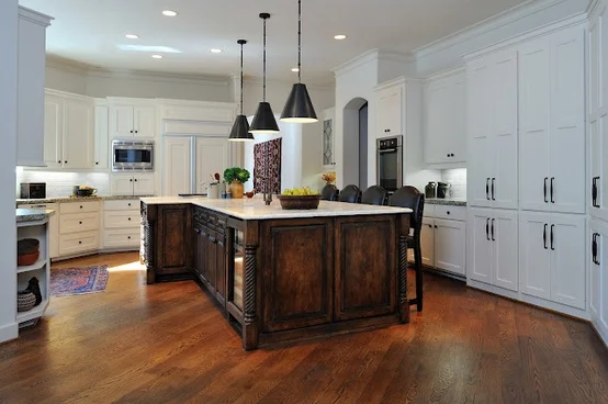
Here's an example -- using one of my remodels -- of what it looks like when you don't decorate above kitchen cabinets.
Had we placed objects up there, do you see how they would have distracted the eye from the island and those gutsy light fixtures? In the field of creamy white, the accessories would have stood out and called attention to themselves.
This kitchen was remodeled with new finishes and a new island, but we left the perimeter cabinets. These days, we mostly take cabinets to the ceiling or at least higher than this, so my purpose here was to blend the cabinetry with the wall color so that these older cabinets didn’t stand out or get noticed.
I wouldn’t want to call attention to their height by putting things up there, now would I?
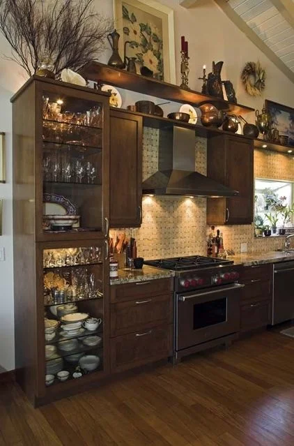
Too much fussy decor above kitchen cabinets
Fussy Decorating
This example is just too cluttered with too much stuff placed way up high. It's too busy, and there are way too many different types of things up there.
Where is all the money in this kitchen?
...It's in the cabinets, the appliances, the tile.
So why distract from the money? Why bring all the attention to the $3 piece of dried organic material up there, when you could be feasting your eyes on gorgeous wood or lovely tile?
Plus, isn’t this just a dusting nightmare?
There are times when decorating above the cabinets can work.
Items that are simple in style and shape are best up high.
I am such a fan of kitchen cabinets to the ceiling and overscaled, tall cabinets that fit the height of these new homes with higher ceilings.
It's as if the builders didn’t get the memo that if you’re going to raise the ceiling, the cabinets and other elements need to go too!
Seriously though . . . While I’m not in love with the stuff that people arrange way up high just to fill a small void, and I do think people overload those areas where it’s not necessary, there are certain situations and certain times when some decorating actually does need to be done above a cabinet.
For example: If your cabinet is fairly short -- let's say about 5’ or 6’ high and it looks way shorter than the ceiling. If it sort of cries out for something to be put above it -- that's okay, you can decorate it ;-)
Really, there are a few approaches you can take when decorating above a cabinet.
So, to make sure one of them really works for you, you first have to determine if you have the right space for what you want to put up there and if you have the right accessories to do the job.
If you do, you can then begin to address your cabinet decorating as follows.
High Ceilings And Lots Of Space Above Cabinets
Are your ceilings really high? Is there so much vertical space between the ceiling and your cabinets that the room looks empty and unfinished?
Many times a bookcase, or cabinet, or the kitchen cabinetry feels way too squatty in a room. This is an instance when you need to let your decor items visually extend the height of the piece of furniture or the cabinets.
No matter what, do not put things that are small and detailed up there! You can’t see them very well because they are so far away.
Decorate With Larger Items up high
If you put any items up there, they need to be big and bulky. Larger, bolder objects should always be used if you’ll be viewing them at a distance.
Personally, I prefer large baskets or boxes/containers, large similarly styled vases or urns that are full and bulbous-looking in a mass. Any kind of large-scaled simple objects that are similar in type will likely work.
What we’re trying to do here is extend the visual height of the piece, so it appears taller.
Take a close look at the images below to see how bulky items do a great job creating that illusion.
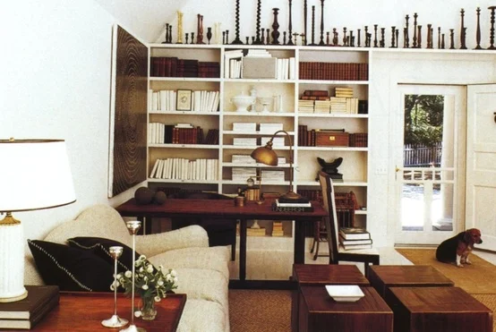
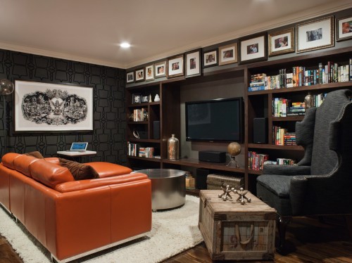
See how the simple, warm-colored shapes of the pieces placed above these cabinets, pictured below, extend the cabinet upward, making it appear taller?

Look how short this piece would seem without these tall items above? Designer: Carla Aston
These decor items, grouped together on top of a cabinet, are all taller items and add height to the piece. (Photo by Carla Aston from Highpoint Market)

See how this client’s warm toned objects extend the height of the piece, visually?
Displaying Collections Above Cabinets
Do you have something special you want to display or show off?
When you have a really amazing collection of something, and you really, really, really want people to see it, displaying what you have above the cabinetry can be appropriate.
Remember: Quantity is your friend in this situation. You're creating a visual horizontal band or border, kind of like a cornice or architectural frieze of some kind, which can only be accomplished with lots of repetition of shape and value.
For example: I wouldn’t put a collection of vases in a line, up high, if they were all of different color and value (lightness/darkness), because it would create a spotty type of visual effect and ruin the purpose.
Designer: Nanette Brown, Image via: Mark Sikes
Take a look at this image.
Do you see how the candlesticks are all linear and dark? That's is a perfect example of this technique using repetition of shape and value.
Don’t line them all up in a row. Group them where they overlap, or slightly stagger them so they look a bit randomly placed.
Here are some more good examples...
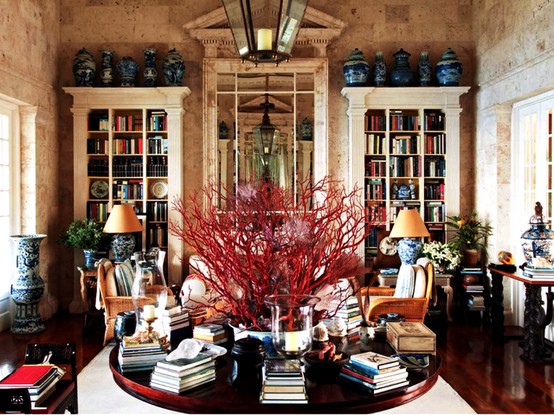
Perfect use of the blue and whites, all close together. Home of Oscar de la Renta, Image via: Mark Sikes

I like how Martha did this. Clear glass is used, which isn't visually heavy or distracting. And I love how they are stacked and arranged to highlight the various styles of her impressive collection. Beautiful. Image via: marthastewart.com Photo by William Abranowicz
A Decorative Element To Top A Cabinet As An Ornament
Does it feel like something's missing? Like maybe an ornament of some sort?
Another reason to put something on top of a cabinet is to just top it off, to provide some kind of decorative ornament or architectural piece that's missing from the cabinet. A flourish.
See this perfect example below.
This singular ginger jar creates the perfect topper for this lovely china cabinet. Seen at High Point Market.
Decorate With Objects That Blend With The Background
Maybe you don't have quite so much space but you'd still love to display something up there.
Okay, despite what I've said about not feeling like you HAVE to decorate up there, there is a way to put some personality up there without having it look like an over-packed free-for-all.
Having decor items on top of a cabinet that blend with the wall can give you the storage and display space you desire, and they won't dominate the scene or make everything seem top-heavy.
See how these white vases and jars blend into the white walls beyond but still provide some interest and a place to store these items successfully?
I love how these ginger jars are massed together, Had they been black like the cabinet, they would have caused the furniture piece to overpower the space. The cabinet would’ve appeared HUGE and the things on top would have looked crowded. Designer: Sean Michael Design, via: houzz

The cabinet stands out (as it should), and the white ginger jars are displayed but don’t dominate. Image via: Mix and Chic, Designer: Scout Design, Nicki Clendening
Will placing artwork up above cabinets work?
I’ve helped people who have had more artwork or wall decor than they have wall space. Since most people think all artwork needs to be hung at eye level, one of the places I often look is up.
Hanging artwork on the wall above a cabinet pretty much does the same thing as all the other suggestions I've mentioned here, however the object is flat and hangs on the wall instead of sitting on top of the cabinet.
Look how it extends the height of the look of that wall, in the pics below.

Artwork leaned against the wall works well to extend the height of the cabinet. Display seen at Highpoint Market.
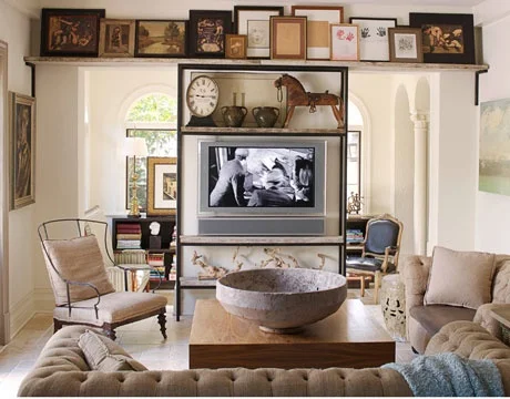
I love how a “frieze” is created on the furr down above the bookcases . . . the horizontal banding or border. Designer: Lizette Bruckstein, via: SFChronicle
This artwork is stacked all the way across, creating that horizontal banding I mentioned before. Instead of objects, they’re flat pieces of art! Designer: Abby Rizor, via: House Beautiful

Imagine if that piece of art had not been hung above the cabinet. The cabinet would not have had the presence it does without that added piece up there. Designer: James Michael Howard
Grouping similar objects create a more cohesive statement
Keep objects grouped together in a similar style or color to create a less busy and confusing look.
You can see these blue and whites seen at High Point Market don’t detract from the beautiful cabinet below. Imagine a mass of different types of objects up there. It would shift your focus.
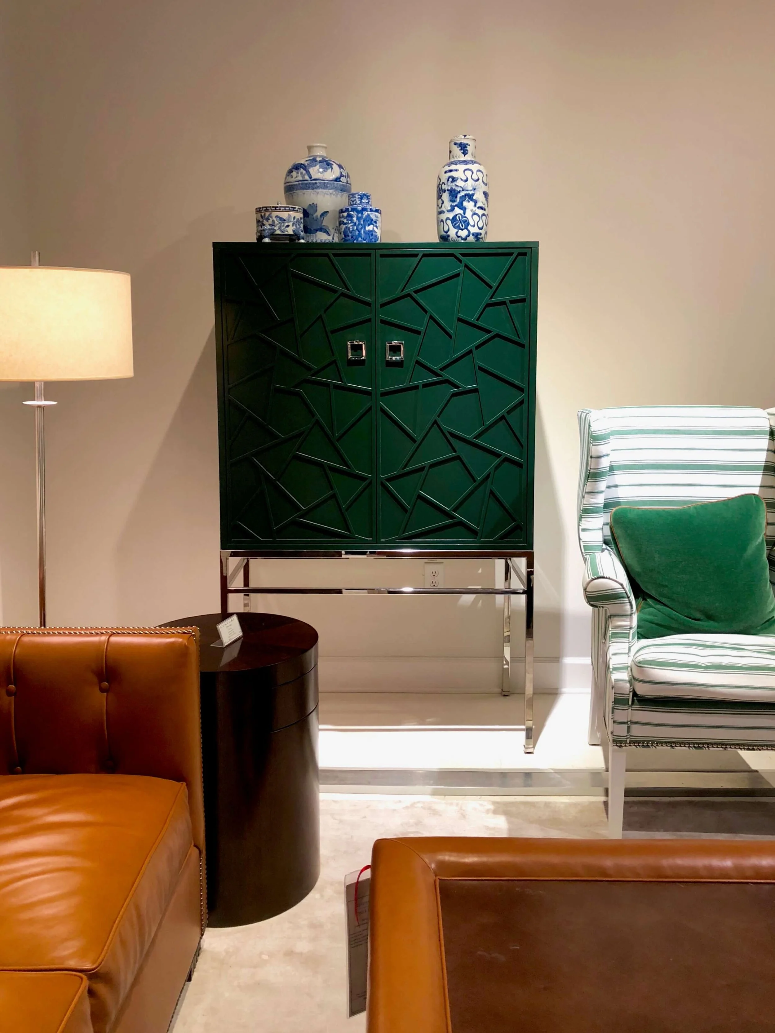
Blue and white ginger jars create interesting decor items above this lacquered green cabinet. Keeping decor objects similar in style and color help create a simpler and more impactful visual when decorating above cabinets.
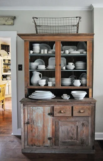
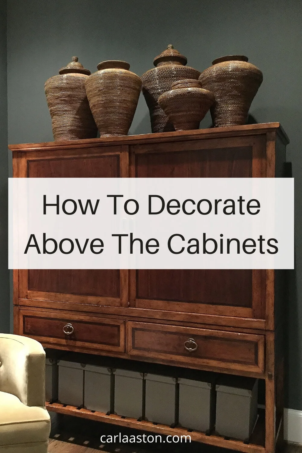
This collection of rustic pottery, pictured below, brings height to the dining room hutch and adds to the room’s overall casual vibe with a simple look.
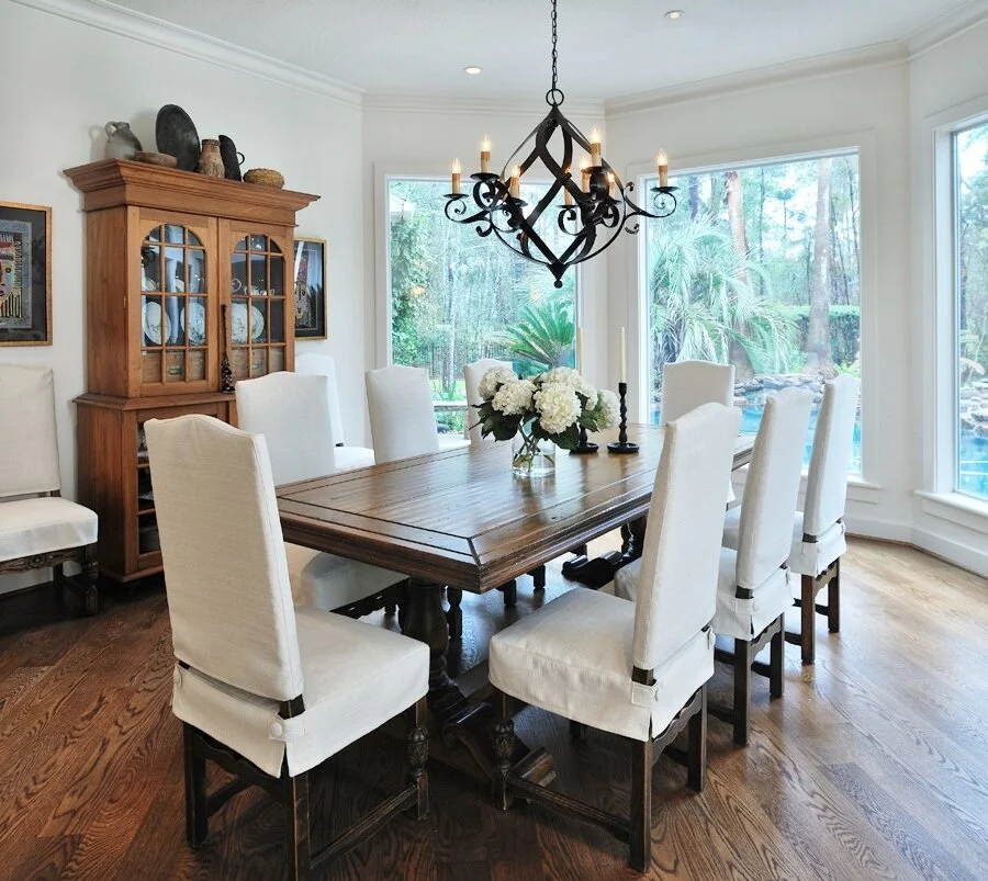
On this remodel project of mine, the homeowner had an interesting collection of rustic pottery that we grouped above her hutch. It created a nice mass and added height to the cabinet as well as working well with the aesthetic of the dining room. Carla Aston, Designer | Miro Dvorscak, Photographer
It's really not that complicated!
After you determine the reason you want to decorate above your cabinets, and you evaluate the space you have, the way to do it becomes crystal clear!
Are you guilty of placing greenery above the kitchen cabinets?!
Come on now. Let's be honest here. I think everyone has done that at one time or another!
__________________________________
Enjoy this post? You'll enjoy these too:
Need some ideas for larger objects that work well up high, above the cabinets? Check out these links below.
My blog contains affiliate links. Any purchases, at no additional charge to you, make me a small percentage, are most appreciated and make this blog possible. :-)
