I don't often do this. Hand out advice to people who aren't my clients when they email me with questions about what to do in their homes.
Because, after all... I do sell this as a paid-service. It’s how I make my living.
And even though I love hearing from people who want to talk about design, I'm unable to answer most times because it takes more time than you think to mull over the details of a question, look at all the images they send, and then send a comprehensive response that advises them on what they should do. People pay me for that kind of advice; so, naturally, it’s difficult to do it for free.
However… sometimes, if a question comes my way that I can answer quickly, and I have a hunch that all of you, my readers, will benefit from a blog post I create out of my response, I’ll go ahead and answer. (Btw: Never do I reveal the person’s identity, that is unless they give me permission to.)
Advice For Decorating Above The Cabinets
Recently, a blog reader emailed me after enjoying a post about decorating above the cabinets. Here was her dilemma:
“I hope you don't mind me emailing you, but…
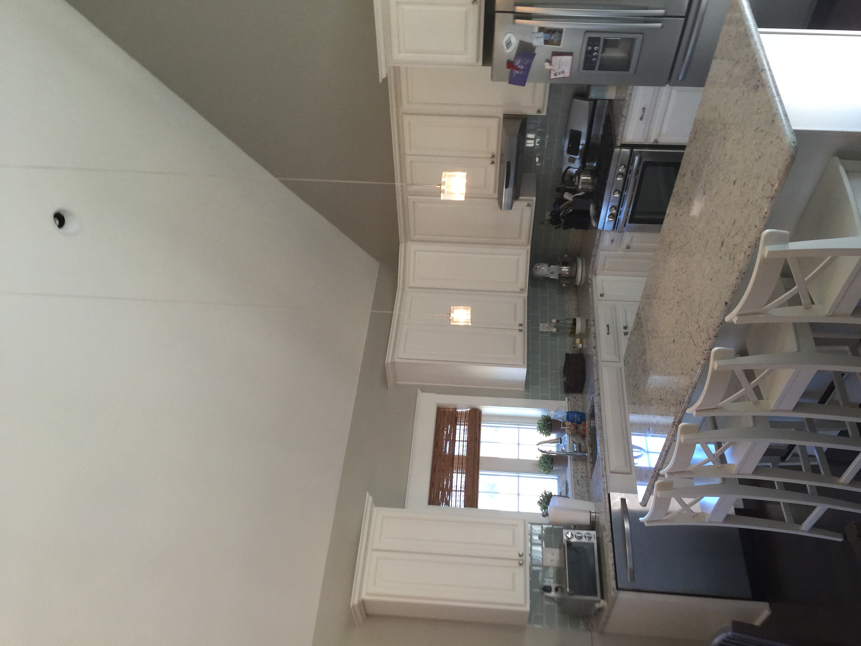
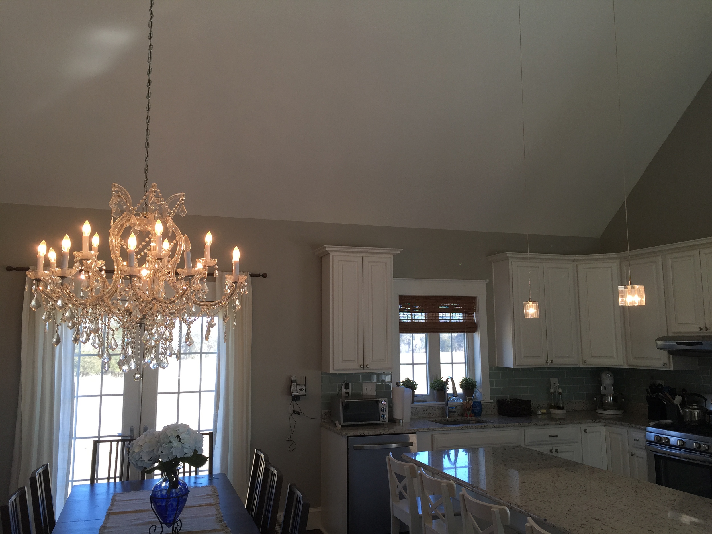
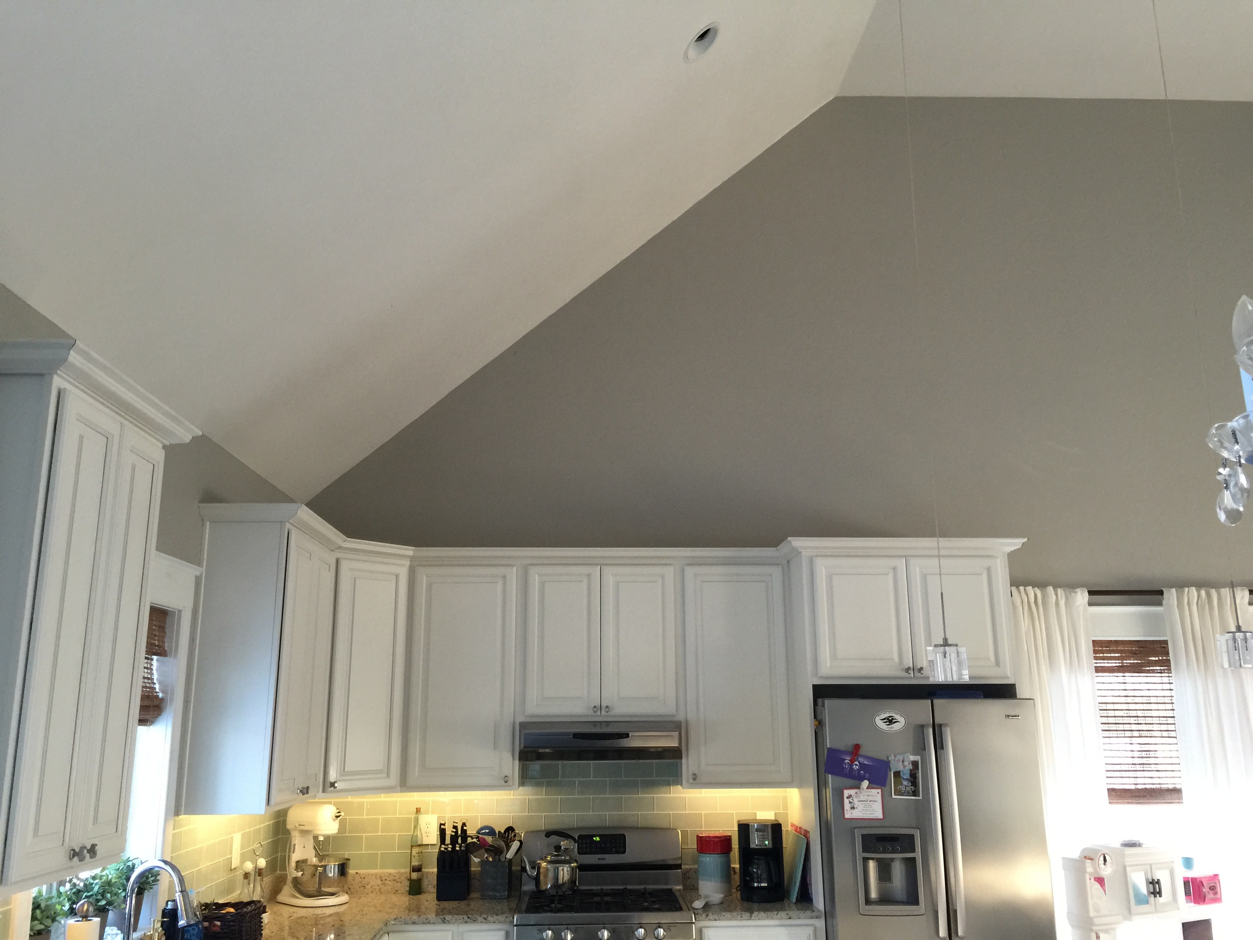
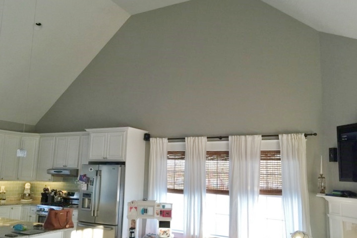
I saw a blog of yours about designing the space above cabinets, and I could really use your help! I have vaulted ceilings on one side of my kitchen cabinets, and I have NO idea what to do. The space is also shared with my living room and dining room. I’ve attached some pictures so you can see. I would LOVE IT if you could tell me what you think!”
HER PICTURES:
Here was my response:
Pretty home, [name redacted]! You've done a nice job. ;-)
I suggest you hang some art objects up there. It's too high to stack stuff on top of the cabinets. Maybe some natural baskets in a collage would work; it wouldn't be very costly, and it would make a big impact.
Also, because you've got a little bit of a shabby chic look going on, maybe something whitewashed would look nice up there. You know, whitewashed items like: wood objects; architectural details, items like that, when grouped in a collage, would work.
BEFORE - Blank wall in a two story space feels bare and empty. Solution….wall decor and raise the drapery rod!
Round baskets would make for some nice wall decor in a random pattern up high on this wall. Raising the drapery rod would help too.
I also took a quick second to sketch out a visual for her...
“I think it's good that you have white curtain panels; they extend the look of the white kitchen cabinets across the wall, leaving that triangular area available, specifically, for a wall-space to fill with something.
Also, if you can, raise your drapery rod by about a foot; you can add a contrasting section at the hem. Personally, I can’t help but feel like they are a little too all-in-a-row (if you know what I mean) and could use some variation in height. You don't have to go too high here, because you're leaving that space above for your art wall.
Good luck! Send me a pic of what it looks like when you’re finished!”
I really hope she sends me a pic of her end result.
Need some round basket wall decor for your home? I've got some links below.
My blog may contain affiliate links. Any purchases made through them render me a small percentage at no additional cost to you and help keep this blog running. Thanks!
Subscribe to my blog and get my FREE Top 5 Bookshelf Styling Tips Guide!
◆◆◆


