I’ve been getting quite a few Designed in a Click Q and A consultations this month and I’m sharing a few snippets with you here today.
Design Consultation 1
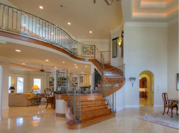
This first Designed in a Click session included the big stair featured in this home’s dramatic entryway. The homeowner thought that it was a bit overbearing, just didn’t look right, and was wondering if a runner would help.
Designed in a Click Q and A, Interior Design Consultation Advice via Email | Carla Aston
A runner would be great, it would soften the room and would add some pattern or color. However, I thought the wood color was a little dated in this creamy environment and needed toning down.
I advised them to paint the baseboard, stringer, and risers on the stairs so that only the horizontal surfaces were wood. That would minimize all the orange wood and give a more updated look.
Then, they could add a runner on top for softness and pattern, at any time.
Designed in a Click Q and A, Interior Design Consultation Advice via Email | Carla Aston
Huge Entry Hall
Designed in a Click Q and A, Interior Design Consultation Advice via Email
Their entryway was huge and flowed into the dining room, therefore making it appear even bigger and more spacious than it would have been otherwise.
I’m all for a dramatic entryway, however, this felt too big and cavernous. I wanted to help this homeowner reign it in a bit and give it a more intimate feel.
I recommended a cleaner style on the chandelier, something more up-to-date. Then, I advised a round hall table with some ginger jars on top, much like Amy Peltier did in her entry hall space at the Pasadena Showcase House of Design last year, shown below.
Some upholstered stools surrounding the table would add some fabric to soften the space too and fill it up even more.
Entry Hall - Pasadena Showcase House of Design, Amy Peltier, Designer
Entry Hall - Pasadena Showcase House of Design, Amy Peltier, Designer
Design Consultation 2
In a completely different Designed in a Click consultation, this homeowner was considering painting her walls a warm white and having her home look a little less Tuscan.
Her home is located in a mountain region, she had a spectacular view, hence the fireplace was a good fit for that style.
She was thinking of getting rid of the gold tones but did not want to tackle the whole room at this point.
While I love a soft white envelope and definitely love using that trick to de-Tuscanize a home, I felt differently in this instance. (That’s why a little customized advice can be a really good thing to invest in. :-)
Should she paint the walls a warm white? Designed in a Click Q and A, Interior Design Consultation Advice via Email | Carla Aston
I told her not to repaint the walls. I loved the hunter green color.
Not many people would go that bold in a two story space, so since she had embraced it before, I told her to keep it. Not painting all that color would save her budget for other things.
I felt like the white cabinetry was bringing the space down in quality and looking a little builder standard. So, I told her to paint the cabinetry on either side of the fp to MATCH the color of the walls, in a satin finish oil based enamel.
That would make the space even more dramatic and make the stone fireplace stand out even more. :-)
Here’s a Pinterest board I had that has some similar looks with the hunter green.
I suggested some new lighter, taller chairs in a graphic, modern fabric by the fireplace, to draw attention there, and a new chandelier with less curlicues. ;-)
Some new pillows for the sofas and a few more modern accessories should get her where she wants to go.
Leaning in to this color and going with a few pieces to streamline the look overall will put this space right at home in its environment and make it feel bold, designed, and up to date.
She liked the idea and will be painting those cabinets soon. Can’t wait to see her end result!
If you have a few questions for a designer, someone who can give you some direction or help you get un-stuck with your design dilemma, you might want to give this service a try. :-)


