How is it that Californians have this style update for a Mediterranean style house right and we Texans don’t?
We have a proliferation of “Texas Tuscan” style around here in the suburbs of Houston. Most of these homes are not that old, but could stand an update that wouldn’t be too terribly costly.
Most of this look, done even about 10 years ago, was gold toned and rather muddy. It was dark and really now looks dated with our tendency for a bright, airy, crisp aesthetic these days. Most of these homes have travertine floors, gold toned walls, tapestries, curly ironwork, maybe even some orange toned wood in there. So, how do you update this look without ripping everything out?
I’ve shared some tips in this article. I’ve got a few more tips today, after visiting California last week for the Design Bloggers Conference and spending a little time with my daughter, who lives there and takes me to these cool places for brunch. :-)
My baby with her friends!
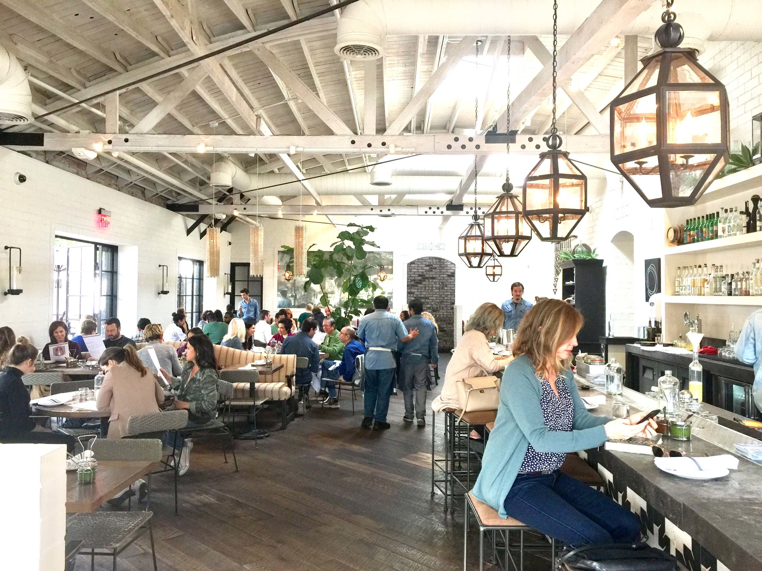
I had seen pics of Gracias Madre on Sfgirlbybay blog and was dying to go. We had brunch there on Saturday before the conference, with her roomies out there, Conor and Dylan. As I walked around the space and snapped a few pics, I just thought, why isn’t this more prevalent in The Woodlands? It would be so easy to adapt this fresh, graphic style to many of these Tuscan homes.
Don’t you agree?
Black and white graphic tile bar face, rustic wood floor | Gracias Madre - Los Angeles
Gracias Madre | Los Angeles
First of all, you’ve got to paint. You’ve got to get the gold out and go white. I think white works well with travertine and I’ve said so here.
And boy, do we have the niches! If you don't have contrived "niche" in your home in The Woodlands, then you just aren't living in Texas style. :-)
Here's how they look so good, with just simple white paint. Okay, the painted brick is nice too, we mostly have sheetrock niches here, but I love the minimalist look of this niche.
Wall niche decorated simply with painted white brick
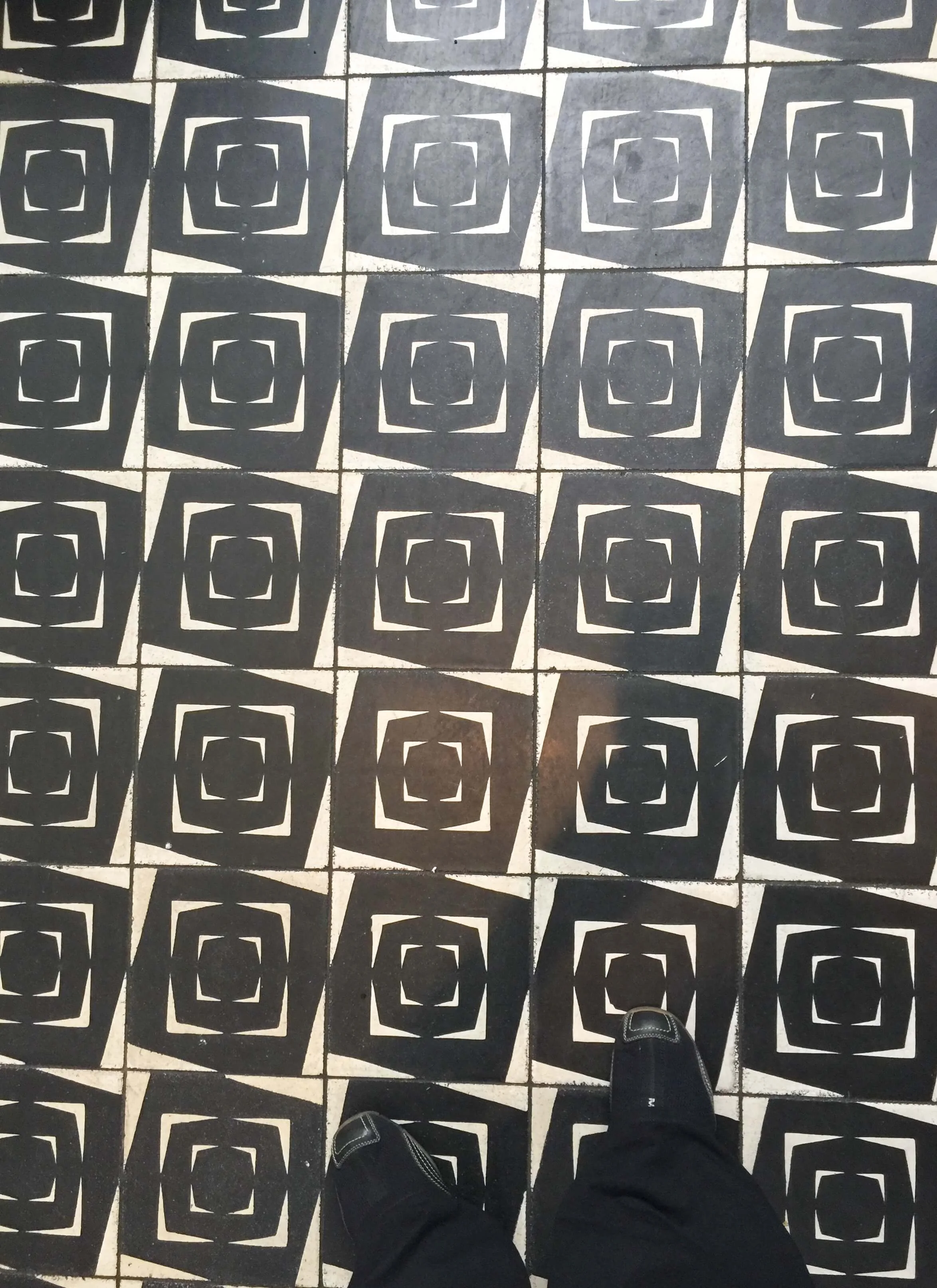
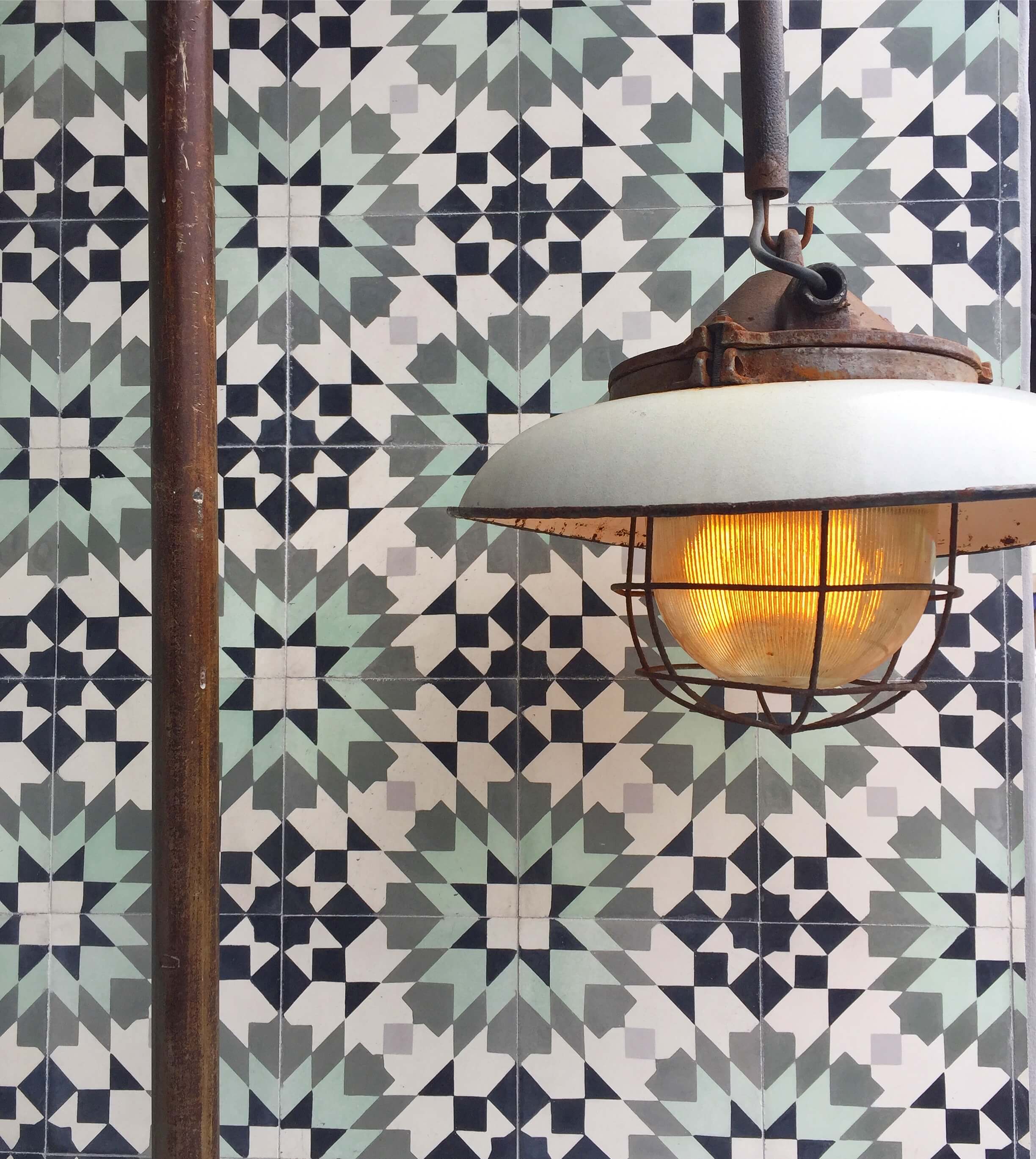
Next, use some graphic tile. If you use something bold and graphic, it will look more modern. Here they did it as the bar face, so it’s not overwhelming. The floor is a weathered wood. The floor in the bathroom is a graphic black and white, doors and windows were black. It’s such a cool look. Done in specific, smaller locations, new tile can still make a big impact.
Graphic black and white tile floor
Graphic black and white tile at the bar face with rustic wood flooring
I think some graphic tile on a kitchen backsplash would be great with a travertine floor in a kitchen.
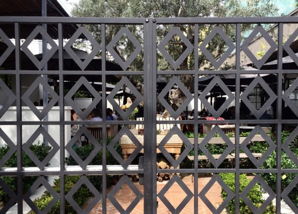
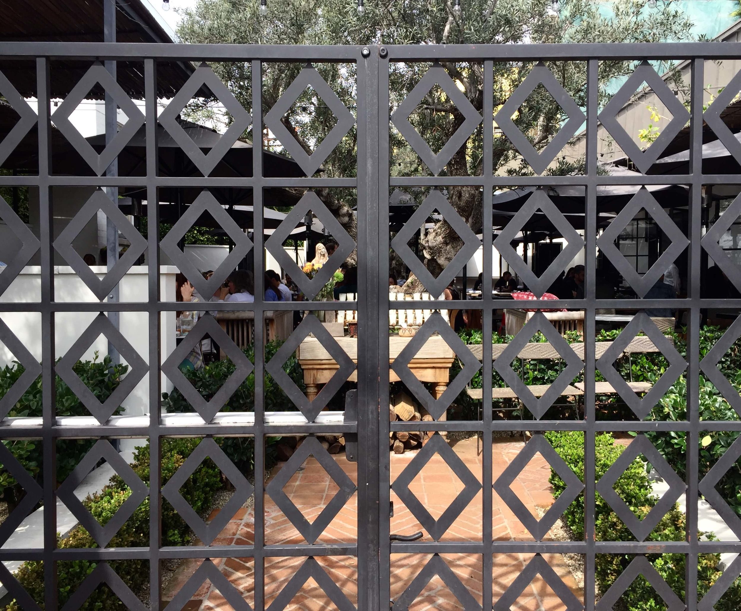
Change out some of the ironwork. Look at this simple design on the iron gate. Still a Mediterranean look, but not the curly iron of the typical Texas Tuscan style. Love it! All those curly iron railings would look so much more up-to-date in a simpler, straighter design.
Do YOU need some advice or help de-Tuscanizing YOUR home? Contact me today!
Graphic tile inspiration from shopping Venice's Abbott-Kinney Road

