Although this kitchen was previously white, it now has a fresher, more modern look because of so many details and tactics that we employed here.
We also did a little rearranging and made the space more useful by doing a few updates that I'm doing in many of my kitchen remodels these days.
KItchen "BEFORE" remodel
The homeowner had a "white" kitchen, but with an unused desk, a fridge that made the corner an unusable space, and black appliances that highly contrasted with the overall color of the kitchen, the space looked dated.
Not to mention the travertine backsplash and wall color which looked tired and could use a refresh.
These homeowners were after something a little more modern with a bit of mid-century style, opting to express the mid-century look with furnishings and to keep the kitchen simple and white. They loved natural stone and were looking for a stand out piece of material to feature in their remodel.
BEFORE - A "white" kitchen, but it was dated and the space could definitely be made more usable.
Before - Sheetrock clad columns aren't very durable and these looked a little spindly.
Before - Kitchen looking into living room area
BEFORE - Railings were a painted traditional style
Before - Railings were a painted traditional style
I mention some of these tactics in a post I wrote previously about this remodel with some sneak peeks HERE, but I'll share those again, here with you now.
We eliminated the desk in the kitchen and added a small telephone/charging niche on the end of the cabinet run instead.
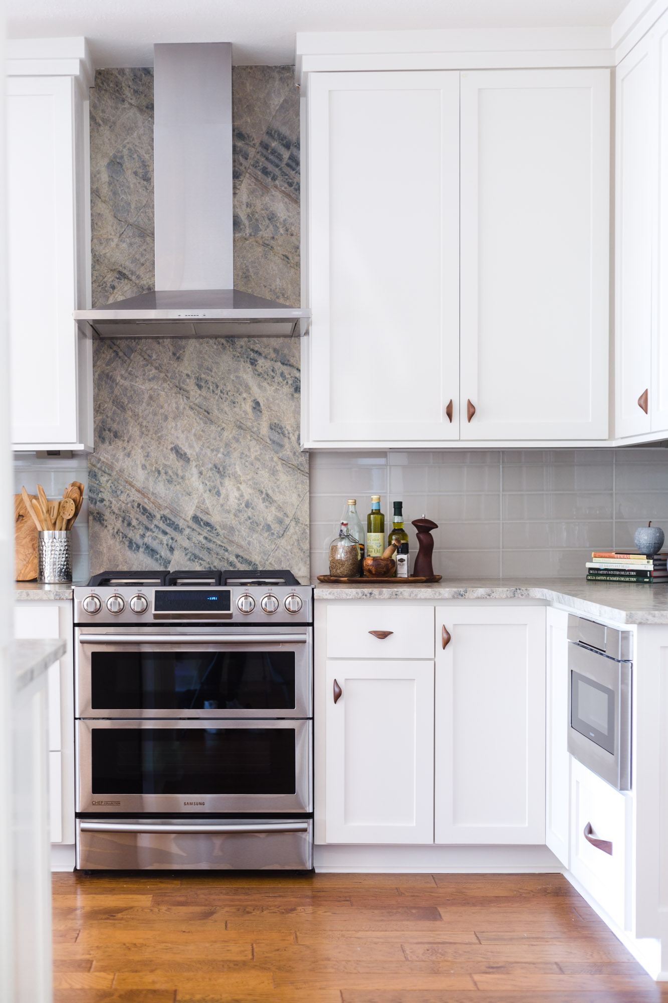
We built in a microwave drawer to get that undercounter.
We did a new range that has the oven in it, so no need for wall ovens or a cabinet tower for those anymore.
We moved the refrigerator, as this location was really cramped on that short end wall and rendered that corner basically unusable.
And yes, we took those kitchen cabinets to the ceiling. :-)
Some of the other architectural changes we made included:
Paneling the columns and bar front, to have all that read as cabinetry and as part of the kitchen. It also makes those surfaces much more durable than painted sheetrock.
A redo of the stair railings where we changed out the wood balusters for iron, painted the wood newel posts a dark gray, we even cut off that ball part on the top and did a small diamond shaped newel cap to clean up the details here. I liked the wood on the railing, to relate to the wood floor.
Removed the small door to the laundry room that, when open, crowded the space. We did a new barn door to keep that door out of the small laundry room and provide an interesting detail that was visible from the dining and kitchen.
Incorporated some sleek undercabinet lighting and electrical to keep it all off the backsplash from LeGrand Adorne. There is even a place for the iPad for recipe search when cooking.
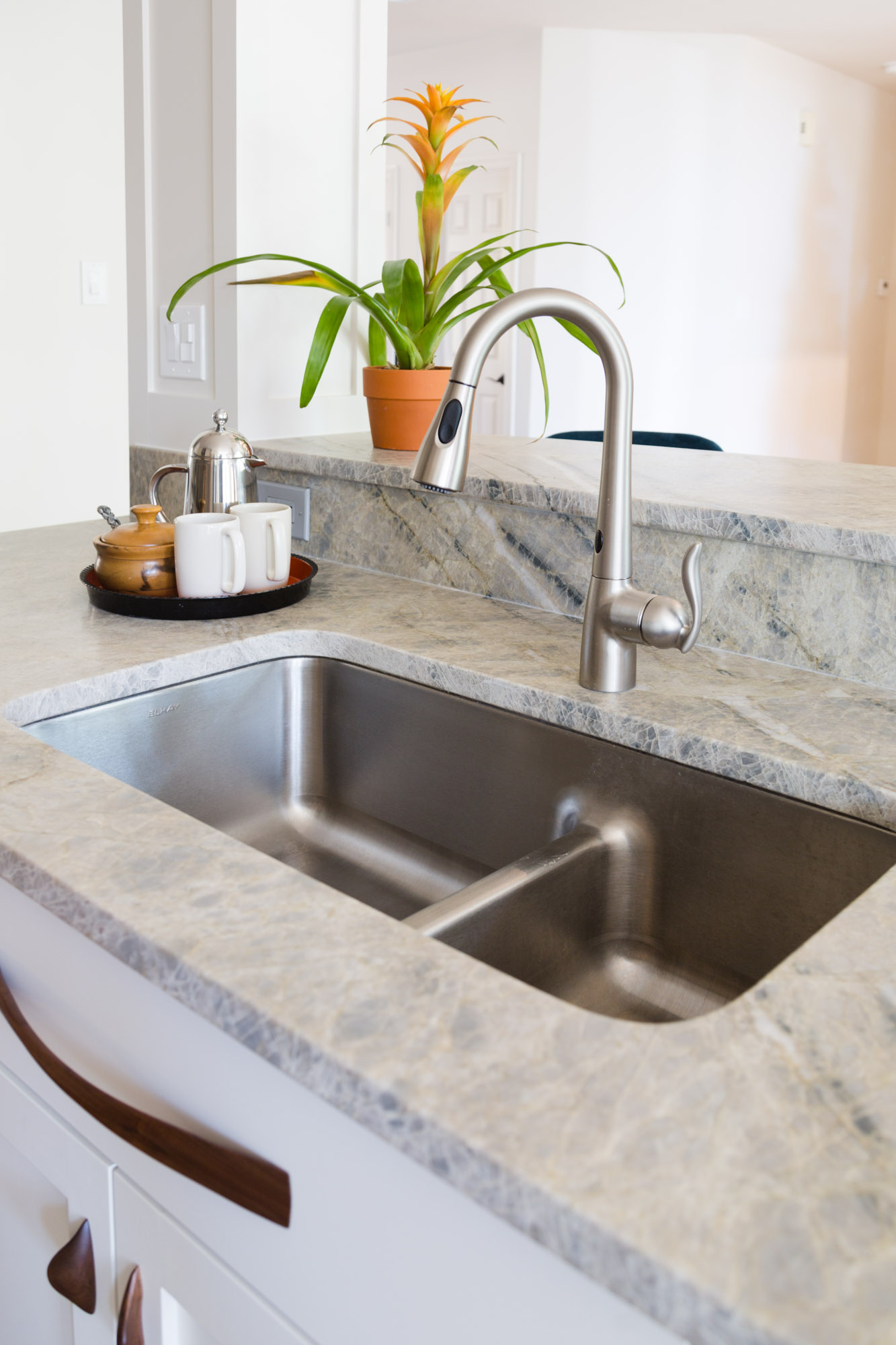
Used some eye-catching quartzite countertops to create interest and speak to the homeowner's love of natural stone. We used it on the backsplash at the hood as well, to create a strong vertical and accentuate the cooking area, use up the full slabs that were required for the job, and to give that stone the prominence it deserved in the kitchen.
My fave touch are the wood cabinet pulls. This kitchen needed just that bit of warmth and modern appeal that these beautiful pulls brought to the cabinetry.
We did other changes to the fireplace and entertainment center, but it wasn't quite complete when we photographed, so I'll hopefully show more pics later on those.
kitchen "after" remodel
Photographer: "After" images - Tori Aston
Contractor: Tony Knepper
Links to some of the products used in this remodel are linked below.
My blog may contain affiliate links. Any purchases, at no additional charge to you, render me a small percentage, are most appreciated and make this blog possible. :-)


