

I’m sharing the kitchen and family room of a whole house remodel project that I’ve been working on for over a year. To have these beautiful finished photos is so satisfying!
We started around December 2024, with initial meetings and programming. This was a former client of mine that I had worked with around 7-8 years prior. They had children at home then, but now were entering a different phase of life and wanted something more manageable that would help them enjoy an empty nester lifestyle.
They wanted to use every bit of the furnishings that they had done before if possible, which I had procured for them. Of course, I loved everything we did then and loved the idea of fitting it all into their “new-to-them” older home! We even remade some of the draperies to fit this house.
We added new furnishings for the family room, as some of their furniture was going upstairs to the game room and it left this void to fill. This is the space I’m sharing in the photos today, the family room and kitchen.
the before photos
This kitchen was an interior space, placed between the living room and the family room on the plan. It had a 16’ high ceiling, a barrel vault, which really didn’t relate much design-wise to the rest of the colonial style house.
We had much to do everywhere in this home, so we elected to keep the barrel vault and just replace the existing windows in the same framing.
I decided to make this vault work better with the architectural style by neutralizing some of the colonial style details (simpler mouldings, etc.) throughout. I then used some strategically placed arched openings that reflected the barrel vault elsewhere in the house. (I’ll show you those in another post about the living and dining room, later.)
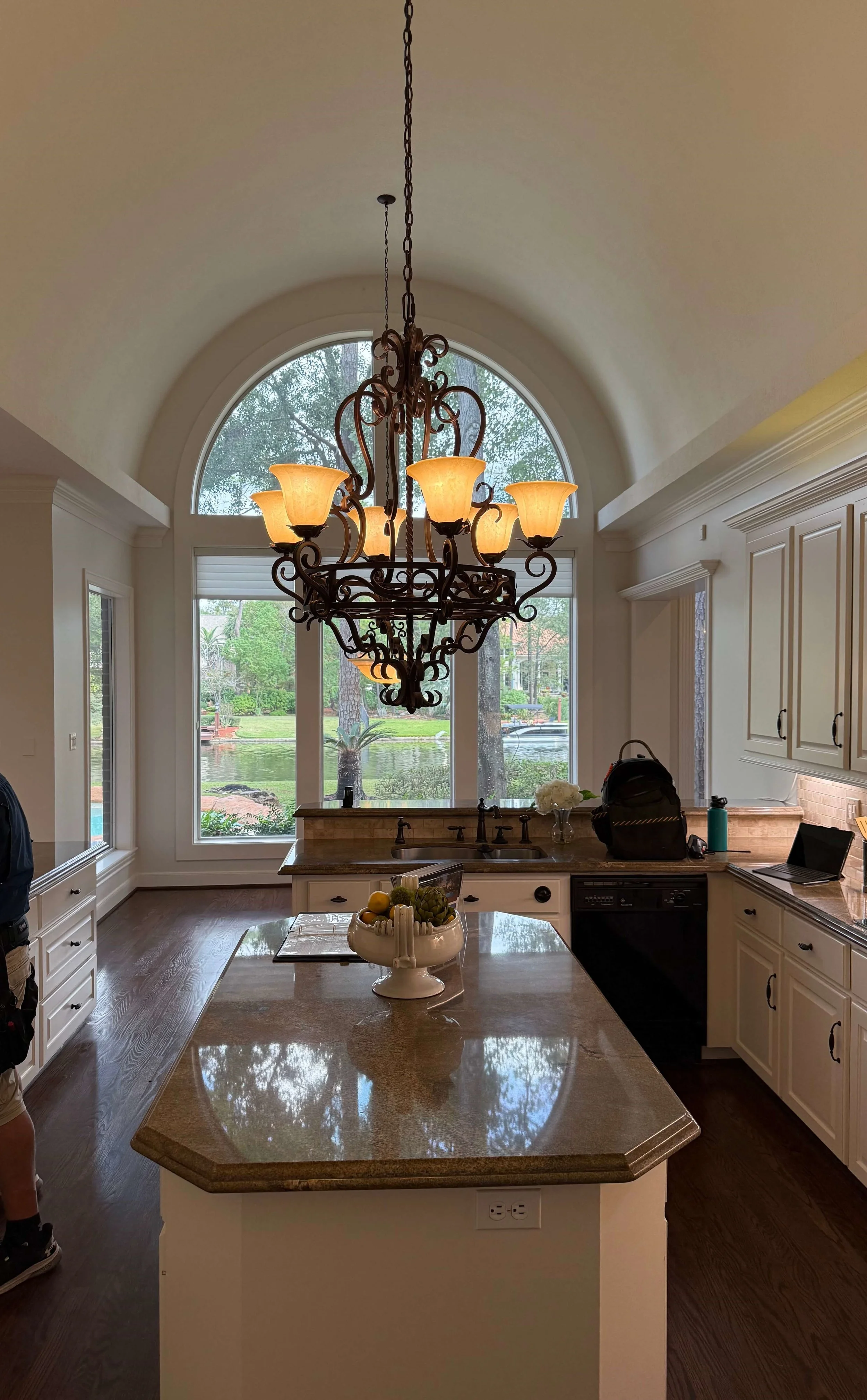
BEFORE - View to the existing windows in the breakfast area. Note the peninsula bar, the centered island and the tray ceiling with some very dim rope lighting. Also, the single light source in the kitchen was this dated chandelier with gold tone glass shades.
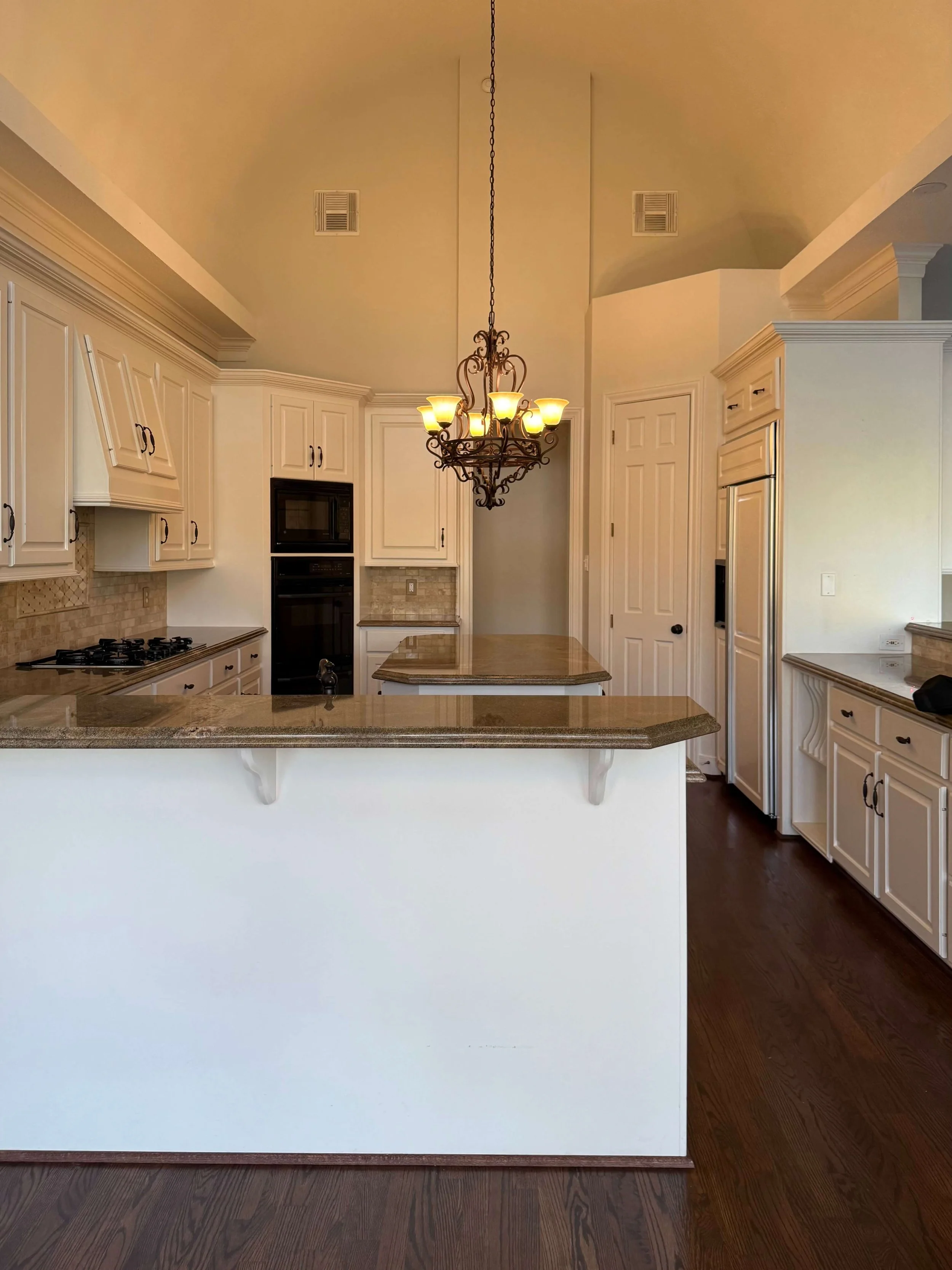
BEFORE - View from the windows to the kitchen.
The homeowner wanted to open up the kitchen to the family room by taking down the wall on that side and make a bigger island, getting rid of the peninsula. That wall is the one with the refrigerator and partial wall with lower cabinets.
I thought that was a great idea and would definitely make this part of the house more up to date.
You can see the kitchen felt like it was cut off from the high, vaulted ceiling space with the light tray and short upper cabinets with a crown moulding that ran the perimeter.
That corner oven cabinet box is a dated element that takes up lots of room, unnecessarily.
The kitchen isn’t bad, just very ordinary and it doesn’t take advantage of the high ceiling. Well, and it had dismal lighting and was rather walled off from the family room. :-)
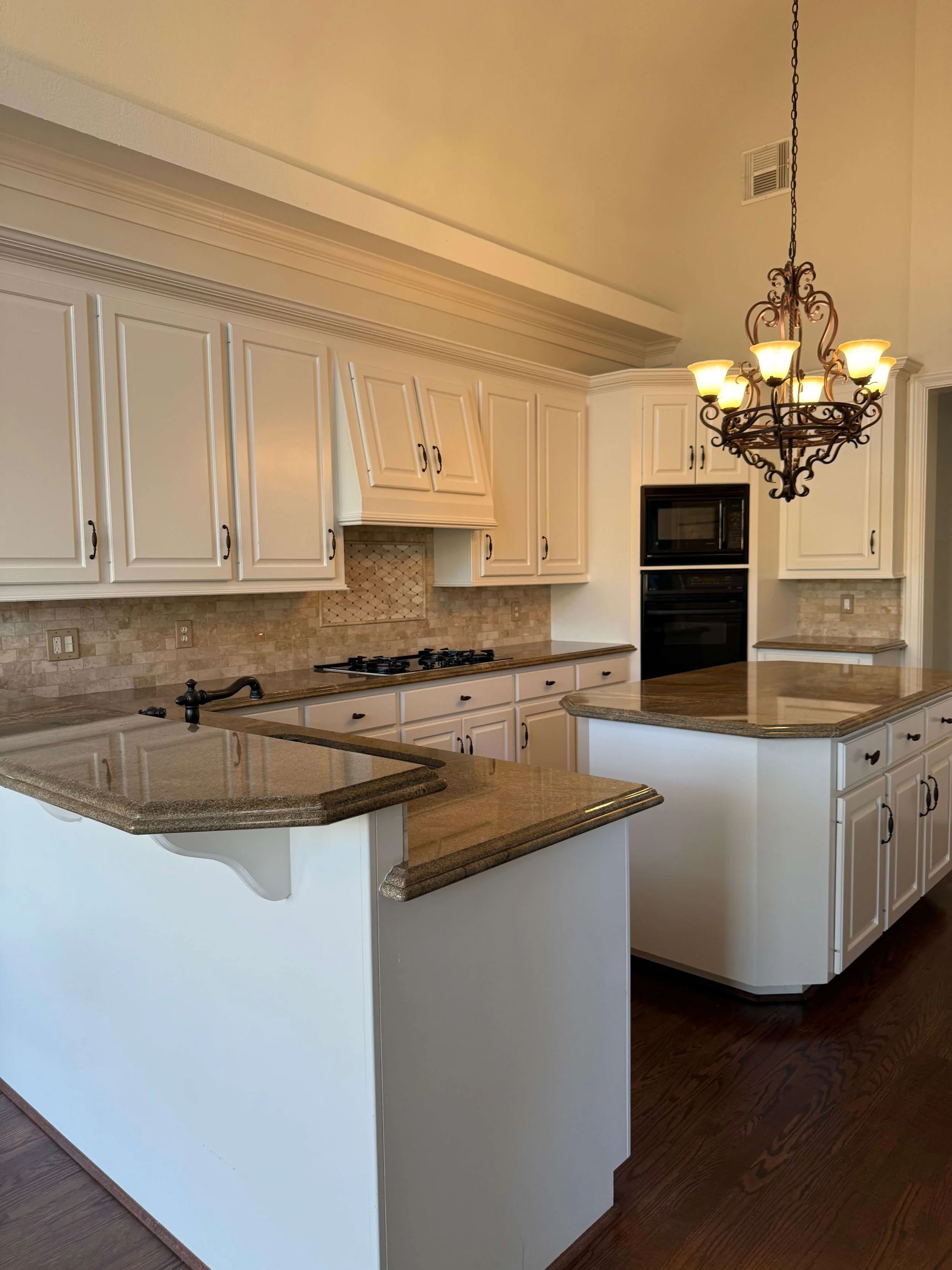
BEFORE - View into the kitchen of range wall, smaller island, peninsula bar with sink.
Here’s a view from the family room, with the half wall and 42” high bar. Check out the carpet/wood floor combination, that was a common feature in homes built in the 90’s around this area.
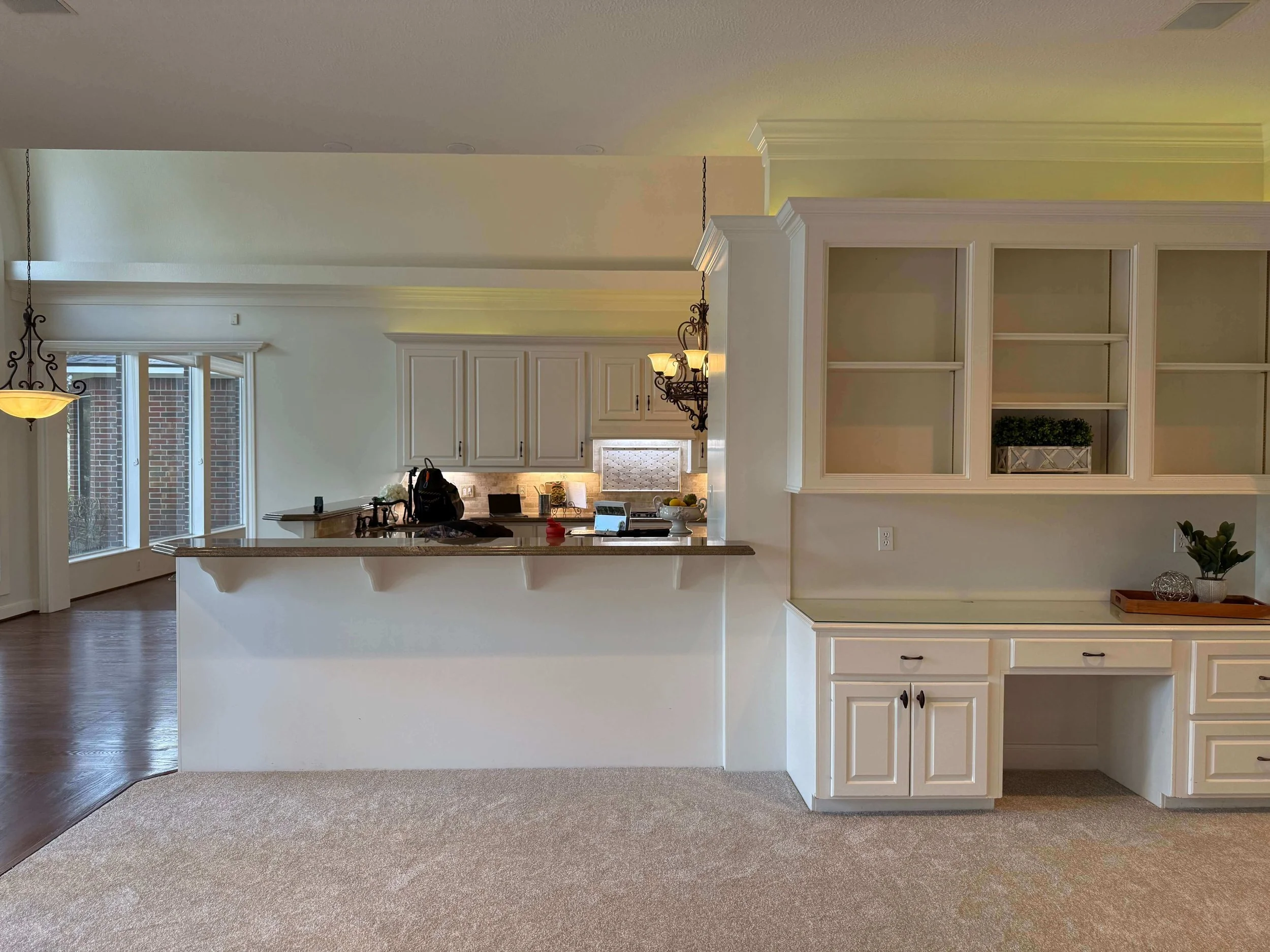
BEFORE - View from family room to kitchen, with a partial wall and a 42” high bar. Carpet is paired with wood flooring in this room.
The opposite side of the family room was a built-in that could not house a modern flat screen tv. I also didn’t care for how the cabinetry was off-center in the space.
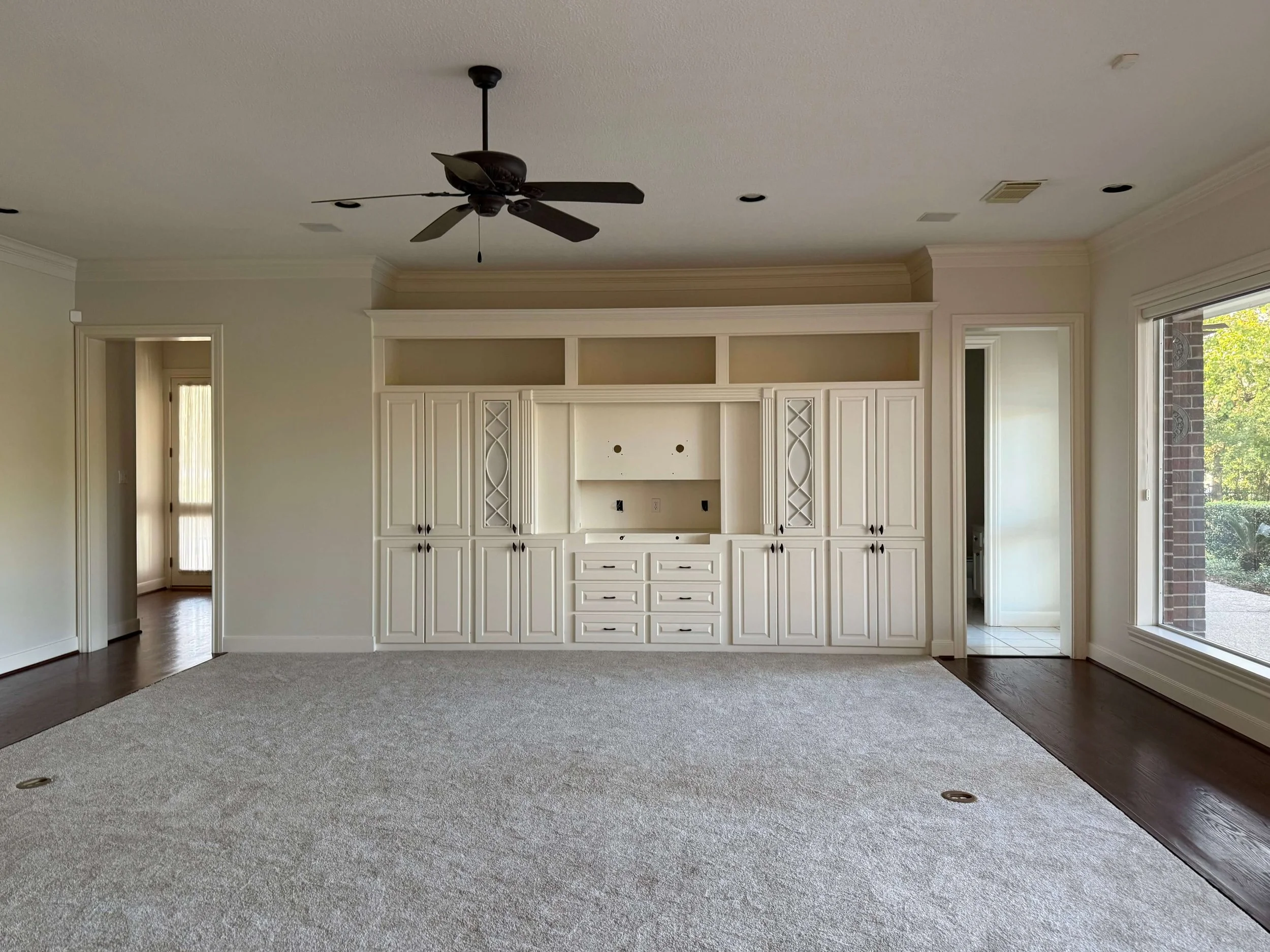
BEFORE - Dated built-in would not house a modern tv and carpet/wood floor combination had to go.
Kitchen Plan
We kept the cooking area basically where it was on the long wall and then moved the sink and dishwasher to the island. The refrigerator moved to the end of the cabinet run and full height cabinet for a pantry and an appliance garage were designed for the other wall.
A bedroom across the hall became the butler’s pantry in this remodel, so extra kitchen storage was placed in that space. (I’ll be sharing those photos later.)
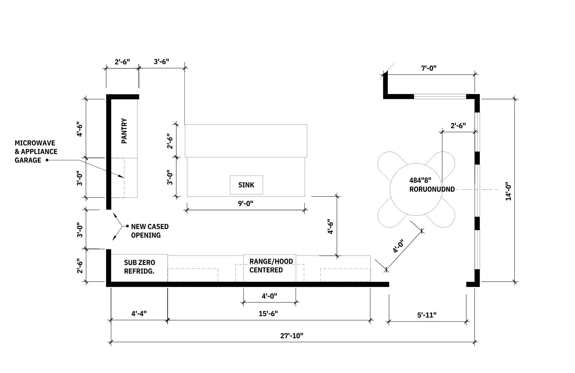
Kitchen Floor Plan
Using their existing bar stools inspired the look of the bar. Since they were tall bar stools, not counter stools, we needed a raised bar. I didn’t want a little raised wall like they had here before, but a more intentional design.
The island is quite large too and I loved the idea of mixing materials to visually cut down the size of the island. Using a thick walnut for the bar and a stunning Ijen Blue quartzite for the main countertop, I detailed the design to have a telescoping effect with my client’s desired waterfall edges.
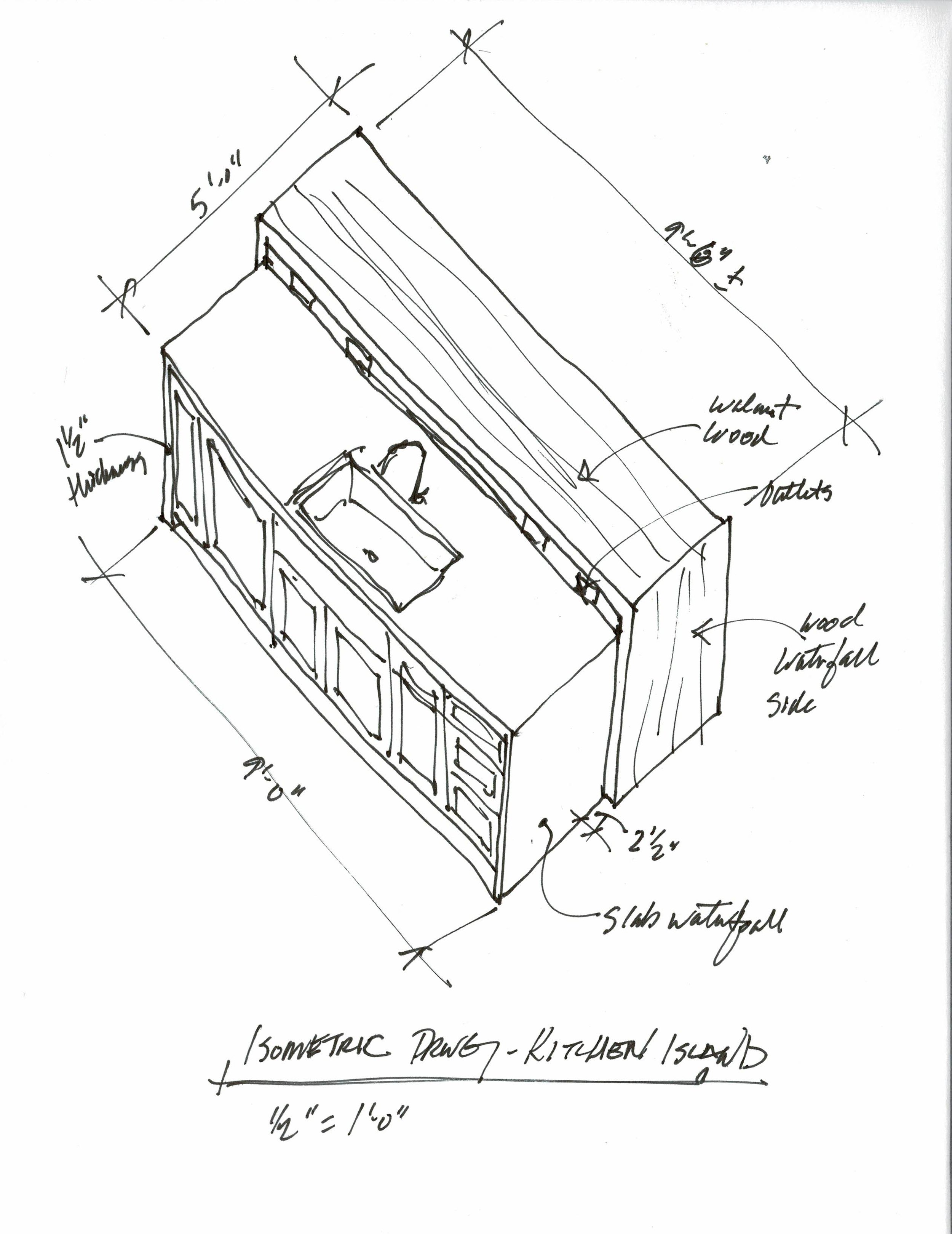
My sketch showing how the waterfall sides would fit together.
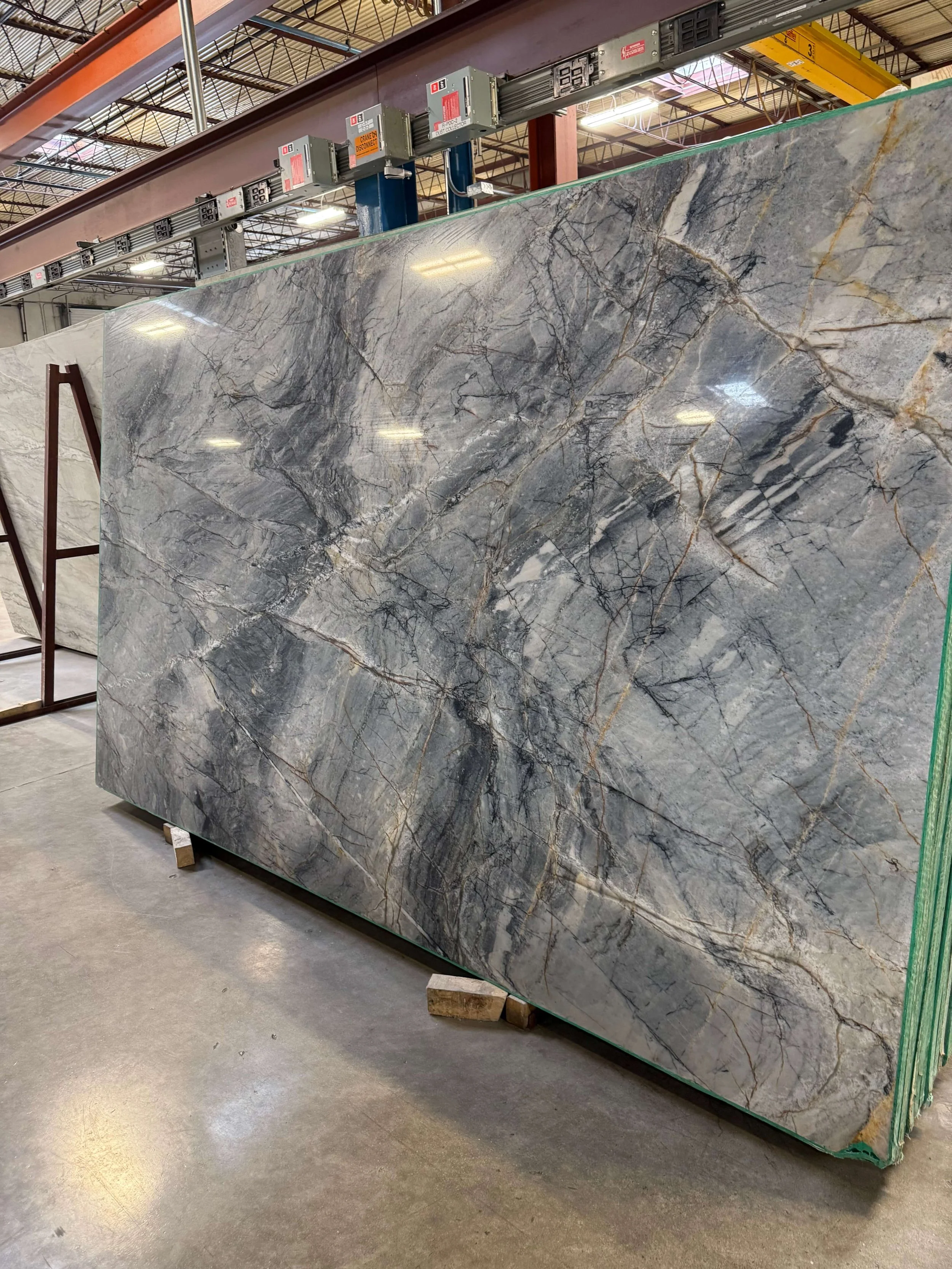
Ijen Blue Quartzite
I wanted a dramatic slab for the backsplash too and Ijen Blue filled the bill. It would add contrast and be an interesting material on the wall.
A tall hood in a dark color, trimmed in walnut, accentuated the quartzite material and the height of the room.
Upper cabinets were designed to blend in with the wall so that your eye wouldn’t stop but go all the way up to notice the ceiling. Although in my original drawings below, I shunned a crown moulding top for the cabinetry here….no little “hats” or unnecessary dust catchers for these cabinets.

The walnut and Ijen Blue make for a perfect pairing. I really wanted a statement of the walnut wood in the kitchen and the bar as well as walnut cabinet pulls, really warmed up the space.
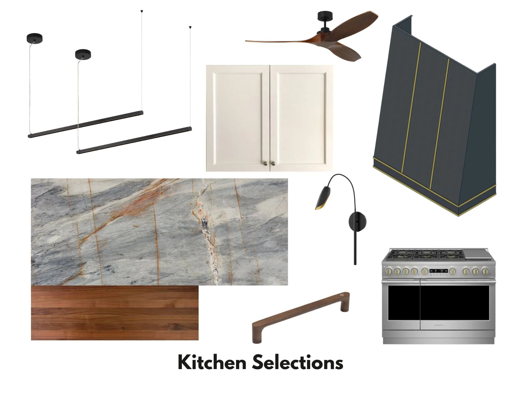
Lighting the Kitchen
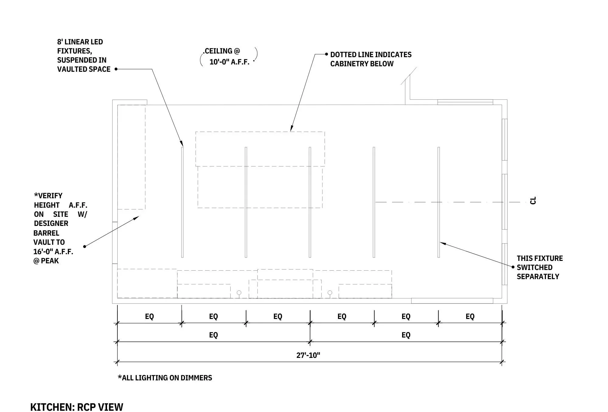
One of the biggest dilemmas here was how to keep the vault and light the kitchen appropriately. The change in layout with the larger island meant shifting the island off-center in the space, so dropping a chandelier or pendant would be a problem.
Dotting a bunch of can light type fixtures didn’t seem like a good idea either. It was a clean ceiling, so I didn’t want to punch holes in it. Plus, at 16’ high, they wouldn’t be that effective for lighting the island.
If we dropped fixtures in the center of the vault, the light would end up more on the aisle behind the island, not over the island directly. Not only would that look off, it would not light up the sink area properly.
Since my clients really love a more contemporary look, I presented these 8’ long x 1” wide LED linear fixtures by Sonneman to be suspended down the length of the space.
The layout rather immitates beams in the room, spanning the vault. Here’s how the new lighting plan ended up.
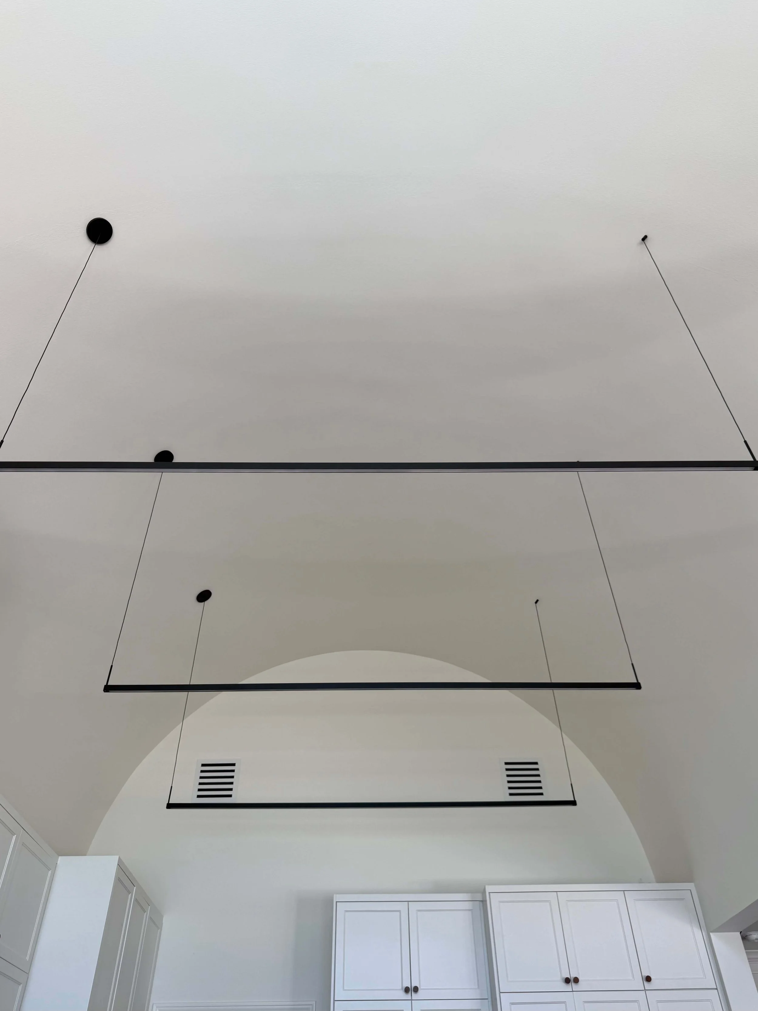
Here are the 8’ linear lights, installed. I love the upgraded linear air vents we used here too.
They truly spread the light all around the space, lighting up the island nicely. It also enabled the breakfast table to be off-center of the vault, which works better spatially. Their table is round but expandable with a leaf, which they leave open most of the time.
Sconces that shine down to the countertop beside the hood were also used to add light and some detail to that back wall area.
Here are the final kitchen photos!
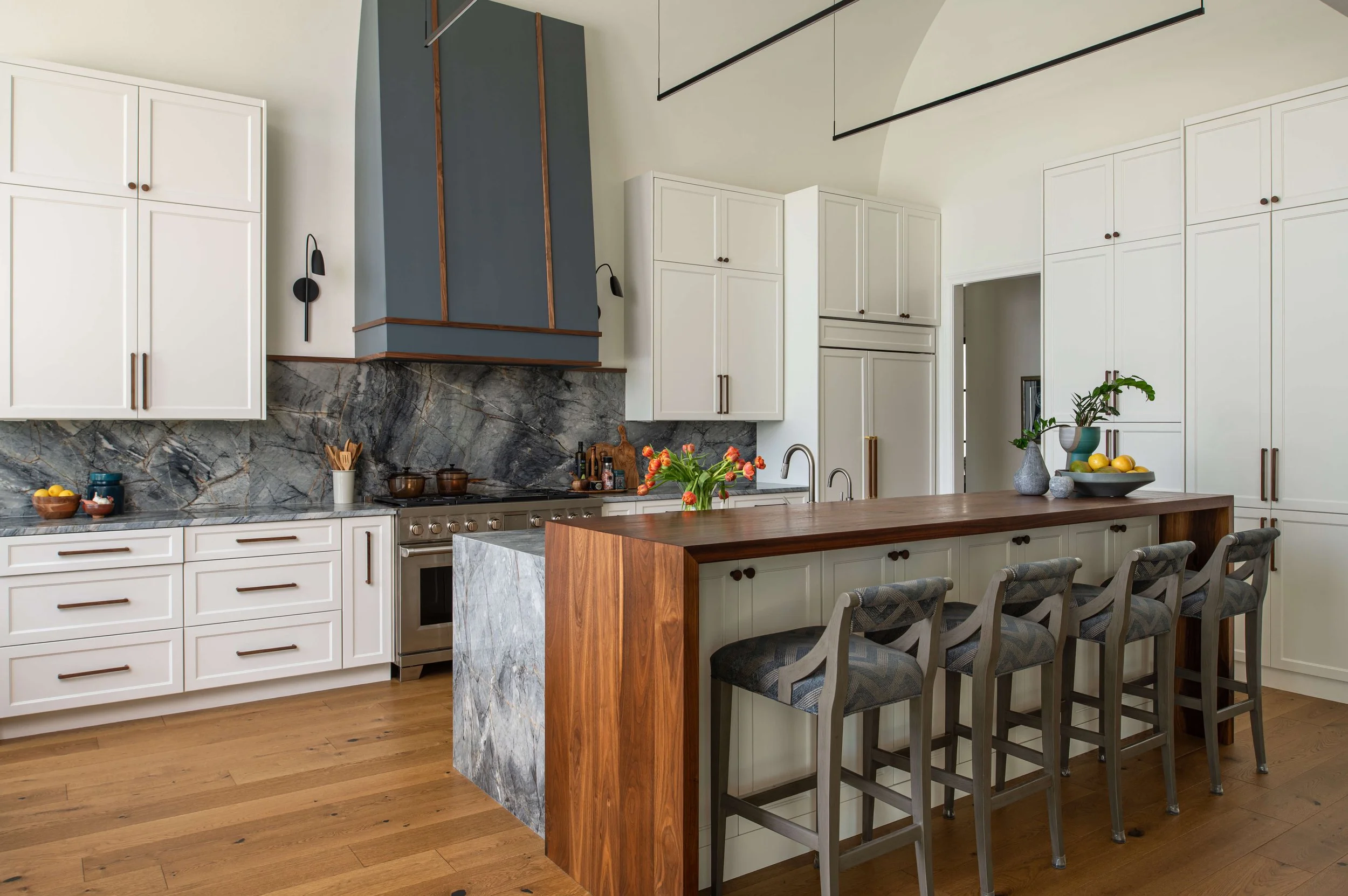
New kitchen with walnut wood bar, oversized hood with walnut trim, Ijen blue quartzite, walnut cabinet pulls and 8’ linear suspended lighting. | Designer: Carla Aston, Contractor: CA Design Build, Photographer: Ellen Renee Photography
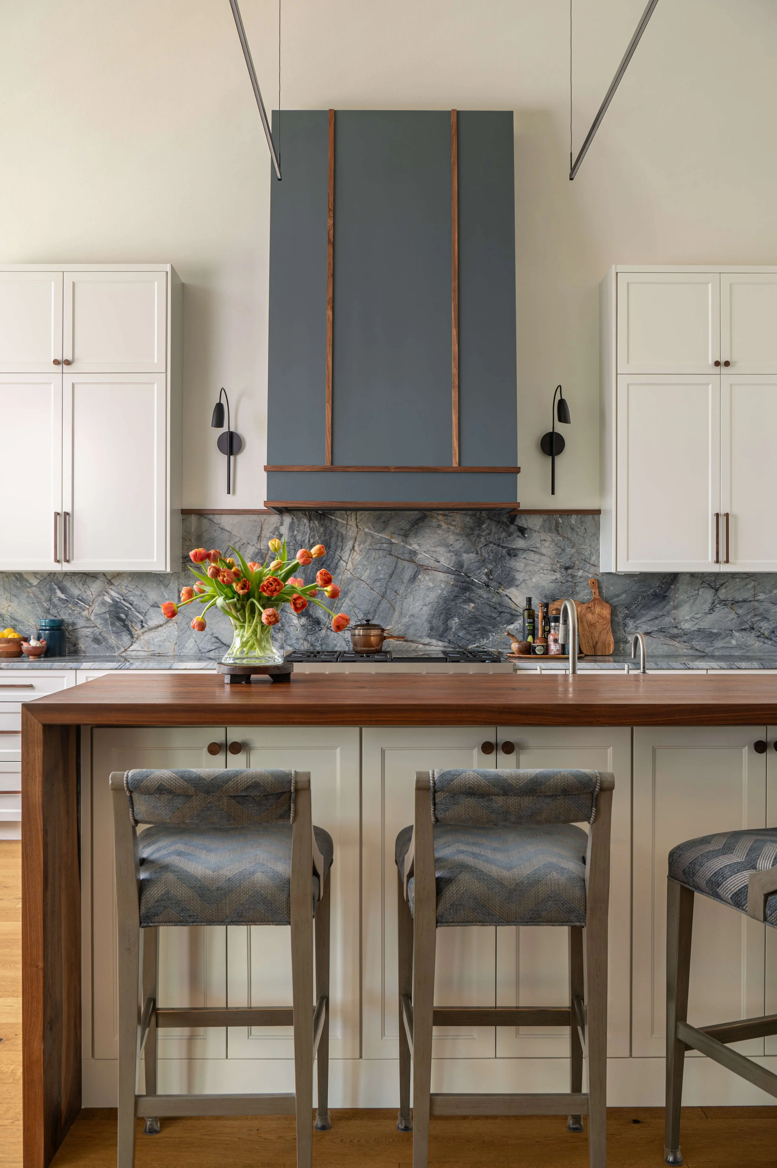
Kitchen island and hood beyond featuring walnut and Ijen Blue quartzite. | Designer: Carla Aston, Contractor: CA Design Build, Photographer: Ellen Renee Photography
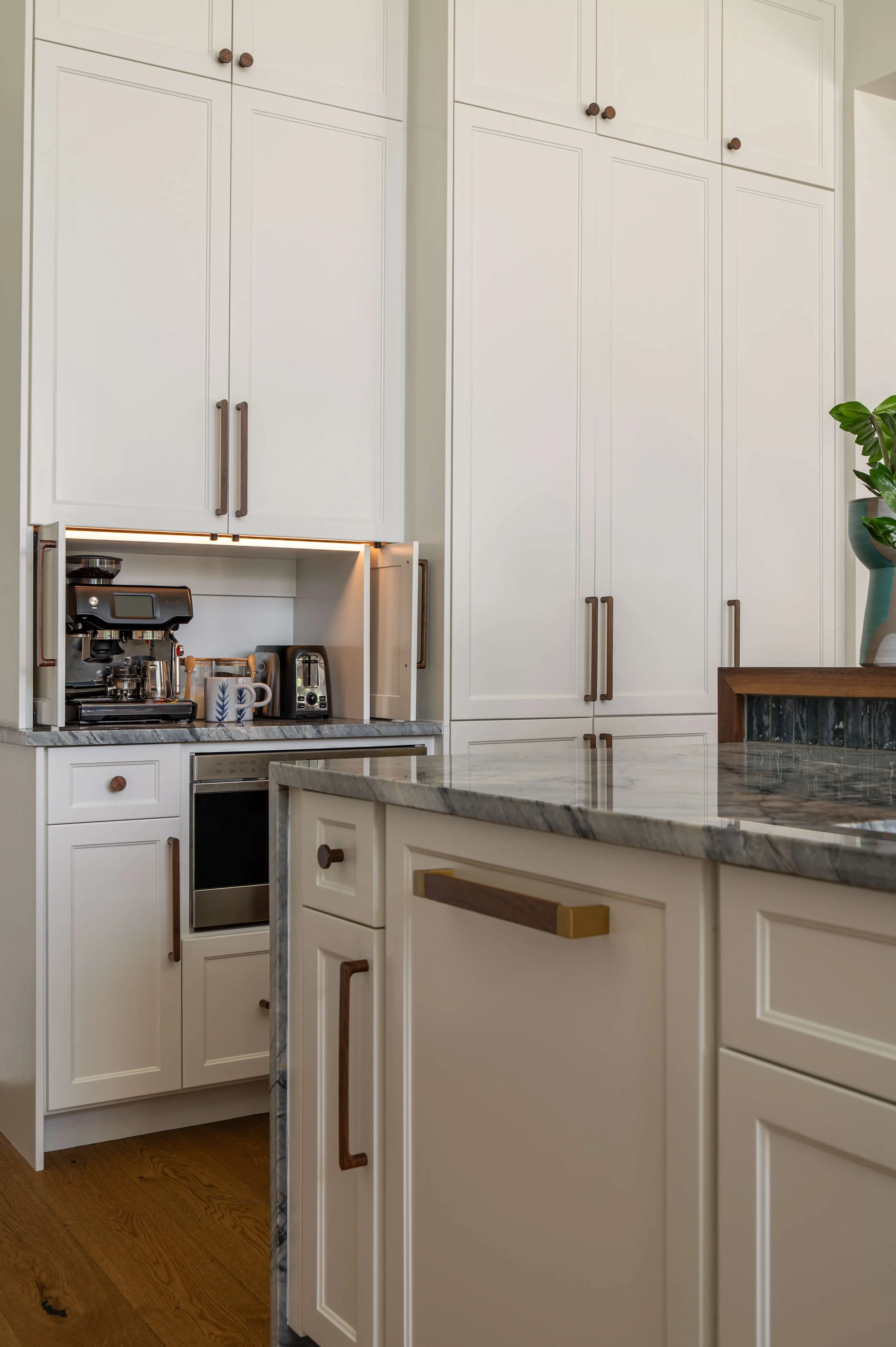
Pantry wall with lit appliance garage. | Designer: Carla Aston, Contractor: CA Design Build, Photographer: Ellen Renee Photography
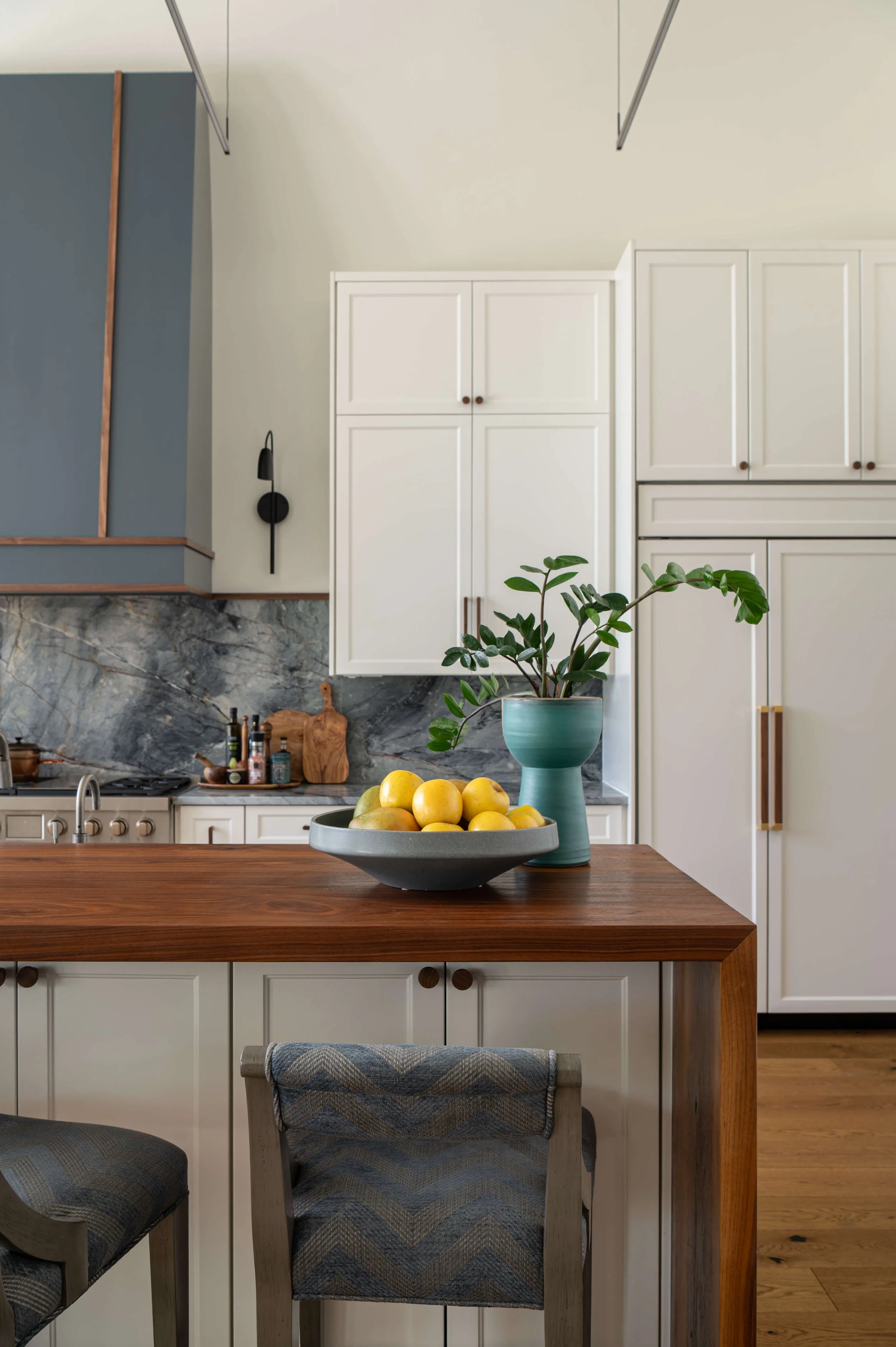
A raised walnut waterfall bar provided warmth in this kitchen and enabled the use of existing tall bar stools. Walnut cabinet pulls add more warmth to the cabinetry. | Designer: Carla Aston, Contractor: CA Design Build, Photographer: Ellen Renee Photography
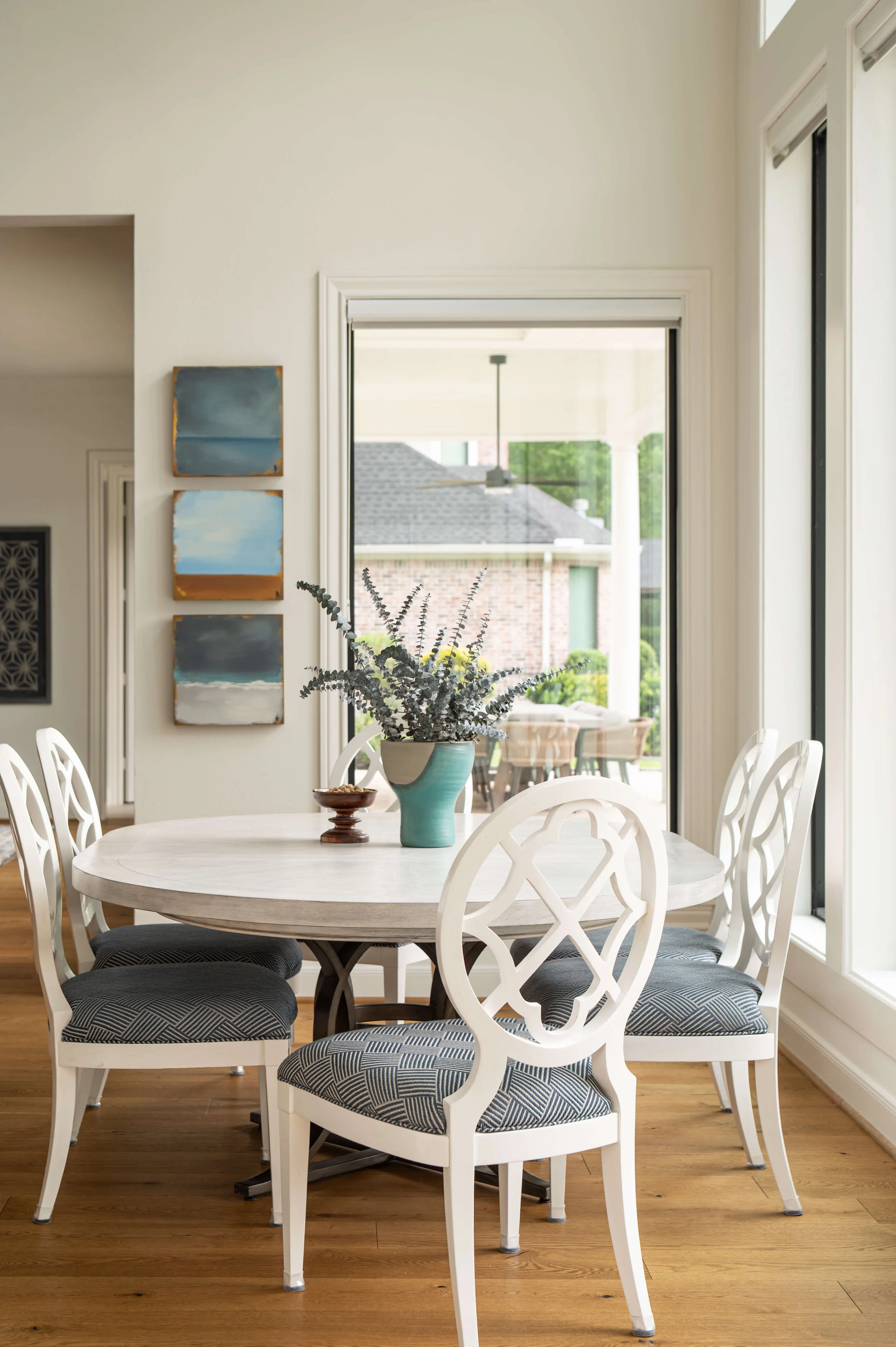
Existing breakfast room furniture was reused with new artwork. The expanded table fits beautifully in this space, off center from the windows. | Designer: Carla Aston, Contractor: CA Design Build, Photographer: Ellen Renee Photography
Family Room
Now, I’ve gone on a lot here so far, so I’ll make the description of this room short and sweet.
Here’s a comfy family room that brings the warmth of the kitchen island and hood to this side of the room. A colorful rug, a large, plush sectional, a textural finish on the round coffee table and a caramel leather recliner make for an inviting, relaxing space.
We didn’t do more built-ins here but opted for a walnut media cabinet, painting the back wall the color of the hood, across the room. We also made the tv niche area smaller, centering it on the wall and capturing some of the space left in the corner for a storage closet, accessible via the small hall to the pool bath.
Art pieces reinforce the palette and well-chosen accessories finish off the space. All furnishings in this room via Aston Design Studio.
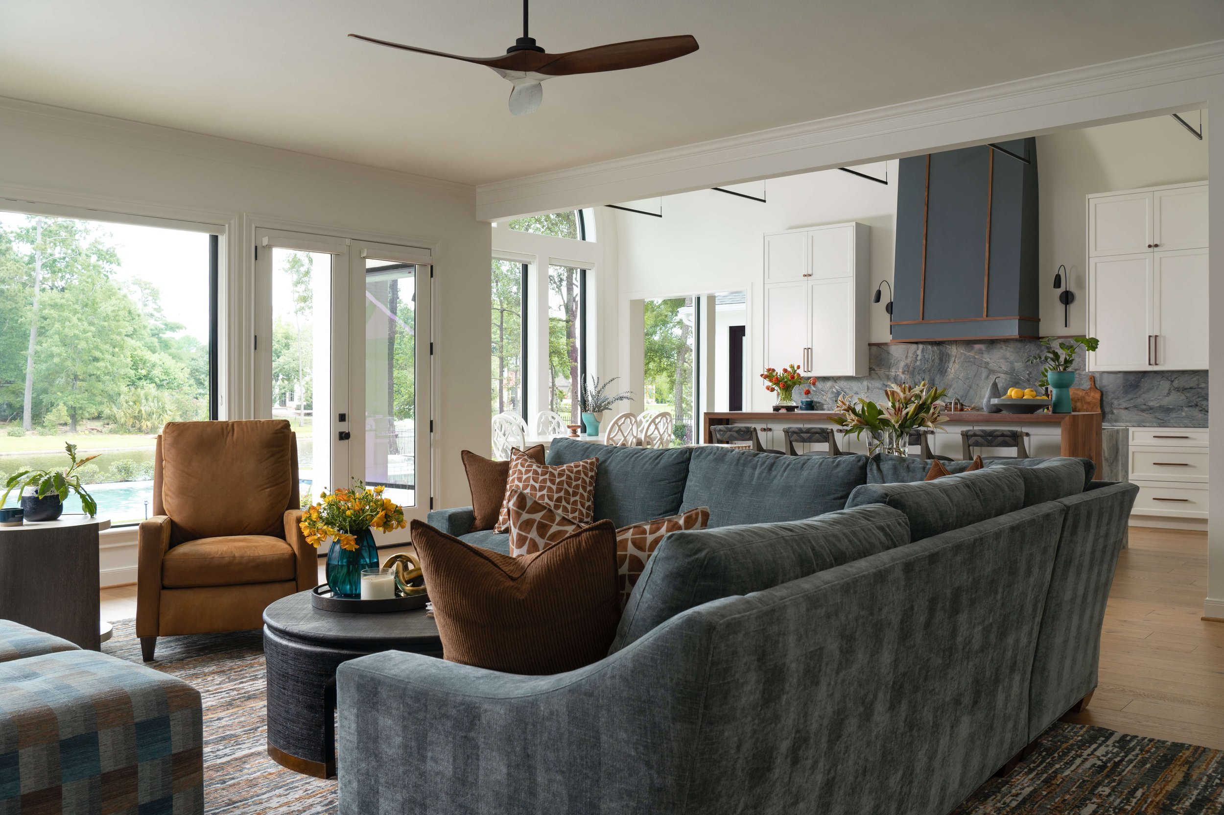
Comfy, inviting family room is now open to the kitchen. | Designer: Carla Aston, Contractor: CA Design Build, Photographer: Ellen Renee Photography
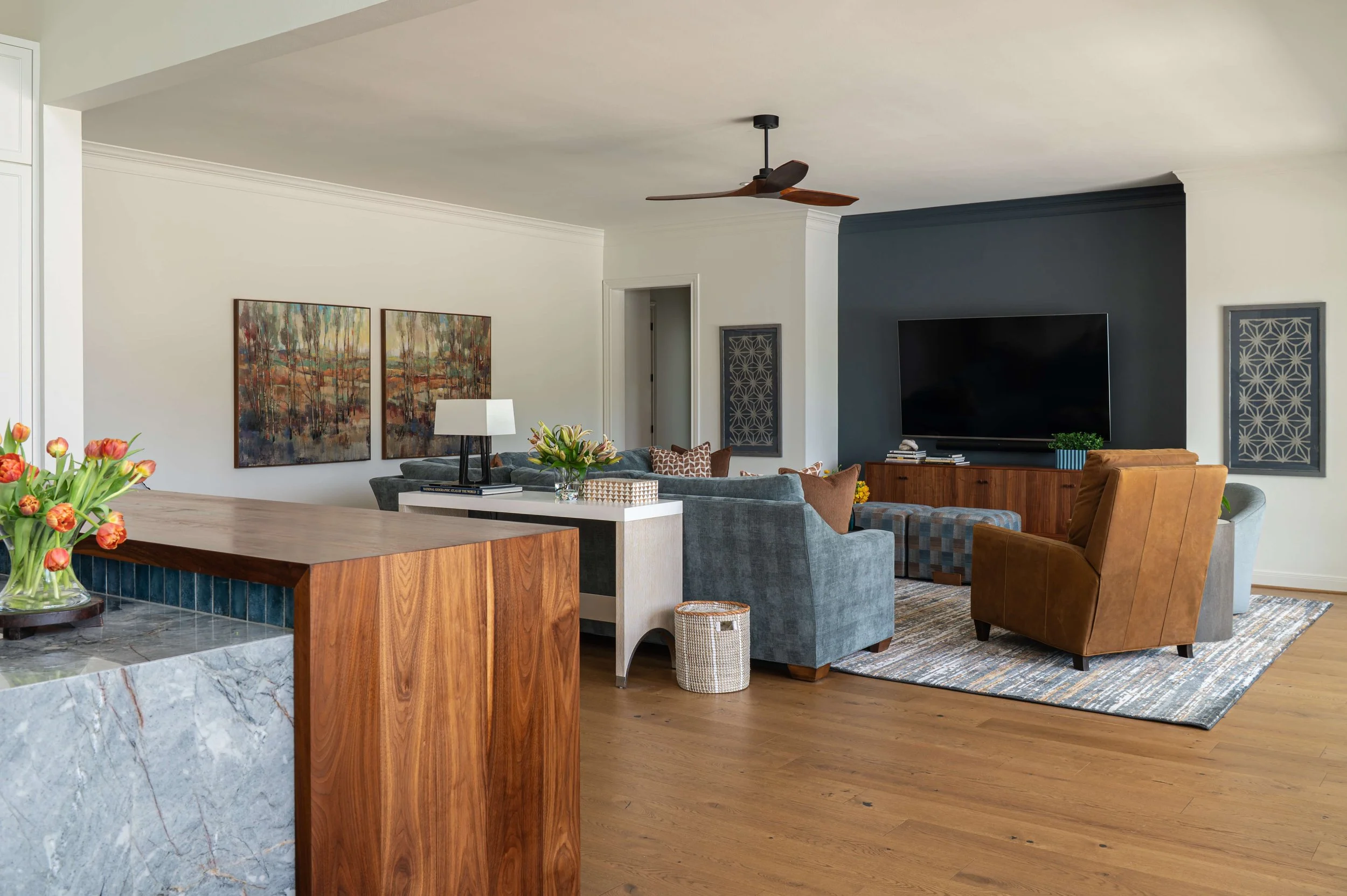
The telescoping bar detail worked out beautifully to make a high bar feel very intentional and current in design. (It’s also a great place to put outlets, since we can no longer put them on the sides of the island.) | Designer: Carla Aston, Contractor: CA Design Build, Photographer: Ellen Renee Photography
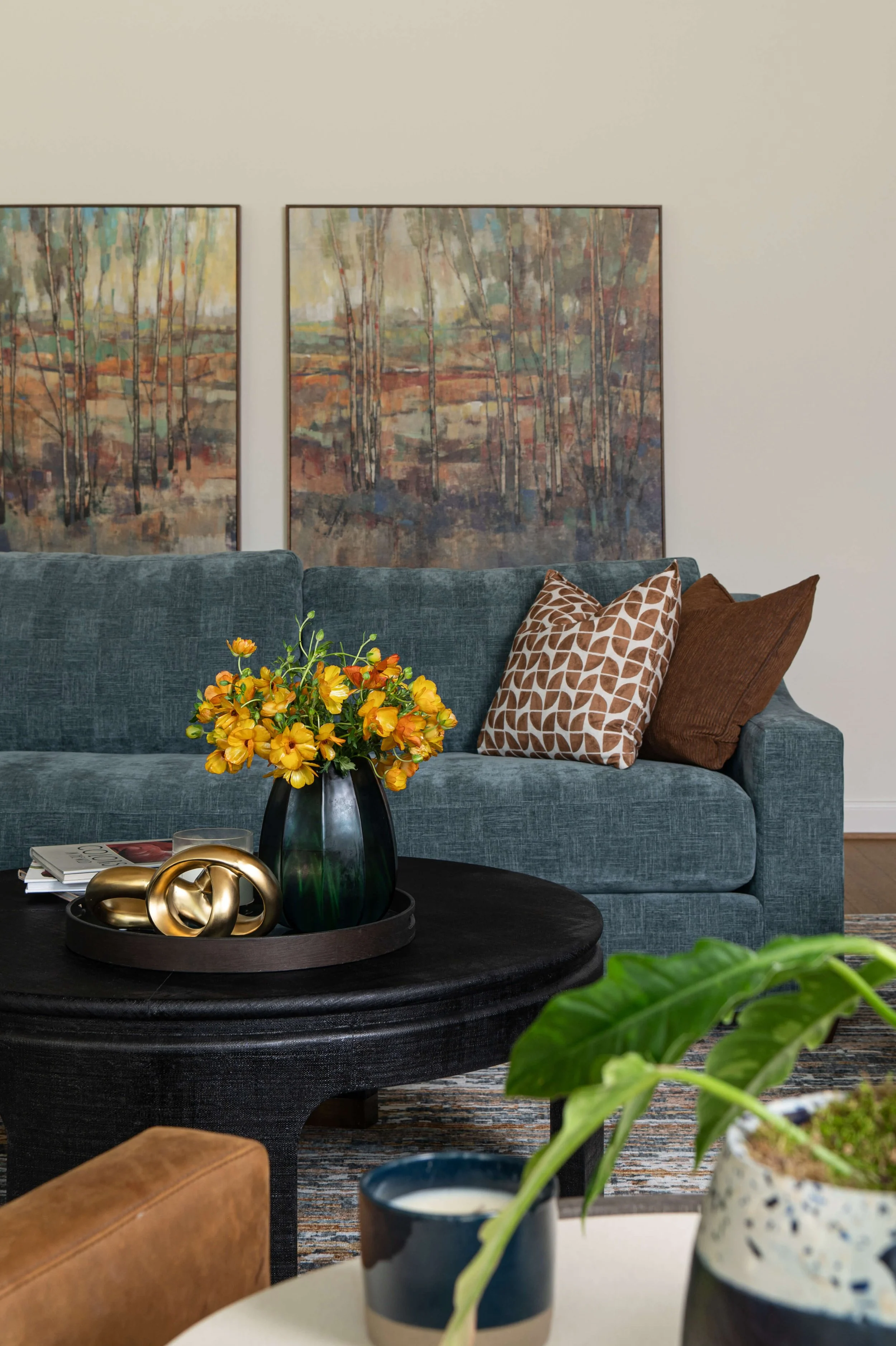
Family room sectional with a black, round coffee table in a textural finish. | Designer: Carla Aston, Contractor: CA Design Build, Photographer: Ellen Renee Photography
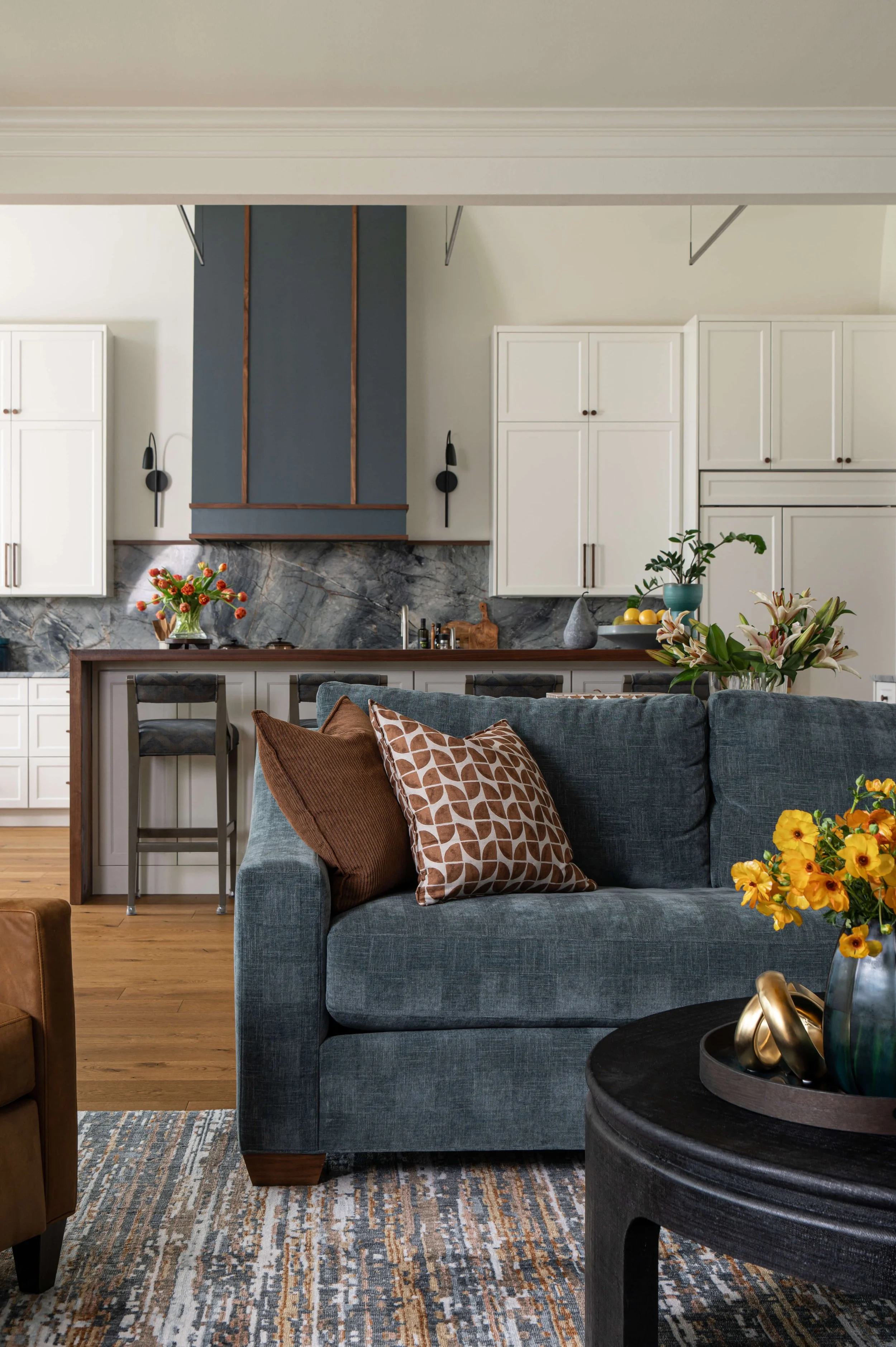
Creamy cabinets paired with a rich walnut and dark blue-gray (SW Gray’s Harbor) make for a cohesive space. | Designer: Carla Aston, Contractor: CA Design Build, Photographer: Ellen Renee Photography
I can’t wait to share more photos of this beautiful home.
Kudos to the other pros on this project, linked below.
CA Design Build - Construction, Shaun Bain and Gus Bruna
Ellen Renee Photography - Photography
Staci Nugent Design - CAD drawings for the project