You’re gonna LOVE this before and after, trust me.
There are some really special features in this remodel/furnishings project and today I’m featuring the kitchen and breakfast nook area.
This client is a family with young children who needed durability but also wanted some unique features in their home that were fun and on trend.
A navy and white kitchen was top of the list.
Here was the tired kitchen before….with a wonky island that you know I’m sooooo fond of in kitchens. (NOT;-)
BEFORE - Kitchen Remodel with wonky island
BEFORE - Kitchen Remodel with wonky island
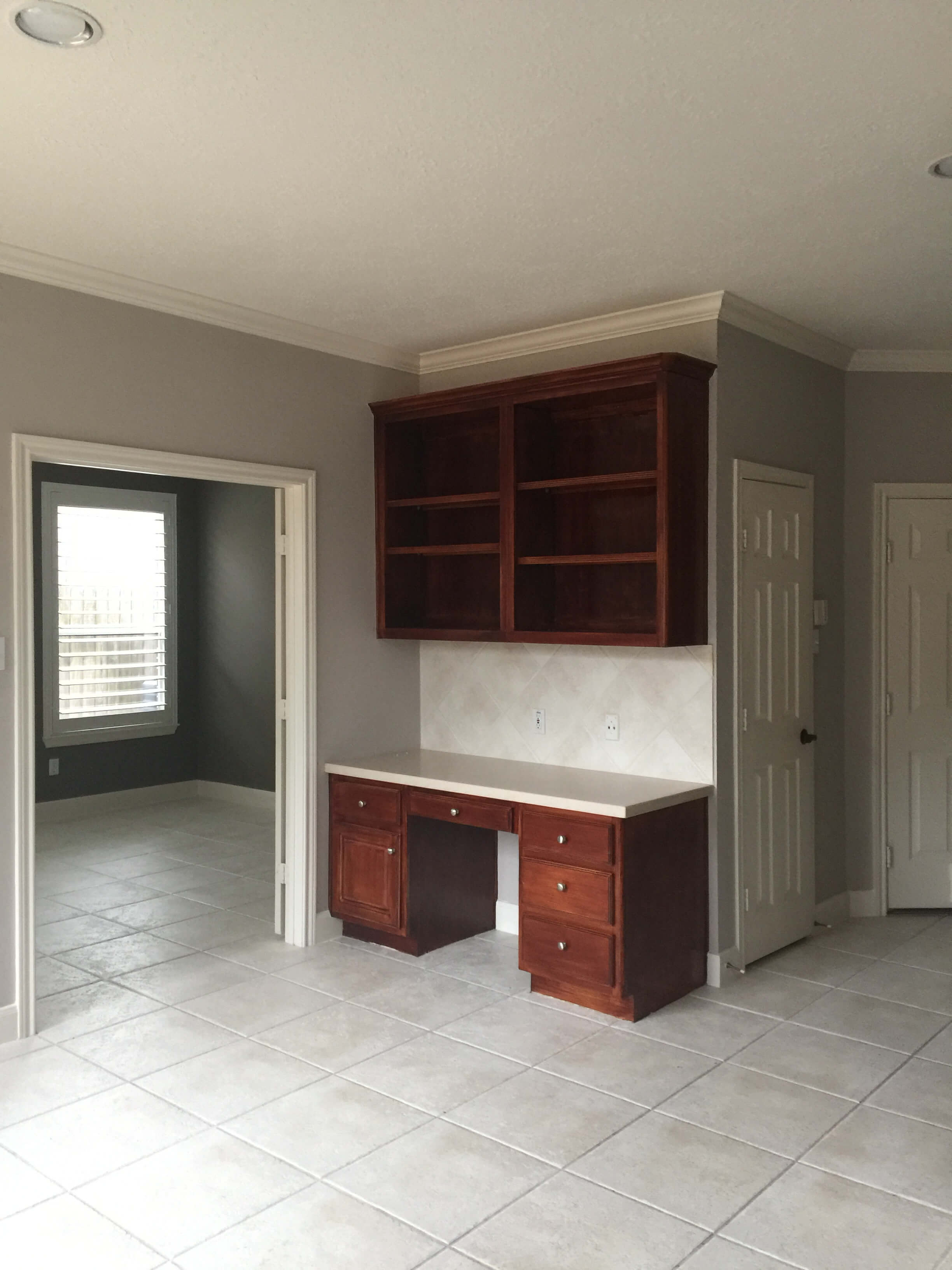
BEFORE - Kitchen Remodel with built-in desk to be removed to include a new mudroom bench
One of the first things we had to figure out was where to put the cooktop.
It didn’t function well on the back side of that island and frankly, the kitchen needed a tad more space too.
With downdraft venting about the only solution here, since you can see there was a second floor above and no way to draft up, we opted to trench over the side wall of the kitchen in the floor. (I explain more about moving appliances and plumbing fixtures in remodels in this post.)
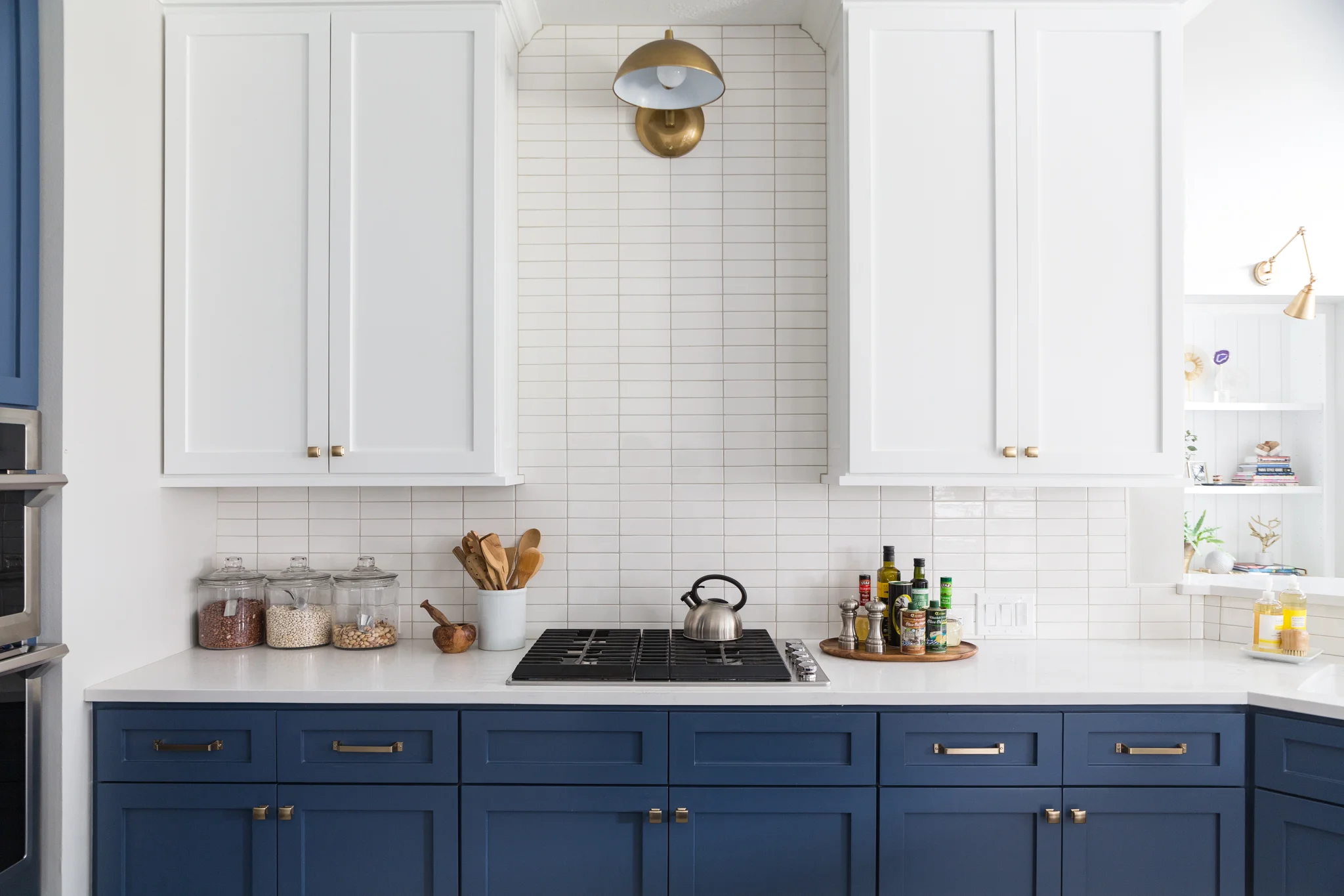
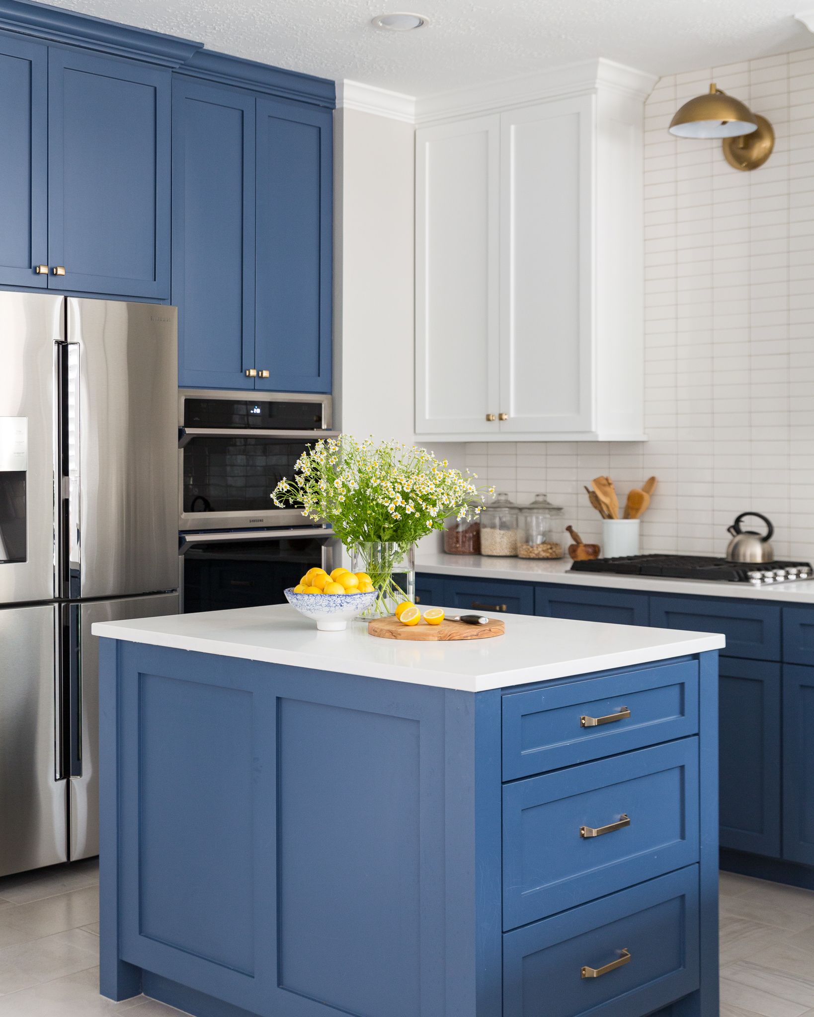
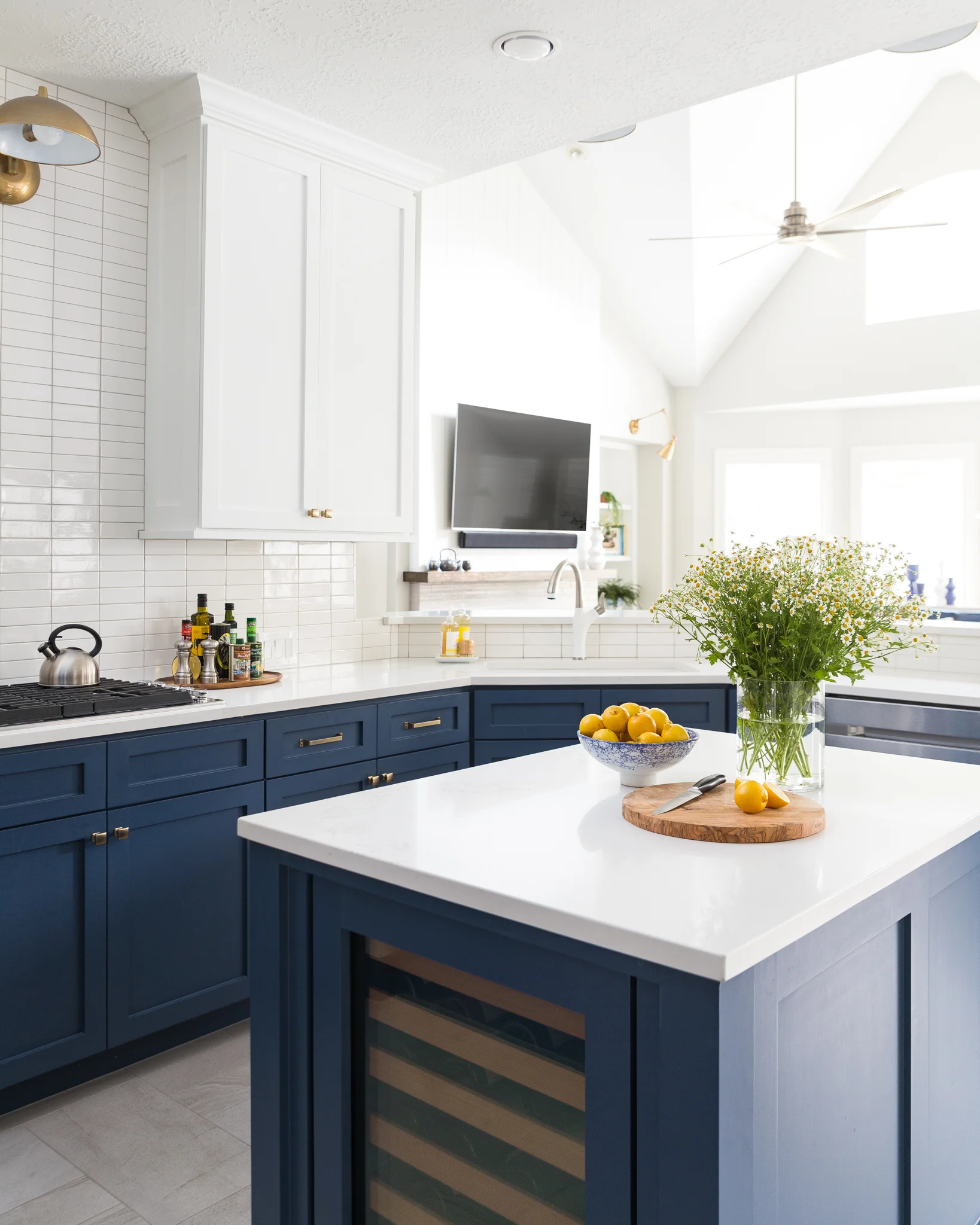
We moved the microwave and oven to the fridge wall to provide a spacious, open cooktop area. We even nudged that sink/bar wall out into the open space to create a little more room for a bigger, rectangular island that now houses a new beverage fridge.
Let’s take a look at how this kitchen turned out.
BEFORE AND AFTER - A navy and white kitchen remodel | Carla Aston, Designer | Colleen Scott, Photographer #kitchenremodel #navyandwhitekitchen #kitchenideas
BEFORE AND AFTER - A navy and white kitchen remodel | Carla Aston, Designer | Colleen Scott, Photographer #kitchenremodel #navyandwhitekitchen #kitchenideas
BEFORE AND AFTER - A navy and white kitchen remodel | Carla Aston, Designer | Colleen Scott, Photographer #kitchenremodel #navyandwhitekitchen #kitchenideas
BEFORE AND AFTER - A navy and white kitchen remodel w/ barn door | Carla Aston, Designer | Colleen Scott, Photographer #kitchenremodel #navyandwhitekitchen #kitchenideas
We made over the laundry room too.
We also remodeled the laundry room and added a barn door. That’s magnetic paint on the side panel of the fridge cabinet for kids’ artwork, notes, and family schedules.
I love barn doors for laundry rooms, as they keep a door swing out of that typically tight space. (I did the same thing in this kitchen remodel.)
That bulky corner in the laundry room was for a return air vent that opened into the hallway on the opposite side of the wall.
We actually slipped the HVAC duct over into the furred out area of the kitchen corner, so that more storage space could be had in the laundry room. See that angled ceiling area? That’s where it is now housed, as it moves down to return air’s new location.
Isn’t that little ceiling fan cool? It helps with air circulation in this space. Yes, we have a ventfan in there too.
BEFORE - Laundry room remodel
BEFORE AND AFTER - A navy and white kitchen and laundry room remodel | Carla Aston, Designer | Colleen Scott, Photographer #laundryroomideas #laundry #remodel
BEFORE AND AFTER - A navy and white kitchen remodel | Carla Aston, Designer | Colleen Scott, Photographer #kitchenremodel #navyandwhitekitchen #kitchenideas
BEFORE AND AFTER - A navy and white kitchen remodel | Carla Aston, Designer | Colleen Scott, Photographer #kitchenremodel #navyandwhitekitchen #kitchenideas
BEFORE AND AFTER - A navy and white kitchen remodel | Carla Aston, Designer #kitchenremodel #navyandwhitekitchen #kitchenideas
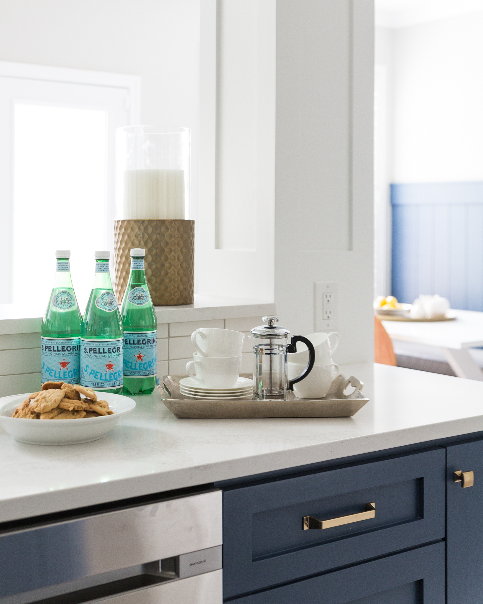
We paneled that column as well as the front of the bar, painting all that white to match the upper cabinets in the kitchen. It just adds in more durability to a home and keeps everything looking crisp.
Here was the BEFORE pic of the breakfast area with its kitchen desk built in.
BEFORE - Kitchen Remodel with built-in desk to be removed to include a new mudroom bench
We are tearing out these built-in desks in remodels a lot these days. People don’t use them any more with laptops and iPads and all kinds of mobile devices that take “desk” work to a more comfortable place in the house.
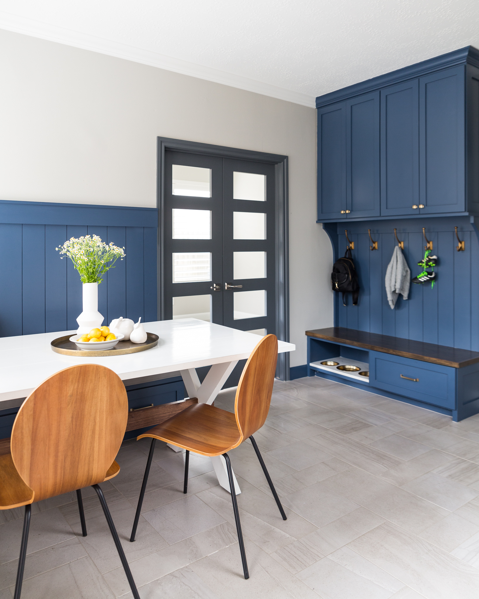
That was the case here and we removed the desk for some new cabinetry in the form of a mudroom bench. It was much more useful for this young family and their two cute pups!
BEFORE AND AFTER - A navy and white kitchen remodel w/ mudroom bench, dog feeding station | Carla Aston, Designer | Colleen Scott, Photographer #mudroom #dogbowl #bench #cabinetry
BEFORE AND AFTER - A navy and white kitchen remodel w/ mudroom bench, dog feeding station, breakfast nook | Carla Aston, Designer | Colleen Scott, Photographer #mudroom #dogbowl #bench #cabinetry #breakfastroom
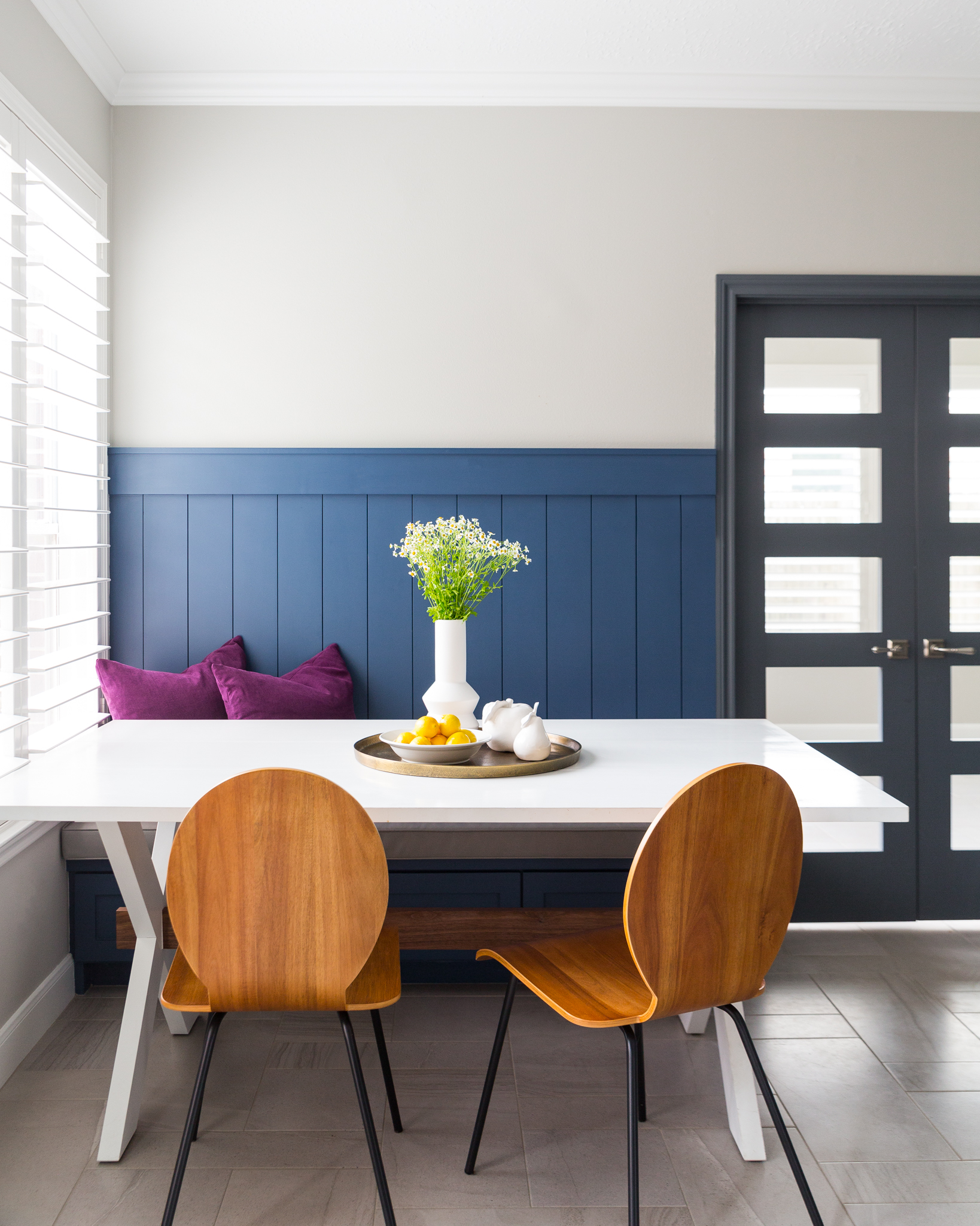
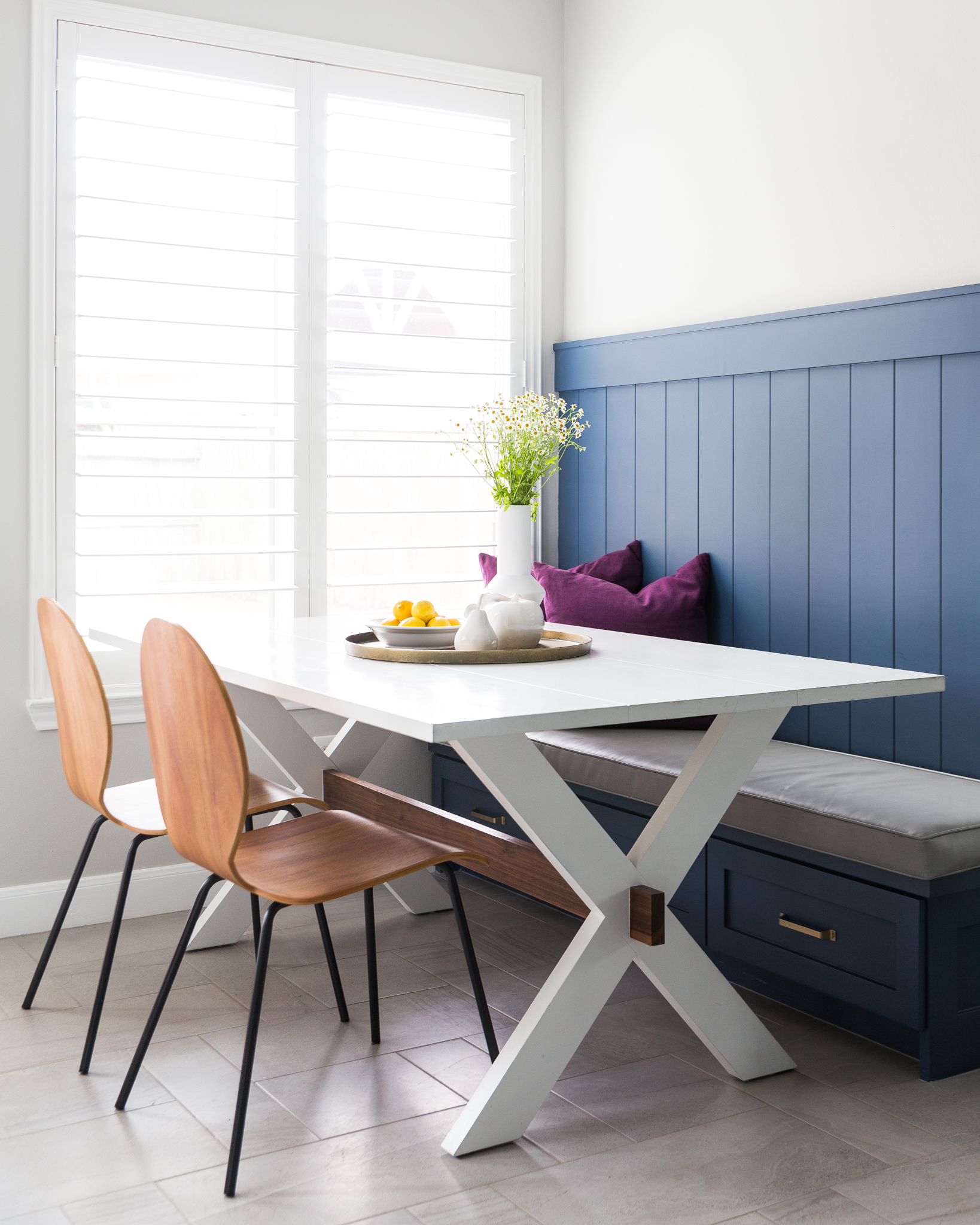
BEFORE AND AFTER - A navy and white kitchen remodel w/ built in breakfast nook | Carla Aston, Designer | Colleen Scott, Photographer #banquette #shiplap #breakfastroom
BEFORE AND AFTER - A navy and white kitchen remodel w/ built in breakfast nook | Carla Aston, Designer | Colleen Scott, Photographer #banquette #shiplap #breakfastroom
BEFORE AND AFTER - A navy and white kitchen remodel w/ built in breakfast nook | Carla Aston, Designer | Colleen Scott, Photographer #mudroom #dogbowl #bench #cabinetry
The homeowner even found some brassy look dog bowls that we designed to be inserted into the quartz feeding station. :-)
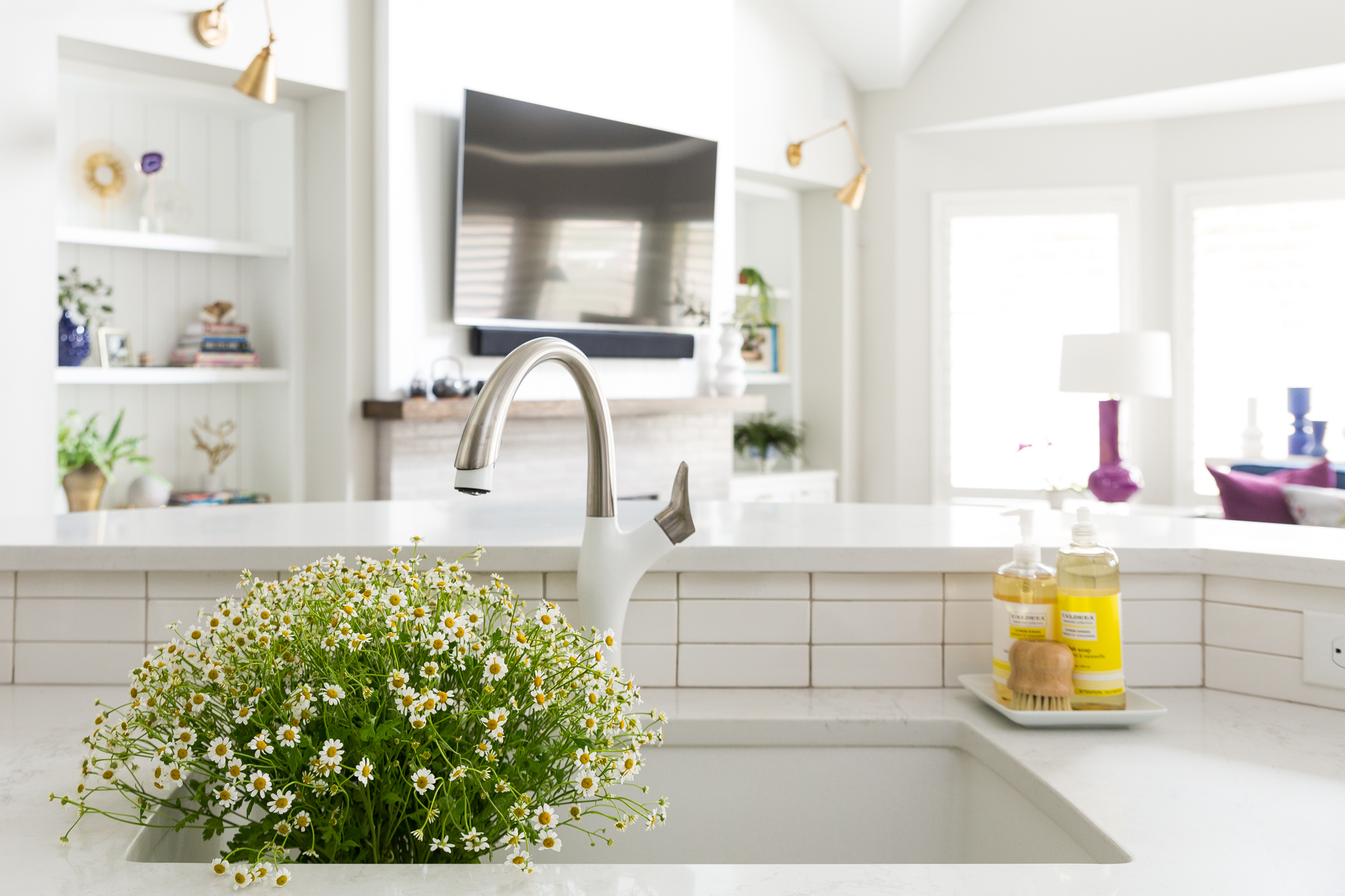
See that beautiful, sleek faucet below? One of my faves from Blanco. It’s just perfect here with one of their white Silgranit sinks.
And check out the living room beyond…..I’ll be sharing that space, as well as a bit more of what we did in this home, soon.
BEFORE AND AFTER - A navy and white kitchen remodel w/ white faucet | Carla Aston, Designer | Colleen Scott, Photographer
Subscribe below to get more design inspiration coming directly to your inbox!
And….help me get these pics out there on the web by pinning some of my images to Pinterest. I would much appreciate it!
Photographer: Colleen Scott
Contractor: Tony Knepper Enterprises








I’ve already posted the kitchen before and after pics from this pretty family-friendly home, but now I’ve got the adjacent family room, a peek at the powder room and a sweeeet bench we had made for the long entry hall.
Take a look…..