This project started out small...and then it GREW.
I love projects like this: projects where my clients enjoy the design and the process; projects where they take their home to the exact level where it feels finished and ready to love for years to come.
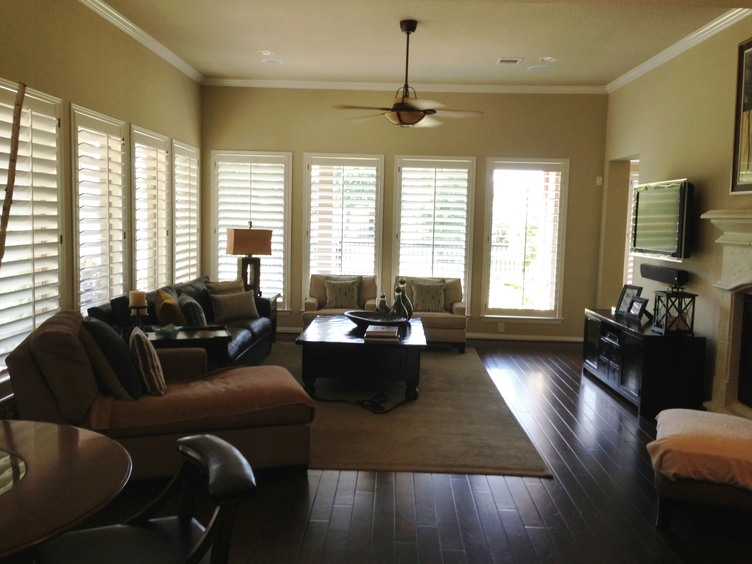
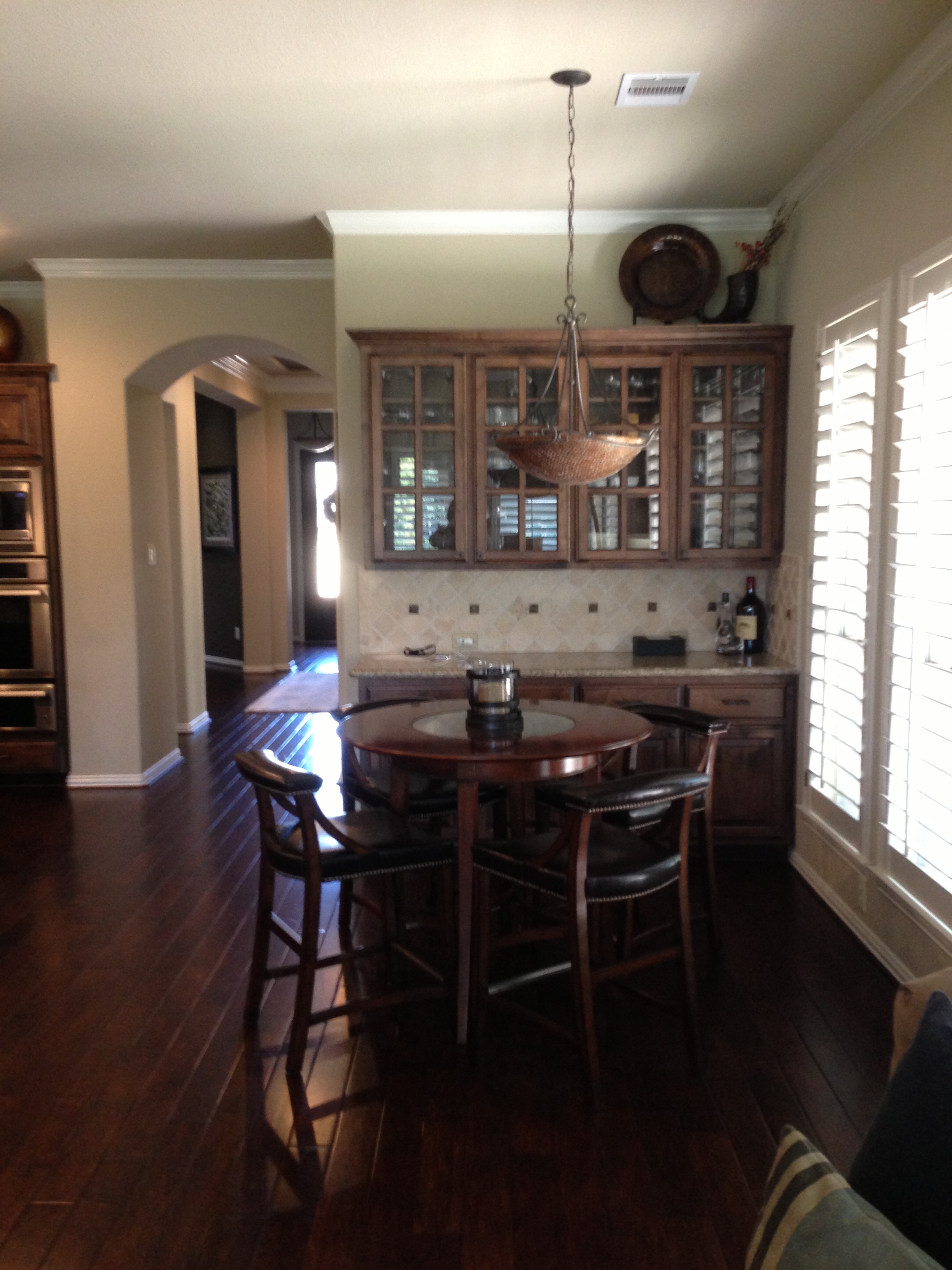
The project started out like this:
We were going to do a partial master bath remodel, some accessorizing in the living room (and perhaps a bit in the other rooms, too), then some remodeling in the laundry room. Not much more than that.
But then we discovered all of the additional possibilities that would allow us to obtain a more complete look, as well as a more desireable effect. That’s when these homeowners decided to go bigger. And I’m so glad they did.
This client has good taste; I could sense she did when I first visited the home and met with her.
She was knowledgeable about design and art/photography. The home had a transitional look — although with a more traditional style (architecturally), with a palette of browns and blues with citrine and gold accents. What she was looking for was a little more edge, a little more luxury, and a little more of a lasting, comfortable yet transitional look.
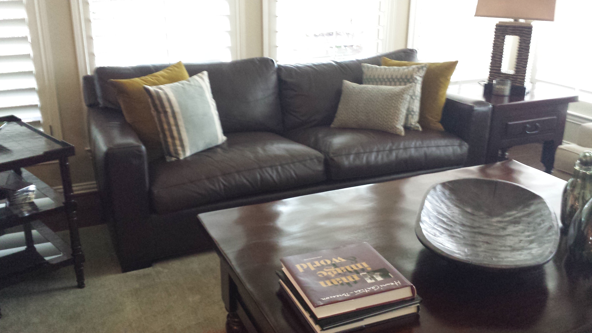
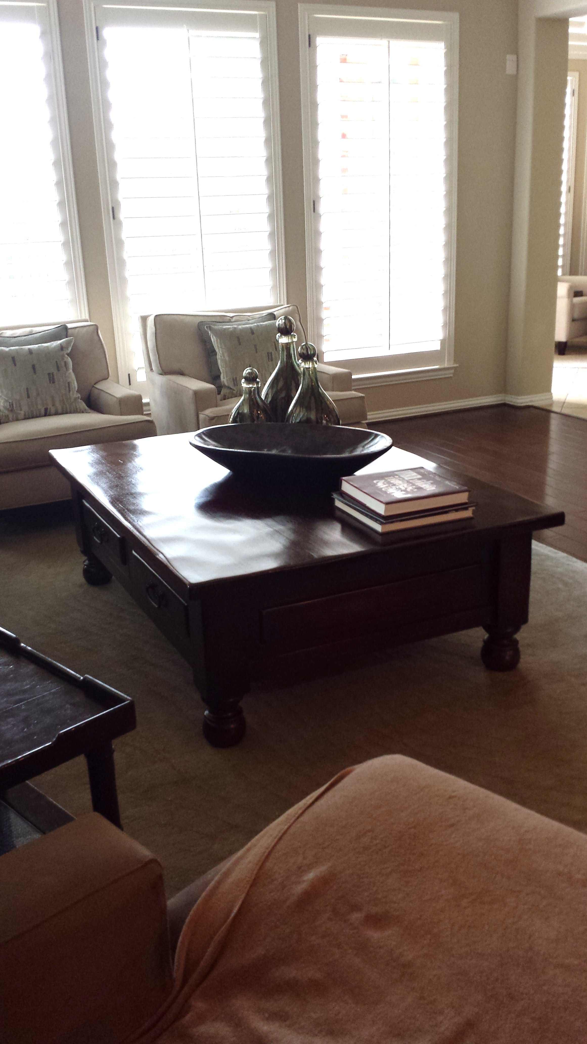
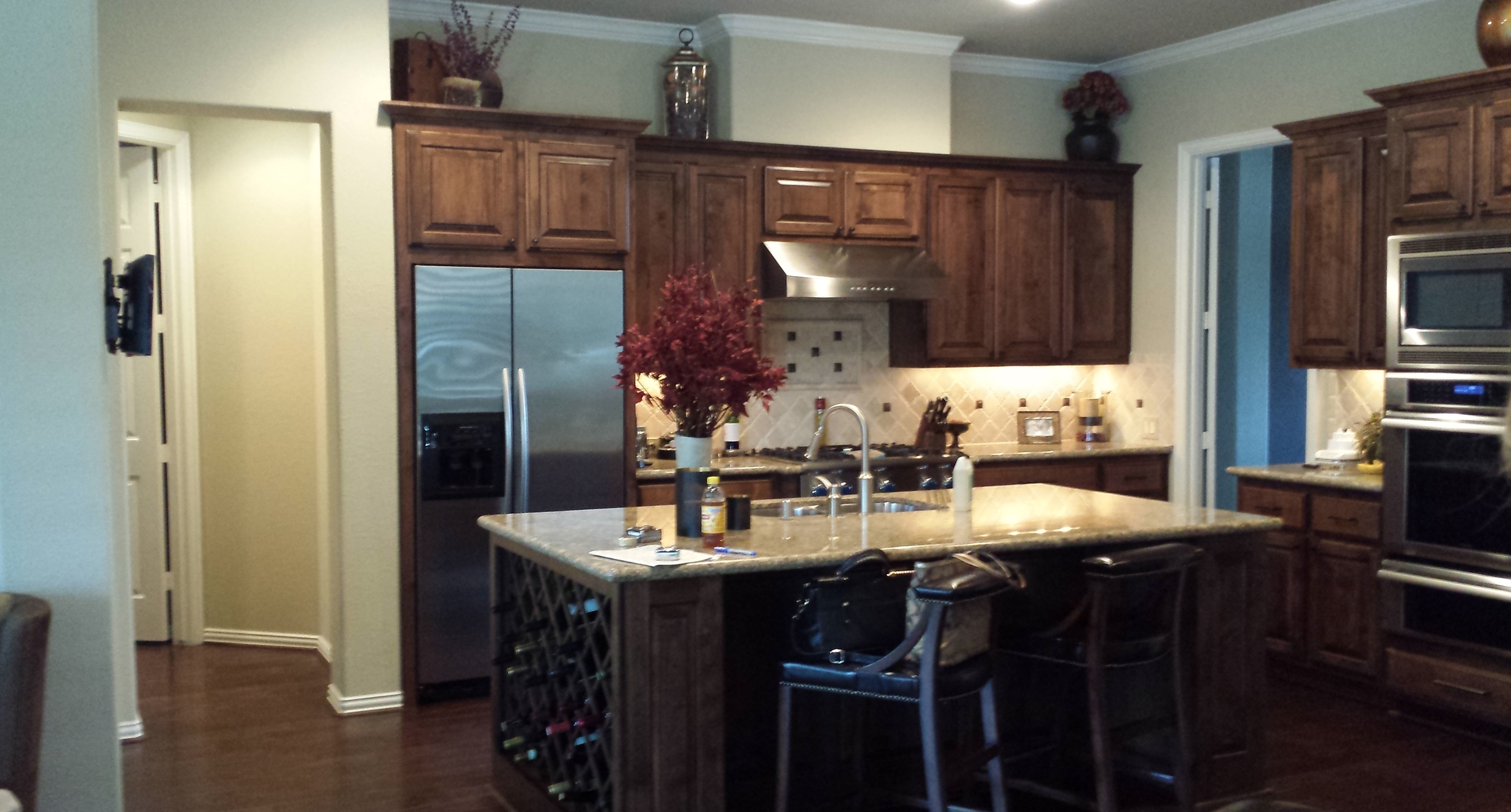
Overall, the color scheme was a little too dark brown, and the blue was reminiscent of what was happening in retail home decor 5-10 years ago. It looked a tad bit trendy, almost a little dated, and maybe even a bit generic. Personally, I didn’t think it really reflected the homeowner’s personality like it should.
the living room:
Btw: The amazing "after" photos you will see throughout this article were done by my photographer daughter, Tori Aston. :-)
We introduced some lighter furniture pieces to help get rid of so much of the dark brown; pieces such as gray leather sofas, a lighter weight coffee table, etc. We also wanted color to make this space look interesting and rich looking. The citrine brings such a freshness to the space, along with touches of teal color in the pillows and drapery. That gorgeous striped custom rug from Stark added that masculine, tailored vibe I was looking for.
After we suggested the style, the homeowner found that beautiful pecky cypress table from a supplier located out of state. She had it custom made for the look we wanted and it turned out great. She loved the color and richness of the wood, as it really speaks to her style and gives the room some personality.
Now the only thing that’s dark brown in the room is that gorgeous chocolate lab! :-)
The Afters:
the kitchen / breakfast room area:
One of the issues I saw with the kitchen was that the wood floors were one shade of brown (a reddish tone), and the kitchen cabinets were more gray brown. It’s not that it looked bad, it just looked a little off and unplanned. I thought it would help to make a bigger distinction and create more contrast between these two dominant finishes so the design of the space would look purposeful and have a more contemporary feel that my client wanted. So I proposed an ebonized look for the wood cabinetry, and the wood floors (obviously more of a pain to redo since they were all over the house) would be the color we’d keep.
To break up all the dark finishes and make for a distinct color direction, we made a bold color choice of teal for the island. It works so well, and I’m so glad they trusted me here. It ties in the color we introduced in the living room and other spaces of the house, perfectly. I love repeating design elements throughout an interior to create balance, as well as a more thoughtful and harmonious look.
We did new countertops of Macabus White quartzite with gorgeous, subtle veining; and we lightened and brightened the kitchen by using a lighter color than their previous countertop. The linear quality of the stone adds to the contemporary look, and the veins have a tiny bit of that teal color that works so well with our palette. Cabinets added to the top of the existing upper cabinetry added height to the space, and the new stainless hood mounted on our glass subway tile added a sleekness to the kitchen’s design.
The “citrine” color was repeated here in the brass bowl lighting that’s hung over the island. I wanted this space to look really different than it did before, and those slightly oversized fixtures make a big statement. The contemporary and colorful theme was repeated with the cabinet pulls, providing a touch of warm, rustic brass on the freshly ebonized cabinetry. Reeded glass panels help establish a more contemporary look to the otherwise traditional cabinet details.
The Afters:
the fireplace wall:
I also had an issue with the fireplace wall in the living room — it sort of looked a bit jumbled to me, and the fireplace surround spoke to a more “old world” look. We did a slate stacked stone to the ceiling for a rustic yet clean-lined vibe, and then a custom entertainment center in a warm stained wood tone with brassy accents. These elements add a richness to the room with their finishes, and also created an interesting elevation on that wall that was missing before.
Before:
After:
the sitting room:
In an adjacent sitting room that houses the dog door, we used the same slate in tile form — that flooring material is perfect for hiding any dirt or mud a dog might bring in, and it also marries well with the outdoors.
In this room we added in the seagrass round rug, some colorful pillows and accessories, a great table (made by the same supplier as the coffee table), and that fab floor lamp that proved to be perfect in our attempt to design a more contemporary space.
Before:
After:
That’s all for now. ;-)
I’m going to save the master bath, the dining room, powder room, and the amazing laundry room for another couple of “before/after” articles. There was a lot to cover here, and I want to make sure to point out all the fab features this home now has so you don’t miss a thing!
Before and After | Living Room and Kitchen Remodel, Designer: Carla Aston


