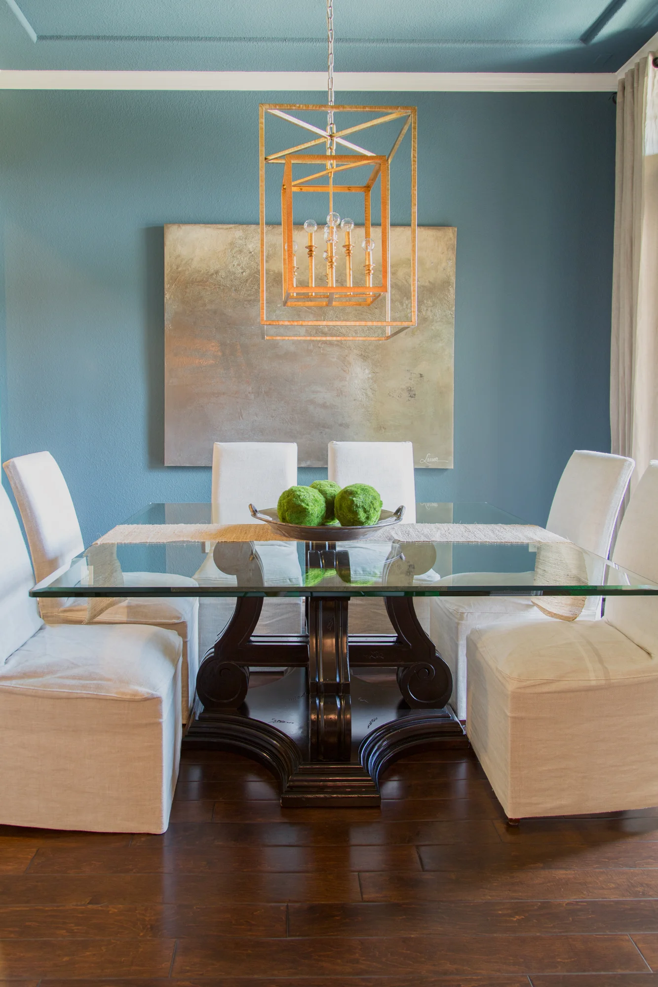
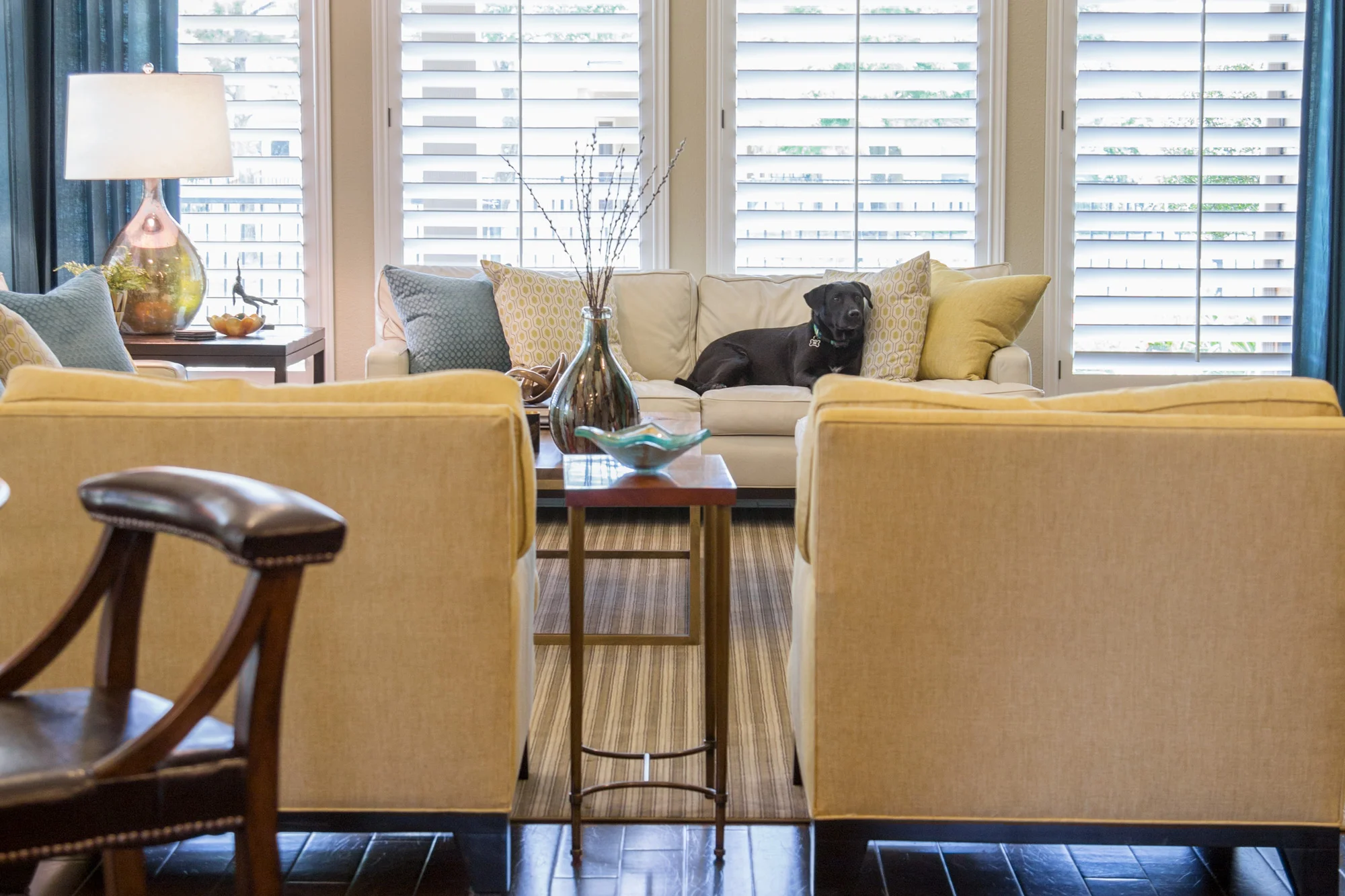
Btw: All 'after' photos taken by photographer Tori Aston.
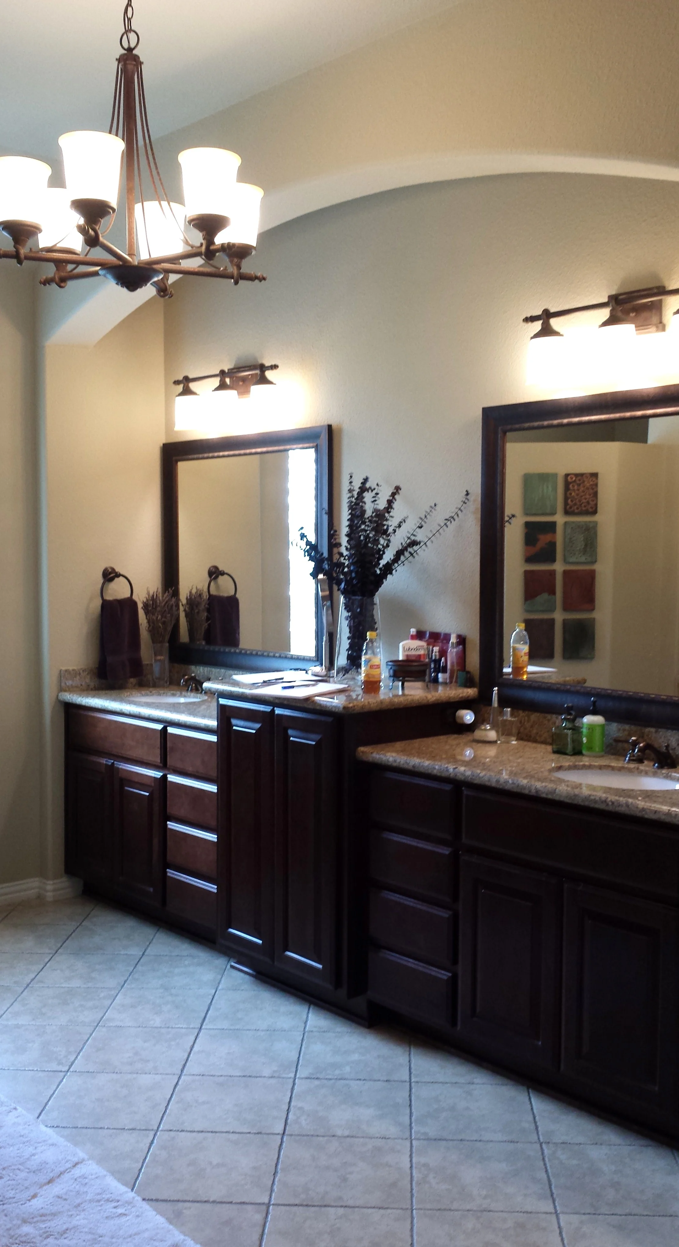
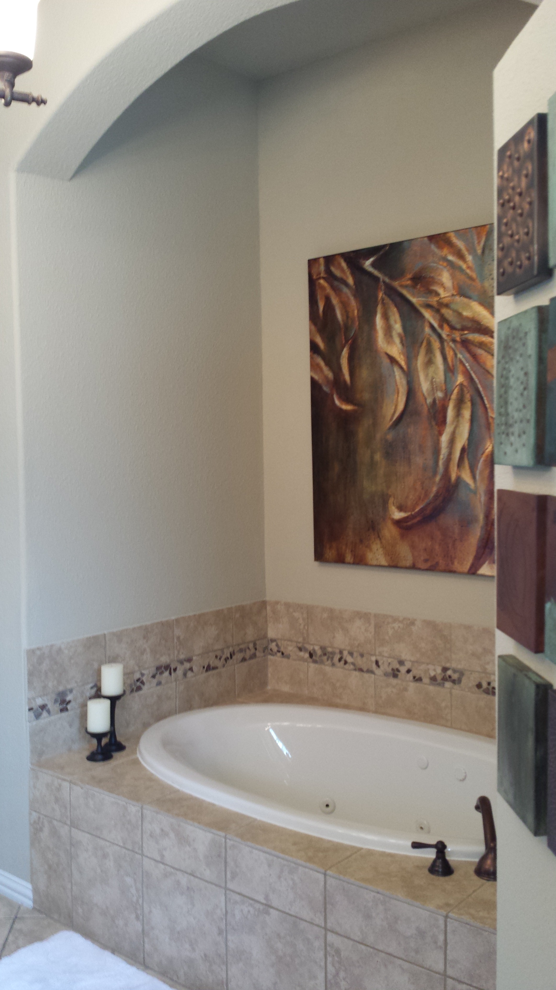
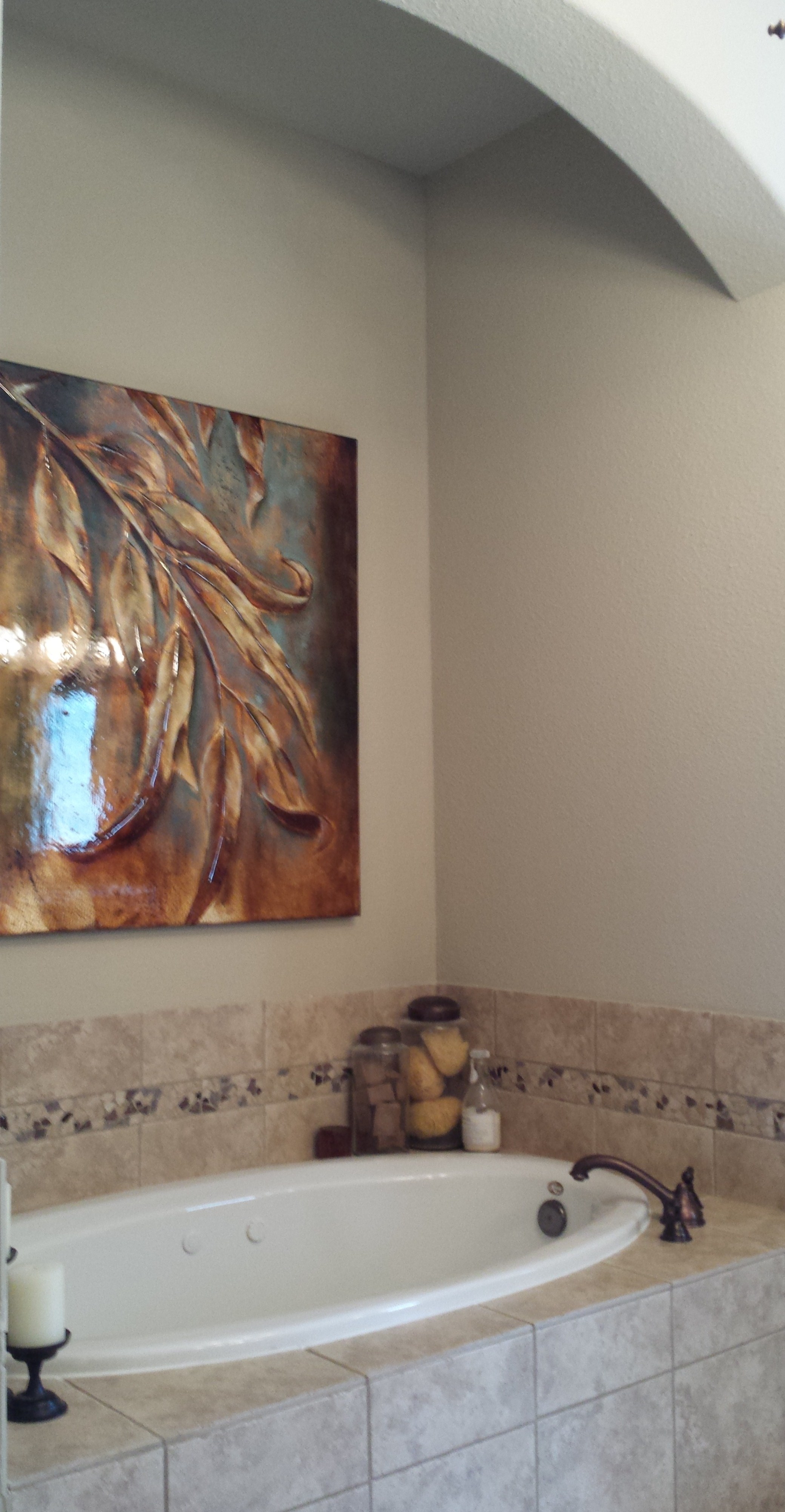
Initially, the client just wanted a partial remodel.
They wanted to keep their existing cabinets and redo the tile and fixtures, however we ended up going further.
Once we got into the project with the homeowner, we got a bit carried away; because, you see, turning a nice — although ordinary — master bath, with a muddy, brown-ish color scheme into something sleeker and more contemporary can be a challenge unless you can do things big like we did here.
Among some of the changes we made were...
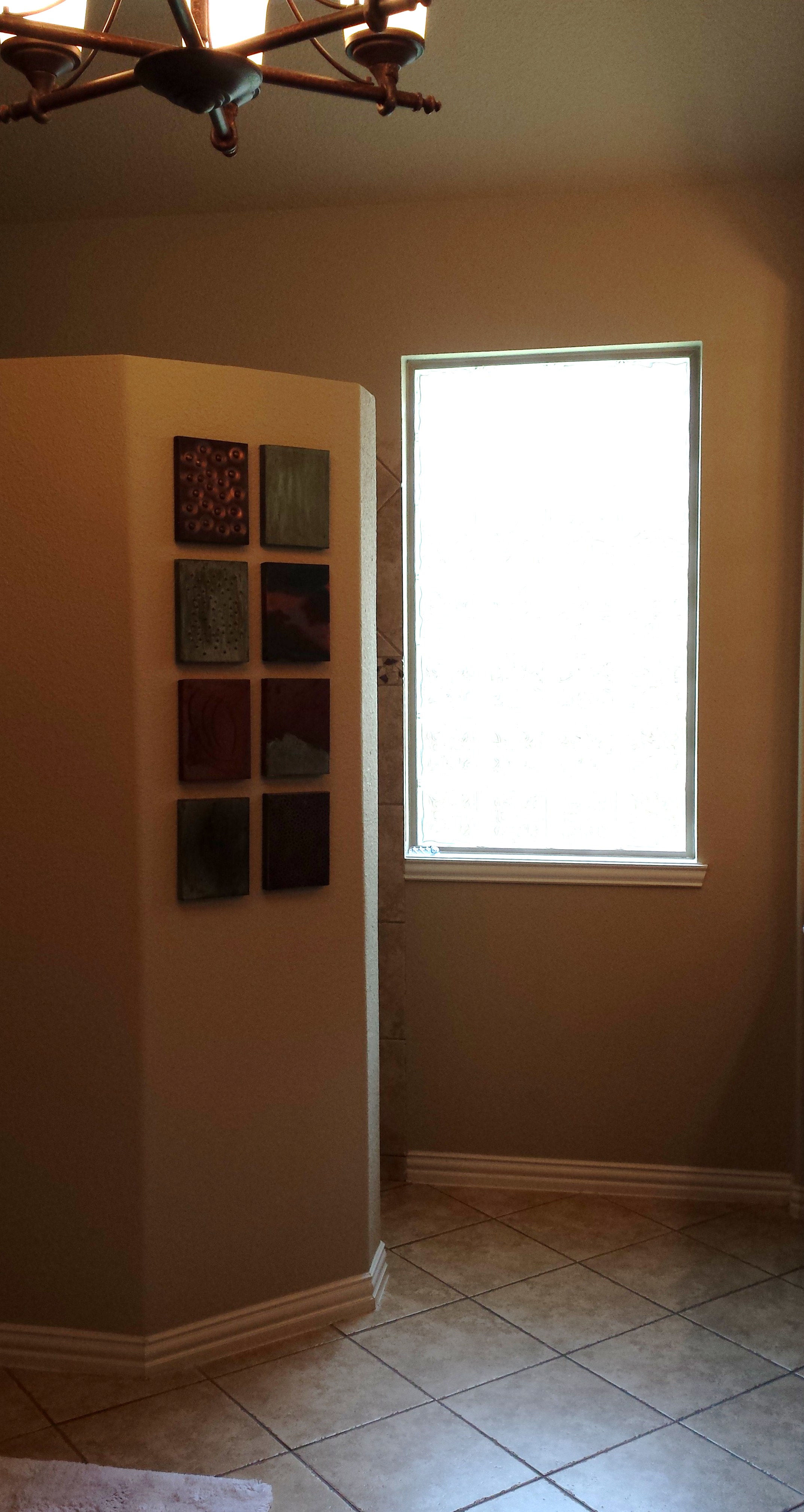
We removed the arched openings at the vanity and tub to open up the space to the ceiling; we smoothed all the walls to get rid of the heavily textured look; we designed a new, sleek vanity style with tall mirrors and those stunning pendants; we used more clean-lined materials with some glass tile insets to provide color and interest; and we designed a niche or two to provide a little storage for some plush towels and such. Also, we opened up the shower a bit by tearing out the sheetrock enclosure and using glass.
I feel like the space is now able to breathe. No longer does it feel confined, stuffy, tired, and heavily textured. It now feels open, spacious, spa-like, and restful — you know, just like...
The type of result you should expect after having remodeled in a big way. ;-)
AFTERS
A Master Bath Makeover!
PROJECT DESIGNER: Carla Aston | PHOTOGRAPHER: Tori Aston
Here's the rest of the house:
I’ve got my handy Bathroom Design Guide to share here today. If you need some help planning your bathroom remodel, my project checklist can serve as your go-to source so you don’t leave anything out and can thoughtfully design the bathroom of your dreams!
Click Here >>>> Bathroom Design Guide
Want my sources on this project? I have links to the lighting, tile, plumbing fixtures, etc. provided for you all in one sheet. Subscribe to my blog, below, to get your copy immediately.


