This dated kitchen was rather sad…..dull, dark and very brown. The homeowner wanted to give it a light, bright makeover with some stylish elements and a more open feel.
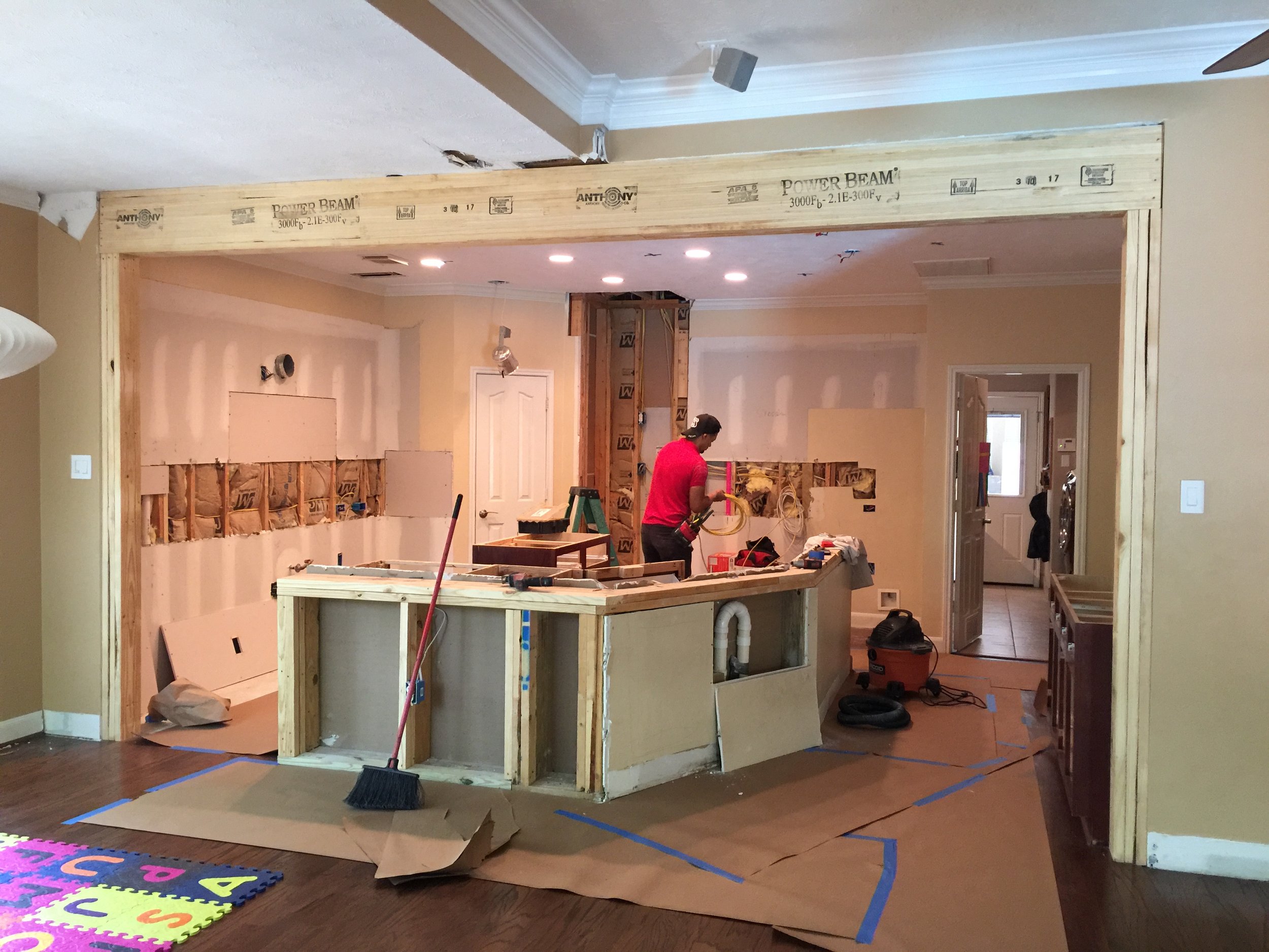
The number one feature of this kitchen that had to go, was the column.
BEFORE - Kitchen remodel w/column that had to go
That column blocked the view from the sink to the back garden. It really served to wall off the kitchen from the adjacent family room and made serving the family at the bar, difficult. Removing the column was the main reason for this remodel.
If you've read my blog, you know how much I love to make sure you address the thing that bugs you the most about your space, when you remodel.
By adding a beam that was then sheetrocked to blend into the ceiling for a more seamless look between the two spaces, the contractor, Knepper Enterprises, was able to get the support we needed and create a much more open space for the homeowner.
During Construction Remodel
We very nearly gutted the whole kitchen. Only a few cabinets and the wood floor were left after demo. Since the floor went everywhere downstairs, the homeowner didn’t want to replace it, so we kept the basic footprint of the space.
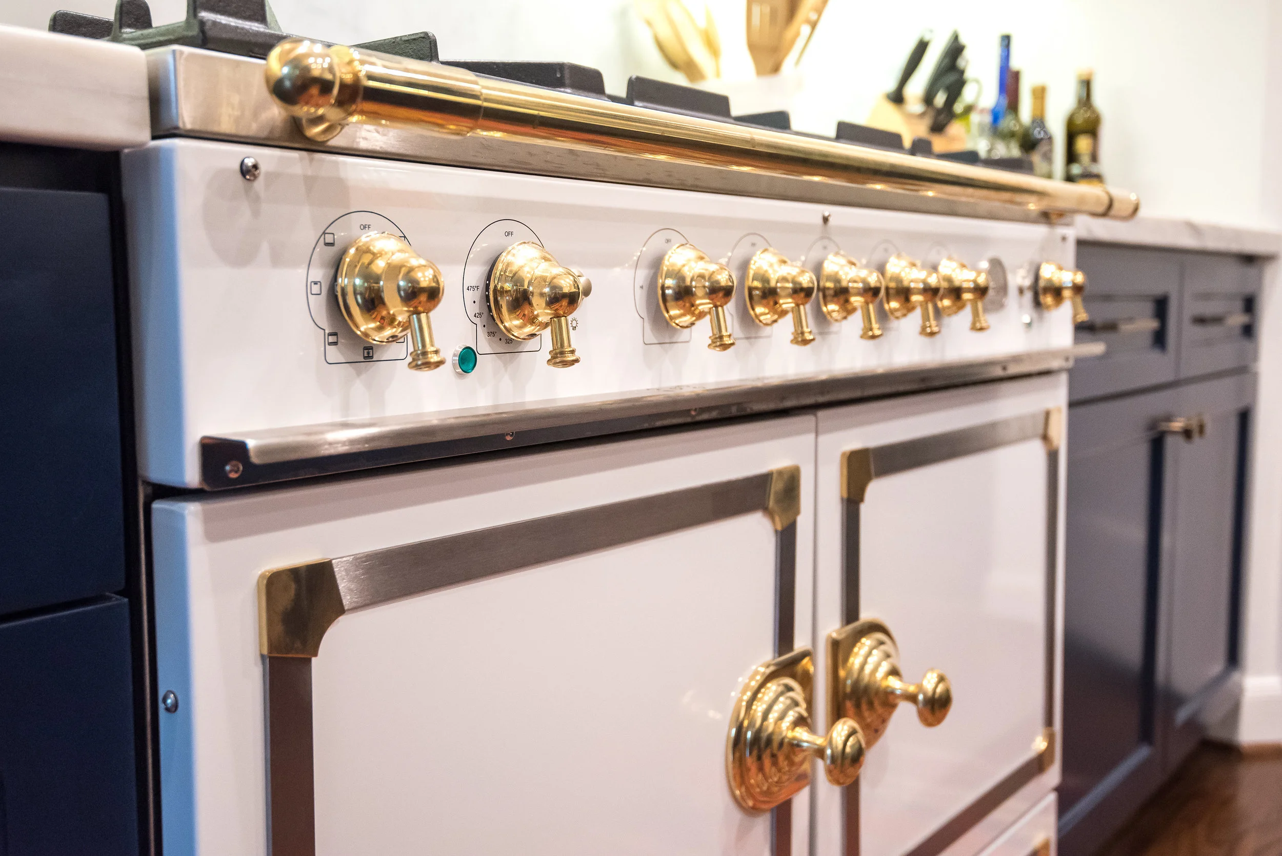
We did a little manipulating to get some better storage, a more functional eating bar, and make room for the star of the kitchen, the La Cornue range!
Navy and white kitchen remodel with La Cornue range - Designer Carla Aston
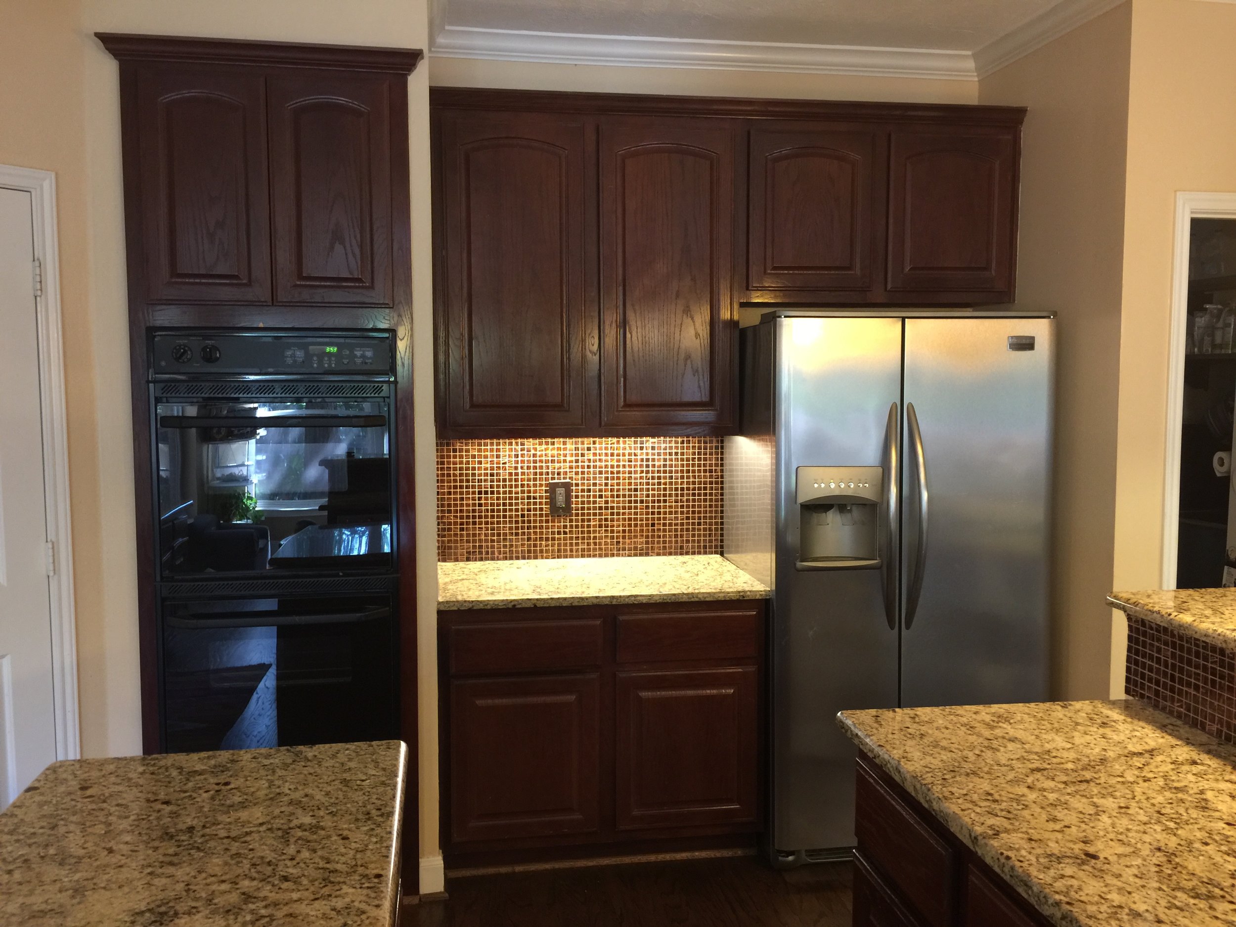
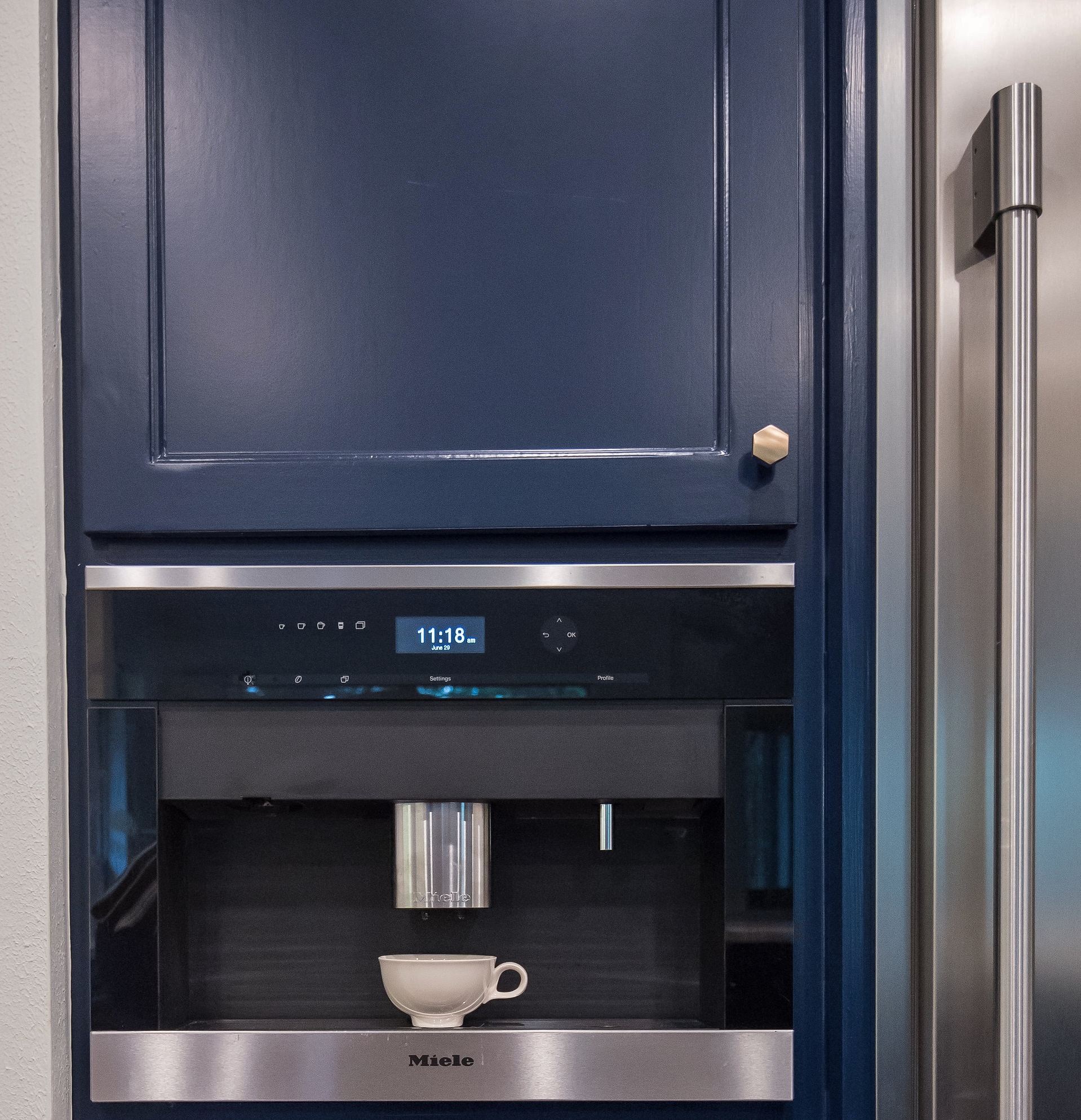
The wall ovens were removed along with the sheetrock surround (since we were getting the range) and a nice coffee bar area was created back on the fridge wall. That Miele coffee maker is a such a sweet luxury!
BEFORE - Fridge wall of kitchen remodel with wall ovens
Fridge wall with new Miele coffee maker - Designer Carla Aston, Photo by Lauren Giles
Coffee bar area with wine fridge - Carla Aston Designer, Lauren Giles Photographer
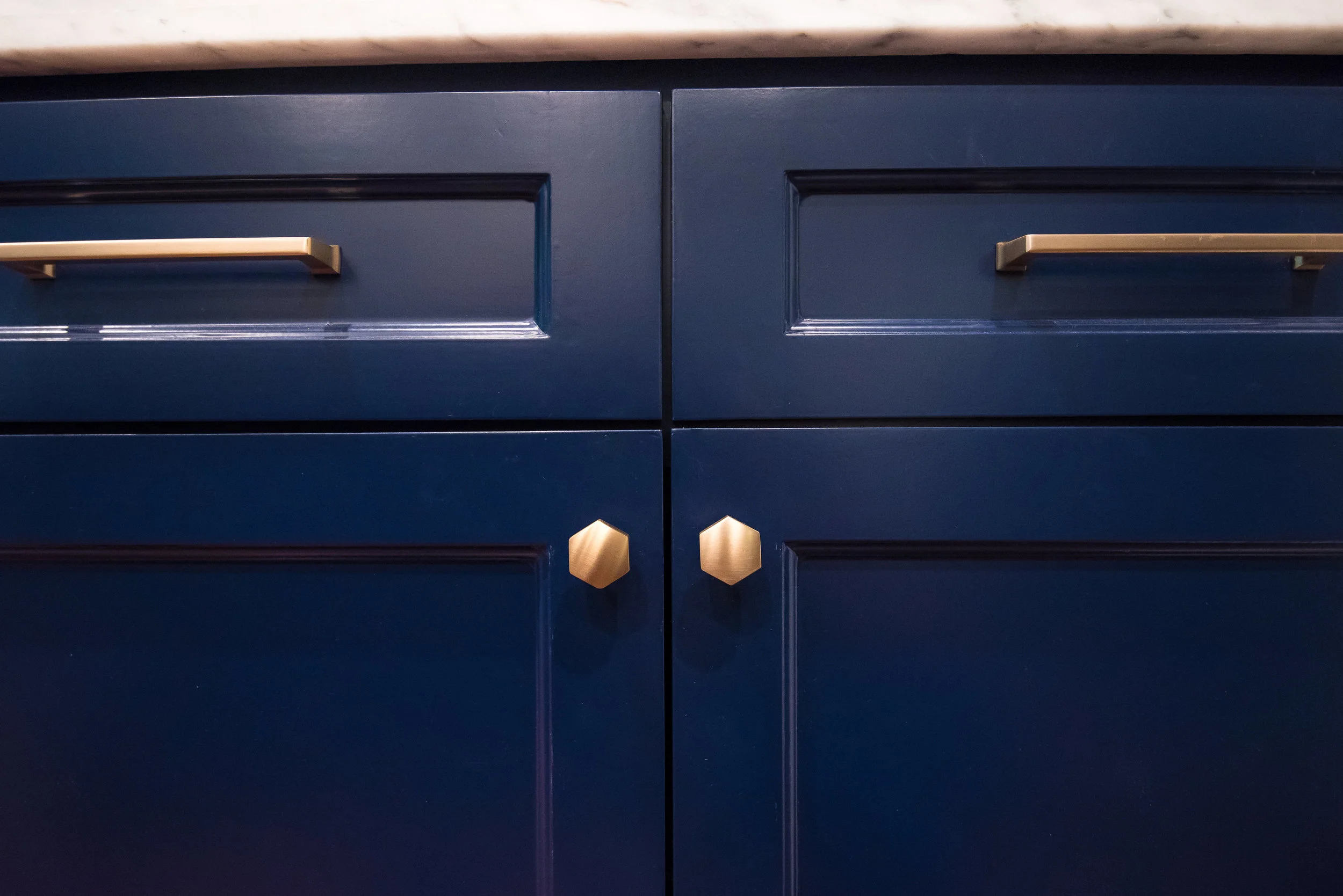
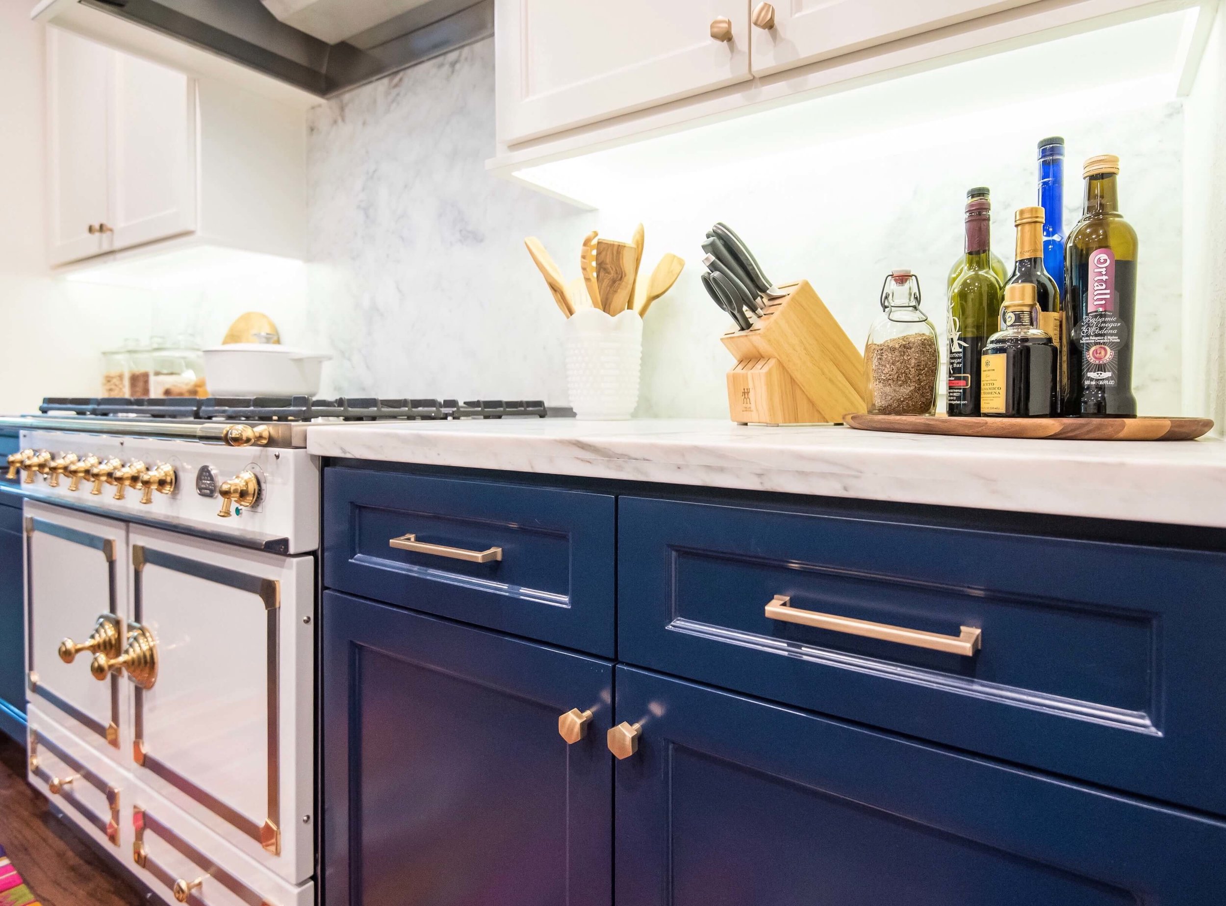
I mentioned stylish, didn’t I? Enter the navy blue lower cabinets with some bright white uppers above. The brassy hex cabinet pulls have a modern, clean look for the transitional style cabinetry.
Navy cabinets with brass hardware brought this outdated kitchen new life. Carla Aston, Designer | #navykitchen #kitchendesign #kitchenremodelideas
The homeowner wanted white marble and that’s exactly what she got. It reflects light around the space and contributes greatly to the new brighter look.
White marble countertops - Designer Carla Aston, Photographer Lauren Giles
We kept the small desk, but updated the uppers with full height closed storage on top of the adjacent cabinetry and then some open shelving above the desk. I shared a bit about the remodel of this area HERE.
That countertop was a catchall for everything and always cluttered. We designed some closed storage to keep it all neatly managed and then opened up the space above the desk for some personality.
BEFORE - Desk Area
Desk in the kitchen with open shelving above - Carla Aston, Designer #navykitchen #whitemarble #kitchendesign
I’m loving the navy and white and especially that La Cornue! It’s a thing of beauty and no doubt the star of this kitchen. :-)
AFTER - Navy and white kitchen remodel with white, La Cornue range - Carla Aston Designer #lacornue #kitchendesignideas #navykitchen
AFTER - Navy and white kitchen remodel with La Cornue range and white marble countertop / backsplash | Carla Aston. Designer #lacornue #whitemarble #navykitchen
AFTER - Navy and white kitchen remodel - Carla Aston, Designer #lacornue #whitemarble #navykitchen #kitchendesign
Navy and white kitchen with La Cornue range and colorful rug - Carla Aston Designer
So, just to refresh your memory.....here's the before.
Before Kitchen Remodel - brown and dark
And here's the After.....
Navy and White Kitchen Remodel After - Carla Aston Designer, Lauren Giles Photographer
Contractor: Knepper Enterprises
Photographer: Lauren Giles Photography
Can't hire me to do the design of your kitchen? Check out two of my e-book guides below, for some tips to help you through the design process. There are more at this link.


