I’m getting lots of questions coming in about final design touches these days, like with this kitchen / dining space I’m featuring today. Many times people can get a good idea of the big design elements in their rooms, but have trouble finishing them off.
That’s fine with me because I love doing this for them!
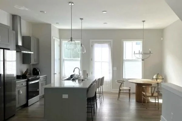
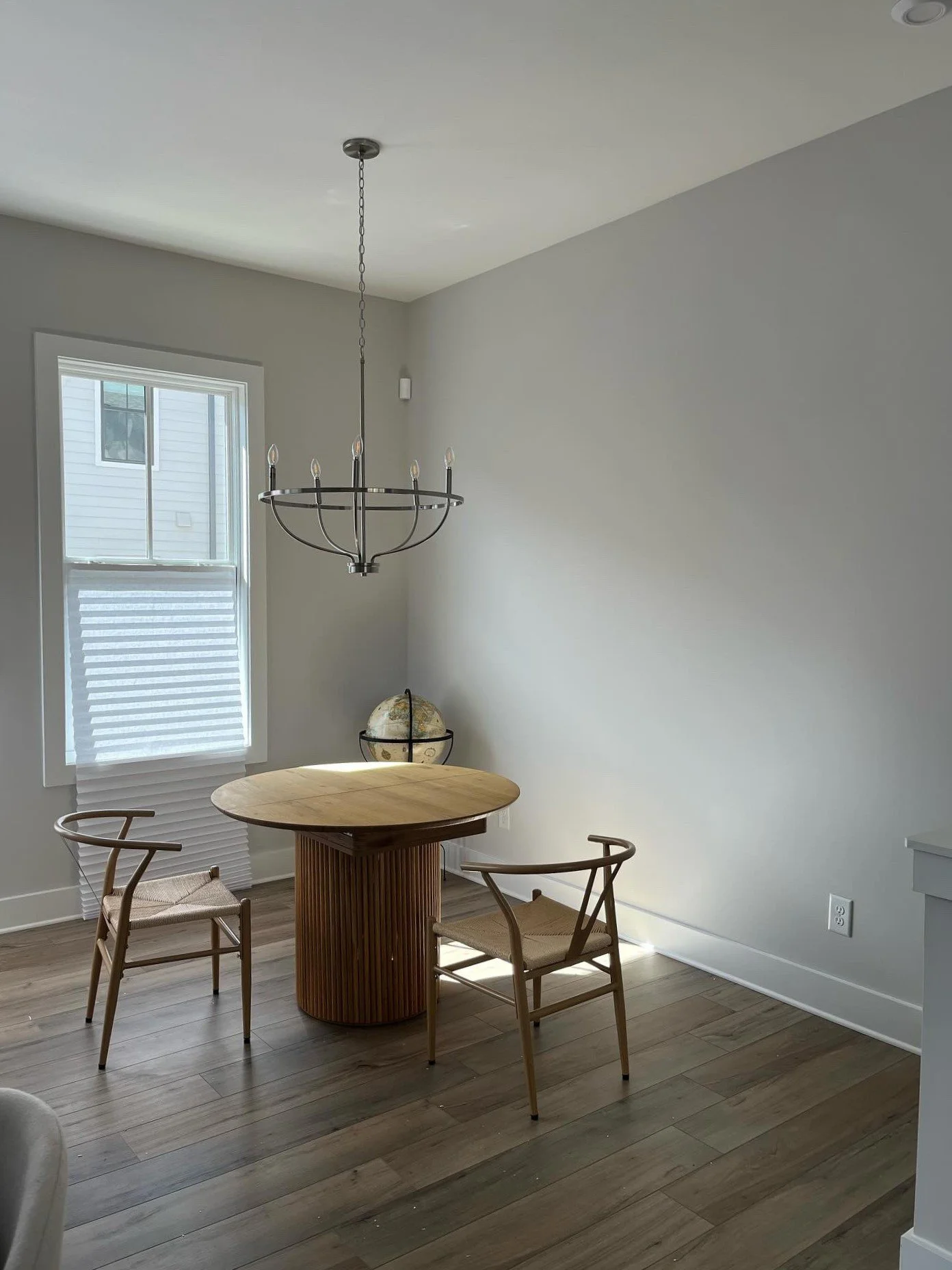
In this case, the kitchen was done, there was some furniture in the dining space, but it looked unfinished and the areas didn’t seem to relate to each other. The homeowner liked a modern aesthetic, as you can see from the furniture choices and the clean look of the kitchen design.
So, how to finish this off? Well, I definitely had some thoughts.
My blog contains affiliate links. Any purchases, at no additional charge to you, render me a small percentage, are most appreciated and make this blog possible. :-)
Adding Color to the Dining Space
First of all, the dining space feels really bare, and the homeowner definitely wanted something for the big wall here.
I felt like we needed some color overall and to bring the warm wood color tone into the gray kitchen.
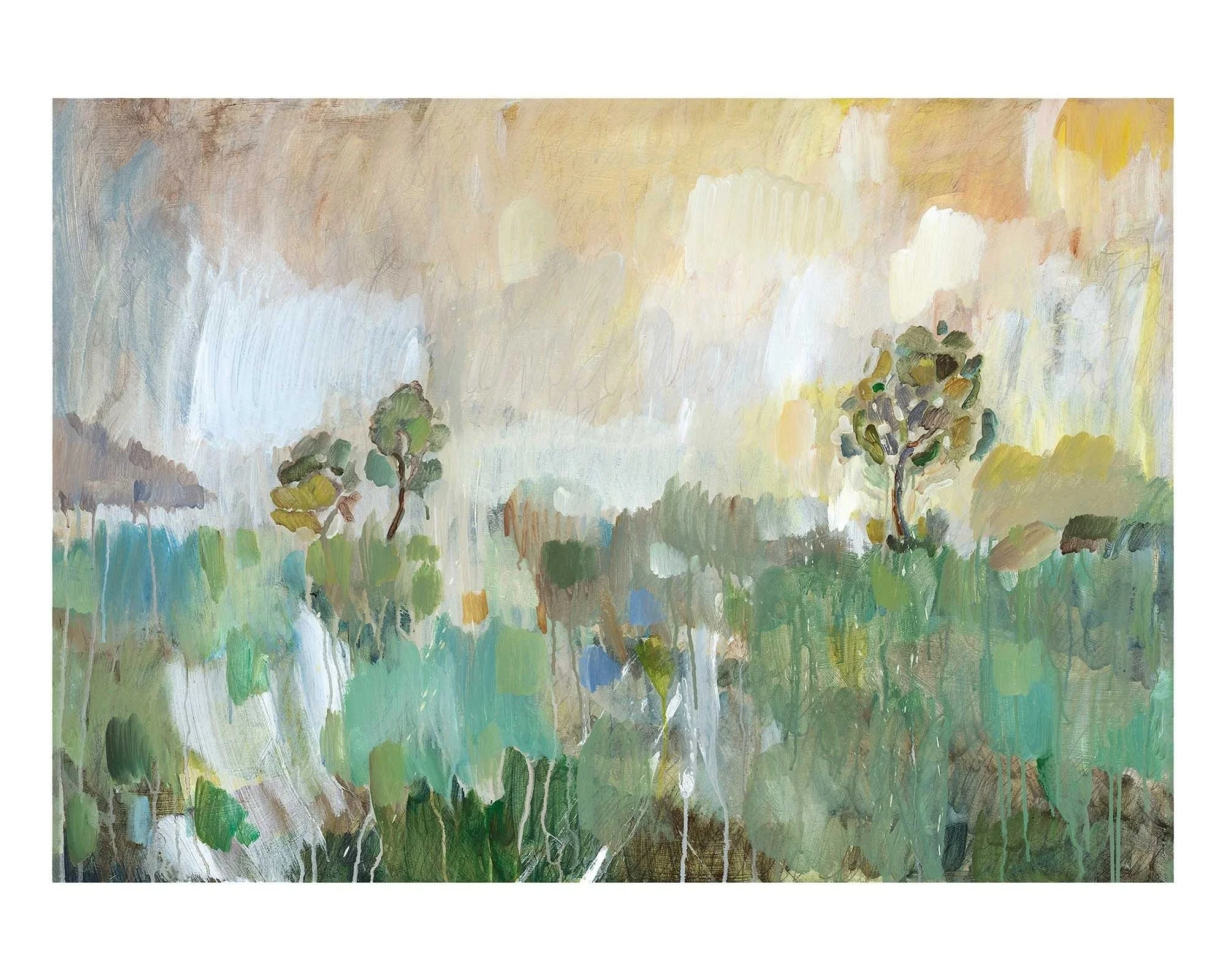
I started with the art and green worked nicely here. This piece marries green with some of the warm wood tones she has along with some gray too. It’s 60” wide x 42”h, so a big piece as well.
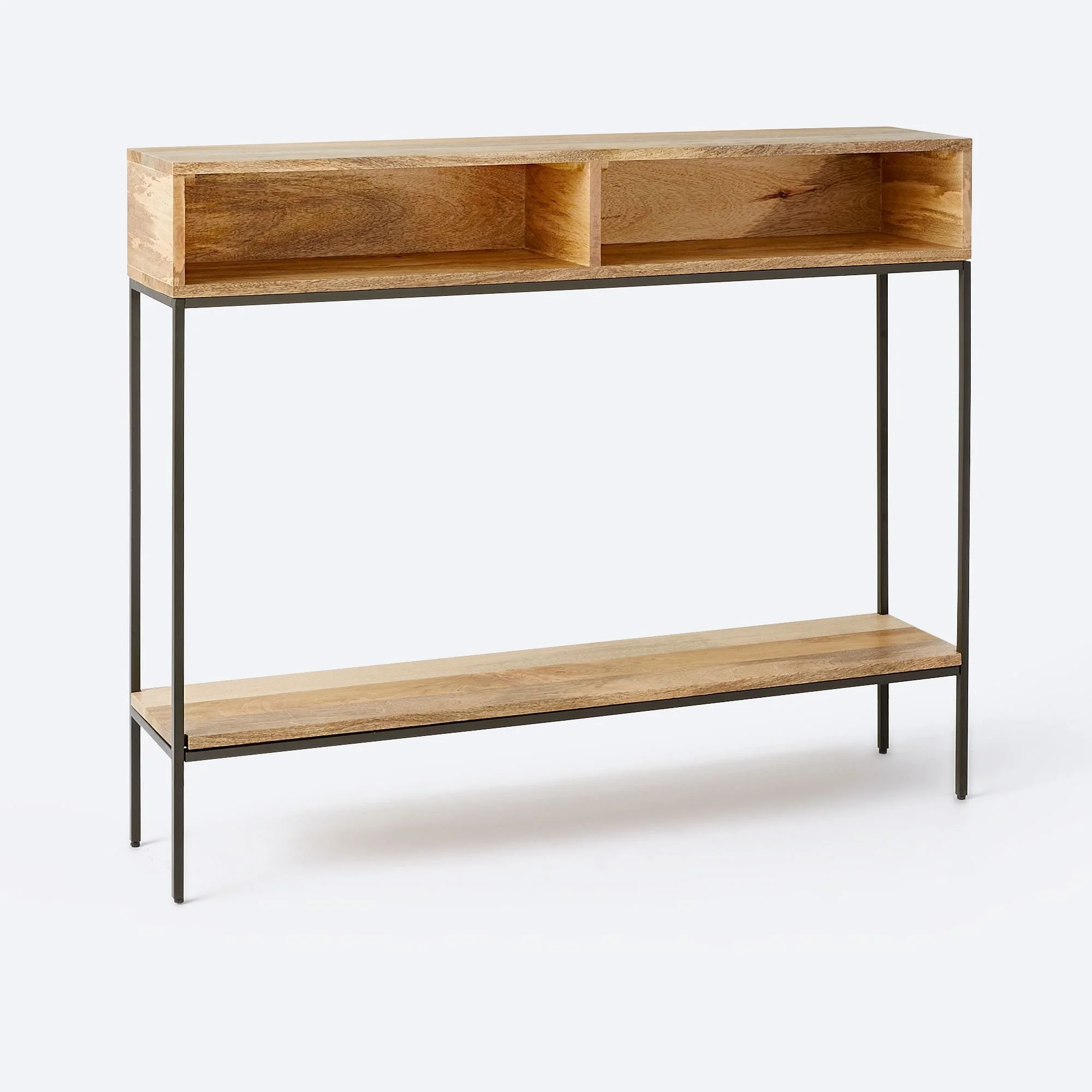
I would love to put a console on this wall, but if they leave the chandelier where it is, then there really isn’t much room. If we did anything, it would have to be really narrow, like this 9.5” deep console. It’s 42” wide, so I’d do two of them butted together, to make for a wide console below the artwork.
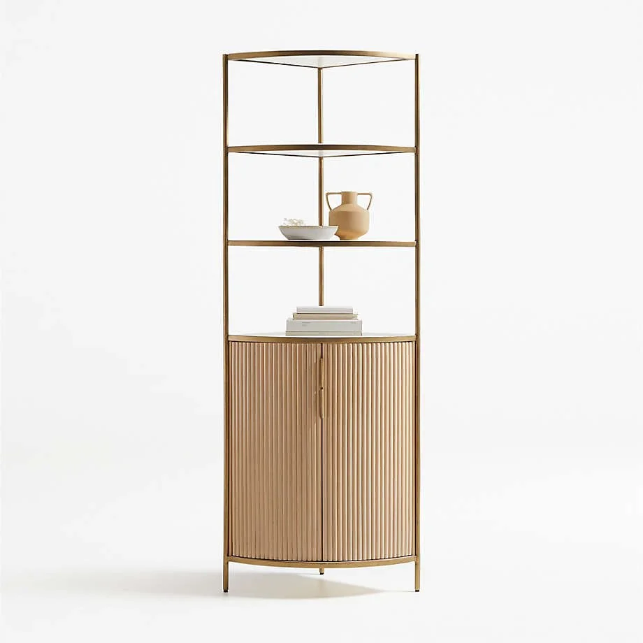
If she just didn’t feel there was enough room for that though, then a corner cabinet would be nice to add some height and be able to accessorize. Something like this one below.
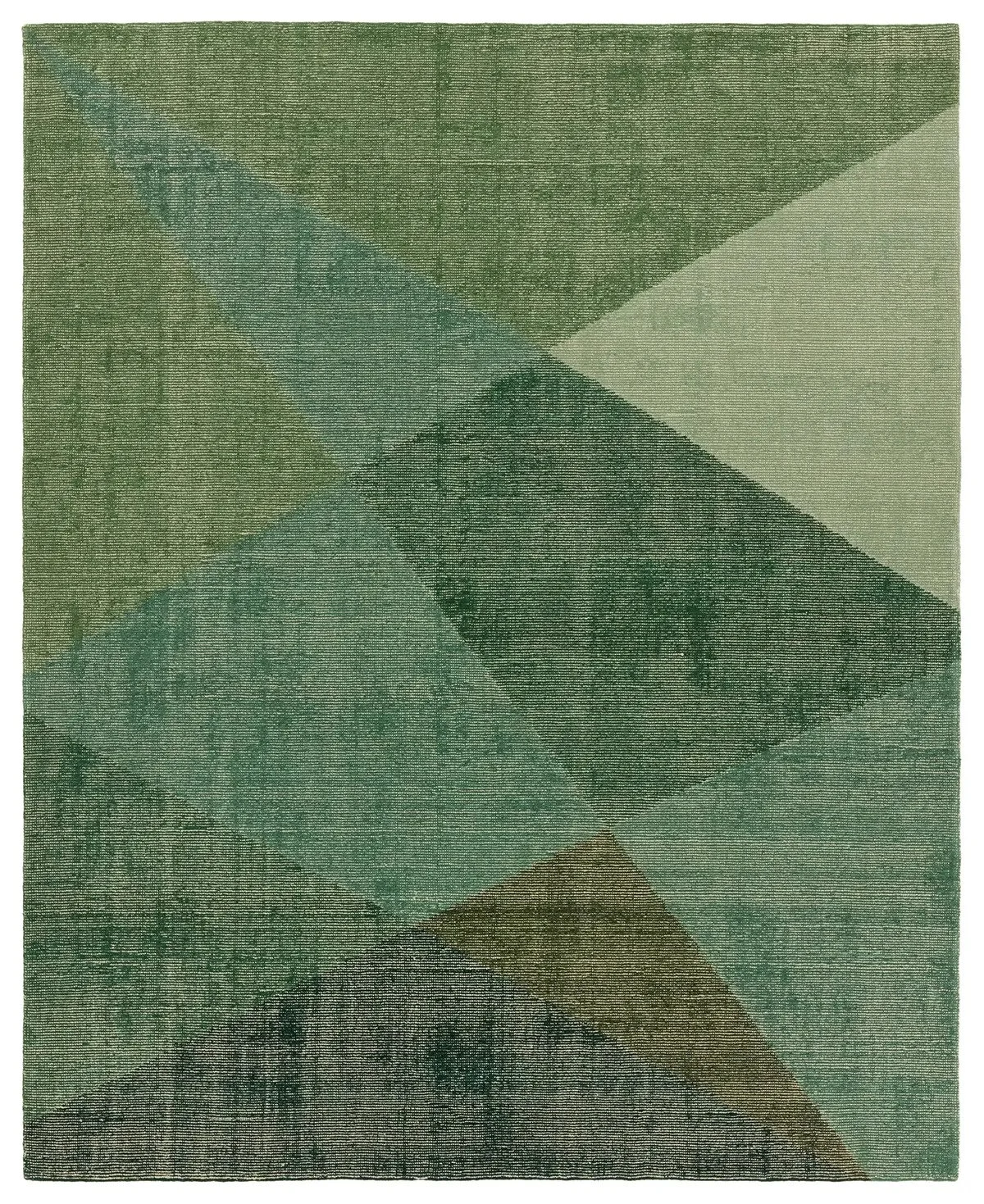
Next, I’d add a rug over here…..something green, of course.
A few vases and cookbooks on the shelves with this bowl on the table.
And here’s how all that works out put together.
Dining room options to add color to a gray space.
Adding warmth and color to the Kitchen
Now, let’s see how we can bring that color and warmth over to the kitchen side of the room.
Here’s the room now.
We need window treatments, so I’d go for shades as there is no room for drapery to stack over on the left side. Also, I think drapery can look fussy in a kitchen type space.
This fabric from The Shade Store looks great in a Roman shade. It’s Pinwheel, Lagoon.
Next, I think I’d change out the pendants. We need more going on in this area, not less, and the glass sort of disappears for a minimal look.
Here is where we can add warmth, with this woven type of pendant. It’s a substantial size at 20” and I like the brass for even more warmth.
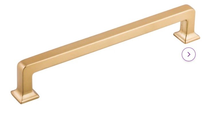
I would consider changing out the cabinet pulls to a brassy finish. I love to put warm finishes on top of cool toned cabinets. These are honey bronze, from Top Knobs.
Next, I’d add a warm oak wood bookcase at the end of the island. Obviously, there is plenty of room and I never love a flat panel on the end of an island. It just feels unfinished. Come on builders, you can do better! :-)
I do like how this adds warmth to the island. She can fill it with cookbooks, baskets that can hold “stuff”, vases, etc. The top might be a great place to have a charging tray since there is an outlet on the island side wall there.
I’d add some statement accessories on the island, a green vase and then a wood bowl. It sort of could block the view of the kitchen sink too.
Lastly over here, I really like this Spicher vintage vinyl rug. If you’ve never seen these, they are actually like vinyl flooring, printed out in all these amazing patterns and colors, coming in all various sizes. These are, of course, wipeable, just like regular vinyl flooring, so great for kitchens.
Here’s how all that looks together.
And here’s a mock up of the space, sans the big rug. I couldn’t get that to work in the photoshopping I did, although I would love to see that in the dining space. :-)
I think overall, it feels more cheery and inviting.
Adding warmth and color to this gray and white kitchen / dining space with warm wood tones and green accents.
Do you need some finishing touches in one of the rooms in your home? Are you having difficulty relating one space to another? Do you need a few furniture and decor recs from a seasoned pro?
Then my Designed in a Click service might just be the one for you. :-)
Shop the post, below!
This blogpost was thoughtfully written by me, Carla Aston, and not by AI, ghostwriters, or guest posters.

