I’m sharing a guest bathroom that came in through my Designed in a Click™ service today. This one was a little tough for me to get started, as the homeowner gave me a lot of room to interpret the design direction.
Don’t get me wrong, I like that when homeowners don’t have all their design decisions made and just want me to put it together. I love when they are open to design ideas they hadn’t thought of before.
Once I got started though, it really developed into a cool transformation that took best advantage of the space and included some design tricks to make this room feel larger than it really was.
Take a look.
Guest Bathroom Before Pics
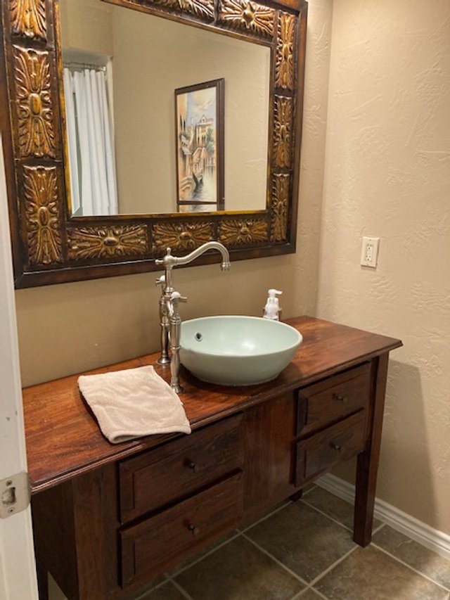
This is a typical secondary bathroom, with a shower in a tub. They wanted to get rid of the tub and do a walk-in shower and relocate the toilet to the wall by the sink.
Before pic - guest bathroom
Before pic - guest bathroom
Floor plan of proposed bathroom layout.
Design goals for this guest bathroom redo
Save this for later reference when you are looking for a quick, painless way to achieve good design for your home.
Homeowner - I am looking to redo a very small bathroom 5’ x 8’4”. Design look will lean more to casual/masculine. This is in an area off the main entrance, the small hallway opens up to bathroom, study and guest bedroom. The toilet will be moved to share the wall with the sink. I want to have a suspended toilet and a curbless walk-in shower if there is enough room.
My dilemma is how to make such a small space functional, and how to make it cozy with all that tile and glass.
1. Can you make suggestions on places for toiletries, towel and toilet paper storage?
2. Shower Glass - stationary glass panel with open area for access or panel and door? Material: Clear? Obscure? Textured?
3. Is it a good idea to use the same tile on all floor surfaces including shower?
4. any tile ideas to help get a cozy look. Halfway up the wall all around, just shower area? Large tile or subway type? Light/dark? Etc.
Basically, this bathroom, except for layout, needed to be designed. Some direction on tile, storage, overall finishes, etc. needed to be addressed.
Here was my response:
Tile Finishes
I think keeping the finishes all similar will make the bathroom seem bigger. I'd like to blend the floor and walls and then do black accents for that sense of masculinity and a more casual vibe. I’d break up the overall color then with some bright white marble to add some contrast and elevate the look.
The tile I've got here is a textural, woven look tile that comes in a 12 x 24 and in the smaller 3" x 4" rhomboid shape that I'd like to do in the niche in the shower. Since you are doing the curbless shower, then the 12 x 24 tile works fine here.
12 x 24 tile for floor and walls, laid horizontally.
Rhomboid 3” x 4” tile in shower niche, laid vertically.
I like the sort of craft-paper-type color scheme with black and white to add crispness. The touch of white marble will add a luxury look. The tile is porcelain and really durable.
Vanity
I've got a 24" wide vanity that you can buy online, I like the black finish. It has a cultured marble top, which isn't real marble, so I would get a Carrara marble top locally as a remnant piece for the vanity top to present a nicer look. Do the three strips at the shampoo niche and the ledge at the vanity, out of the same marble material.
You won’t need a marble splash, as I’ve designed the bathroom with tile there.
Here's the vanity. You can also get something like this made by a carpenter, but this is well priced and the drawer with the cutout for the p-trap is nice to have.
Shower Enclosure
I think your bathroom is too small not to have a door on the shower, since you are doing curbless. There would be water out on the floor of the bathroom without a door. I like the black accents with a grid on the shower glass wall, to add some interest. These look like steel doors and that will add a quality look to the space.
Black framed glass enclosure for shower stall in guest bathroom. carlaaston.com
Here’s a sliding door version, similar look. This would keep the door from opening into the room.
Plumbing Fixtures
Follow that black finish with the Kohler Purist plumbing fixtures in black and an Infinity linear drain that will run the full length of the shower at the back wall.
Mirror and Lighting
I really like the vanity wall reflecting the shower with the white marble ledge at the same height, and then mirror to the ceiling from there up. The vanity light fixture would be mounted on the mirror.
I also have a nice masculine black finish ceiling mount light fixture that would look cool in there too. (Of course, you need a vent fan there as well, which I imagine is already there.)
I would paint the ceiling the same color as the wall, so the color wraps the room. I'd like the paint color to match the tile, whatever tile you might end up with. I have this color in there on the board, but I don't physically have that tile sample so I'm not sure if it would match the tile in real life. You'll have to check that with what you land on for the tile.
I furred into the bathroom space on both sides by 4" to create the ledges, as you do have space there to handle it. I just like the extra shelf space that gives you there and it makes the room more interesting and allow space for soaps and other products.
There's not much space for storage. The only extra place is above the toilet, but I tried that and it just feels so chopped up that way. I really love how the vanity wall repeats the shower wall.
There is room for toilet paper in the vanity and you can do a basket of towels too, over by the shower. I like the idea of a row of hooks rather than a towel bar.
Here are my sketches and moodboard for this guest bathroom.
Project Sketch - Guest Bathroom Remodel | carlaaston.com
Project Sketch - Guest Bathroom Remodel | carlaaston.com
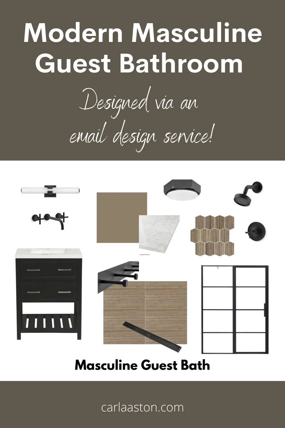
Moodboard - Masculine Guest Bathroom Remodel | carlaaston.com
Designed in a Click™ Design Service Offering
I’ve changed up my Designed in a Click™ service offering these days. These more thorough, in depth responses where people want multiple selections are becoming very involved and take a lot more time than a quick Q&A.
While I know it looks easy, it takes some careful thought and a lot of time spent shopping for product on the internet for just the right combination of items. Even a small bathroom requires this amount of design time to get the design figured out and some products selected.
As a result, my sessions are offered at two price points now, a $450 level and then a $900 level. This design above fits into the $900 level, as there are multiple products to be selected and the design of the whole space was taken into consideration.
Here’s another example of a session that would be in the $900 category.
This is now spelled out on my service offering. Basically, you can submit and pay the $450, but if I think it will take me more time, I will ask you to pay again to total the full, larger amount.
These are basically eDesign projects and I spend several hours on them getting all questions answered and selections made, sometimes up to a majority of a day. Hence the additional fee. Any follow ups or revisions/reselections can be done with another purchase of the $450 amount.
If you are considering this design service, you can find out more about it here. :-)


