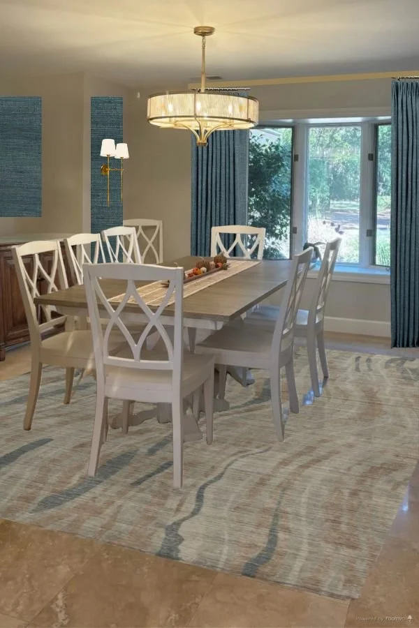
In this recent Q&A consultation, a Florida homeowner felt her dining room was lacking some style. She had just purchased the dining table and chairs and this relatively new home, for them, had travertine floors throughout, so they would stay.
She wondered about the built-in cabinet though and the art and what else she could do to make this room look more designed.
Here are the pics.
My blog contains affiliate links. Any purchases, at no additional charge to you, render me a small percentage, are most appreciated and make this blog possible. :-)
Here’s a photo of their recently remodeled kitchen through the opening. Beautiful!
Recommendations for Adding Contrast and Color to Dining Room
I think we need some contrast and color overall. It just appears all too light.
First of all, let’s look at the back wall with the built-in. It appears to me that it was an older cabinet with an upper, but at some point someone took the doors off.
I would remove the upper and lower cabinet here and I feel like we need some stained wood, to match the kitchen in here. That would create some interest, add richness, and relate to the kitchen.
I would just say remove them and get a stained wood console here with storage, but I imagine that the travertine goes up to the edge of that built-in and stops. If so, you don’t want to mess with adding flooring in there, I’d just install cabinetry, just like the kitchen cabinets, but with a wood top. It will look more like a piece of furniture.
Then I’d do one cabinet pull in the center of each door, to uplevel that look.
I’d like to do something with that entire wall, the two side spaces are needing something too. I love the idea of adding moulding in boxed shapes on the sides and above the cabinet and installing some grasscloth wallcovering to add color and texture.
I do love their art, so something that works with that and the color of their sofa, as a grasscloth, would be nice.
This Candice Olson grasscloth looks good, but always sample things in person before you buy if you can! I’d do some draperies too, to match the color of the grasscloth.
I’d also love to do wall sconces there on the side walls. These would work well with the fixture they have. They’re scaled perfectly for those walls and the shade and simple style works well here.
Here is how this elevation would look.
You can see I added a rug, I’d do something light, as I don’t normally like dark rugs on top of travertine. I think this rug, from Barclay Butera, would work with their living room rug.
Next, let’s address the chairs.
I like the backs and we want to show those off. Against the dark wood and some of the color, they will stand out. However, I think they need some cushions.
I always like cushions in a dining room. I understand in a breakfast room they are easy to wipe down without them (although I usually do vinyl then), but cushions are so much better if you want people to stay longer. Honestly, when I look at restaurants to eat out, I look at photos of the dining room and assess if the chairs look comfortable. :-)
I really like the way this client’s chair cushions turned out with the small tailored skirt. My goal here is to add as much fabric into this space to soften things up. These cushions achieve that and they feel more elegant than just a cushion on top of the wood seat.
I like this fabric for the cushioned slipcovers with its small scale pattern.
So, here are all the new elements put together.
Proposed last layers for a designed dining room. carlaaston.com
And here is a photoshopped rendition, sans the chair cushions as that is above my skill level! :-)
Proposed last layers for an designed dining room. carlaaston.com
I think all these elements will give this dining room a designed look that will last for years to come!
Want to see more of my dining room consultations? I have a few below to peruse.


What to do with this blank dining room wall with no space for a console behind the table?
After my post last weekend, where I asked for submissions for blank wall dilemmas in your homes, I received some I thought would be interesting to share. This question and photo was one of them. Click through to see what I proposed…