At one time or another just about everyone has this problem:
What should I do with this blank, boring wall?
Maybe you’ve moved into a new house and don’t know what to do with it; maybe you’ve been living with this situation for a while and can’t find a solution; or, perhaps, you have been shopping and collecting ideas, yet you still aren’t sure what’s best for your wall.
It’s always good to begin with a plan.
Lately I’ve had a couple of Designed-in-a-Click consultations, as well as a regular project, where we had wall space that needed some kind of design or treatment. These walls looked lonely, blank, and needed some attention.
Take a look below to see how I advised them.
Homeowner #1
This homeowner called her huge, blank living room wall an “eyesore”. She didn’t know what to do with that mirror or how to address the wall above the sofa.
Befores
I felt like her sectional sofa was sort of crammed into that corner. The furniture wasn’t crowded in that room at all, so I suggested she pull it out of the corner about 12 - 15”. That will let the window treatments have some space to hang, and then she could put a simple console behind the sofa, against the wall.
I suggested some large ginger jars on the console. (That’s kind of like hanging art there, as it contributes to the composition of the wall decor.) I liked a grouping of four art pieces — these can be photographs, but I like landscapes, abstracts, botanicals, or whatever speaks to the homeowner best.
Then I suggested a boom-arm style lamp to give that corner some structure and interest. It would work well to light the art and that corner of the room, too.
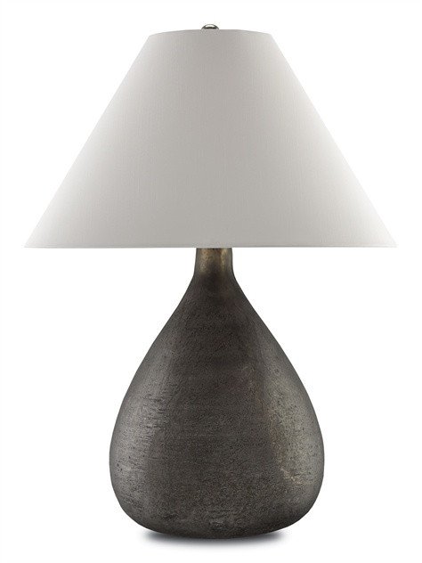
Finally, she could hang the mirror above the round Pottery Barn table and create a vignette there. I would add a chunkier, dark lamp with a shape that sort of reflects the table base. It would make that a nice vertical element on the end of that wall. The mirror can reflect the light from the lamp and, because the frame is light, it will not dominate on the wall, visually, but, instead, fill it nicely.
I kind of like how there are two zones for the wall decor, as this approach can really help fill up a wall. When you relate the wall decor to what’s going on below it or in front of it in the room, it’s a natural connection to the space and your eye sees the “grouping” as a whole.
Here’s my simple sketch:
Here’s the lamp or type/look of lamp I suggested for the round table:
Here’s a cool boom arm style lamp that would work in the other corner:
Homeowner #2
This homeowner had a huge wall with tall windows, and a big TV in the only wall space in between. How will I make this work? Let’s find out.
Before
I love tall window treatments that connect the lower space in a room to the high ceilings. If you use inexpensive, linen look fabric, it doesn’t have to be too pricey. (Obviously, that depends on your point of view.) We are trying to make this wall look good, and I feel like we need some visual connection here, as well as some softness. Contrast and color would be nice, too.
This homeowner didn’t want a big furniture piece and, instead, wanted the TV to remain on the wall. And, quite frankly, the TV was so big that it couldn’t have had much of a furniture piece around it without blocking the windows and appearing too massive. I did a low cabinet there, and I added a sunburst medallion wall decor piece above to accent that space. I like the round shape in the middle of all the geometry and boxed shapes on the wall.
Doesn’t it now feel “designed”? :-)
Sketch windows and tv | Click to enlarge
Here’s an entertainment center and wall decor piece that would work. I like the fact that the entertainment center is black, so it will blend visually with the TV, when off.
Homeowner #3
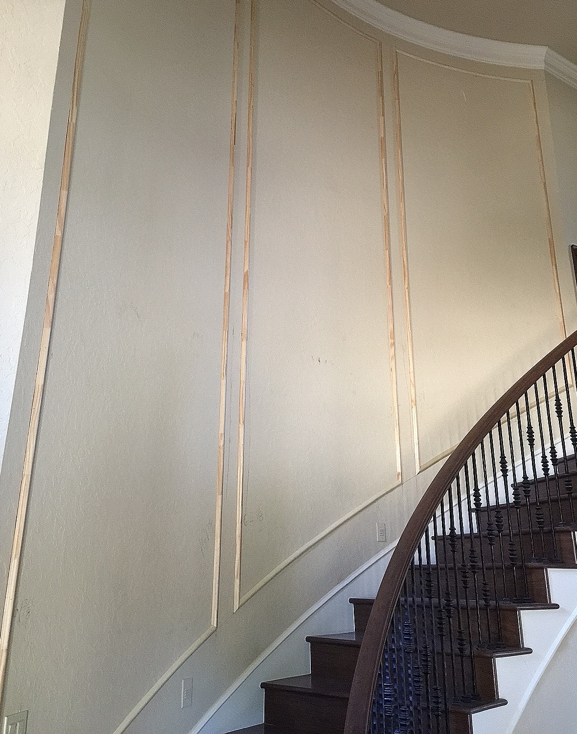
This is one of my full service client projects. This was a massive, two-story curved wall in their entry that was crying out for some attention. I didn’t really want to amass a bunch of art pieces here. My client had asked about paneling the wall, perhaps using a wainscot. That would be good but, with the curve, the height involved, and the sort-of Mediterranean style of railing, I preferred to address the overall space with a subtle pattern, framed with moulding. (This is kind of a sneak peek, and the photos are from my own Iphone on the job site. No pro shots yet!)
Before
Entry Hall Stair Wall - in process, with moulding applied
Afters
Curved stair wall
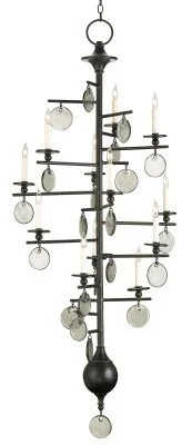
Here’s that gorgeous statement light fixture we used:
Do you have a unique trouble spot in your home?
Do you need some creative assistance? Do you need someone to look specifically at your wants, needs, and circumstances to come up with a plan of attack just for you?
Well then, I’ve got just the thing for you >>> Designed-in-a-Click.


