There are some rules to decorating, but if you peruse the high end magazines and projects of top notch designers working these days, you soon realize that rules are often disregarded. Whether it's done for personal taste, dramatic impact, or simply to do something unique, rules in decorating are often made to be broken. This is when decorating becomes art and in the hands of a real designer, it has incredible results.
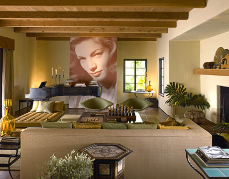
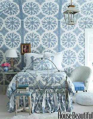
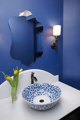
Scale is one of those elements that can be toyed with to create real drama. A large object in a small space or a small object in a large space can really command your eye and focus your attention. If you want a relaxed, peaceful, calm interior, scaling something to fit the space is very appropriate. However, if you want some drama or to create a really personal, artistic statement, try over or under scaling an object of importance in a space.
Dick Bories and Jim Shearron - Elle Decor
Doesn't that small, beautifully carved clock command attention in the vast expanse of all that white?
Patrick Printy - Elle Decor
The justaposition of the hefty brass candlestick on top of the tiny table arouses curiosity.
Susan Ferrier - House Beautiful
Is there any doubt that it's all about the chandelier?
Barry Dixon - House Beautiful
The large mirror makes a grand gesture. By comparison, the sconces are dwarfed, making the space seem even grander.
Steven Gambrel - Elle Decor
The vintage Italian light fixture is small in scale with the rest of the room. That scale dynamic emphasizes it's importance.
Jim Hodgins - House Beautiful
That piece of art above, reaching from sconce to sconce and from the ceiling down past the top of the sofa creates a strong visual in this room and commands your attention. Don't you feel you're in the presence of a real masterpiece?
Steven Gambrel - Elle Decor
What a strong, architectural presence the overscaled dentil moulding gives this room
Amilee Wendt - ASID Showhouse 2011
I loved this light fixture Amilee Wendt chose for the study in the showhouse I was in last spring. It was such a bold statement.
Jay Griffith - House Beautiful
Veranda
I love how dramatic this little lamp and table looks in the tall niche one would typically want to fill with art or stuff.
Anytime you break the rules, you must be careful it doesn't look like a mistake. In the hands of masterful designers, breaking the rules can become art.


