I received yet another question on where to end a kitchen backsplash from the new owner of this cute kitchen.
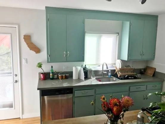
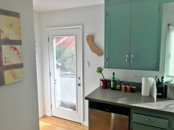
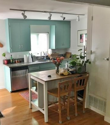
You can see that the upper cabinets don't line up with the lower on the end by the door.
If you've read my blog much or if you have my Backsplash Bible, you probably know what I'm going to advise here.
In this instance, I went a bit further.
Here was his question:
I was wondering where to stop the tile near the back door? I've thought to tile the entire wall, or just stop at the countertop.
He also wanted to know if he should do a dark grout with the subway tile he was planning to use.
Where to end this kitchen backsplash? A reader Q and A. #kitchenbacksplash #backsplashideas
Here's how I answered his backsplash question
The big problem I see is that the lower and upper cabinets don't line up on the window wall. Normally, I would say to then align with the upper cabinet. You can see examples of that in this kitchen backsplash post.
I'm also going to suggest something else here. I think that your cabinets are a bold and unusual color for kitchen cabinets. Not that I mind that, it is a nice color, it is just very eye-catching.
The contrast brings attention to the fact that the cabinets are not lining up.
There is high contrast created between cabinets and wall. You really notice that the uppers are symmetrical around the window, same width on both sides, and that the lower cabinet is not.
Now, the lower cabinets can retain the color, lower cabinets are not that impactful in a kitchen design since they are below the countertop and lower than eye level in a space where you stand and don't sit much.
However, if you painted the upper cabinets white to match the wall, you could get away with not calling so much attention to that discrepancy. It would make those cabinets not look so large in the space.
Where to end this kitchen backsplash? A reader Q and A. #kitchenbacksplash #backsplashideas
The cabinets aren't exactly brand new, and painting them that light turquoise color sort of accentuates that too. By camouflaging the upper cabinets, you take the focus off them and I think the space will feel bigger and more open.
Then you can tile just to the end of the upper cabinet and it won't be that noticeable.
The more you tile, the more money you spend and from a design perspective, I'd rather have you spend money on new upper cabinets really or .......(some other type of upgrade).
I would not use a dark grout here, as that works best in a situation where there is a mass of tile and the grid sort of stands out as a pattern or design element, like it did here in this bathroom I recently designed.
I think it would look too busy in this situation and you'd be better off just going with a more subtle look.
I would also take a look at this post, about the slab backsplash and how it might be good to remove it and tile from countertop to upper cabinet instead of chopping up the backsplash even more there with two different materials in an 18" space.
Have a backsplash question or two for me?
You'll probably find the answer in my Backsplash Bible.
If not, you can always hit me up for a personal answer to your question in my Designed in a Click service.
Please read more about how I answer questions on my blog here and then note the disclaimer policy at the bottom of my sidebar. :-)


