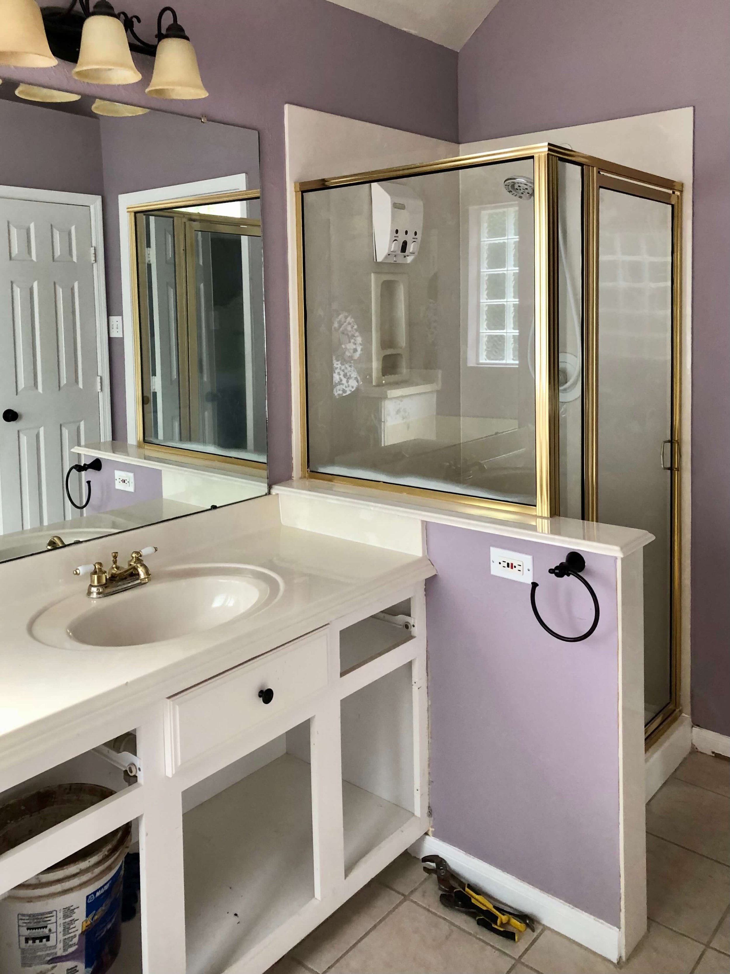
The before and after images of this bathroom remodel show a remarkable transformation, from a dated, builder basic bathroom to an eye-catching, modern retreat.
My blog may contain affiliate links. Any purchases, at no additional charge to you, earn me a small percentage, are most appreciated, and make this blog possible. :-)
before images of this dated, builder bathroom
BEFORE - Bathroom remodel | The window was removed on the back wall there and a double vanity installed.
BEFORE - Bathroom remodel | The shower area was enlarged and the vanity moved to the other wall.
I often hear this from homeowners......that they don't use the big corner garden tub. It just wastes valuable space in their bathroom and they want to take it out.
I've done lots of remodels where we have removed them, making way for more of what they do use daily, usually a bigger shower and more storage.
That was the case here, in this primary bath remodel too.
They also wanted something graphic and loved the idea of black plumbing fixtures and hardware. They weren't afraid to lose one of the windows or go a little bold with their look either.
We needed to fix some badly textured walls left from the previous owner and update finishes and fixtures, all within a pretty tight budget.
After the design, there were things we had to cut for the budget, a barn door in lieu of the double closet doors and a new window instead of the glass block, but the design remained intact and I think it turned out great!
layout was key in this bathroom remodel
When I first looked at this bathroom with the homeowner, we thought the shower would go on that back wall and the longer double vanity to the right as you walk in to the space.
However, I'm a big fan of a statement vista in a space, when you peer into the room. The double doors to this bathroom would be open most of the time, and that back wall exposed.
Therefore, I wanted that main back wall to be striking, eye-catching, and make the big style statement in the room. The shower would be okay, but it wouldn't quite give it the punch I was looking for.
The double vanities, the tile selections, the black fixtures that create some high contrast, and the detailing of that back wall all make for a much better statement.
I Practiced What I Preach When It Came To The Backsplash
Yes, I did. All these design guidelines I talk about over and over here on my blog are there for a reason, they are part of how I design and my daily work.
This little detail, the 2" high slab backsplash was just the design detail for this type of tile application at the sink and worked beautifully.
When you're done oggling my pics below :-), you should come back and see what I mean at the link there and then buy my Backsplash Bible, so you can be up on all the best design guidelines for backsplashes in a residential setting.
If you're a designer...it will help you too!
I think it is a remarkable transformation! Don’t you? :-)
BEFORE AND AFTER - Primary bathroom remodel with cement look porcelain tile, black faucets and center cabinet on top of vanity | Carla Aston, Designer | Charles Behrend, Photographer
BEFORE AND AFTER - Primary bathroom remodel with cement look porcelain tile, black faucets and cabinet on top of vanity | Carla Aston, Designer | Charles Behrend, Photographer
BEFORE AND AFTER - Primary bathroom remodel with new, expanded shower. Cement look porcelain tile shampoo niche, white subway tile with dark grout, bench and black plumbing fixtures make for a striking yet budget friendly design. | Carla Aston, Designer | Charles Behrend, Photographer
BEFORE AND AFTER - Primary bathroom remodel, new shower with cement look tile shampoo niche, white subway tile with dark grout. | Carla Aston, Designer | Charles Behrend, Photographer
BEFORE AND AFTER - Primary bathroom remodel, black cabinet hardware, custom cabinet on top of vanity | Carla Aston, Designer | Charles Behrend, Photographer
BEFORE AND AFTER - Primary bathroom remodel, new shower with black tile floor, white subway tile with dark grout| Carla Aston, Designer | Charles Behrend, Photographer
BEFORE AND AFTER - Primary bathroom remodel with cement look tile, black faucets and cabinet on top of vanity | Carla Aston, Designer | Charles Behrend, Photographer
Kudos to the contractor, Shaun Bain of Curb Appeals, for making it all happen.
After photos by Charles Behrend.
You can check out the sketch and some progress shots in this post. And I have a few links of some of the materials below. :-)
This link is for the light fixtures.
The cabinet color is SW Mindful Gray. Wall color is SW Toque White.
I’ve got my handy Bathroom Design Guide to share here. If you need some help planning your bathroom remodel, my project checklist can serve as your go-to source so you don’t leave anything out and can thoughtfully design the bathroom of your dreams!
Click Here >>>> Bathroom Design Guide
Pin this image to Pinterest to save for later reference!


