I’m sharing some styling advice and the accessories that I recommended for two consoles and a stone fireplace mantel, in a recent Q & A.
I think you might find this helpful too, as it deals primarily with the underlying color tone of the stone as far as what dictated the accessories and a piece of furniture she had.
My blog contains affiliate links. Any purchases, at no additional charge to you, render me a small percentage, are most appreciated and make this blog possible. :-)
fireplace mantel
This was the first pic she sent me, without any decor or art on the mantel. Her friend, who had a lovely home, had recommended she declutter a bit and they had removed the art above the fp and any decor she had there.
Fireplace mantel with no decor or art.
Here was the art she had there previously. It is nice, I like it, but there is one problem that is causing it not to really enhance t he stone and wall.
Previous art hung over the stone at the fireplace.
Basically this art has a yellow-green color overall. And even though it is a good size and subject matter, etc., I don’t think it works well with the stone.
The stone definitely has a pinkish/peachy tone and I think something that worked with that color family might be a better choice.
I do think she needs something on the mantel, but she could go smaller, so that the stone might be considered a feature rather than have it covered up so much.
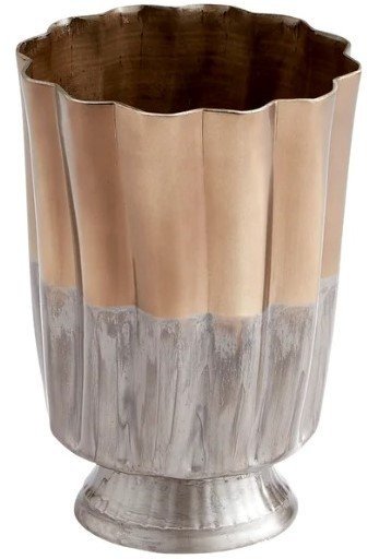
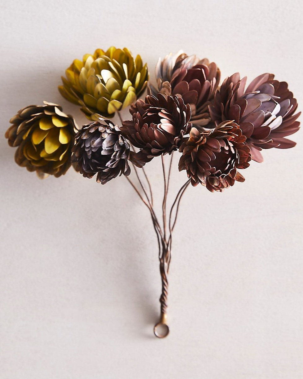
I do think copper or a coppery color works well with this stone color and bringing in some black to echo the cabinetry is a good idea too.
With my rather rudimentary photoshop skills :-), I showed some items that I think would work well.
Copper metal tones and some propped art with black to relate to the cabinets and stand out against the stone enhance the look of this fireplace. carlaaston.com
You can see how the copper really looks great with the pinkish toned stone.
This is even more evident in the dining room console, which also had a stone wall.
Console against stone wall
She wanted tips on accessorizing this console, but I advised her to go a little further here.
Her console is nice, but the yellow-ish muddy tone is clashing with the pinkish tone of the stone. The busy mirrored grillwork also detracts from the stone, which I think should really be the feature here.
I suggested she go plainer with the console and something that would work with the color of the stone.
This console from Sarried seems to fit the bill. She could even do a dark wood tone, as long as it was a reddish hue or even a black finish would work.
Some dark metal candleholders on one side and then a container for some flowers that have a pinkish tone too, fills out the sideboard top nicely.
Her black tray with glassware looks good in the center there.
Here’s another simple mock-up I did to show what this would look like.
The color of this console works much better with the stone and the busy, mirrored face of the previous piece is now simple, to divert the attention to the stone wall.
Another Console Needing Decorating
Here’s another console that she wanted to decorate more and she asked for some tips here.
I like this piece with the art above. It’s a such a bucolic style, very nice, and works well with the console wood color here.
I would remove the rustic wood bowl, and go for a change in material. I’d do a glass vase, this one has some warm neutral tones and then do some tall pussy willow branches in it.
A stack of greige books in the middle and then a slender more lean look in a table lamp. I like the metal shade and the telescoping arm, a big unexpected here, but it will illuminate the top of the console nicely.
And here’s the mock up!
I love the fact that the shade doesn’t really get in the way of the art here. It’s sort of a pet peeve of mine to have a big lampshade covering art.
This questions came from my Subscriber group on Instagram where I do a Q&A once a month. I gather their questions as they DM me and then I answer on a Saturday, usually the first Saturday of the month.
You can join us there by clicking my Subscriber button on my Instagram profile. :-)


