These two pics came in during my last Q&A regarding a foyer or entry hall. The homeowner had styled it up two ways and wasn’t really loving either one.
She wanted to know which direction to go and then how to uplevel the look here at her front door.
My blog contains affiliate links. Any purchases, at no additional charge to you, render me a small percentage, are most appreciated and make this blog possible. :-)
Which Foyer Look To Start With?
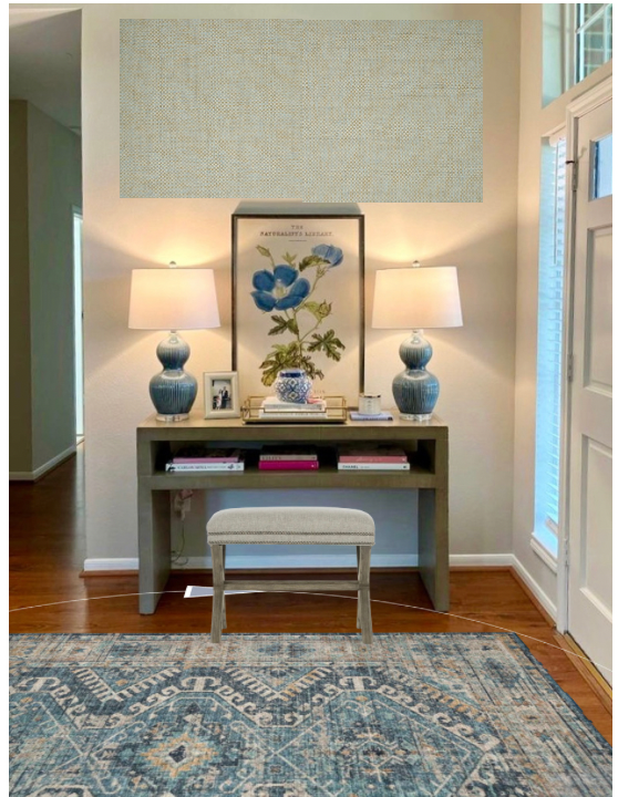
Let’s start with picking the option we want to work with. I definitely like the lighter blue with the chubbier lamps.
I like this foyer option best to expand upon.
Here’s why:
There’s more color with the lamps and the art.
It looks softer and fuller than the other set up.
I’m not fond of the fringe trim on the small ottoman stools. To me they don’t work well style-wise with the modern look of the console.
New Items For This Foyer
The first thing I think this space needs is a rug. That will add more color and really define the foyer.
1) Rug
I like leaning into the blue color here so I found this rug. It comes in many sizes and will help furnish this space.
3) Stool/Bench
Next is a stool for under the console.
I like something a little more linear here to work with the lines of the table and something that sort of fills that space in. I prefer one single wide bench to two smaller ones here.
3) Wallcovering
Lastly, I’d like to add a little design detail go-to of mine for places where I’d love to see wallcovering but have difficulty seeing how to end it in an open space.
I’d definitely like to do wallcovering here, this nice textural grasscloth from Thibaut that has a beige and blue look just adds so much to this vignette.
Thibaut, Golden Gate, Grasscloth for the wall behind the console.
However, I think wallcovering only on this wall would look a little random and I want to make it feel more intentional.
In this case, I’d like to frame out a rectangular box on the wall and put the wallcovering inside the box. That will give this wall the special attention it needs and be the perfect backdrop for this collection of furnishings and the art.
It’s just like I did on the back wall of this dining room.
This wall was shorter on this end of the space, the ceiling angled down and the other walls were busy with a big window and an opening to the stair and entry. Wallcovering on all these walls would have created a lot of odd transitions.
Grasscloth wallcovering on back wall of dining room framed in with wall moulding trim.
So, here’s a little mock up with the rug, bench and a touch of the wallcovering at the top there. Obviously, I’d want it to go behind the console too, like it did in a big framed rectangle in the pic above.
My next Q and A for my Instagram subscribers will be October 7th. You can subscribe by clicking the button on my Instagram profile.


Today’s interior design Q&A has to do with furnishing a foyer in a coastal home. This homeowner has moved in for full time living and wants help tying it all together with a more finished look.
Yay! This will be fun.