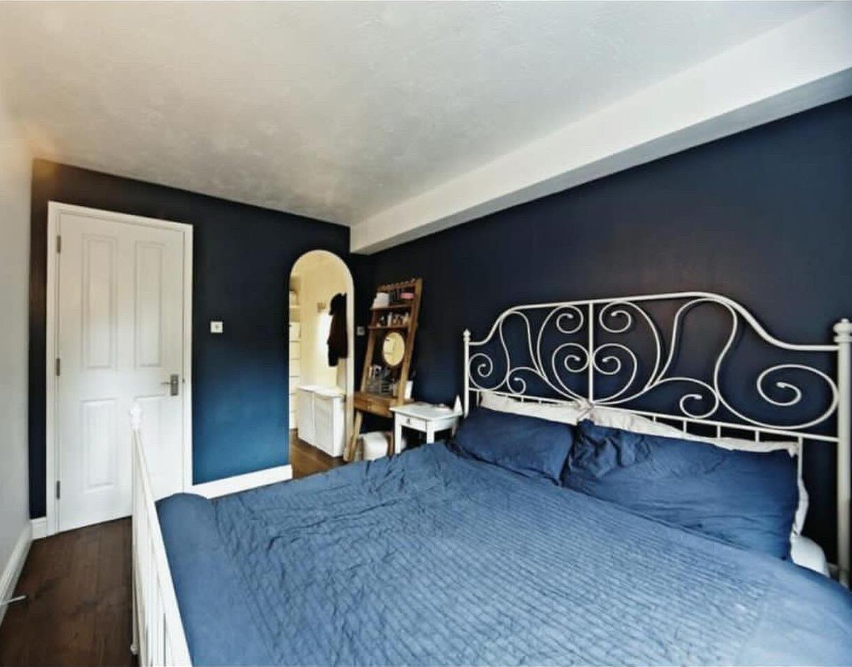
This bedroom needed a redo in a modern, organic style. Likely this is a rental, as they could not paint the walls. This question came in via my Instagram Subscriber group in our Q&A we have once a month.
Navy blue isn’t what you think of much when going with an organic look, but I think we can work with that. I can work with the white trim and ceiling and the beige curtains too, I believe.
My blog contains affiliate links. Any purchases, at no additional charge to you, render me a small percentage, are most appreciated and make this blog possible. :-)
It’s a small room so I want to make sure to get some functional pieces that won’t make the space look crowded. The bed wall feels crowded now, with the two nightstands and the tall vanity piece along with the metal bed.
I like the idea of chunkier and fewer pieces to satisfy that modern organic feel.
I’d start with a new bed like this fully upholstered one in a linen look fabric. That will add some softness and warmth to the navy wall and will be really comfortable to lean back on too.
Then, I’d look at the bedside table.
I found out that only one person sleeps in this bed, so there really isn’t a need for two nightstands.
In that case, I’d scooch the bed over closer to the window by about one foot and not use anything over there. I’d just have a big enough gap to make the bed and have the covers fall easily over on that side with about 6 inches between the bed and the a/c / heater unit there on the wall.
Then, I’d put a small desk by the bed, using that as a nightstand also. This one below is only 48” wide and 20” deep, so I don’t think it would feel so crowded in there. She can keep the little upholstered stool there for a vanity.
I selected a round, textural mirror, this one is 40” diameter, so it will be almost as wide as the desk. I think it would look great on the navy wall.
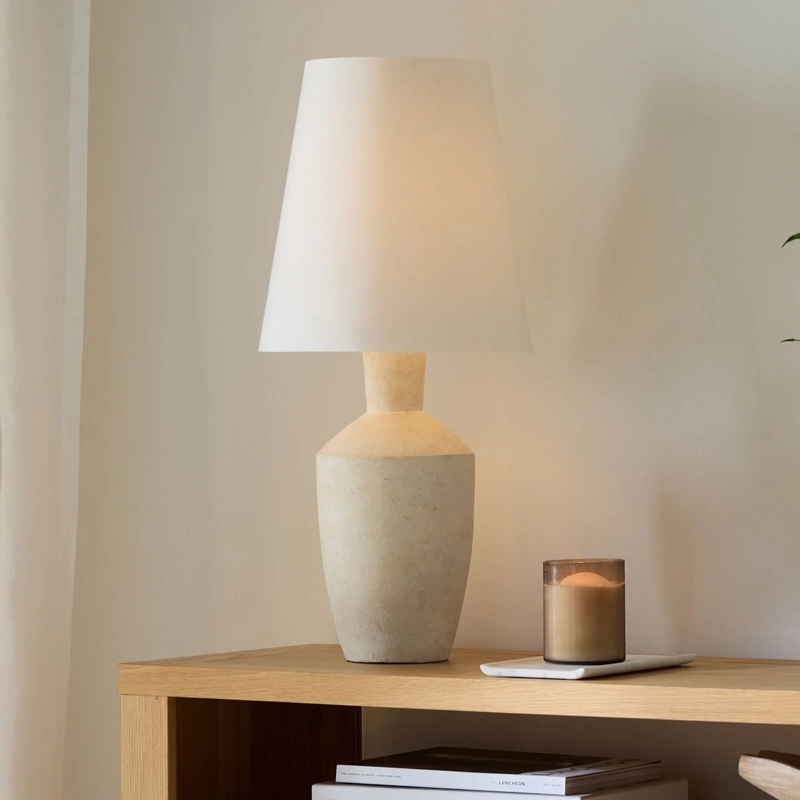
I’d pair it with a modern lamp. This lamp has an organic shape but has a slender base and shade, so it won’t take up too much room on the top.
I’d add some kind of art to the opposite white wall, and I like going with the neutral, textural theme here with a woven, modern piece.
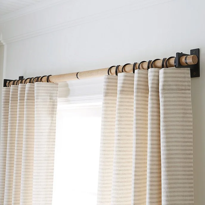
It would be nice to raise the curtains up, above that a/c unit on the wall. She could use her existing curtains and pair them with this new oak and steel hardware.
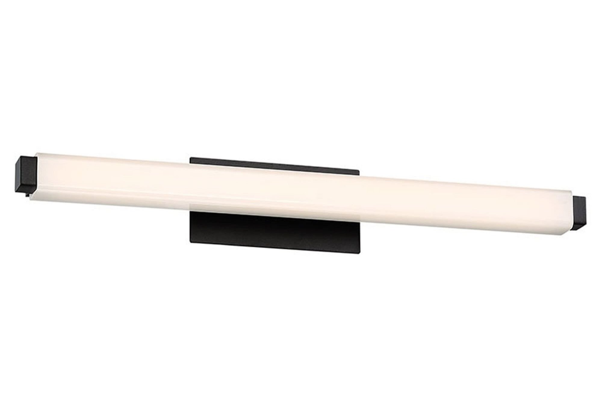
Lastly, if this could ever be done, I would change out that wall light fixture for something more modern. It looks like this is the only wired-in light source in the room, no overhead lighting, so having a light there is important.
Something like this fixture would be nice, it is modern. I like the black finish (would relate to the drapery rod) and would rather imitate a picture light over the tapestry. I’d go for the 24” length. This one though, being a vanity light, would give off more light into the room.
She can tweak things to get them more to her liking or budget, but these pieces are a good go-by to take shopping with an overall idea in mind.
I think by going with fewer and somewhat bulkier pieces with a modern design, we’ve achieved that modern, organic style she wanted, keeping the navy blue walls. :-)
Want to see some more Q&A sessions? They normally don’t involve a whole room like this, they’re typically more specific questions, like these below.
This blogpost was thoughtfully written by me, Carla Aston, and not by AI, ghostwriters, or guest posters.


In my recent Instagram Q and A, questions came in regarding the interior decor of two different foyers. Both didn’t really need much, but come and see how evaluating scale and making a minimal change made a big difference!