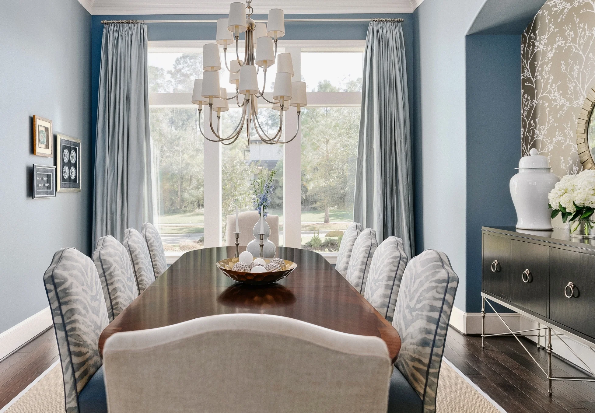
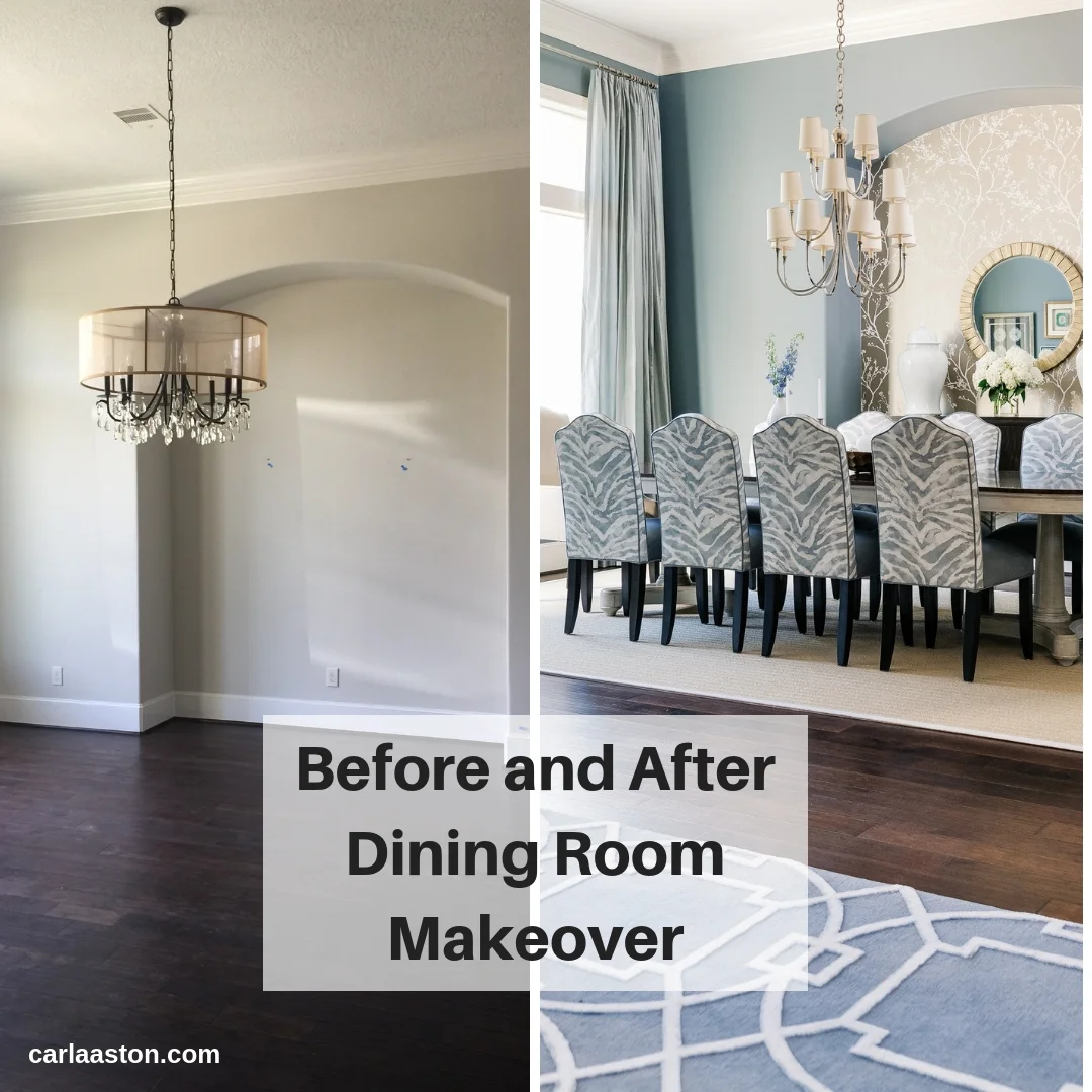
This elegant dining room started out as a very plain, simple space and was given a fresh, new look with furnishings and some custom touches.
This was a project that I finished last spring and I’m delighted to share some of these first rooms in my project reveal with you today.
Let’s go back to the beginning.
This homeowner called me in to help furnish their new home. They wanted a look that was sophisticated, clean lined, with a more transitional appeal.
This house had been on the market as a new build, and had some features that needed a little tweaking and customization first, before we added the furniture. (You’ll see more of the architectural changes we made in upcoming posts.)
Here was the dining room, before.
“BEFORE” Dining Room
It had good bones, with a high ceiling, lots of natural light and ample space.
The crystal chandelier didn’t work with my client’s more clean lined aesthetic, so we opted for another more suitable fixture that still had some polish and much needed height, to scale properly in this space.
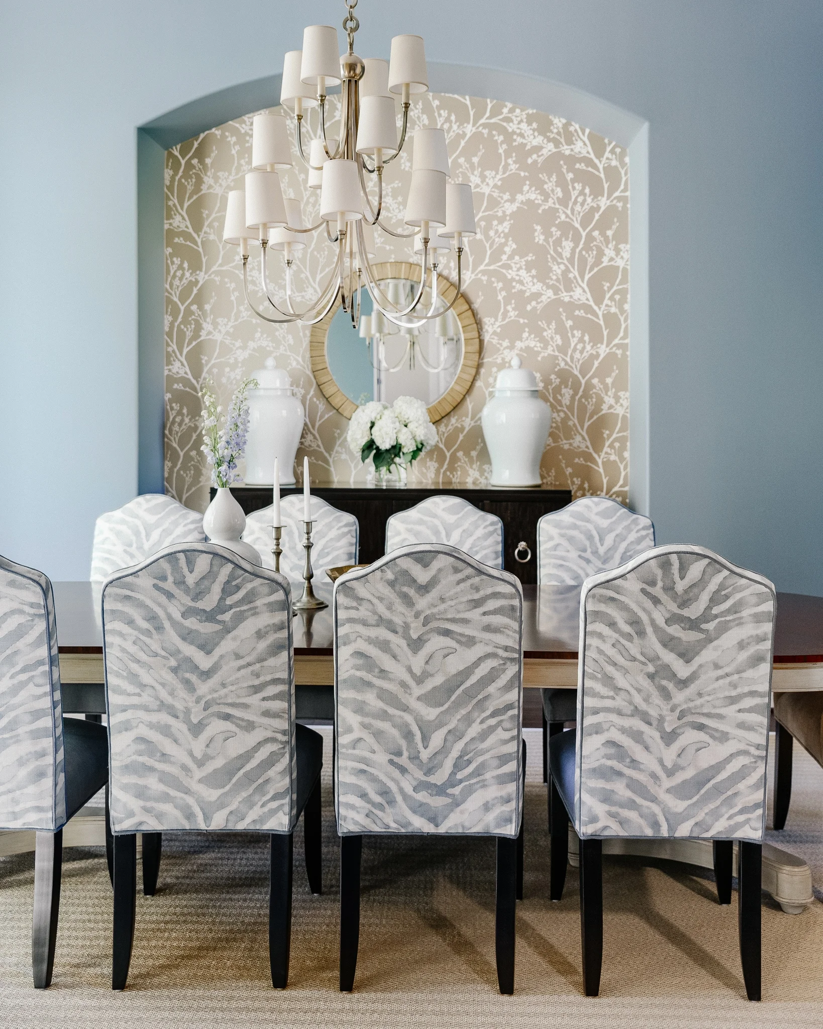
I felt this room would benefit from some color and the niche was the perfect place to add elegance with a gold wallpaper.
Throughout this project a mix of metals and silver and gold finishes help keep a nice balance of cool and warm.
I loved how the cool metal of the light fixture played off the warm gold wallpaper.
IN PROGRESS - polished nickel chandelier with gold wallpaper beyond
Just to share a little bit about my process, here was the digital storyboard created for this room. We also presented the design with fabric, wallpaper, and wood samples.
Elegant blue dining room storyboard
The paint color, Benjamin Moore Montpelier, made the perfect backdrop for the subtle watercolor zebra patterned fabric on those lovely customized chairs.
The beautiful silk drapery softens the window with that same color and adds elegance and sophistication.
Elegant blue dining room | Carla Aston - Designer, Colleen Scott - Photographer #diningroomideas #diningroom #bluediningroom #zebrapattern
I also really love the light seagrass rug we did to add some texture and simplicity to the overall design. It helps the chair fabric pattern and wallpaper to really stand out, serving as a nice visual backdrop and a separation between the dark floor and chair legs.
I’m just so happy with the way it turned out. :-)
Elegant blue dining room | Carla Aston - Designer, Colleen Scott - Photographer #diningroomideas #diningroom #bluediningroom #zebrapattern
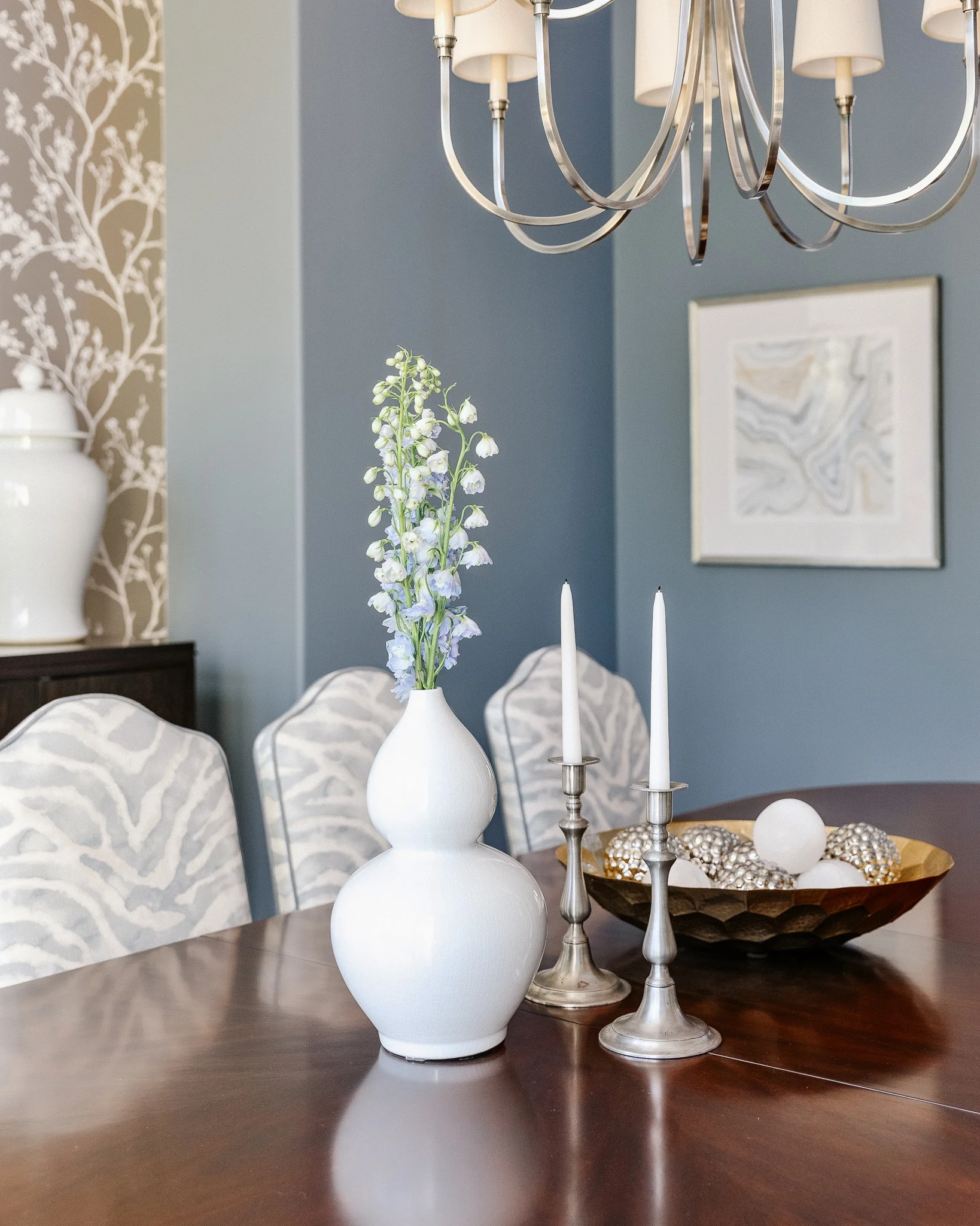
Elegant blue dining room | Carla Aston - Designer, Colleen Scott - Photographer #diningroomideas #diningroom #bluediningroom #zebrapattern
Elegant blue dining room | Carla Aston - Designer, Colleen Scott - Photographer #diningroomideas #diningroom #bluediningroom #zebrapattern
Elegant blue dining room | Carla Aston - Designer, Colleen Scott - Photographer #diningroomideas #diningroom #bluediningroom #zebrapattern
Elegant blue dining room | Carla Aston - Designer, Colleen Scott - Photographer #diningroomideas #diningroom #bluediningroom #zebrapattern
Elegant blue dining room | Carla Aston - Designer, Colleen Scott - Photographer #diningroomideas #diningroom #bluediningroom #zebrapattern
Accessorizing the project
I love finding just the right accessories for my furnishings projects to help add that last layer into the room.
I found these beautiful selenite balls, below, at Dallas market last winter.
I love that I can drive there, so I can buy accessories and load them in my car to take back to use in my jobs. If I buy in the Cash and Carry, I don’t have to pay shipping! They were heavy and would have been so costly to ship! Can’t wait to go back this winter to shop for my current roster of clientele.
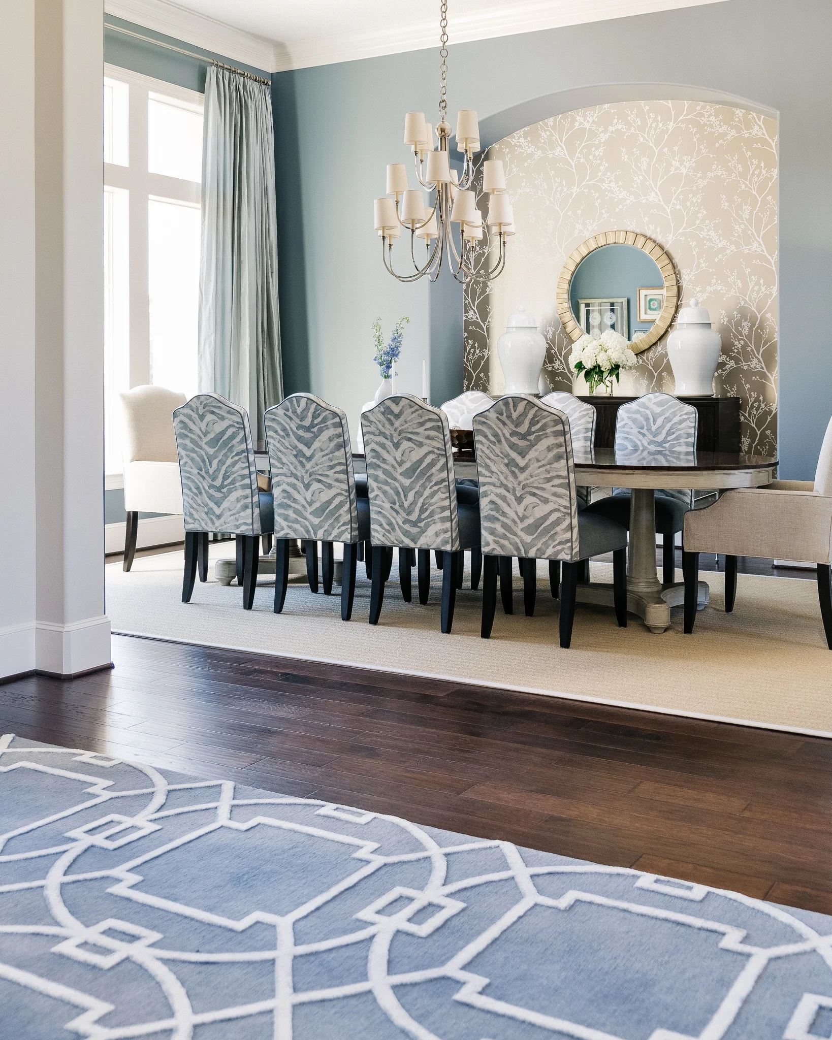
The dining room, just off the entry, sets the tone for the color scheme throughout most of the house. Cool blue grays with some warm gold toned accents
I found the ideal entry hall rug at Postmodern Traditions in Houston. It tied in the color we were using and the enlarged trellis pattern gave a nod to some of the iron grillework on the baluster and on the front doors of the house.
Elegant blue dining room | Carla Aston - Designer, Colleen Scott - Photographer #diningroomideas #diningroom #bluediningroom #zebrapattern
Here’s more from the entry hall.
Entry Hall Foyer | Carla Aston - Designer, Colleen Scott - Photographer #console #foyer #entryhall #foyerideas
Some of the homeowner’s ceramics from overseas are displayed with a beautiful bowl found on one of my shopping trips.
Entry Hall Foyer | Carla Aston - Designer, Colleen Scott - Photographer #console #foyer #entryhall #foyerideas
A fresh new look for the home office
BEFORE - Home office with dark wood paneling and cabinetry
Just off the entry is a home office where we tucked some nice seating in the window.
This room previously had dark wood paneling with the dark wood floor and just sort of felt too brown and heavy overall. Painting it a medium gray freshened it up and made the space feel less traditional.
Home Office Seating | Carla Aston - Designer, Colleen Scott - Photographer #study #homeoffice #paneling
The warm and cool contrast is going on here as well with the fabric choices, wall colors and then silver nailheads with a gilded lamp.
The dark brown woven wood shades speak to the wood floor color and their top/down - bottom/up feature, helps give privacy when needed while still letting light into the room.
I have written several posts about mixing gray and beige, warm and cool colors, if you’re interested.
Home Office Seating | Carla Aston - Designer, Colleen Scott - Photographer #study #homeoffice #paneling #homedecorideas #decorating
There are lots more beautiful images coming, the living room, wine bar, game room, master bedroom, even a glimpse of the beautiful back yard. This was such a fun and special project! I am so grateful to have had this client trust me to create this lovely home for them with all the finishing touches.
These kind of projects make my job so rewarding and getting to come back in and photograph is the icing on the cake!
I would love for you to pin some of the images above to Pinterest to save for your reference and to help me share my work with others. ;-)
“After” images all by Colleen Scott Photography
Contractor for project was Shaun Bain, Curb Appeals









Take a peek at this beautiful, luxurious master bedroom reveal I’m sharing today. You’ll be wanting me to design a bedroom for you too!