I’m sharing some moodboards, flatlays and sketches today that I’ve done for some of the design projects I’m finishing up at the end of the year. I’ve got some great clients now, most are past clients, and I’m participating in an incredible virtual showhouse. The work has been plentiful and challenging. :-)
I sure hope the “furniture delivery gods” are smiling on me as these all come to completion. Goodness knows, 2020 has been a supreme challenge for acquiring product!
Virtual Showhouse Flatlays
When I signed on to create the living room space for Seasonal Living Magazine’s Designer Showhouse, I thought maybe that I wouldn’t have to review samples and finishes in real life, since it would be viewed online in a 3D version.
However, as I got into the design of the room, I had that designer itch to see, touch, and compare the samples and finishes of the products I was using, just like I do for all my other full service projects.
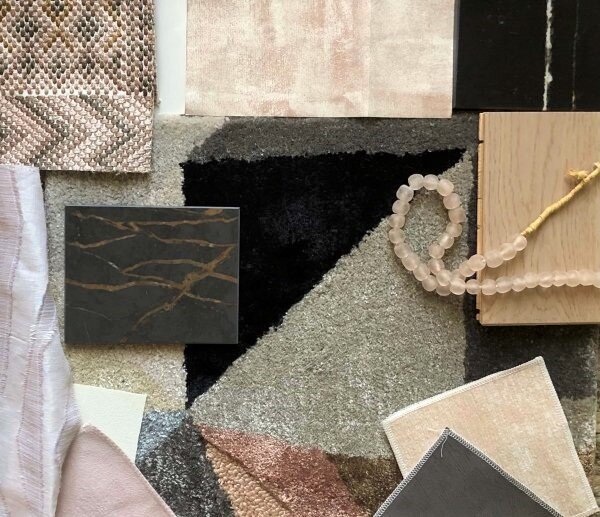
So, I contacted the vendors, pulled my samples together and created these flatlays for the multiple seating areas in my expansive living room.
Seasonal Living Magazine’s Virtual Designer Showhouse - Living room fabrics and finishes flatlay
Living Room Color Palette
In a spectacular luxury home of this caliber, I imagined that there would be lots of entertaining for all kinds of purposes….charitable, political, business, and personal (eventually, right?).
I think this space and the adjoining outdoor and entertaining spaces would be used for these functions.
I am doing a blush, mauve, creamy white, and dark gray color scheme with black and brassy accents. I wanted to be able to use a variety of warm whites and pinkish tones to create a modern and inviting look that would create a beautiful ambience, during the day or evening. :-)
Surrounded by the blue of the ocean, I wanted this space to reflect the sand but still bring some glamour with a stark contrast of blacks and brassy accents.
Seasonal Living Magazine’s Virtual Designer Showhouse - Living room fabrics and finishes flatlay
I shared some of the products from our fabulous vendors here, in this post, that I’m using in the room.
Here’s where you can go start the tour after December 3rd! Check it out!!
Local Remodel Project Finishing Up
This project is a local remodel/addition that has been under construction for almost a year. It has been a complete dream job for me, the clients are so easy to work with and have allowed me to introduce some fun finishes and thoughtful design into the job.
They have been living overseas and we’ve basically done this project with communication mainly via email and I’m so grateful that they’ve taken the time to review all my long emails and trust me to handle so much here for them.
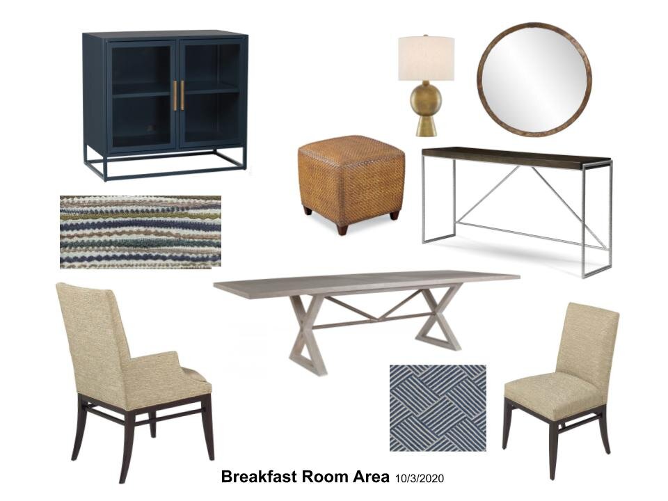
In the last phase, we’ve done furniture and window treatments and here are some of the moodboards and sketches I created to help share the furnishings items with them. (The sofas are in a bold blue performance fabric and the counterstools will be done in a caramel colored vinyl. All very family friendly. :-)
I took pics of the real samples, noted them up in a simple app called THIS, on my phone, and then email the image to them with further explanations. This was a fast and easy way to label things up for a quick review. Here are a couple of my pics.
Family Room and Breakfast Room fabrics and materials
Great Room fabrics
Great room sketch
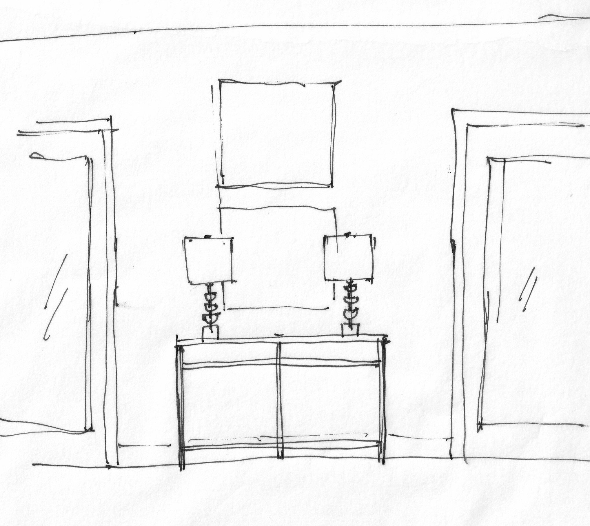
You can see, below, I sketch out consoles and art/mirrors, lamps, etc., on wall space, to make sure I have the scale right. (Even after all these years. :-)
Console wall sketch with mirror and lamps
Great room wall sketch with console, art, and lamps
The whole process has worked really well. I’m keen to work this way with future clients as it is such a safe way to work, in this day and age.
Honestly, I’m so much more efficient and productive this way and the timing couldn’t have been more perfect for this kind of project.
Kitchen Remodel Project With Extra Furnishings
I’ve got another remodel that is underway now, it’s a full gut kitchen project and includes some construction in the living room and dining room too.
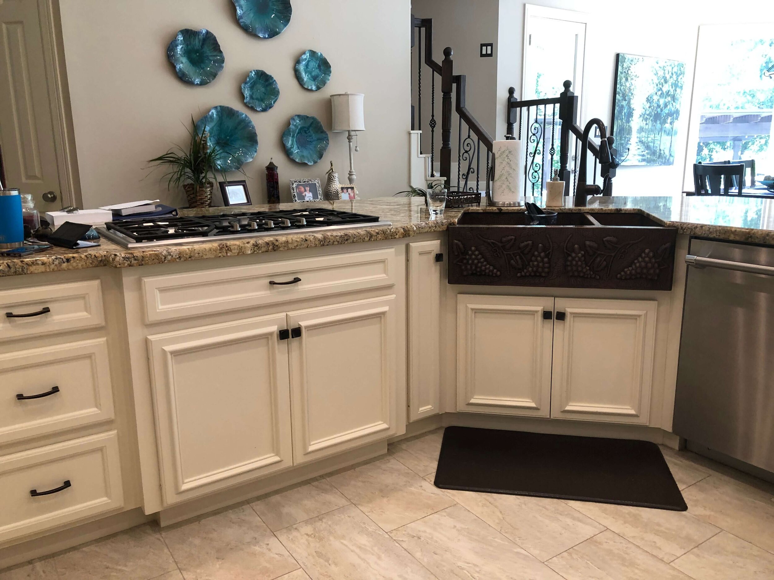
Here was the kitchen, before. The main goal was to remove the arched area and column over by the back door that sort of created two hallways, and to use the whole space more effectively.
Even though this kitchen looks spacious, it was not very efficient or well laid out.
Kitchen before remodel
The cooktop and sink were close together and yet so far from the back countertop of the kitchen, over 8’. It just did not create a good workflow.
Kitchen before remodel - sink and cooktop were right next to each other.
We are adding length to that back wall where the ovens were previously and moved the cooking area there with a beautiful new 48” range. So, no need for wall ovens in the new kitchen!
We gained a little over a foot or so on that wall and it made a huge difference. We are also pushing out the pantry wall and enlarging that space, moving that wall about 18” into the kitchen. It takes advantage of that large open area created when the arched wall goes away and gives them a nice, big pantry. :-)
Here’s the old floor plan, where the pantry wall aligns with the stair wall. You can see there were more columns to begin with, the previous homeowner had done a partial remodel to remove two of those and did the structural work for that to happen. They just left the odd arched wall to nowhere.
Existing floor plan - to be remodeled
Here’s the new floor plan, you can see that pushing that garage door down and adding wall space there creates a much nicer space for the range wall.
I love the reconfig of the pantry too, with a barn door there for easy access when cooking. The pantry now is like an extension of the kitchen.
New kitchen layout
Here’s a peek at the kitchen rendering I had done for them to show how their new kitchen would lay out and how they should definitely go bold and blue for the backsplash.
Rendering of blue and white kitchen design, Carla Aston - Kitchen Designer, Staci Nugent - Rendering
In the living and dining room spaces, we are tearing out the low arched openings that the builder put in and raising them up with a squared off look to get a more open feel with cleaner lines in this home.
I also presented new furnishings for the dining room, some new items for the living room and then will be doing breakfast room and counter stools in the kitchen too.
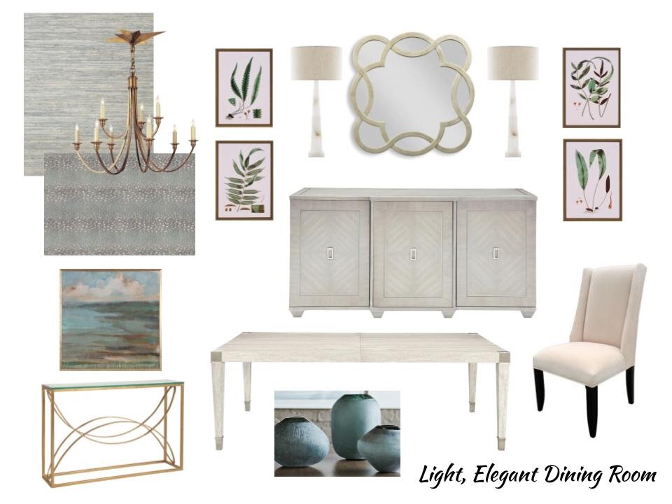
The dining room is a rather dark room now. I wanted it to feel fresh and light and like a totally new space for this homeowner, so they can truly enjoy all the improvements they’ve made in this home.
I did light toned furniture against an envelope of a soft blue-green. I really love the grasscloth here, as it will just make this room feel special and more completely designed.
Light and elegant dining room moodboard
The alabaster lamps add a real touch of quality and the botanical prints are such a nice way to bring in nature and touch of green. Brass makes a really nice contrasting color for a metal finish, against the cool tones of the walls and floor.
So, that is just a bit of what I’ve been working on this past summer and fall. I’m so excited to see how these will wrap up and to have these clients enjoying their new spaces soon!
Remember to sign up for the FREE Seasonal Living Magazine Designer Showhouse Tour, right here!

