I’m sharing one of my popular Designed in a Click Q and A consultations today, a master bedroom design that needed a few tweaks to get it all pulled together.
This homeowner had some inherited furniture and some of those pieces had to stay, but there were a few issues with the room that had the homeowner perplexed.
She felt it just wasn’t all working together and wanted to know if there were some ways to make most of the furnishings work better together in the room.
My blog may contain affiliate links. Any purchases, at no additional charge to you, are most appreciated and make this blog possible. :-)
Master Bedroom Photos - before
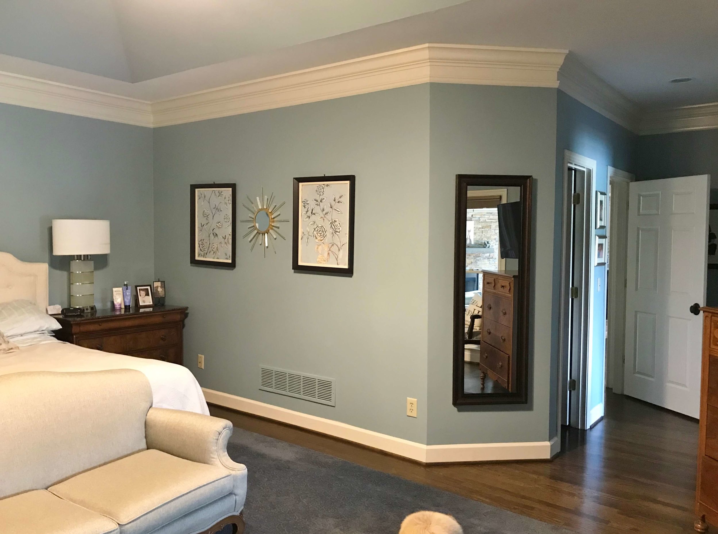
You can see, the bed is placed back in the niche area, to face out to the view of the lake. She liked that layout, but was wondering about the placement.
The non-matching nightstands concerned her. She loved the inherited furniture she had, the settee, dresser, chest, chair…..but didn’t want the room to read “granny”.
She didn’t love the monogram initials over the bed, but wanted to keep this recent purchase and wondered about the best way to deal with that.
What she wanted to keep in the new master bedroom design:
settee
dresser / chest
most wall decor
wall color, SW Interesting Aqua
What she could change:
nightstands and/or headboard
rug
ceiling fan
pillows / coverlet
possible wall decor
What I liked about the bedroom and wanted to keep
I loved the wall color, especially with the dark beautiful woods of the case pieces, it looked fresh and pretty.
I also thought the headboard was a sure, safe bet. I am a big fan of upholstered beds and headboards and I thought this was a good choice, contrasting nicely with the wall color. No need to spend there when some other purchases might make more impact.
I loved the beautiful woods in her inherited pieces and kudos to her on doing the light neutral upholstery fabric on that settee. That solid light fabric makes that piece look more current and up to date.
I understood the furniture layout with the view being the main focus. I normally put the bed on the wall directly across from the door when possible, but if she did that in this room, I didn’t think the settee would fit in properly.
So, the layout would stay as is.
Here were my recommendations:
Bed Wall
Even though everything fit in the niche, the bed wall felt squished to me. The nightstands were slightly too big, and with them being mis-matched and so tight, the bed was slightly off-center and the matching lamps, slightly different heights.
While I don’t mind mis-matched nightstands, in this case, it just wasn’t working.
Even though I liked all the wood tones in this room, I typically like to mix in some painted finishes in a bedroom.
A light painted finish on two matching nightstands that were slightly smaller than what she had, seemed to be the perfect fit here.
The monogram wall decor was not my favorite either, but if she framed them in a plexi box with a light linen backing, the monogram look would be minimized and become a light tone-on-tone piece that would look nice above the bed.
The rest of the art was fine for the room, but I thought it all could benefit from some new framing. I felt the dark, heavy boxes around the room stood out too much and took away from the softness of the space.
I advised her to do some kind of slim, silver/gilded type of simple framing for the large piece beside the bed and the two prints on the opposite wall.
Dresser Wall
Seen right across from the door as you enter the room, I wanted the dresser wall to have more prominence and make more of a statement there. I felt doing something bigger would make that open space feel more like a sitting room and have a grander appearance.
I also thought the attached dresser-mirror was what was giving the room the “granny” look. I suggested she remove that and only use the bottom dresser in the space.
The smaller painting, just to the left there, also in a dark frame, would be a little distracting in the fresh vignette, so I suggest she remove that.
Small starburst mirror would look nice over the antique dresser instead of on this wall. Reframing these two pieces of wall decor in a slim, silver/gilded type frame would be a nice effect for this wall. | Designed in a Click Q&A Consultation Service - Carla Aston
I recommended she use the small round starburst mirror that was currently between the two prints over on the opposite wall, centered above the dresser, then fill out around that with some new white-framed simple coastal look art.
This would lighten up the dresser wall and give it more height and significance.
A white-washed finish floor lamp between the chair and dresser would fill out that space and brighten the corner.
Here’s a very quick sketch I did of the dresser wall.
Here’s my quick sketch for the dresser wall with the new wall decor layout and floor lamp. The large art piece shifted down the wall slightly away from this grouping and would be reframed in a slim, silver/gilded type simple frame to soften the look. Designed in a Click Q&A Consultation - Carla Aston
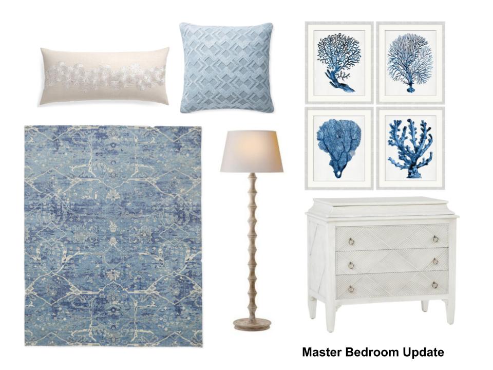
A new rug, in a light, tone on tone, subtle pattern, would be nice in this space.
Changing out the coverlet from a white to a cream or off-white to match the headboard would look more intentional and I liked the idea of adding pillows to the bed and then to the settee.
Here’s a little board I put together for the new items for her. Links to buy are below.
Storyboard of new furnishings for the master bedroom design
Lastly, I recommended this fan for the ceiling fan light. The satin nickel finish kind of goes away against the light ceiling and the wood blades hint at the wood furnishings in the room.
An all white fan would make it blend in, but sometimes I feel like all-white fans look cheap in a room with wood furniture.
She’s already working on it now! I hope she shares photos when done. :-)
As with all my Designed in a Click Q&A consultations, the products I recommend are a starting point for the homeowner and suggest design style without reference to a budget or exacting measurements. These are meant to be done in under one hour, so there is not enough time for multiple options or exact specs for anything.
It’s meant to help someone get unstuck and provide a professional view of their space from a design-only perspective, giving them info they can move forward with, on their own design journey. (Although, I go a long way to find what I feel is just the right option for my consultation clients. :-)
Do YOU need a fresh pair of eyes on a room in your home?
Do you have a few specific questions that a design pro might be able to help you with on a project?
My Designed in a Click email service may be just the right service for you.


