I have a living room to share today with a bit of a challenging tv wall. The angled ceilings and odd front window made it difficult for this homeowner to come up with an solution that felt just right.
She also wanted to get some new furniture, especially the tv console, along with some upholstered seating. She was possibly thinking two sofas, which I did agree with her on.
My blog contains affiliate links. Any purchases, at no additional charge to you, render me a small percentage, are most appreciated and make this blog possible. :-)
The Living Room TV Wall Challenge
You can see in the photo that the wall had been painted blue. She wanted to change that and needed a suggestion on what to do there. She liked more of a modern farmhouse style look, to work with their recently remodeled kitchen.
I don’t really mind the color, if she liked that color, but I didn’t really like the way the angled ceiling stood out more with the contrasting color. That shape also didn’t really work well with the stacked, peaked window wall.
She wanted to keep the rug, it is a washable one.
They have plenty of room for some furniture changes here, so let’s get started.
TV Wall Challenge
While I wasn’t sold on the whole wall in a bold color like it was, I did rather like the idea of an accent wall. This space is very open, painting it all would mean painting all the open areas of the house, and that is not really what I thought was best anyway.
I toyed with the idea of a gallery wall look with the tv in the midst of some staggered art, but if you aren’t really a big collector or already have lots of art to choose from, that can be an expensive and tedious task to complete and make look good.
I wanted to give her a solution that wouldn’t take much wall decor, if any, but still make the design of this wall look more intentional and finished.
First, I went looking for a tv console. I wanted something in wood to warm up the wall and something good sized, in case they wanted to up the size of the tv someday.
I liked the look of this one, above, with the woven, breathable cane panels. It is 80” wide by 32” high, so taller than the one they have. It will have more presence on the wall.
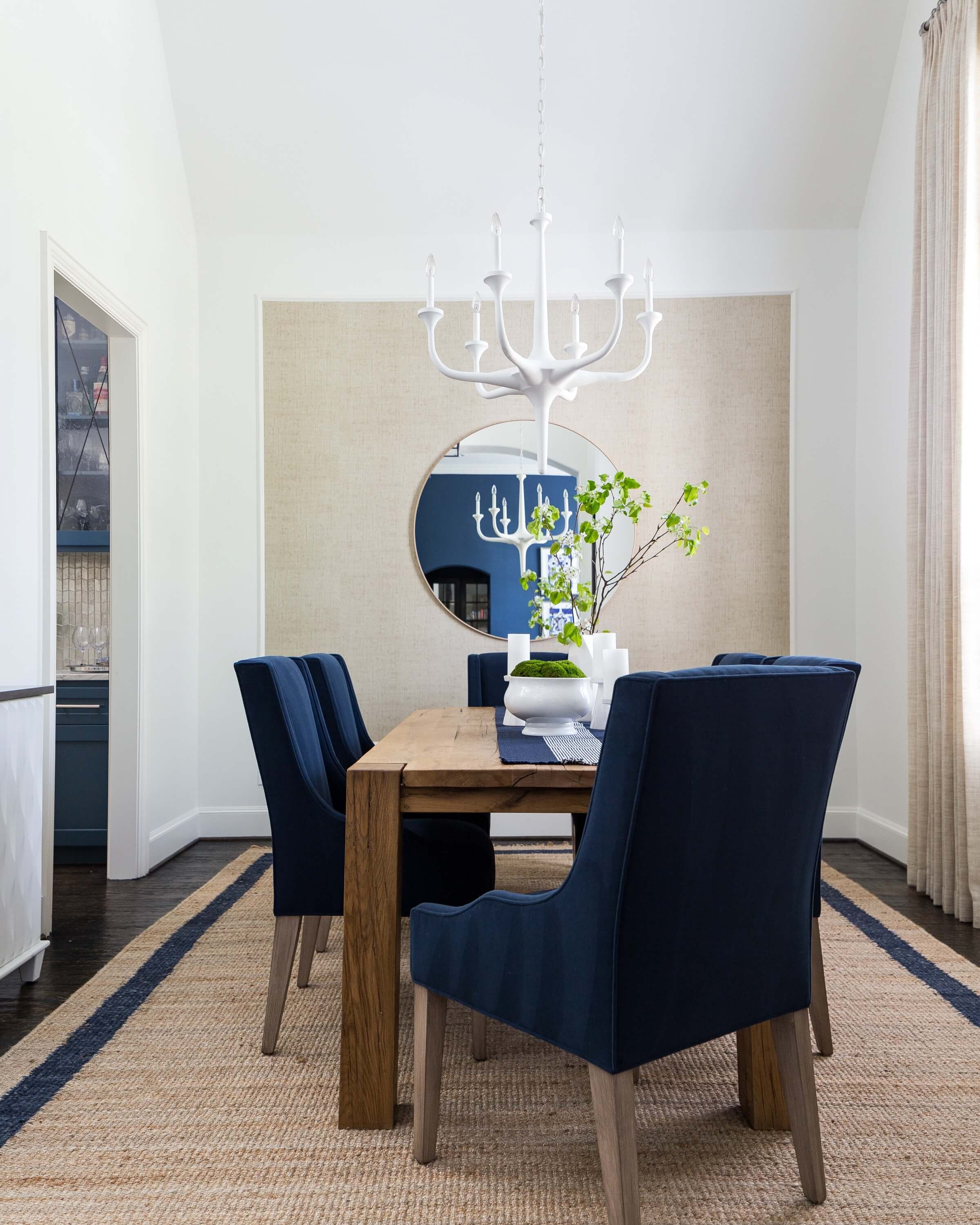
In this past project of mine, I created a boxed in area on the wall for some wallcovering. This dining room had a low ceiling at that back wall and if I had put any color or wallcovering on the wall, it would have made the room feel short.
Doing the picture frame moulding feels more intentional and more finished.
I think this would be a good solution here too. Paint the perimeter to match the other walls and ceiling, add picture moulding about 12” from the perimeter, as shown on the sketch, and then put in some wallcovering or a contrasting paint color inside.
At the top, I wanted the moulding not to follow the angle of the ceilng, but to go straight across that wall.
I used this vinyl, grasscloth-look wallcovering in my past project, and really, it would be great for this wall too. Vinyl wallcovering doesn’t show seams like a grasscloth does, which I really like in this instance.
I would also recommend changing the ceiling fan to one that has wood blades that sort of match the floor. I like this one from Minka Aire. The finish is burnished nickel with driftwood blades.
Furniture and Rug
I mentioned that I like the idea of two sofas. She could actually arrange those facing each other with two chairs opposite the tv, or in an L type shape, with the chairs on the kitchen side.
I like the idea of light upholstery for the sofas, as you can see the dark upholstery she has disappears into the floor.
I know she wanted to keep the rug, but it really is too small for this room. I think that is why it doesnt’ feel very comfy in here or as inviting as it could be.
I do think she could use it in the dining room though and then do another, bigger, washable rug in the living room. There are lots of brands that make them now. I like this rug from Nourison.
The sofas and leather chairs really have a comfy vibe but it still looks put together and sophisticated.
A rectangular coffee table would work well here, between the two sofas. If she wanted an L arrangement, she could do a square or round coffee table.
I did a little mock up of how this would look in her room.
I’m really liking the tv wall now. It feels designed but not overpowering. It all seems fresher and more up to date.
She could adapt this plan any way she likes, with swivel chairs, with some cool toned blue-gray sofas, even a blue-gray color in the wallcovering, if she wanted to keep with the blues.
That’s the beauty of my consulting services, I give you some ideas that you can work off of to create your own look with your own preferences.
Shop the post below!
This blogpost was thoughtfully written by me, Carla Aston, and not by AI, ghostwriters, or guest posters.


