While I try to over-deliver and bring real value to each and every design consultation I do, there are some I can’t help but go all in with. That’s because the homeowner has made a great start and is up for some spending to make their room exactly what they want.
This was one of those cases.
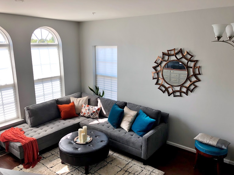
This homeowner had recently moved into a new house and had made a good start with a gray sectional sofa and a Benjamin Moore Hale Navy painted tv wall.
I also like the cabinet she used for the tv, it was substantial and the color looked good. The rest of her walls were painted SW Repose Gray, a good base color.
My blog contains affiliate links, where I make a small percentage off any purchases. These are at no additional charge to you, are most appreciated and make this blog possible. :-)
Here are the pics of this living room.
Before - living room with no window treatments and needing some help tying the design together
Before - living room with no window treatments and needing some help tying the design together
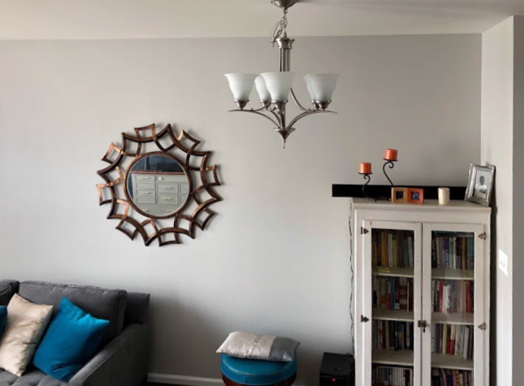
Before - living room with awkward placement of wall decor and furnishings
Before - living room with awkward placement of wall decor and furnishings
Living room Design consultation Areas Of Concern
Question/Priority 1:
What do I do with the wall behind the sofa? There’s the one window off to the side, I know I need some kind of window treatment and the mirror there looks off and out of place. I don’t know which parts of the wall to measure for art/wall décor placement.
Question/Priority 2:
What kind of window treatments would work for the Palladian windows? (I have temporary/paper blinds in there right now.)
Question/Priority 3:
The living room overall looks to me like a mish mosh of things and not pulled together. Do I need to change accessories, pillows, rug, to create a more grounded and cohesive look?
Question/Priority 4:
The couch is what I have and it has to stay. I placed the ottoman there because I want the comfort – I want people to feel ok putting their feet up. Does it work? Is it too dark?
On a side note, the ceiling light fixture off to the side there would be removed, as it was intended for a table underneath but there wasn’t really the room for it nor did the homeowner want to use the space for that purpose.
My Recommendations To Help Add Balance And Style
I think you’ve got a good start with the sofa and the navy color on the tv wall. I also like the Repose Gray.
Here’s how I think you can tie this all together a bit more.
Obviously, you can take your time or substitute items as you wish.
I think the navy color needs to be repeated elsewhere in the space, especially on the opposite wall. That will help everything feel more cohesive. Here are the decorative elements that I think would help you achieve that.
1. Pillows
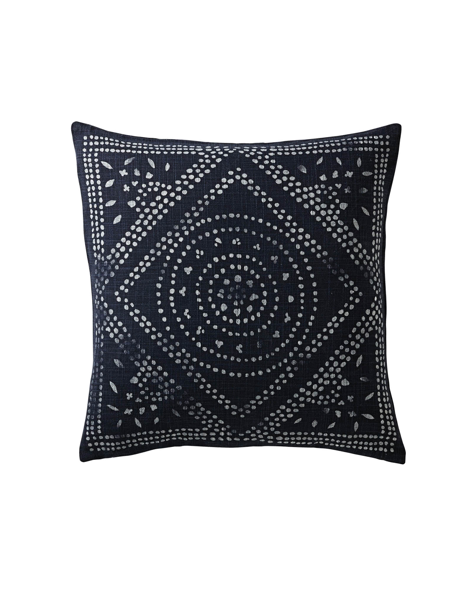
I’d change out the blue pillows you have there to navy. The orange is a good accent, so keep those, along with the patterned pillow. This navy pillow and this pillow would work there on the sofa.
2. Wall Decor
I think the mirror just feels a little random to me there. I’m not crazy about the finish and it doesn’t really relate to any furniture.
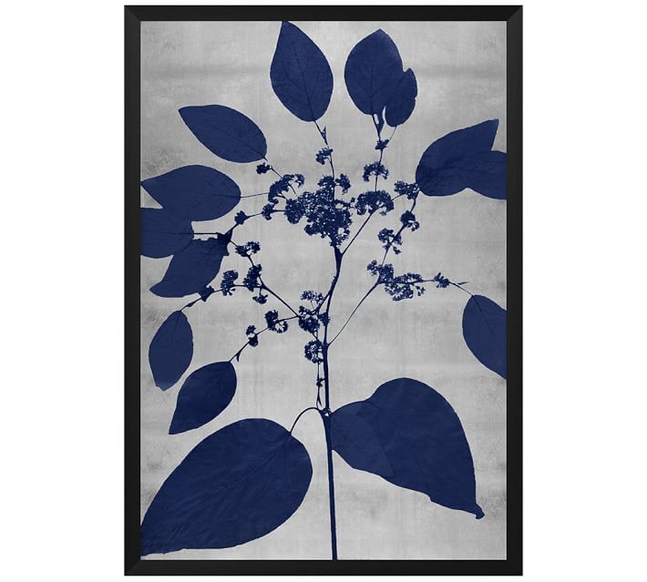
I think this would be a good place to come back in with some navy, in this art piece and this piece, that could be hung on that wall over the sofa. I like these because they are graphic, organic in feel, and combine the navy and gray nicely. I think they’ll be a good size too, staggered on the wall.
3. New Bookcase
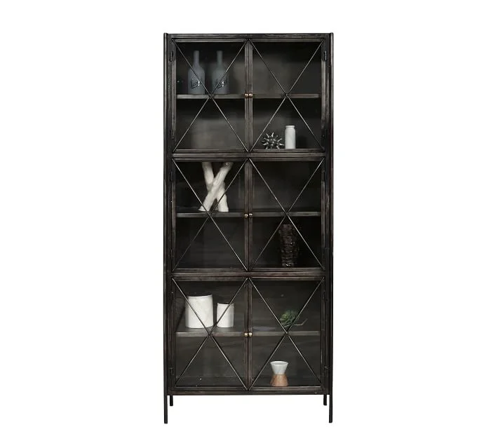
I think your bookcase can be painted a dark color and then centered in that space on the wall, as opposed to pushed in the corner like it is now.
If you wanted to get something new, then I like this bookcase, as it has a geometric pattern on the glass and is taller for a more substantial look. I like the dark finish, again, to sort of balance the navy wall across.
4. New Side Table
I’d do a new side table beside the sofa there, this gray top would look nice next to the sectional and I like the wood there to bring in some warmth.
5. New Lamp
A little more navy over here would work well in the lamp. These navy colors don’t all have to match exactly, they will relate though.
You can see my sketch, below, of how this wall all fits together.
Design Tip: You always want to look at a wall as an overall visual composition and create balance and contrast, accordingly.
Design Sketch of living room for an email design consultation | Wall decor and furnishings suggested to create a pleasing visual in this room. Carla Aston, Designer #designsketch #livingroomideas #walldecor
6. Window treatments
I think you need to go with some simple tone on tone patterned draperies there. They can be dummy panels, just there between the windows, but on one long rod. I’d do the same on the wall with the shorter, rectangular window too.
Aerin fabric for drapery with gray diamond pattern
Applying the same treatment on all the windows here will unify the look and be a nice, soft backdrop for the sectional.
I like The Shade Store for some really professional looking drapery. The Shade Store did all the window treatments in this designer showhouse I attended recently and they looked great!
The pattern I like for you is Aerin, Palm Leaf Diamond Pattern, color: Oyster. You can order a swatch. The geometric pattern will work with the X on the bookcase cabinet and then with an alternative rug choice I have below.
Then, I’d do some cellular shades for the windows. You can do outside mount and cover the arched tops by mounting them just at the top of the curtain panel, and then stopping at the sill of the window.
These can be ordered to operate with either a top/down, bottom/up lift system or just a standard lift, however you might prefer to open them.
You can keep the tops of the arched windows open by mounting them inside like you have the paper shades, if you prefer
You might want to make sure you get a fabric that has a translucent quality so you can maintain the light coming into your space.
7. Planters
I’d push the floor lamp there in the far corner of the navy wall, to illuminate that space and then pull your plants out in front of the window there, with some new planters that might get them up off the floor. West Elm has some nice ones.
Here’s how that wall would look with the window treatments and planters.
Design Sketch of living room for an email design consultation | Window treatments and furnishings suggested help complete this room. Carla Aston, Designer #designsketch #livingroomideas #walldecor
8. Possible New Rug
At some point, you might want to get a bigger rug. I like the style you have, and this rug I’m recommending, is similar. I like the diamond pattern in this option and the fact that it is not quite as much of a shag carpet, but a bit more tailored.
(My daughter just got this rug for her apt in LA and it looks great!)
9. Ottoman
I like the ottoman there, I think it works fine, but you might consider reupholstering the top at least.
Does that top that lift off? If so, it would be easy to reupholster.
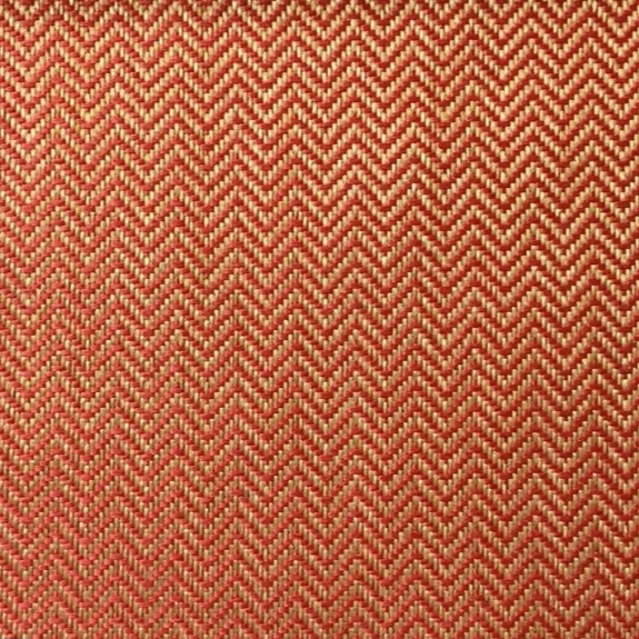
I think having the buttons or tufting on the sofa cushion and the ottoman both is a bit much. I think I’d like some color to liven up the gray. These are performance fabrics. They will hold up better for you there.
I like the orange accent color for this. Here are several options, linked in the images, but get a cutting first, if you can to see if it works with your pillows.
A More Pulled Together Living Room Design Plan
I think this gives you a plan to move forward with. Obviously, you can substitute similar items for budget reasons or if you have other preferences. I do think this would work well and help tie everything together for you in this space.
Well, I’m happy to say, she loved it! And I do too. :-)
Do you enjoy seeing how these consultations, both local and online, work?
Subscribe below to have these delivered right to your inbox.
And pin this image to Pinterest and help me spread some of this design love. :-)


