I’m sharing 3 color schemes today that work well to bring some life to a gray or cool toned interior.
A lot of people are over the gray look that has been popular for so long. Home design trends are definitely moving to warmer color schemes.
(Not the muddy gold tone Tuscan look of the early 2000’s though. If you still have that look, don’t think it is coming back anytime soon! :-)
So what colors work well with your gray color scheme? What color can help make this palette more vibrant and unique, without changing it all up?
If you went all gray and white then don’t despair because that is an EASY palette to work with to add color. It’s clear, clean and basically the perfect background to lay on the accents.
I’ve got 3 bold palettes here for you to peruse today, just to give you some ideas of how you can color up your gray home!
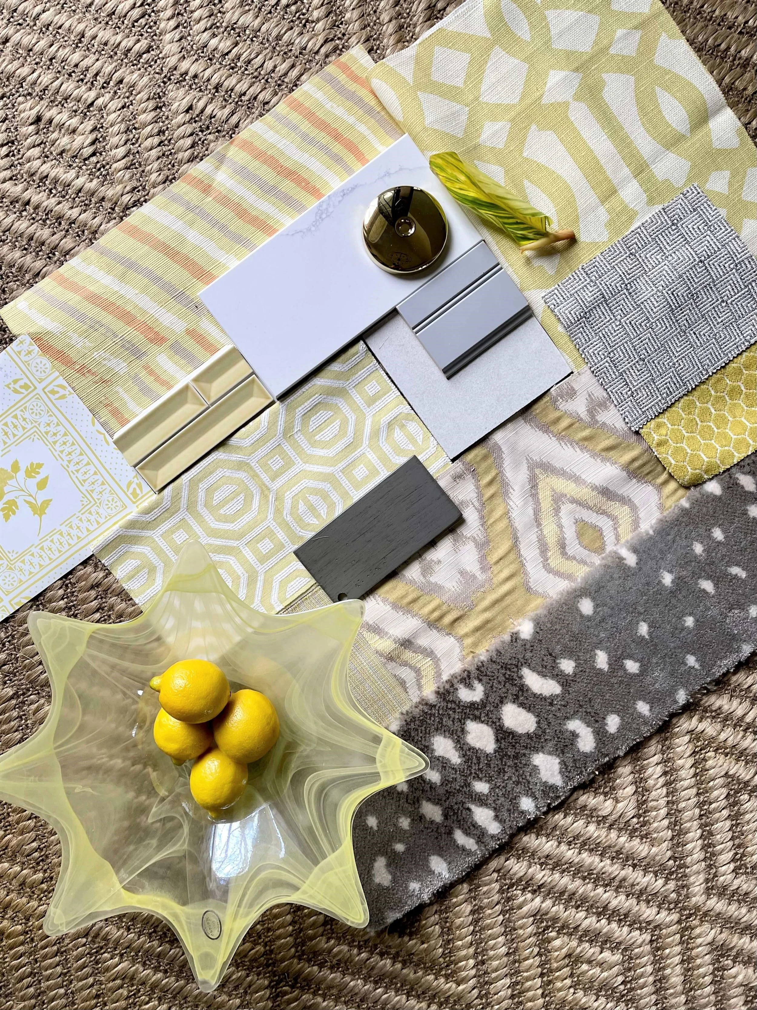
Gray with Lemon Yellow Color Palette
Is there anything that says spring more than yellow? I think not. And this citrusy version goes so well with all the grays.
Imagine a kitchen with medium gray cabinets, some off-white/grayish tile on the floor, a white marble look white/gray quartz countertop and white subway tile. Pretty typical of what everyone has been doing in the last 10 years, right?
Well, how about leaving all those hard surfaces alone except for the backsplash?
Add in a colorful tile, reupholster the bar stools or breakfast room seat cushions, and add a kitchen window fabric shade in a pattern and color that works with the splash. You will have a whole new look and it looks colorful!
Here’s a combination that will look fresh and bright for years to come. This yellow is a wonderful accent for a gray palette.
Lemon yellows work beautifully to brighten up a gray and white kitchen. carlaaston.com
Gray with Bold blue color palette
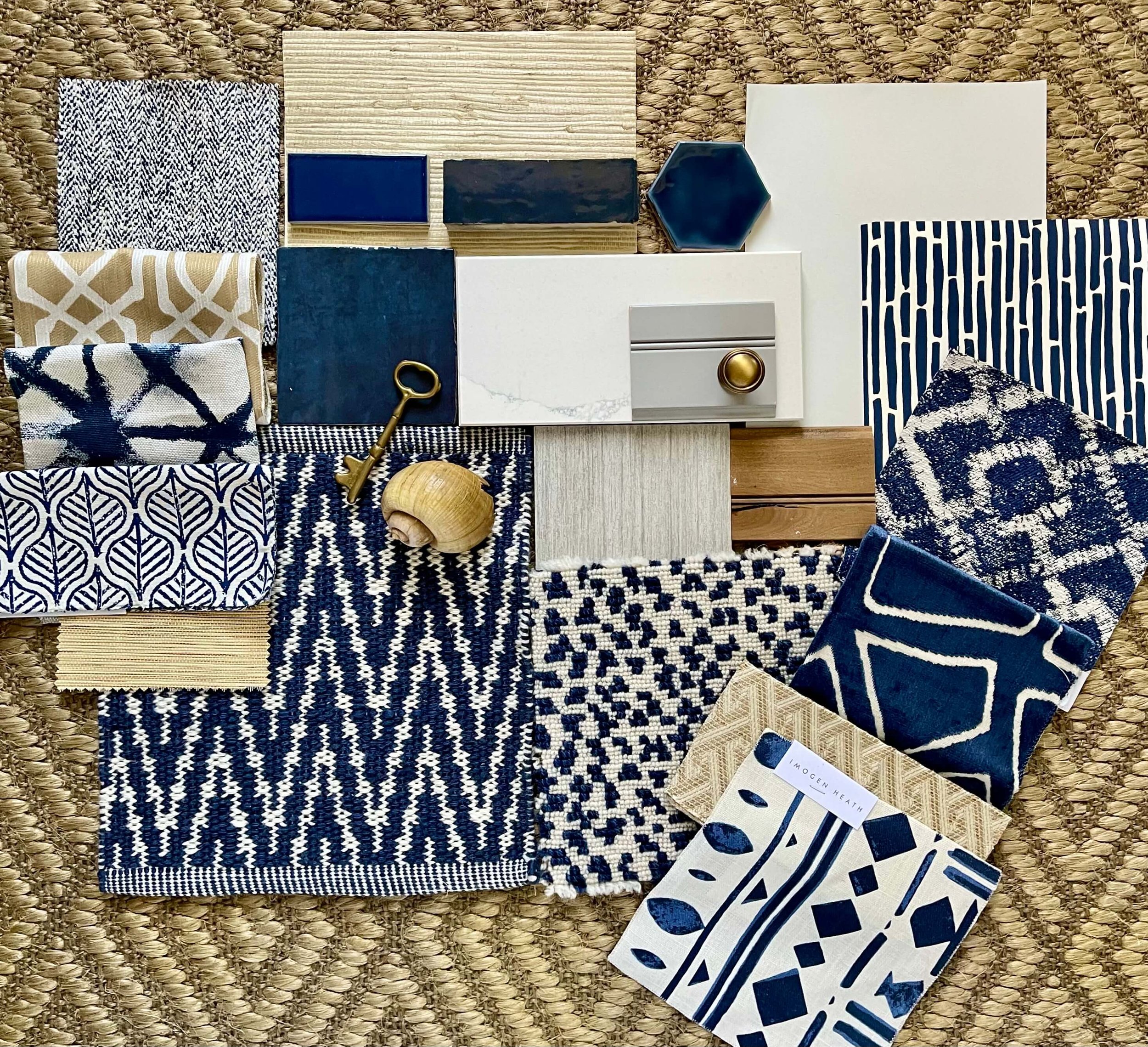
Here we are again with gray kitchen cabinets, white/gray quartz counters and light gray paint on the walls. What’s another color that could make a strong impact?
Bold blues! Navy, royal, indigo, cobalt……all blues look good with gray.
There are lots of blue tiles out there that can make a dynamic statement on a backsplash. This little collection from my own library shows plenty of examples.
Again, as in with the scheme before, add in a window shade of some kind, some new fabric on stools or breakfast table chairs, maybe even a rug and you could make a real statement with this color.
I love how adding in the sandy neutral tones layers this look, as well as some brass hardware.
Strong blues look great with a gray kitchen. It also works to add in some neutrals to layer even more depth and color. carlaaston.com
Gray with Bold Green Color Palette
We all know green is the hot color right now, especially those duller, more muddy tones like the paint companies’ Color of the Year choices for 2022.
If you have gray walls and white trim, gray kitchen cabinets or even wood cabinets, then a bolder green might work really well. I’m thinking something more emerald green, like in this flatlay below.
Bold greens can brighten up a kitchen as a backsplash tile, a window treatment or chair seats. carlaaston.com
Your gray home doesn’t have to stay all gray if you don’t want it too. Pick a bold color and use it in these ways to brighten up a gray kitchen.
Change out the backsplash to a bold, colorful tile that will make a big statement.
Repeat that color in a window treatment fabric.
Reupholster chair seats or stools to echo that color choice.
Want the sources to the products shown above?
Check out my Flatlay Sources Guide, available in my shop. It has over 21 flatlays with the sourcing included for each.


