

Pantone’s Color of the Year just came out. It’s a little bright and garish for me. Definitely in the same color family that I had predicted, the greens, but it’s not the dark, rich, moody version I was envisioning.
It just happened that I attended a color seminar this week with Benjamin Moore, where the head of their color of the year selection team gave a presentation about how they go about identifying their color choice. They highlighted this year’s color, Shadow, and it’s surrounding palette.
It’s quite a detailed process. They take influence from around the world, primarily looking at trends in art. They visit museums, exhibits, and art shows. They were highly influenced by a painting at Art Basel in Miami, that featured various sunset images. The variation and depth of the colors in that painting, really spoke to what they wanted to capture with this palette.

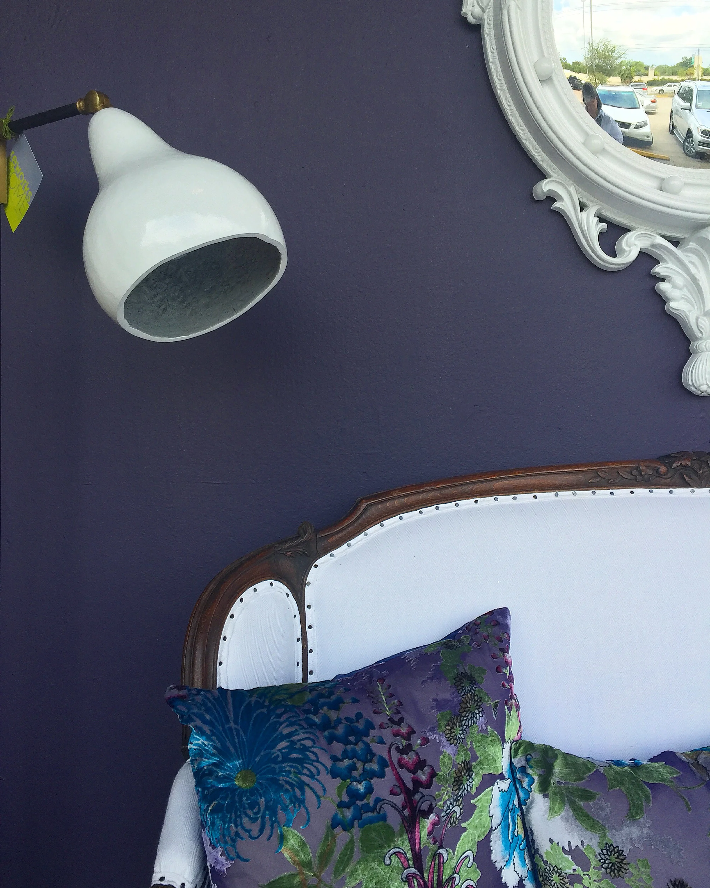
She related how this year’s color, Shadow, had the rich purple color but was more subdued in a grayer, darker look. They purposely went for a nuanced color, one that can be interpreted in many ways. They liked that it could work with many types of interior styles, traditional or more contemporary.
I feel like you can sort of read what you want into this color. It’s understated yet colorful. It satisfies those that want a strong color choice, but it’s not too bright or obnoxious.
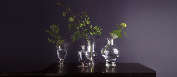
After the seminar, I chatted with her about the windows at MAI that I had done earlier this year with Shadow as the backdrop. I related that I did one window in a more traditional style and one in a more eclectic to show how the new trendy color can be used in different environments.

I also mentioned that I loved Hunter Green from BM and was rather anticipating a color in that shade for this year from Pantone. (This was the day before Pantone’s announcement.) She said that really, Pantone’s COTY is selected for other industries as well, particularly fashion, and not just interiors. I agree, and wonder why, in our industry, we make such a big deal about the Pantone selection.
I'm not sure about Pantone's color, Greenery. Maybe as accents? I'm not sure I'd want a whole room painted in this color.

I have to say, I love the Benjamin Moore color palette they presented this year. It’s strong, yet soft. The colors are rich and bold without being overpowering. They remind me of an Elle Decor magazine layout. The whole palette works so well together with Shadow as the lead.
And yes, all of these colors will work on your walls.

Benjamin Moore - Paint Color Palette for Color of the Year, 2017
Which color would you choose to paint your walls?