This is an interesting little project for me, because one of my clients moved from their “totally done” home out in the suburbs, to Houston, to be closer to work. :-(
Since we had worked on her remodel and new furnishings for the suburban house, her offices relocated, making her commute really unbearable. I was sad for the move, that she had to leave that beautiful home we all created together for her and her husband, but happy to get to work with her on the new place.
This was a brand new house in Houston and although all of her furnishings have basically been reused as much as possible, there were a few tweaks needed. It is, after all, a new layout and house.
One of the rooms that needed some tweaking was the master bedroom.
Okay, here’s our journey. This is the room when we first started working with her.
It was nice, but I felt it needed some lightening up. She was trying to get some gray into the room, but the brown dominated. She had a more contemporary / transitional style she wanted to explore and the furniture was a bit too traditional, heavy, and dark.
The first thing we discussed was getting rid of some of the wood, I felt the room needed a softening. An upholstered bed did just the trick.
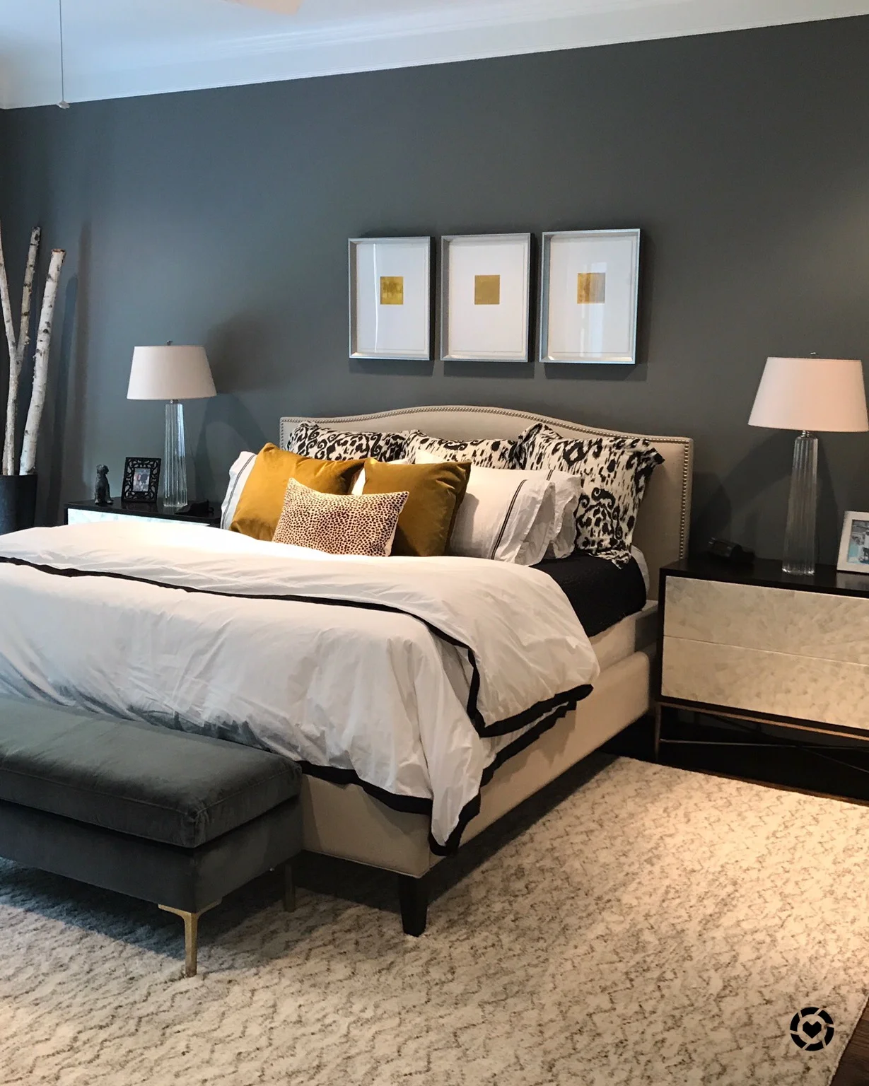
We also used a lighter rug, changed out artwork, bedding, lamps, and grayed down the walls. I like the contrast of the walls with the light, upholstered bed. I thought it made the light bed stand out even more and feel plush and luxurious.
Here was our end result, at the old house. :-)
Obviously, she wanted to reuse a lot of this, but the new room in the new house was quite a bit larger. On an upper floor, it was also brighter overall.
They needed a bigger rug to fit the room properly and some bigger nightstands would help too. I always had thought a lighter color on the nightstands would be good, but they weren't ready to change them at the old house, since we had so much else to do at that time. Especially with the recent move though, I wanted to see a change there.
We went through a lot of options, but came up with these Bernhardt pieces that look amazing with the bed and rug. The capiz shell face was a nice material mix and brought the lightness on to that wall. They were a great transitional style too, and as “bachelor chest” type pieces, were the perfect larger size for the room.
She bought the rug from Restoration Hardware. We didn’t want too distinctive of a pattern there, something textural, and they wanted softness in the bedroom. I love how the light coloration brightens things up and tends to warm up the gray walls.
Speaking of gray walls, we went even darker this time, with SW Cityscape. It adds even more drama to the space and with this large room now filled with some lighter furnishings, creates just the right luxurious, designed look.
The last finishing touch was a velvet bench from Anthropologie that had a long lead time. It just arrived last week and is the perfect balance for the gray walls, there at the end of the bed. It helps to fill up the large room and adds some punctuation in the center of the space.
It’s funny, this is the perfect embodiment of how to go gray with a beige house (even though this house was white when we started). The blogpost I’ve written on how to going dark with your gray can make all the warmer colors appear cooler and more on trend is a popular one.
I love this neutral but dramatic scheme and how this new bedroom turned out!
Gray and beige master bedroom | Designer Carla Aston
My blog may contain affiliate links. Any purchases, at no additional charge to you, are most appreciated and make this blog possible. :-)
Check out her previous home, at these links below. It was published in a local magazine when it was finished!


I promised you this reveal last week. You know, the reveal regarding the master bath makeover we did for this house remodel I blogged about recently.