I was recently in LA visiting my daughter and was inspired by lots of beautiful visual moments out there.
So, today, I want to share a few of my design guidelines (many of which I’ve written about before), confirmed by those inspirations, to help you with your future design goals.
1. Some color combinations always work.
Slate gray and a warm wood tone go so well together, as seen on this home on Abbot Kinney Blvd. in Venice. The warm wood makes the facade look richer, doesn’t it?
Slate gray and warm wood tone at entry
White and wood tones also work well, as seen at Butcher’s Daughter Cafe, also on Abbot Kinney. I love the homey pieces they used, like the big cabinet for a wait station, and some of the vintage and industrial finds they’ve incorporated into their interior. It feels wholesome, hand-crafted, fresh, rustic, and a little farmhouse. The small touches of polished copper gleam against all the texture. Notice the tp holder. Unusual, no?
Butcher's Daughter Cabinet
Butcher's Daughter counter
Butcher's Daughter - Copper edge banding on tables
Butcher's Daughter - polished copper on whitewashed wood / I found it online. You can buy it HERE.
Butcher's Daughter vignette
White and wood also worked at Malibu Pier, where this darling shop and restaurant of Malibu Farms resides.
Malibu Farms on Malibu Pier
Malibu Farms Shop at Malibu Pier - White on white for the win!
2. Hand-crafted items win for household goods.
There’s just no getting around it: any handmade object is going to top machine-made. Is it economical? Maybe not. Is it perfect? Absolutely not. And that’s the beauty, isn’t it?
I found this little shop in Venice, Tortoise General Store, and fell in love with their beautiful small objects for the home. What a special gift or keepsake item any of these would make.
Tiny baskets from Tortoise General Store
Tiny vases from Tortoise General Store
Handmade utensils from Tortoise General Store
3. Succulents are the new fig tree.
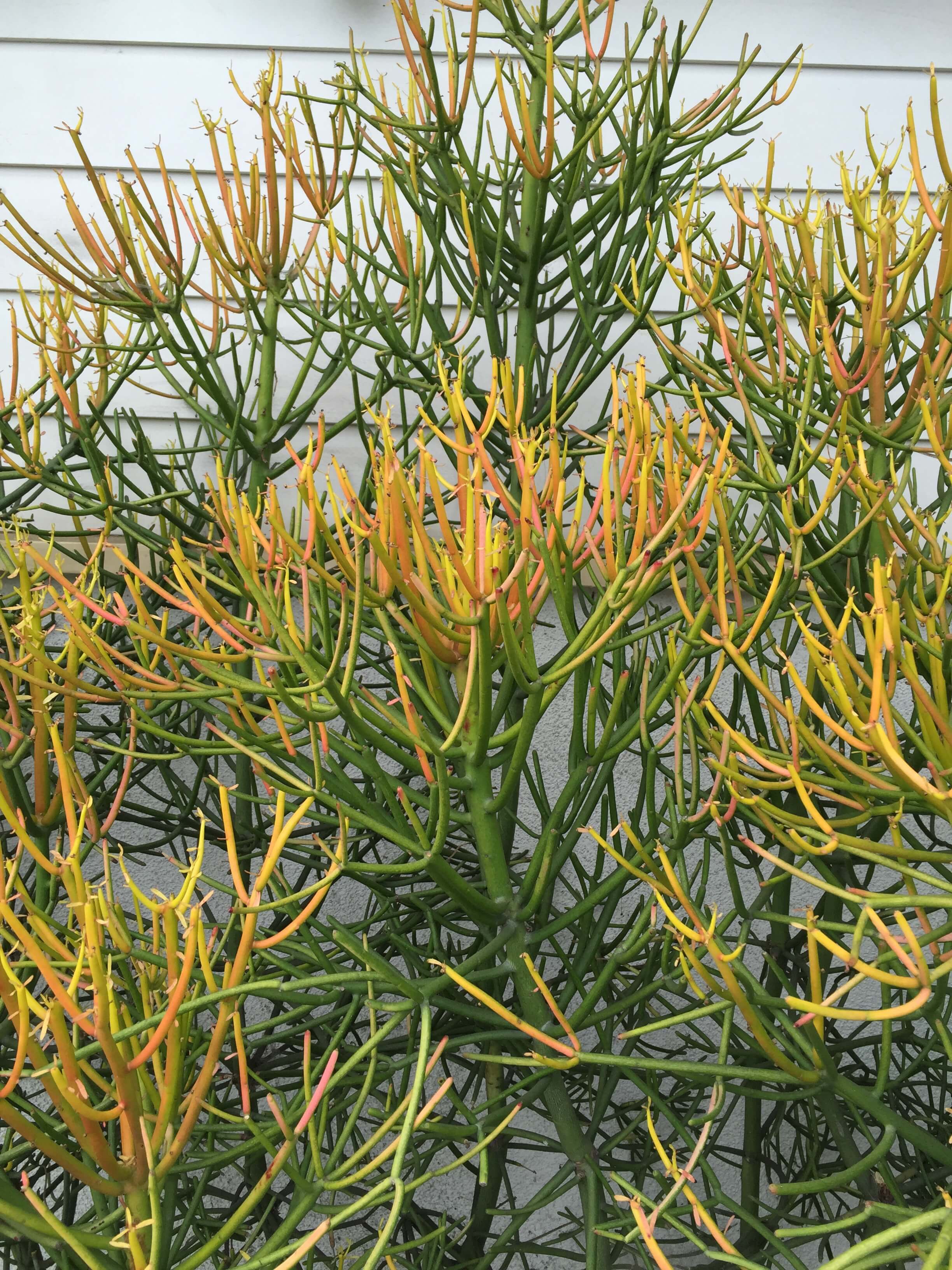
Maybe Californians have known this all along, but I’m really just now waking up to the fact that succulents don’t die, they multiply like crazy. They are beautifully sculptural, live on almost no water, and can provide just as much color and visual diversity as you can possibly imagine. I have some in pots in my back garden, and I’m looking forward to expanding my selections and growing even more.
While I love a fig tree in an interior (they’ve been so popular in recent years), the succulent is taking over instagram, many thanks to Justina Blakeney. I have to say I’m completely on board after seeing these beauties below, and I’m truly ready to step up my succulent game.
Succulents are the new fig tree in interior design
Succulents combo
Golden succulents - the new "fig tree" in design
4. Chalkboards are still in.
I don’t care what “trend spotters” say, chalkboards are going strong in design, and they aren’t going anywhere anytime soon. Here’s the deal: If something serves a purpose and looks good, then that’s just good design. Good design is not a trend. Black paint of any kind is good design and not a trend. (And the same goes for barn doors. ;-)
All the walls were painted black chalk paint at Bacari PDR. (The wine bottle ceilings are pretty cool, too.)
Chalkboard Wall at Bacari PDR
5. Go for the wow!
Play it safe or do the ordinary and you won’t be memorable. If you want to be remembered, then make a statement and go bold with it. This industrial warehouse space that houses Angel City Brewery has such a great vibe. With bold graffiti and a big metal slide, this place is memorable and fun.
Slide at Angel City Brewery
Need a few more bits of design information?
Info, perhaps, on kitchen remodeling or cutting your budget? Then check these out here:


