It seems like in every kitchen remodel I work on, a fireplace transformation is wanted.
It’s usually because it is located in the open plan family room / kitchen area and if we don’t address the fireplace, it will stand out like a sore thumb! It is just the perfect smaller job to add on to a bigger project too, kind of like powder baths. :-)
Often, when clients add these on, we do tv or bookshelf cabinetry changes as well. Usually, the whole wall is affected.
Today, however, I’m sharing some simpler changes that can be made to a fireplace with just paint, wall finishes, and the tile surround.
It can make a huge difference in updating the look and not be such a big deal to make the changes.
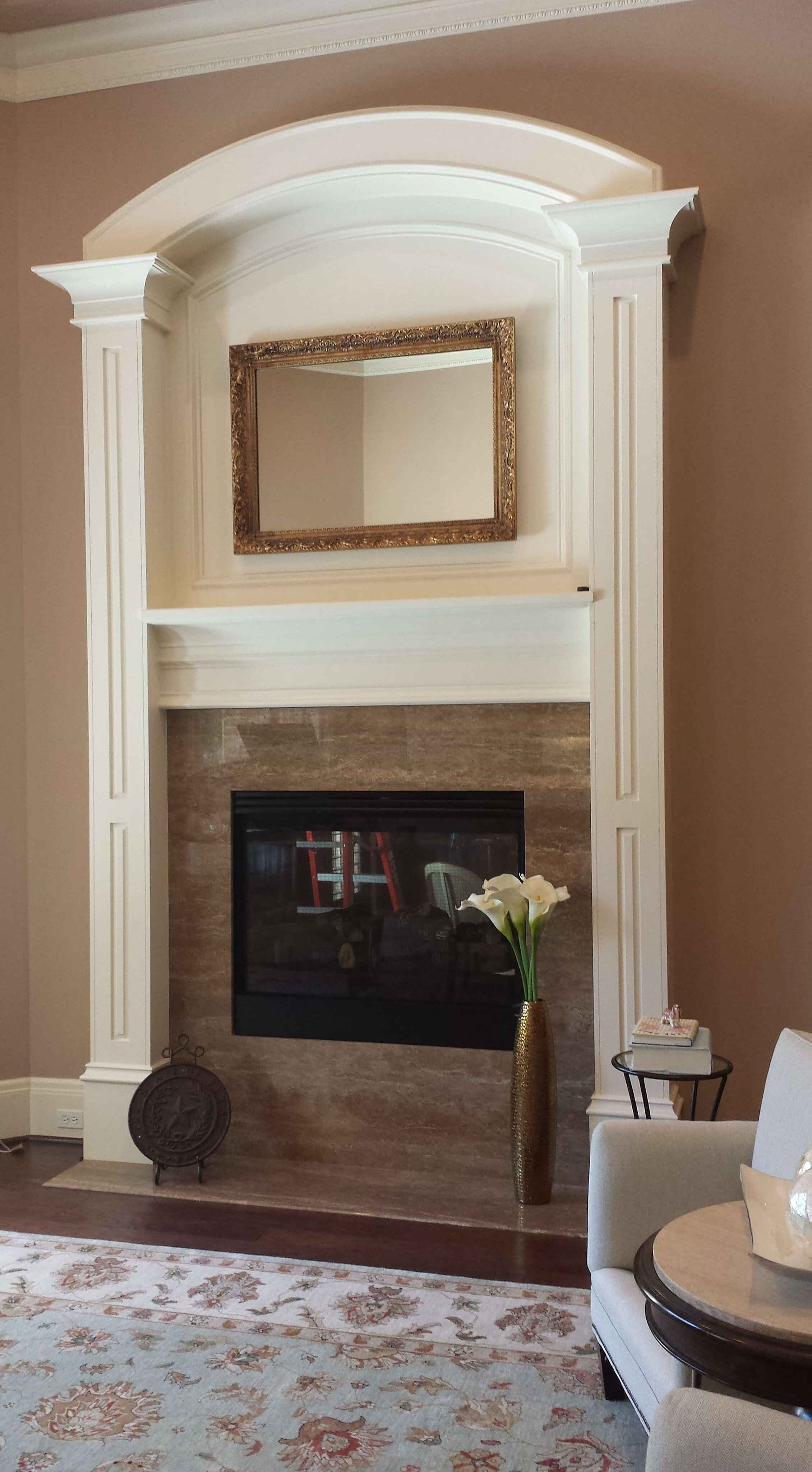
Fireplace Remodel 1 - Thick, heavy mouldings and minimal decor
In this redo, the big, oversized mouldings were staying. We were going with a lighter, fresher look overall. To minimize all that heaviness, I suggested we paint the mouldings and trim in a soft white, SW Aesthetic White, in a satin finish, to match the new white wall color.
That proved to subdue the look and get the focus on other things in the room, like that gorgeous grand piano. ;-)
The white marble slab surround and hearth added a freshness and touch of gray that we played up in the drapery and ottoman.
Warm, gilded finishes on the mirror, lighting and drapery hardware added some sparkle and contrast. That round shape of the mirror makes for a nice complement to the boxy shape of the paneling.
BEFORE - Fireplace Remodel | Brighter, lighter paint, marble and fresh decor will help update this look. carlaaston.com
AFTER - Fireplace Remodel | An overall white paint color and marble slab surround brightens up this fireplace area. The round gilded mirror is a much more pleasing shape inside the arched framing of the paneling and reflects the same finish in the curvy chandelier. carlaaston.com
Fireplace Remodel 2 - Dated orange color and glitzy iridescent tiles
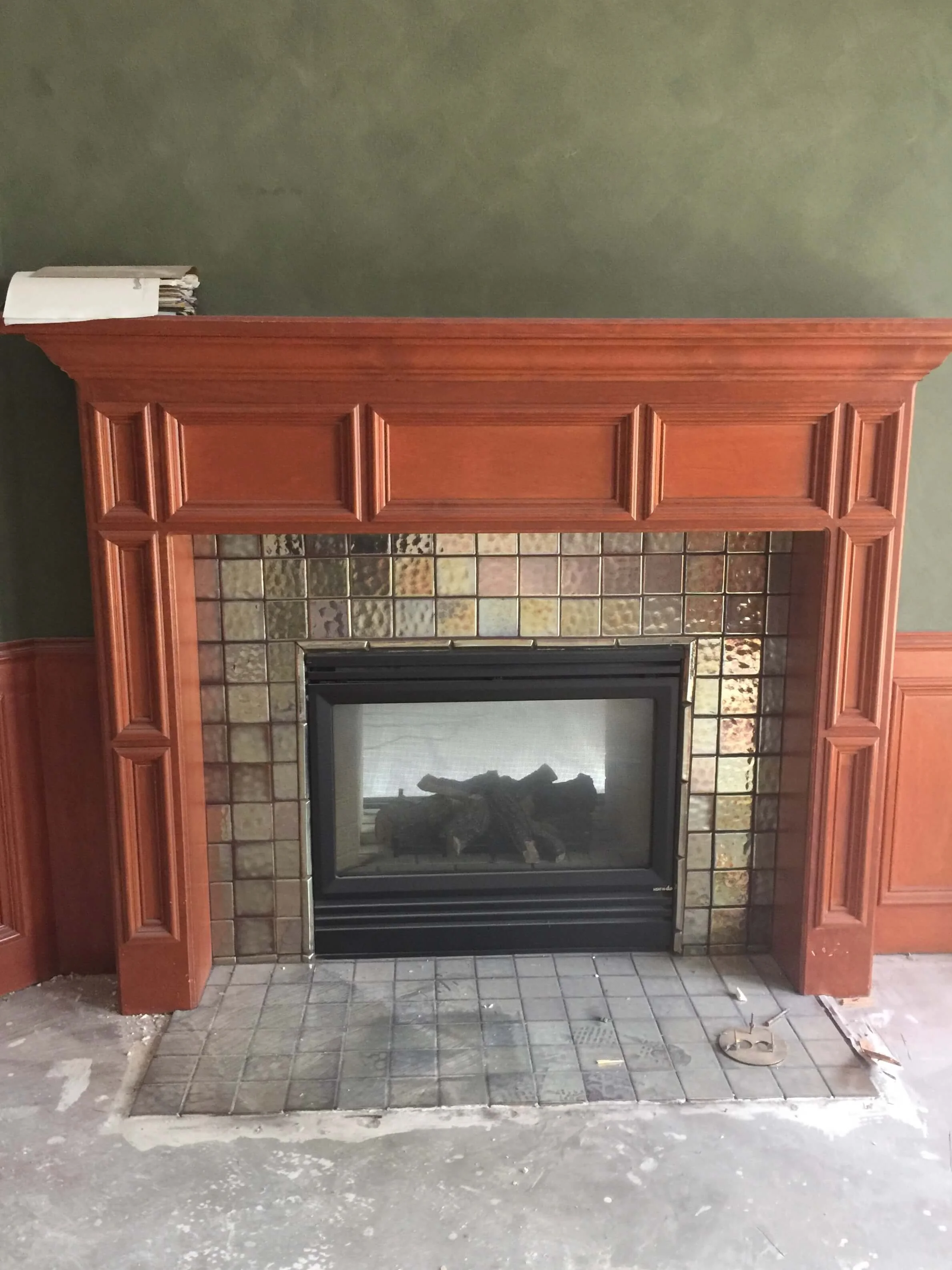
This fireplace in a home office had some nice proportions and decent paneling, however, the color was very dated. The homeowner was looking for a lighter, brighter look and we opted to paint that orange wood a simple light gray.
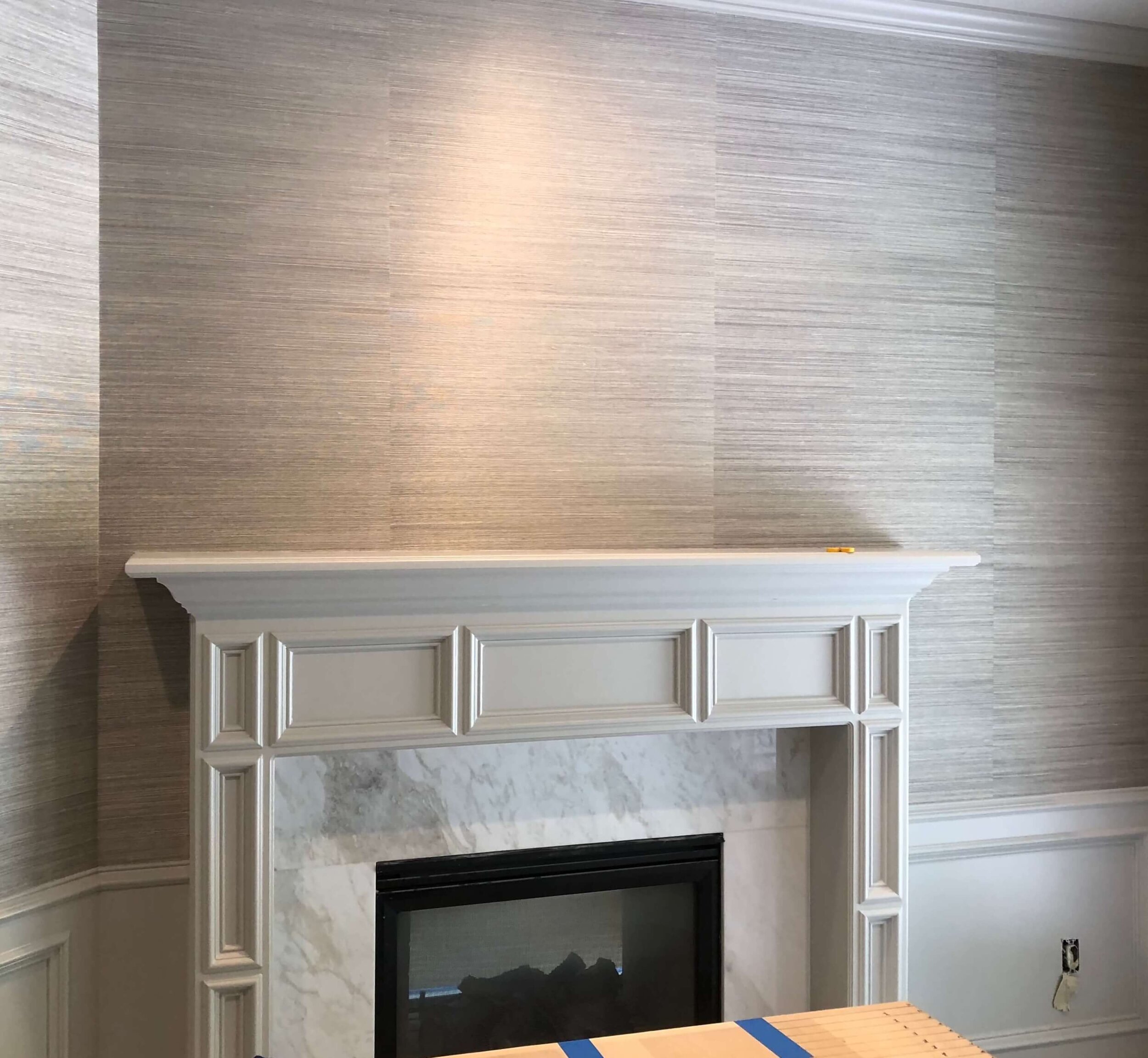
A new marble slab surround and hearth in Frosted White marble, makes for a simple and light appearance. The grasscloth wallcovering adds texture and interest in this room.
BEFORE - Fireplace Remodel | Stained orange wood tone and iridescent tile date this fireplace in a study. carlaaston.com
During Construction - Fireplace Remodel | This is a job site pic, never got finished photos of this. :-(((( It was looking great here though! carlaaston.com
Fireplace Remodel 3 - Builder standard fireplace gets toned down
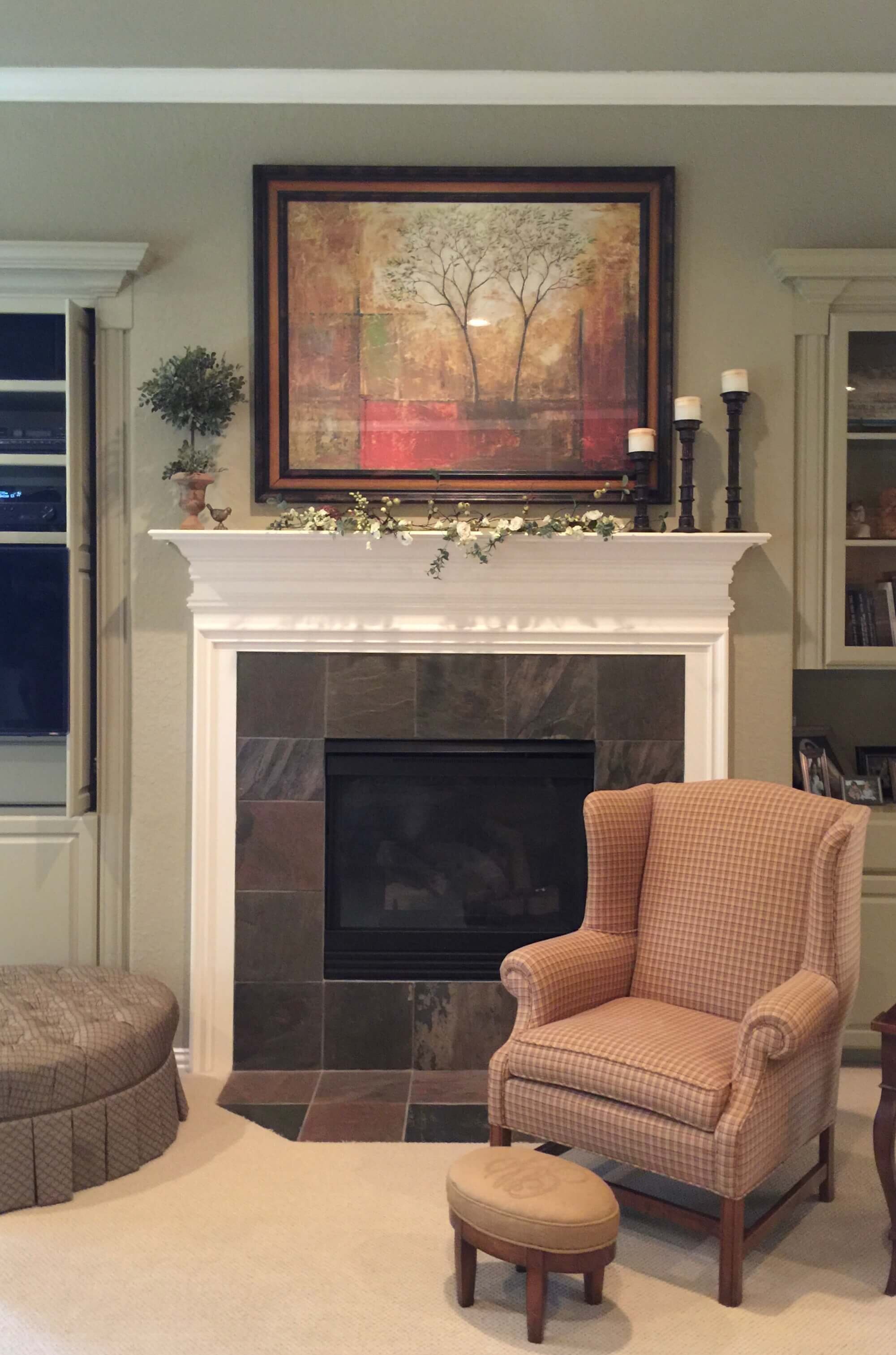
This fireplace was painted the builder standard bright white and had a dark 12 x 12 slate tile on the surround and hearth. The art above the fireplace looked a bit heavy and the homeowner was looking for some fresh decor as well.
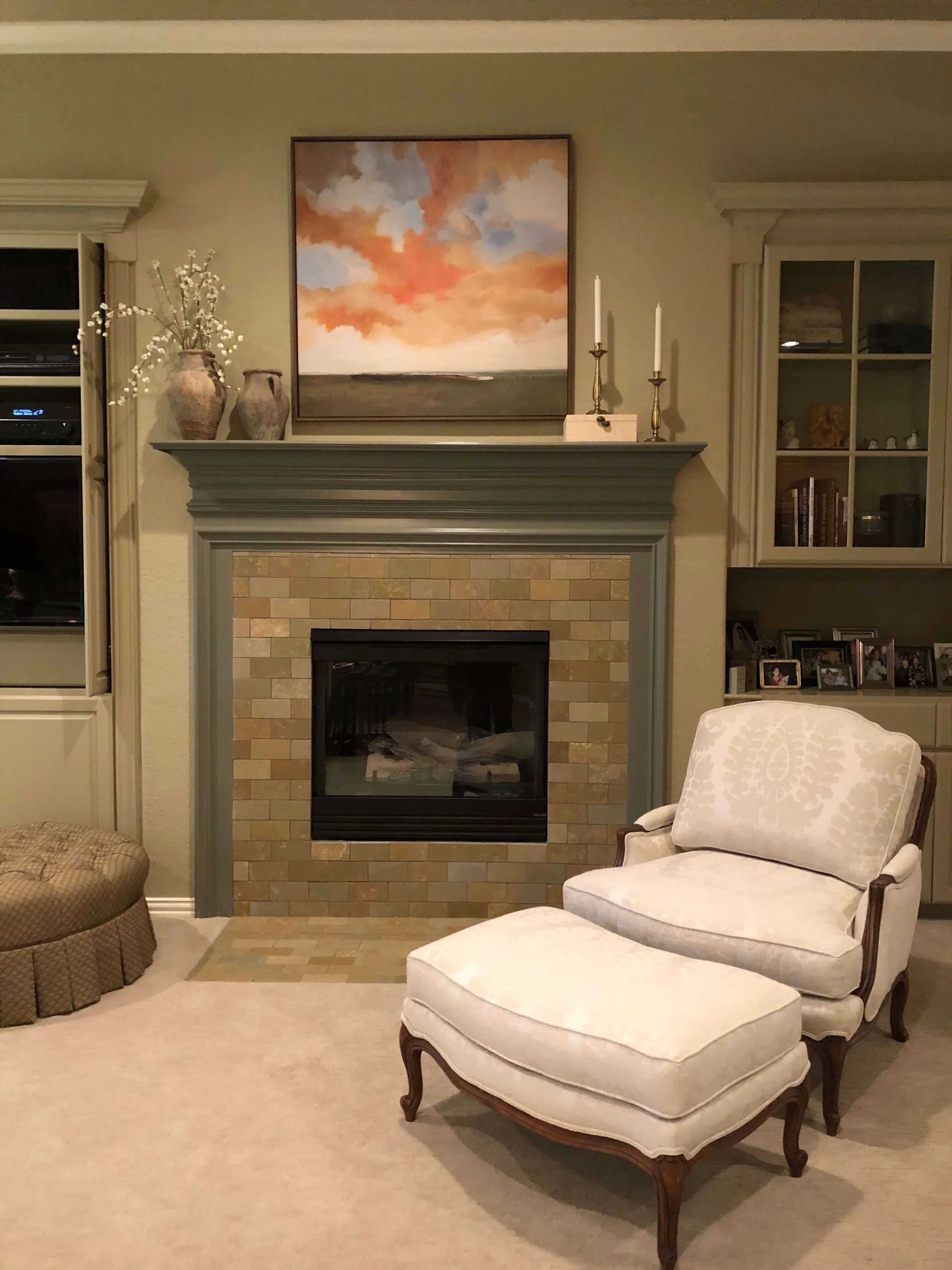
The wall color was kept as is and a darker, warm green was painted on the existing mantel. A beautiful leathered 3 x 6 slate tile was used as the surround and hearth.
The art has a nice, fresh feel, doesn’t dominate the wall, and different accessories add a more “collected” vibe.
BEFORE - Fireplace Remodel | A builder white mantel with the high contrast dark slate on the surround stood out as rather garish in this warm toned living room. carlaaston.com
AFTER - Fireplace Remodel | A darker, warm green was used on the existing mantel. A colorful honed 3 x 6 limestone tile was used as the surround and hearth. carlaaston.com
Fireplace Remodel 4 - Another wood fireplace mantel to go light
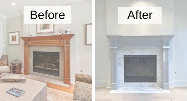
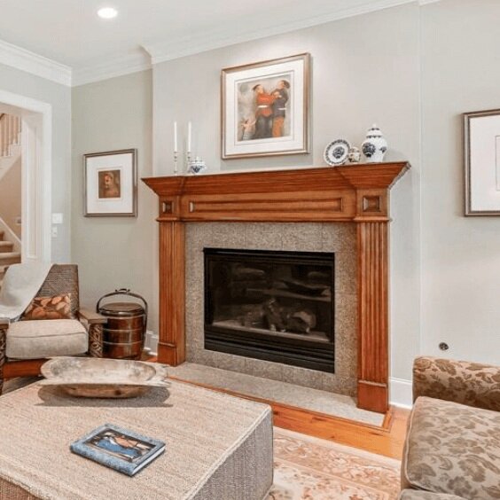
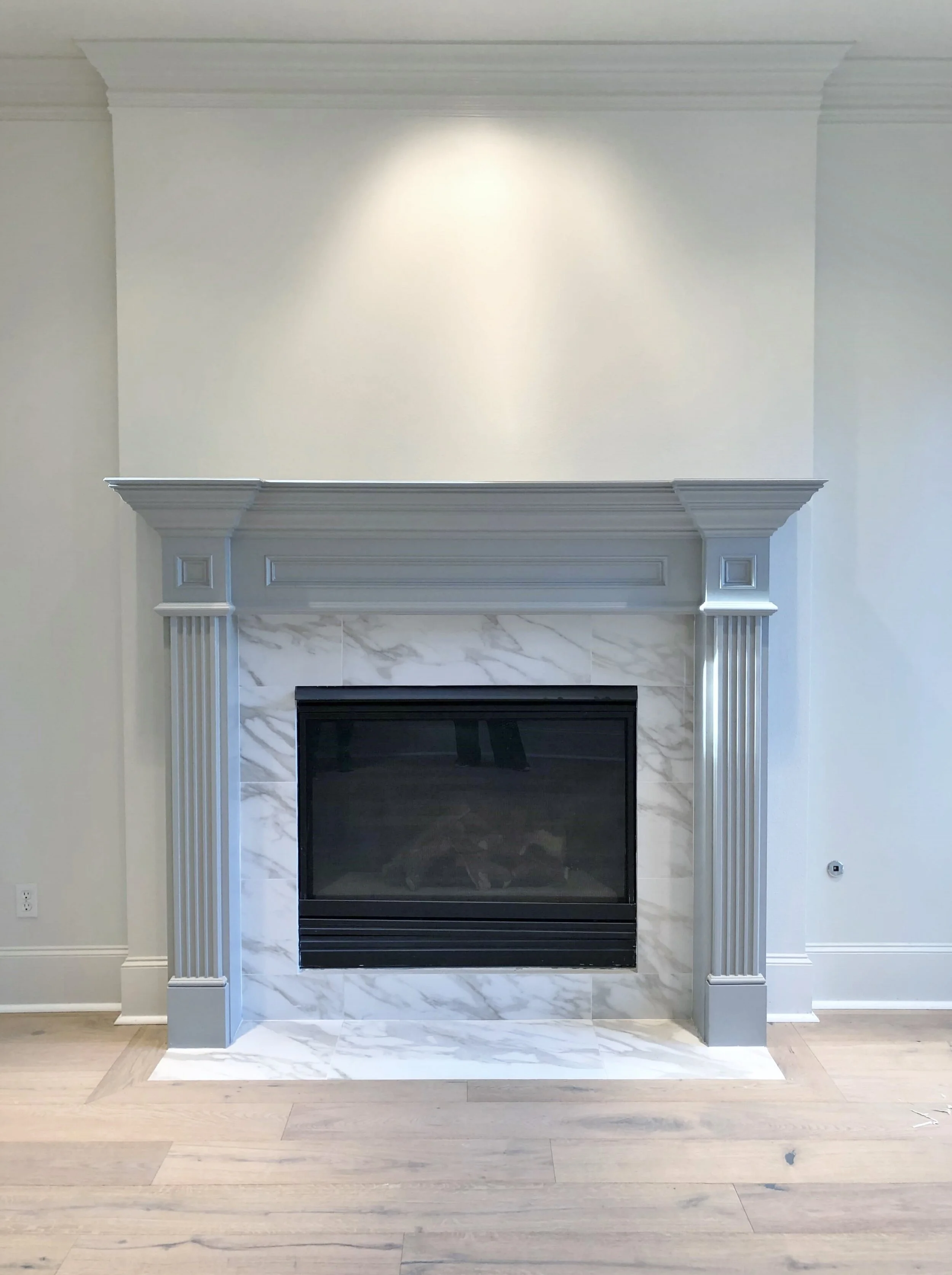
The homeowner here wanted to go lighter and brighter as well, on this living room fireplace. A nice gray was used to paint over that wood mantel with a creamy white on the walls and trim.
These are 12 x 24 marble-look porcelain tiles here, used in the redo to save a little bit on the budget.
BEFORE - Fireplace Remodel | An orange tone stand on this fireplace and spotty granite tile surround were needing an update in this remodel. carlaaston.com
AFTER - Fireplace Remodel | Gray paint and marble-look porcelain 12 x 24 tile gave it a fresh and modern update. #fireplaceremodel
Here’s a pic after they moved in. This was one of my consultation clients.
You can read more about this project in this post. >> How To Update A 20 Year Old Home To A Fresh Look That Will Last - Before And After!
AFTER - Fireplace Remodel | Gray paint and marble-look porcelain 12 x 24 tile gave it a fresh and modern update. carlaaston.com
Fireplace Remodel 5 - A Warm toned fireplace goes cool
In this fireplace remodel, we simply changed out the small Crema Marfil mosaic tile to a quartzite slab that we had left over from the kitchen remodel’s counters.
In the pic below, this living room formerly had a beige wall color and there was cream colored trim. We went with a whiter color for the trim in the kitchen and primary bath, but in this open area, we kept the cream color to not have to paint everything.
To introduce some cooler tones, we did a blue-gray on the walls, but somehow it just didn’t feel like enough and the fireplace especially, came off creamy (really rather yellow).
The cool toned quartzite slab not only tied this color to the new wall color nicely, but it related this space to the kitchen. It used some leftover material and the fact that it was a slab was a higher quality look.
I love how it turned out!
BEFORE - The Crema Marfil mosaic tiled fireplace surround made the fireplace come off as a mass of warm toned white. carlaaston.com
AFTER - The new, cool toned quartzite slab tied this color to the new wall color nicely and made the whole space seem less warm toned and more cool. carlaaston.com
Pin this to Pinterest to save these ideas and inspiration!

