This large primary bedroom created a roomy challenge for the homeowner in a recent consultation. How can she make this room feel more “designed”?
You can see that wide open space is not a problem in this bedroom. However, it feels a little lackluster and empty.
With the queen sized bed and the mix of furniture styles, let’s see how we can layer in some extra pieces and decorate the walls to add coziness and a more upgraded look.
My blog contains affiliate links. Any purchases, at no additional charge to you, render me a small percentage, are most appreciated and make this blog possible. :-)
The Bedroom Pics
She sent nice pics of each corner of the bedroom from the opposite side of the room. This helps me get a good view of the whole space. I can ask for detail shots if I need to.
Closet / TV Wall
Entry to bedroom and entry to bathroom
Bed Wall of Primary Bedroom
rather tight parameters for this bedroom design
We will keep most of the existing furnishings (rug, bed, dresser, vanity + chair, lamps (including task lamps on nightstands) not sure about nightstands?, not sure about cedar chest?).
Keep existing furniture arrangement; it works well.
Paint walls a pale blue and do White Dove trim (to match rest of house).
Install single hanging ceiling fixture in center of room.
Her Questions:
What architectural upgrades would help this space? It's fairly large (16' x 21' with 8’ ceilings) and I feel like it could benefit from moulding on the bed wall.
What would you recommend for window treatments? I would want light filtering, as our house is in the woods and often very dark.
What furniture arrangement would you recommend for the TV corner? I could envision an upholstered chair with a floor lamp for reading.
I really like the vintage vanity found at a resale shop, and the chair and mirror I bought at auction. I would mount the mirror on the wall, but need advice on how to refinish the chair.
My Recommendations:
I think you do need some vertical elements and structure to the walls, but getting the math right with applied mouldings with an asymmetrical layout like this one, is a challenge.
The window and then the bed location, that is more centered in the room, is making that difficult. I do think we can get a good result though, another way.
First of all, full height drapery treatments on the two windows, will create some much needed softness and verticality in the room. Yes to those.
Secondly, adding in an upholstered chair and ottoman and then an upholstered bench at the end of the bed, will also get some more softness in the room and help to fill up this big space.
The Layout
I do think you need to move the dresser to the tv wall, for two reasons.
One, so the tv won't be floating up there so high by itself like a hospital room, and two, so we can push the bed and nightstand more to other side of the room. I think the bed is just floating too much in the middle of the wide open bedroom and needs to feel more anchored to one side.
Then you can put the cedar chest along that wall where the dresser is and tuck one of your little chairs in the corner there for some height. You can do a little gallery wall there above the chest.
I do like that now you don't see the matching bed and dresser when you walk in the room. I always prefer going with a mix of furnishings rather than a set.
This arrangement is best figured out by looking at the plan.
New layout switching the dresser and cedar chest, moving the bed off center in the room and adding in the new lounge chair grouping. carlaaston.com
At first I thought the bed would be best centered between the outside edge of the drapery on that wall and the opposite corner, but it isn't quite right when you consider the rug placement.
If you look at the rug in the floor plan layout I did, I laid it 1'-0" from the front of the nightstand and then 2'-0" from the wall. I would set the nightstand there (and I have a new one selected), then place the bed and the other nightstand.
I think this gets the overall layout right, with the added chair and small table. I feel like, with this layout, you now have sort of two separate zones.
I also like the look of having the bed more in view from the door.
New Furnishings
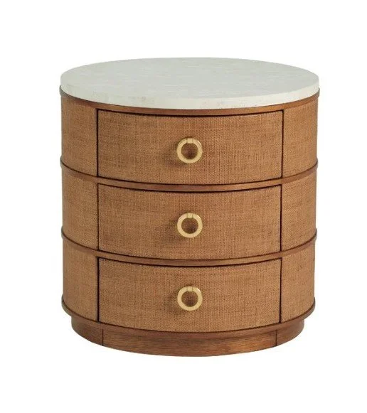
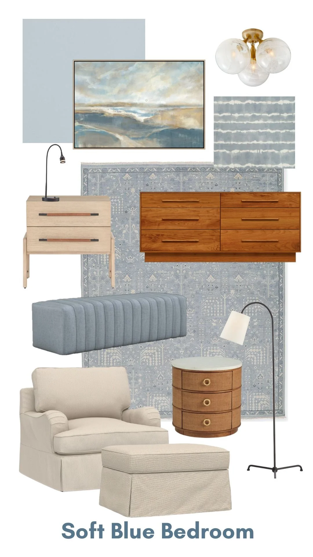
Here's the nightstand I like. I wanted to use a different finish from the bed, a lighter one preferably.
I love that this one has the leather pull that relates to the color of your bed and dresser. I like the bit of black on the pull too, as it relates to the modern lamps by the bed that you want to keep. This is a good price point too, really.
I looked at so many different vendors and felt this was the best. The bed is so distinctively simple, I didn't want anything traditional and going too plain and ultra modern didn't feel intentional.
I left your dressing table and mirror in the same place and then added a nice upholstered lounge chair and ottoman at the window with a round table.
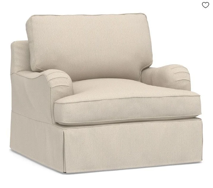
Here's a chair from PB, I like the English arm and the skirt. I'm sure they could do an ottoman to match too. (Skirted upholstery is becoming very popular and we will see more of it to come.)
I'd do a side table something like this one, below. I like this because the color is like the dresser and bed but is a textural look, so just different enough. I like the white top too.
I like a floor lamp here, something simple and more modern looking that doesn't block the window. This is always a fave of mine and it has that black arc like your lamps you have and want to keep at your bedside.
I think you definitely have the room for a bench at the end of the bed. Let's keep it simple, something like this.
I like that it would sort of extend the bed, it is 61" wide. You could likely get it made in a local upholstery shop in something slightly more narrow, like 54" wide.
I do think you need art over the bed. I like the idea of a big piece, something that spans the width of the bed, like this one.
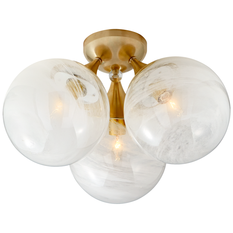
A new flush mount fixture was needed to replace the central fixture too. I like this modern look one.
Bed Wall Design
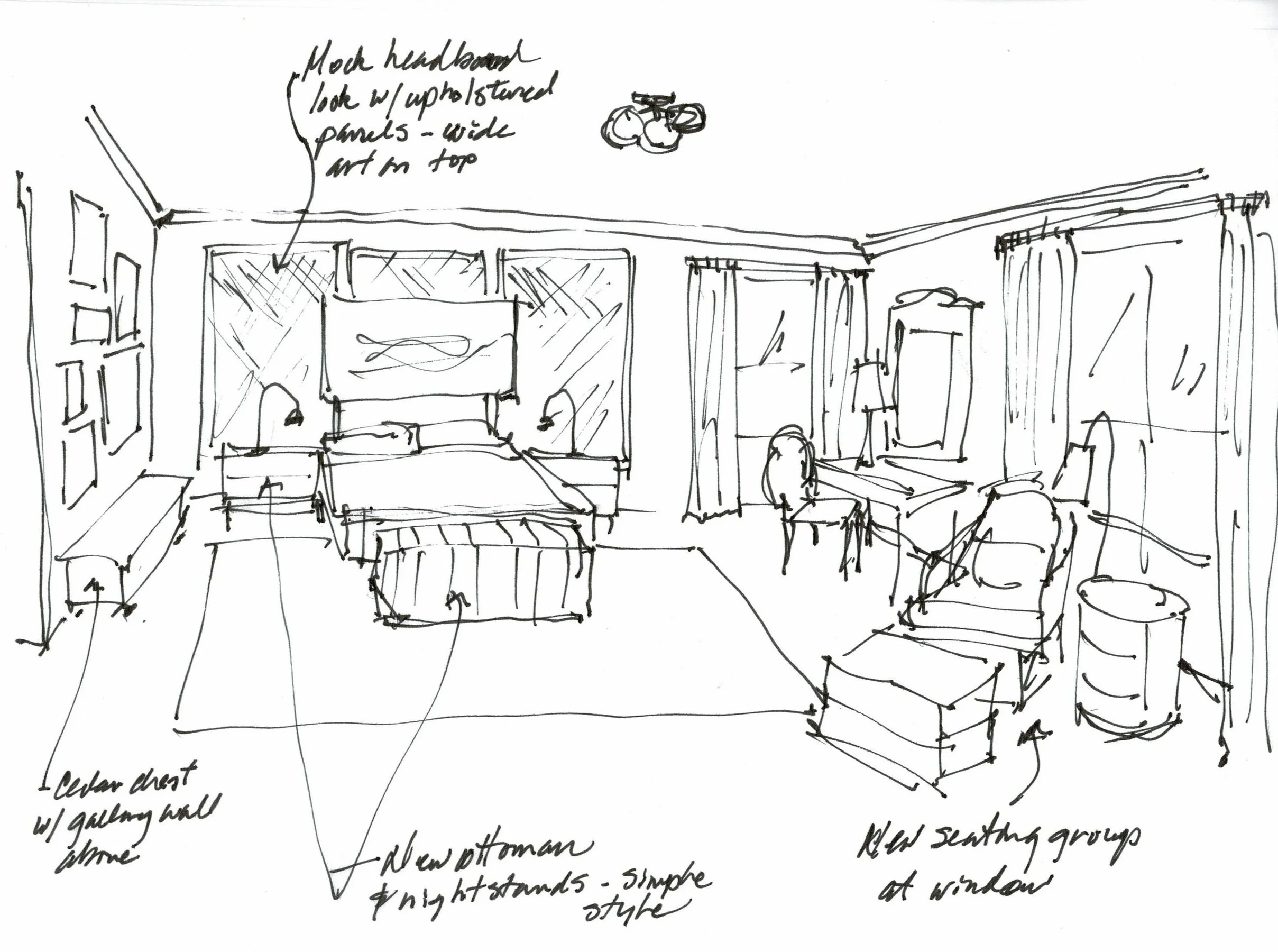
I think the bed wall needs some structure but as I mentioned, there is a problem with how to divide up boxes if you want to panel it. I would rather see you do sort of a mock headboard look.
You can still apply moulding, but do so in a way that aligns with the center of the bed with 3 equal sections, going just beyond the total nightstand-bed-nightstand at about 11-'6" wide.
Align the top with the top of the window moulding and then do that same distance above the baseboard. So, you will have 3 panels or boxes there on the wall, highlighting the bed. I would space them about 3-4" in between the boxes.
Bedroom sketch showing wall treatment for the bed wall. carlaaston.com
Definitely mark it out on the wall, check your bed size and the nightstands you end up with there, marking it out with blue tape to make sure you are happy with it.
I feel this is better than an overall grid pattern which, honestly, is becoming dated. People are saying the whole “paneled accent wall” is a bit “over”.
I would then upholster or apply a backed fabric for a soft, almost upholstered-headboard look. Some kind of linen look, a textural color, would be nice.
Grasscloth would be a similar look and an option. I do not have a sample of this and would have no way to compare to your rug, but here's the idea.
I'd also consider a crown moulding in here. I just think it would give a more finished look with the new wall color.
Color
I would go with a tone on tone look, so whatever fabric for the wall you get you would match the paint color for the trim moulding and walls.
You have started in with the blue color in the rug. That's what you have to work off of. I can't just give you an exact color without comparing the rug in hand with a paint color, so you will have to do that on your own. I would try to match or go slightly grayer and lighter with it.
You might try Sherwin Williams Upward, their new color of the year. That looks like it might work. But definitely start with the fabric or whatever you put on the bed wall there.
Since you want light filtering sheers on the windows, then I'd go with a light neutral creamy color. The lounge chair and ottoman can be in that color too.
Here's a creamy sheer fabric that I used in a bedroom this past year and it turned out really nice. I like that it had a pattern, it seemed more special.
You can do a pillow in a pattern, along with the vanity chair. I would not spend the money to lacquer the chair. I like the white finish and it would relate to your White Dove in the room.
Lastly, fabric for the chair. You could also use this for pillows too. Again, anything here you need to check with your rug color. The rug, walls and then this fabric should all be a similar tone that looks good together.
Storyboard - Blue, Modern Mix Bedroom
And here are all the items together combined with a few of the existing pieces to see how they all work together.
Are you still reading? :-)
Four seemingly simple questions can turn out to be a big design challenge, right? Hope you read through all this above, as there are some good ideas for how to approach the design problems you may have and some tips along the way.
And if you followed the whole thing, you get a gold star!
More bedrooms to peruse below!
This blogpost was thoughtfully written by me, Carla Aston, and not by AI, ghostwriters, or guest posters.


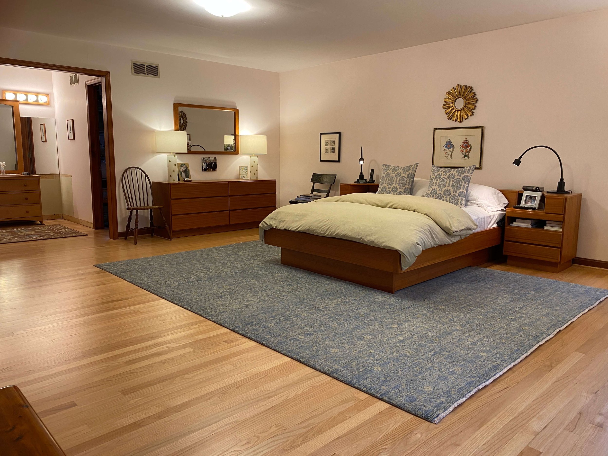
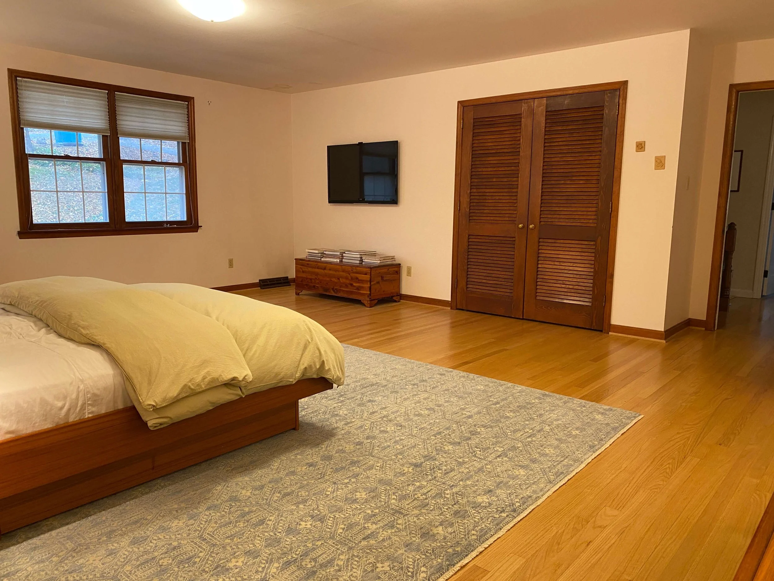
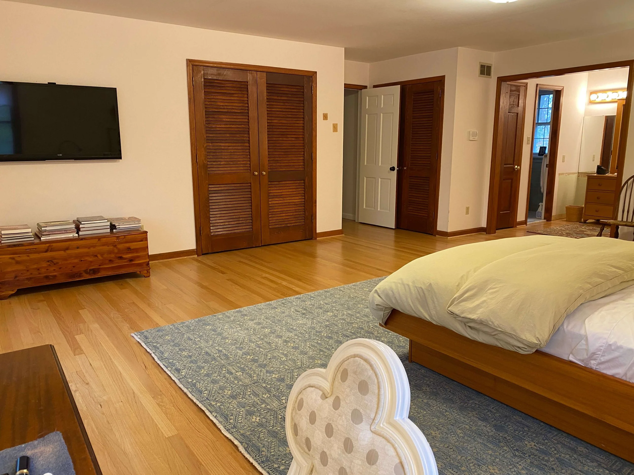





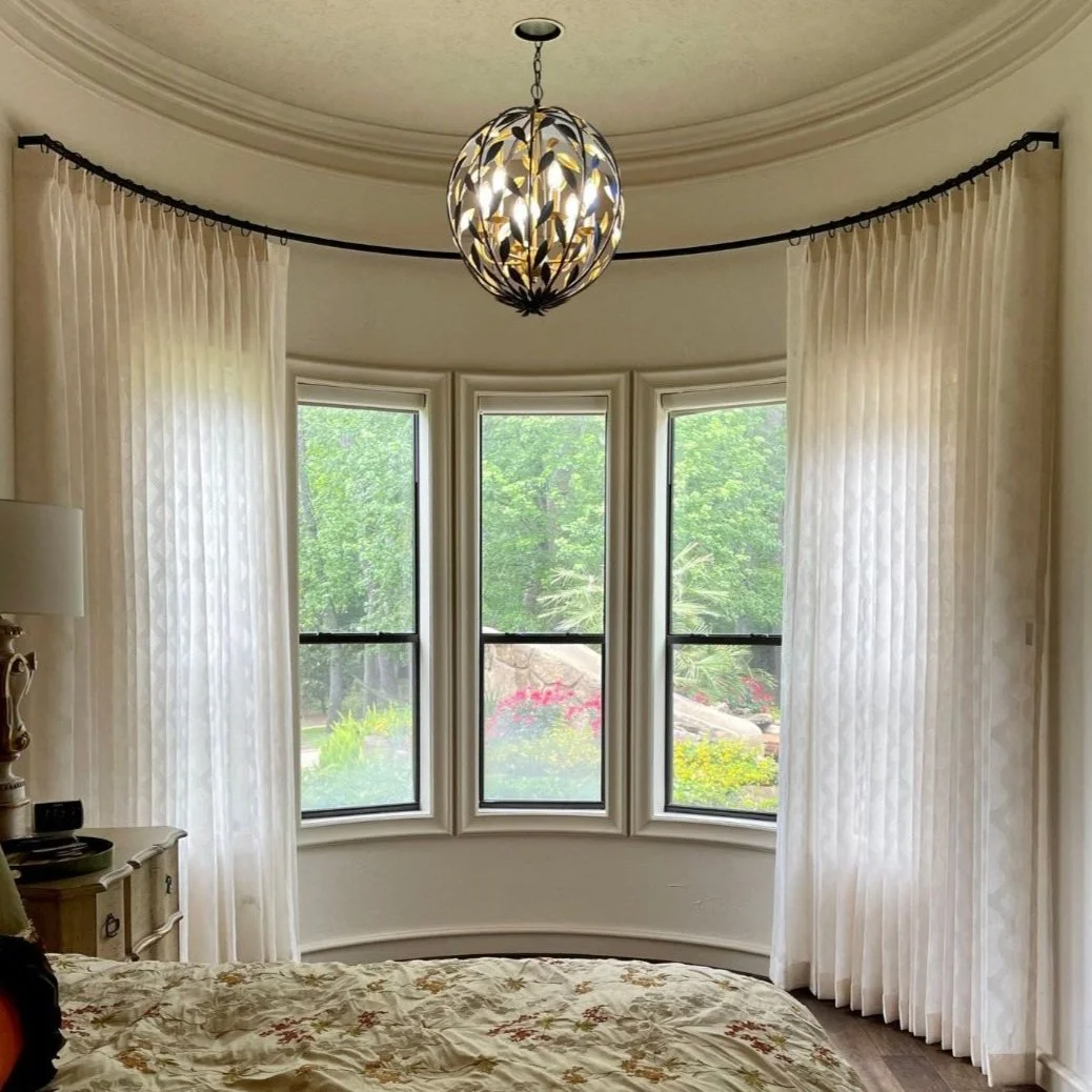



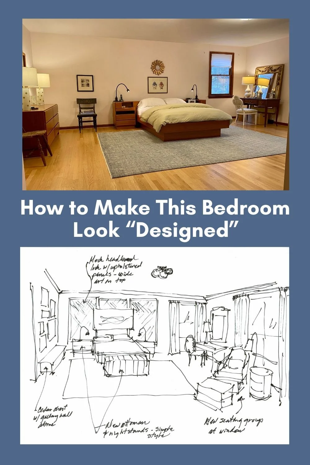
This primary bedroom had a good start but needed a little more decorating to make it feel designed or completely finished and put together.
Come and check out these recommendations….