Sometime in the 60s, 70s, or even 80s (I believe), builders decided to get tricky with their floor plans for homeowners.
They added in some trendy style that really could end up breaking your neck. Sunken living rooms were a hot design item and made a space feel multi-level...I guess?
Not sure what the attraction was, but boy is it annoying. Happily, we don’t see this feature much anymore — except when we’re remodeling.
I have a project going on right now that has one, and I’ve had another one in the past.
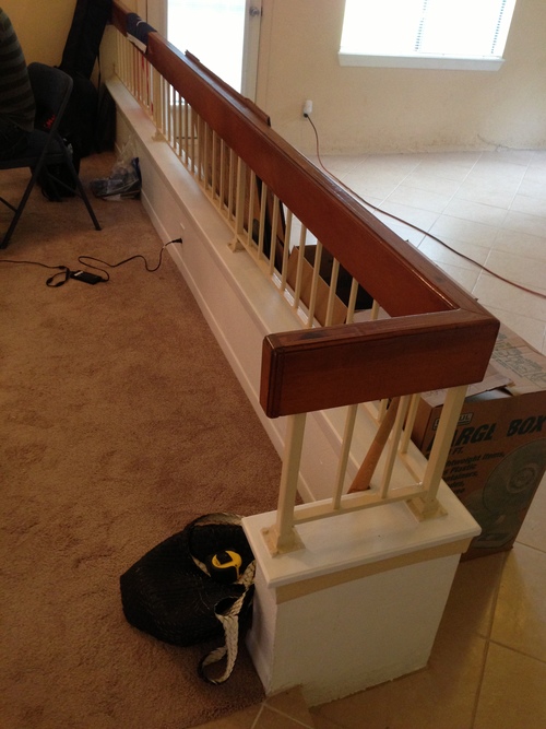
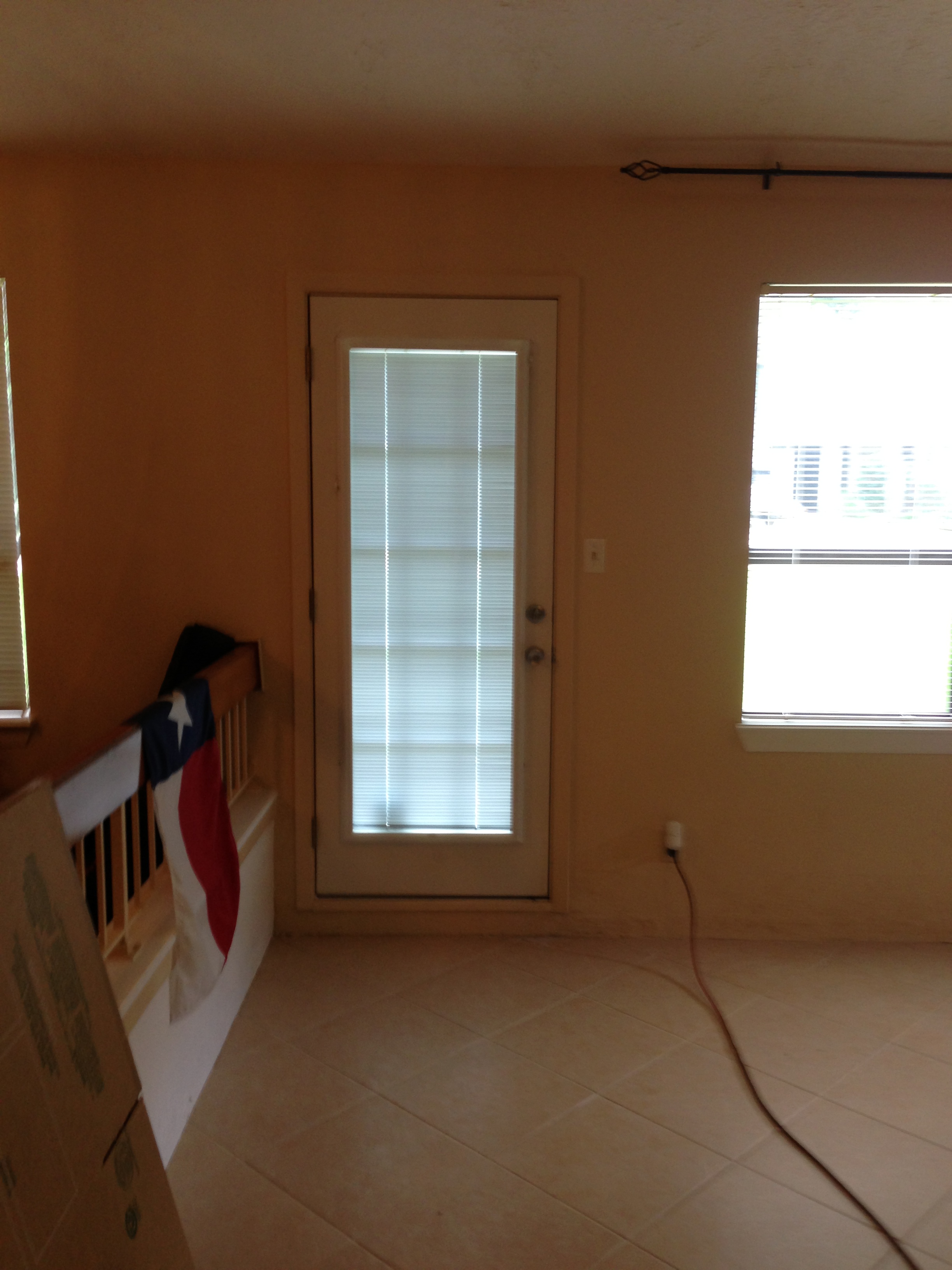
This project for a young bachelor had a living room floor that was sunken about 3-4 inches, just enough to trip you up and send you sprawling across the room. It even transitioned at a doorway, which was even crazier.
Bachelor Pad - sunken living room before
Bachelor Pad - Sunken living room w-railing
Bachelor pad railing and sunken living room before
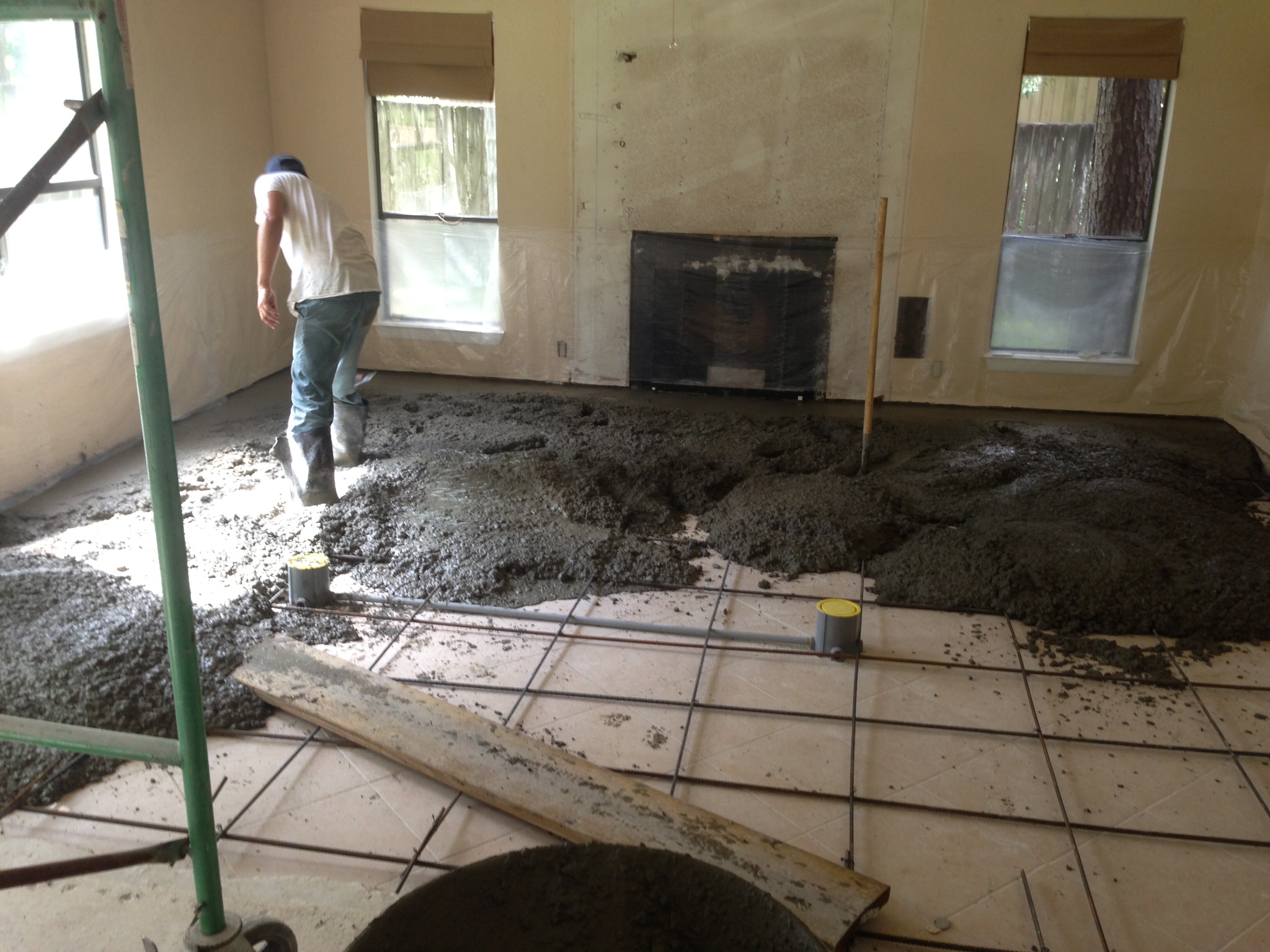
Sunken floor area being filled in
Floor all one level for a more open feel.
Here is the end result of this remodel:
Bachelor Pad - dining room after
Bachelor Pad - flooring all one level, just after construction
You can read more about this project HERE.
Years ago, when my mother bought a house after my father had passed away, her living room was sunken.
I advised her then to level it out by installing rebar and pouring concrete. Oftentimes, these areas are depressions in the slab and, you don’t have to worry about the sides of the depression, they are typically concrete — so, basically, it’s a big wide hole. Such was the case in all the ones I’ve seen.
My mother lived in that home for about 20 years; my grandmother ended up living there with her, too, until she passed. My mother was never so happy as when she would thank me for telling her to fill in that sunken living room. It was situated between the bedroom wing of the house and the kitchen. You had to go down and then back up a step to get to your coffee in the morning.
My mother wasn’t elderly then, but she was retired. She ended up having hip replacement while living there and had to use a walker for awhile. My grandmother was elderly and was very feeble, and she never would have been able to get around in that house without the change we made.
But, never mind the universal design issue that was obviously going on with this architectural feature, it’s much more than that. This is something I continually preach, and I did just that when I talked to my new client and advised her to fill in her sunken living room.
Design affects behavior. How our homes are laid out and designed truly influences how we behave, and that is powerful.
So my client’s sunken living room, which was off the main entry, opened up to the kitchen/breakfast room. Also, off the entry hall, was the home office, a place where she works some during the day and needs privacy for phone calls and serious focus. You have to get to the kitchen through the sunken living room or through her office from the other parts of the house. Other members of the family tended to go through her office rather than through the sunken living room to get to the kitchen.
Now it’s not that anyone living there is elderly or disabled, it’s just that it is ever so slightly more convenient not to step down and then step back up. Unconsciously, everyone was taking the easier route, interrupting my client and her work.
Not only that, but the break in the floor really promoted the feel of a separate living room; and, as all young families love now, an open plan and a layout that flows seamlessly from one room to the other makes for ease of use and supports a more modern lifestyle.
So, we’re filling in the floor. Money well spent on this remodel.
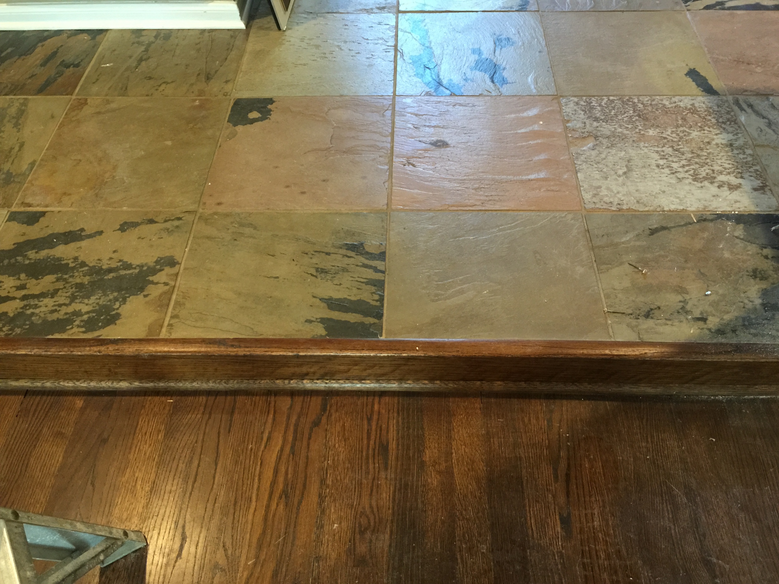
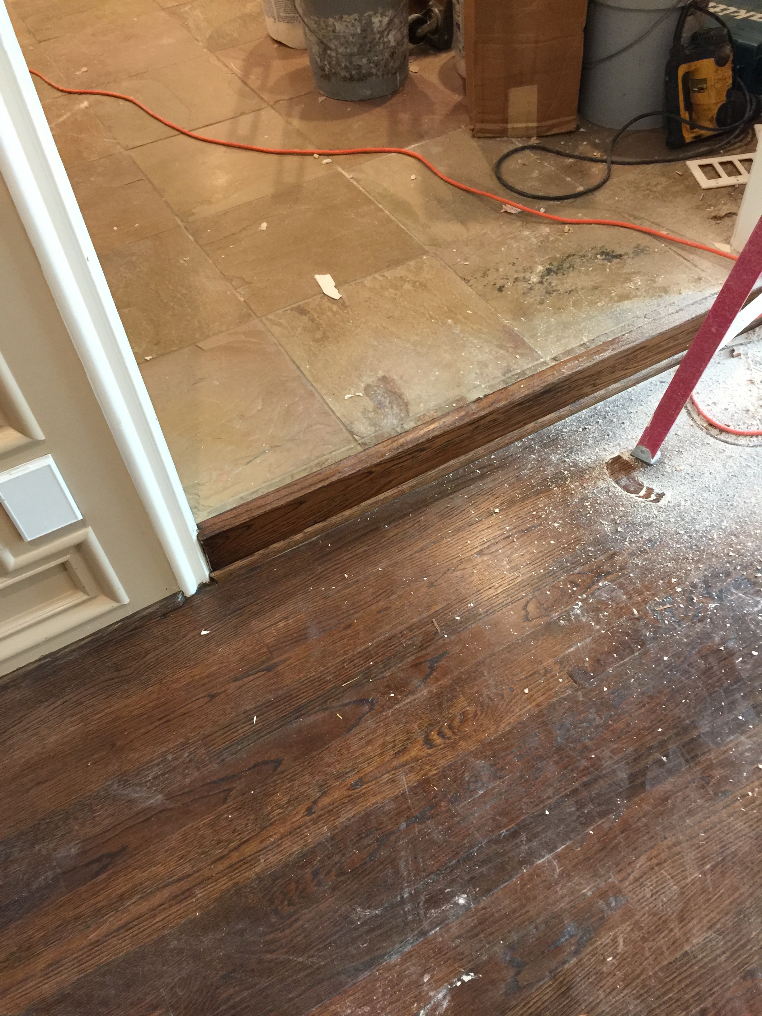
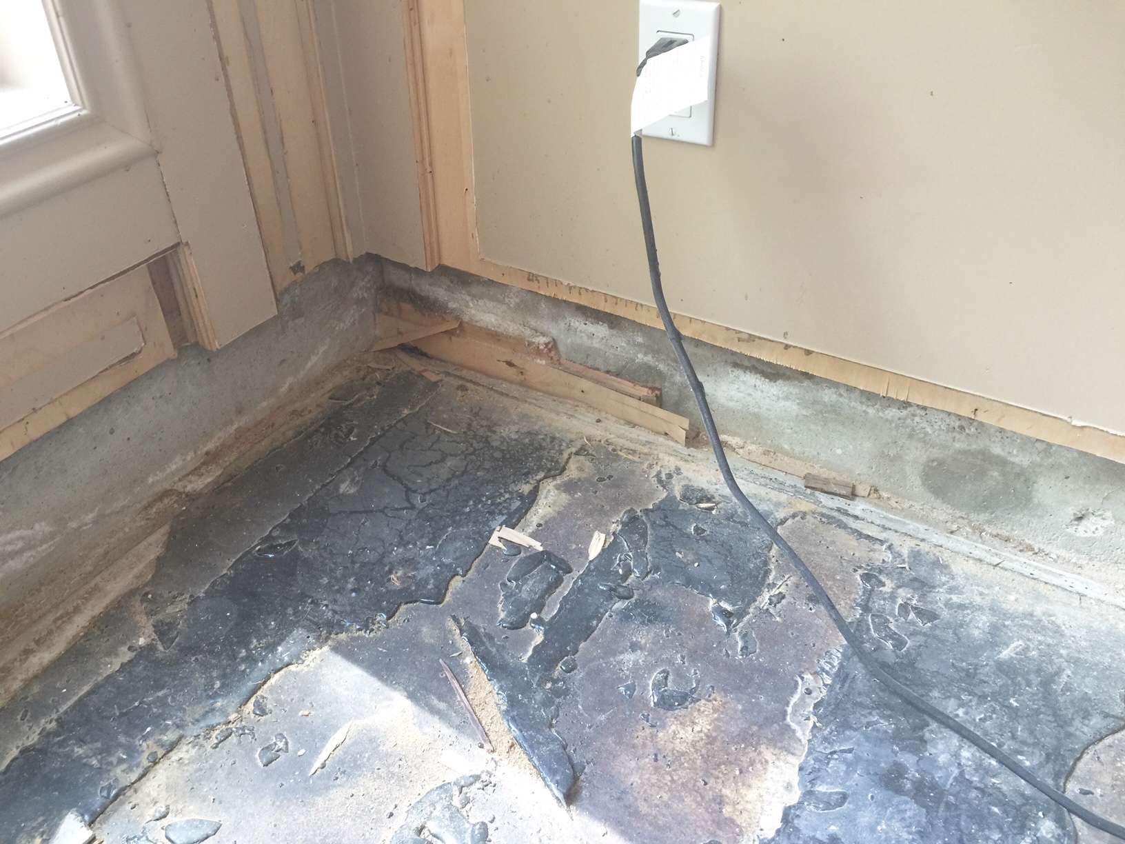
Below, is work in progress. See how this is just a depression in the slab that can be filled in?
Sunken living room - before demo
Sunken living room before demo
Corner of sunken floor
Sunken floor about to be filled in
If your sunken living room was done just for aesthetics, then maybe it’s time to change it.
If it was done because, perhaps, your house is situated on a slope and your house steps down with the grade, then at least put a contrasting floor material at the step, so people don’t go flying. (I’ve got another story about that, but I’ll save it for another day.)

