I’ve been hinting about our projects, right?
I’ve been saying I would be sharing a few “real soon”, and even more beyond then.
But I haven’t delivered on that yet, have I?
Well, to make up for my tardiness I thought I’d give you a sneak peek of a design plan I recently presented.
This one is for a client whose downstairs we’ve already finished. We turned their gold toned rooms into white, light-filled spaces, along with touches of soft turquoise and a warm caramel accent. The walls, ceilings, kitchen cabinets: they’re all now a beautiful, warm white. The furnishings were purchased new, and some existing ones were reupholstered to create an entirely different look.
(No, I’m sorry, I’m not ready to share that...yet. It’s still to be photographed. ;-)
I’ve already shared a preview of a small part of the remodel we did: a pantry overhaul.
Today though, I’m going to share the upstairs gameroom design plan.
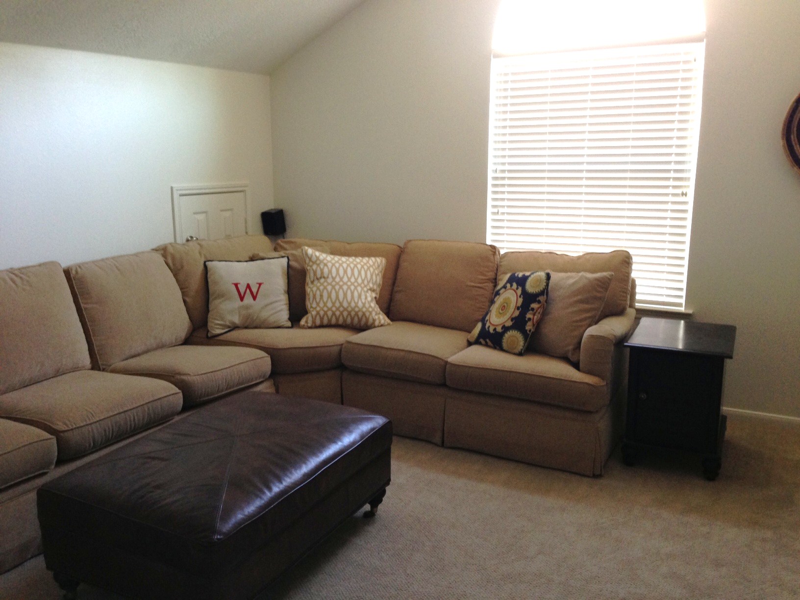
This is the last hold out of the gold: the sectional sofa.
It’s in a kid-friendly room, needing perhaps a little bit of help to make sense of its fabric — which isn’t in bad shape at all and would be quite pricey and big pain to reupholster. (And, if we reupholstered it, we’d still want the other stuff I’m presenting to fill out the room. :-)
Here's what I'm dealing with:
So...
How do we make this sectional sofa look like it belongs in this white/neutral house?
How do we make it look purposeful and fit in with its surroundings?
How do we make it seem like it belongs, and that we’re just not waiting for the first opportunity to load it on a truck and get it out of here?
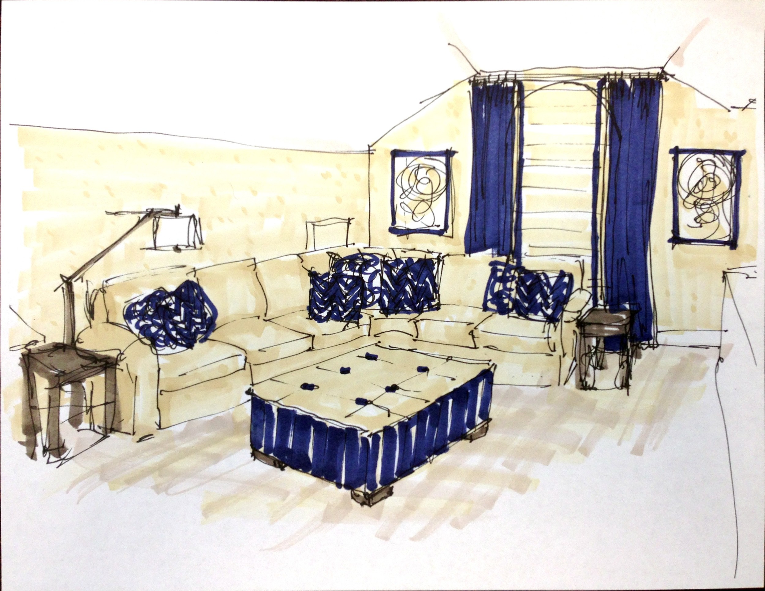
We add a touch more...a touch more gold.
...
Except it’s not gold anymore.
It’s a butterscotch burlap-textured grasscloth.
Overall, a much more upgraded look.
;-)
Now the sofa blends with the background and doesn’t stand out as the one-off thing in the room. Now it’s just an extension of the grasscloth wall — which is nice and current and upgraded and a little bit luxurious.
Tap to enlarge fullscreen!
Next...
We throw in a cool, bold blue. Kind of navy, but really more denim. What could be more perfect for wear and tear and for bringing that dated sofa into 2014, almost 2015! (I’m still betting on indigo as Pantone’s 2015 Color of the Year!)
We have some fun, graphic fabric for pillows; some simple drapery panels to add height to the room, along with some textured tape trim to enhance the custom look; and a great new custom ottoman with a durable “butterscotch” faux leather top, as well as that denim-like Ralph Lauren striped fabric to wrap the sides.
So what do you think?
Do you still see the “gold” sectional sofa?
Or do you see a comfy gameroom with a color palette that will last for years to come, firmly rooted in a graphic, relaxed style? :-)


