Look at this juicy color palette I'm working with for a dining room project. It's so fresh and colorful! We're doing a jute rug, the ikat on the chair seats, the large suzani print on the curtain panels, and some luscious wall color. The homeowner loves color and wants a younger, fresher, vibe in her often used dining room. She's lived overseas and has collected colorful pottery from everywhere. I thought her dining room should reflect her love for the color and pattern that attracts her eye. Here's some of her collection.
This was the project where a dinner party started it all!
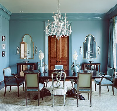
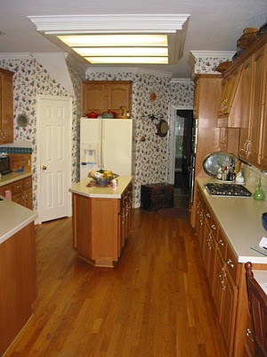
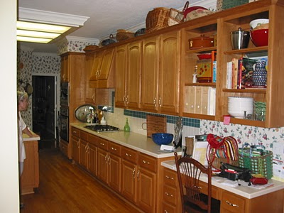
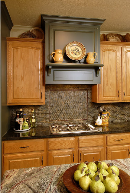
The "Before"
Remember?
During a dinner at this house one night not too long ago.......one particular friend, well I guess it was several friends, decided the border had been there long enough.
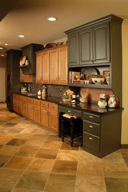
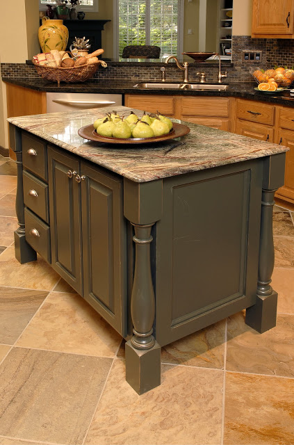
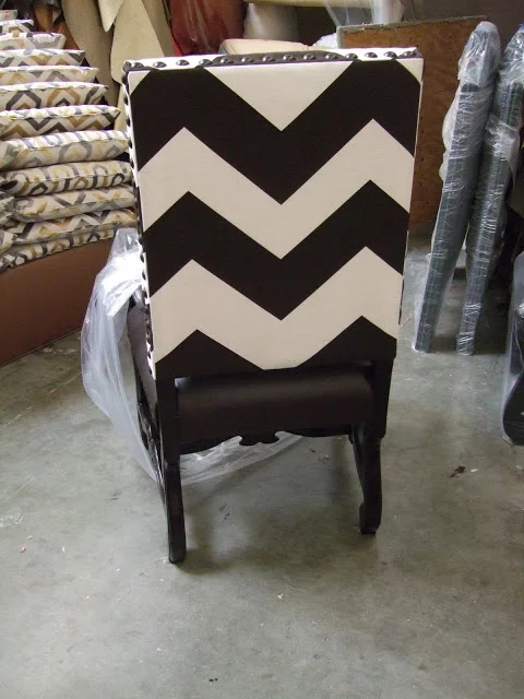
One piece was saved as a memory!
Everything is on order and will be ready for Christmas!