
Suzanne Kasler, Kim Winkler - House Beautiful
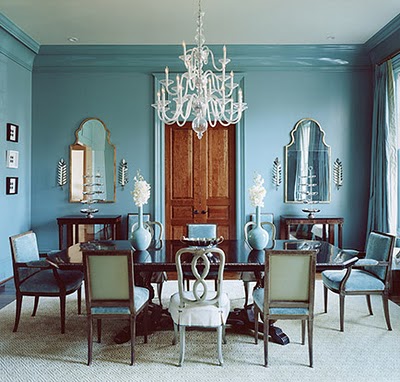
Using the same color on walls and mouldings in interiors can be effective in doing many things. Most importantly, it makes the lines or bands of contrast go away and a stronger, bolder, somewhat more contemporary look emerges. Where contrasting moulding might have visually divided up the space above, it is now unified with one color statement. Those beautiful, rich wood doors really stand out in this single color space.

Gwen Driscoll - Elle Decor
The graceful lines of the furniture and rich color in the artwork stand out in this interior. The same color treament updates and modernizes the traditional furnishings.

Kay Douglass - House Beautiful
Painting the wall mouldings and door the same color as the walls simplifies the look in this dining room. The texture of the ceiling is allowed to be the star.

Barry Dixon - Traditional Home
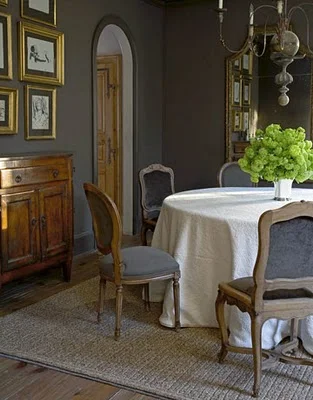
The colorful artwork really stands out on the wall with mouldings subdued by a same color treatment.
Barry Dixon - Traditional Home
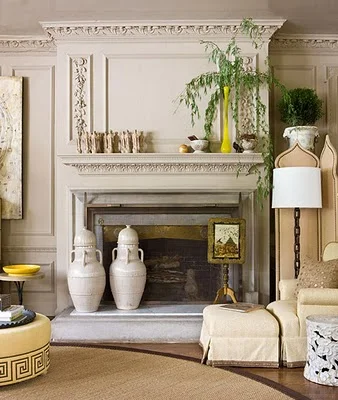
The intricate carving in the mouldings above is actually more pronounced. If they had been painted a contrasting color you would have noticed the banding or lines of the moulding, not the detail of the carving.
Barbara Westbrook - House Beautiful
Here the same color on the mouldings gives a bigger impact to the overall design. That smokiness and romantic quality would have been destroyed with the crispness of white mouldings.

Elaine Griffin - Elle Decor
This color makes a bolder statement painted on walls, baseboards, and window trim and shutters.

Robert Goodwin - House Beautiful
The gilded antiques above are set against a simple backdrop that is not fussed with a contrasting moulding.

Kay Douglass - Veranda
Just gorgeous. A simplified, modernized version of a traditional dining room. It doesn't forget it's past, but is such a creative and dramatic reinvention.
While not appropriate in every situation, the same color used on walls, mouldings, and doors can add an updated, bolder look to a room. The lines running around the room or "outlining" disappears and color envelopes the space. The objects in the room become more visually pronounced and emphasized. What a great tool for instantly changing the look or feel in a room!