
This kitchen is getting a remodel and I’m sharing some tweaks to the design I recommended in this Designed in a Click consultation. Sometimes you just need a review of what you have already thought out and this service can accommodate those questions.
This consult was the Level 2 version, which means I can take a closer look and spend some time looking up products to suggest.
Project Goals
Here are the before pics. I love all the space they have, so space and storage is not really a problem here. She sent the fp wall pic opposite the kitchen just for reference as they will basically be all in the same room.
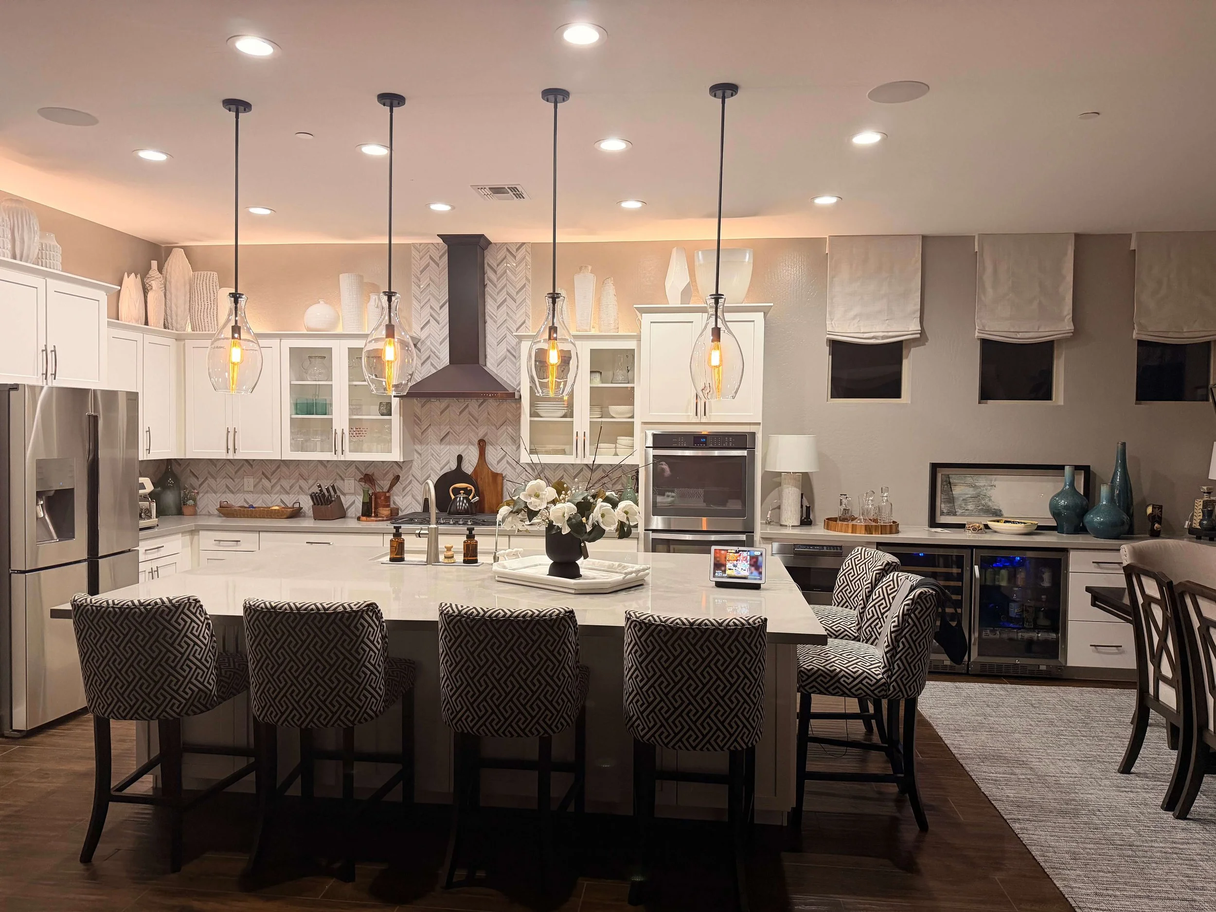
Kitchen to be remodeled
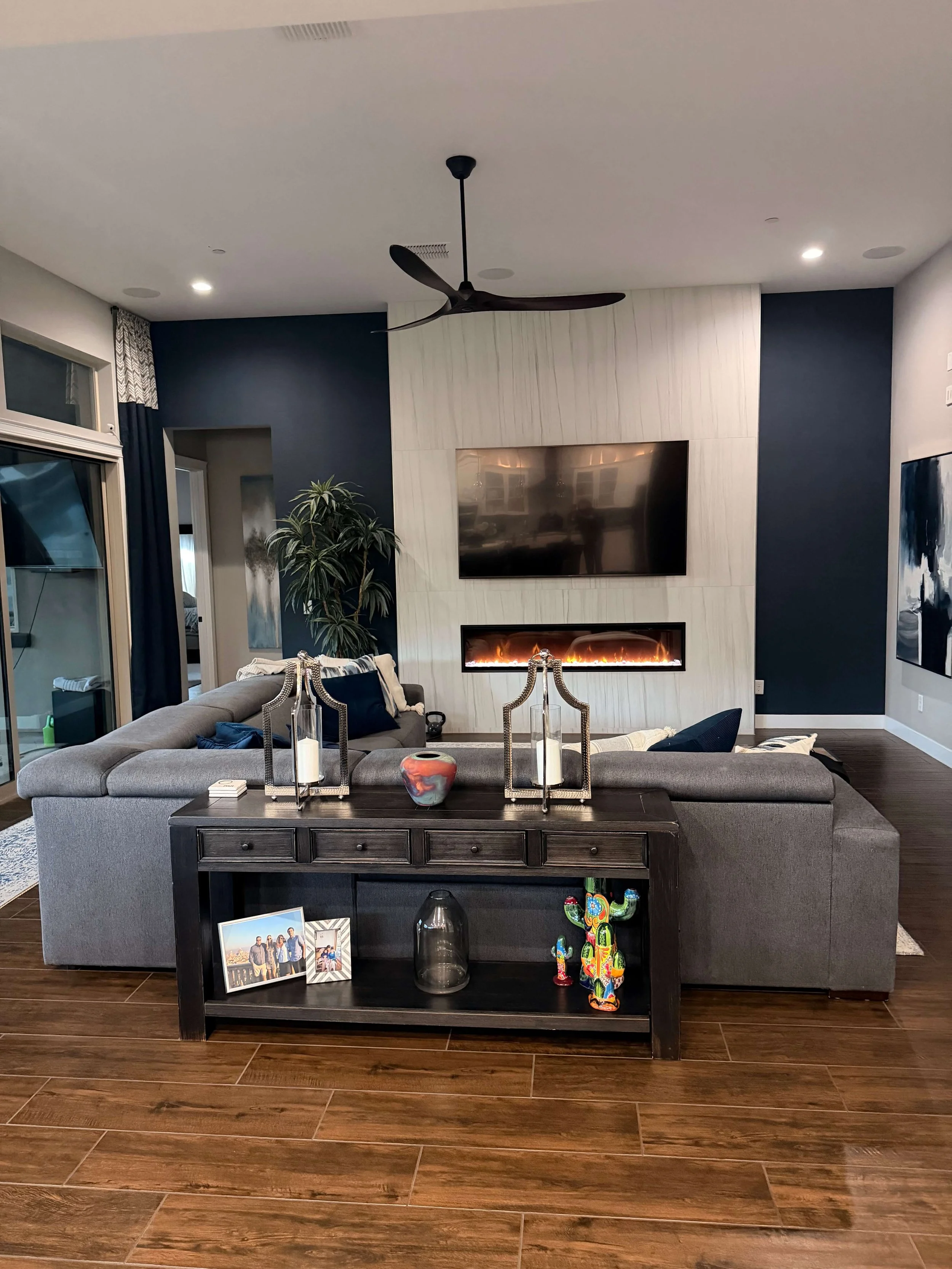
Fireplace wall opposite the kitchen
They are getting all new cabinetry at the perimeter and moving the refrigerator down to the other end of the kitchen, covering up one of the small windows there. The island is staying.
They are getting a new range, doing away with the cooktop/wall oven combination that really does save space in a kitchen. (I’ve written about this idea before.)
It also gives a certain professional and upgraded look to the kitchen.
One feature that she wants to incorporate is a hearth style hood, something that is very popular these days. She has the room for it, so I think it is a great idea.
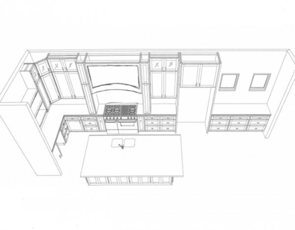
This drawing, below, was a preliminary look at how that would work. She wants to do a plaster hood, not wood, and have the legs curve back to the backsplash wall somewhat. That is a very on trend look these days and I think breaking up the wall of cabinetry with a different material is a great idea here since there are a lot of cabinets on that wall.
Cabinets to the ceiling will be done, something I love and recommend often.
Corner Cabinet and Coffee Bar
One of her questions was about the corner cabinet which she didn’t really like and then the coffee bar at the end wall which would have some open shelves. She was even wondering if she should build out a sheetrock column there at the corner, to butt the cabinets into, in lieu of having the corner cabinet.
My Response - Corner Cabinet
The way they've laid out the kitchen works well for the lower cabinet sizes. The range is centered in the lower cabinet space so then the uppers have that one foot extra, where the uppers overlap the countertop down at the corner. Since you have the pull-outs beside the range and then the hearth type hood that mounts on the countertop, it all looks best with an angled corner cabinet.
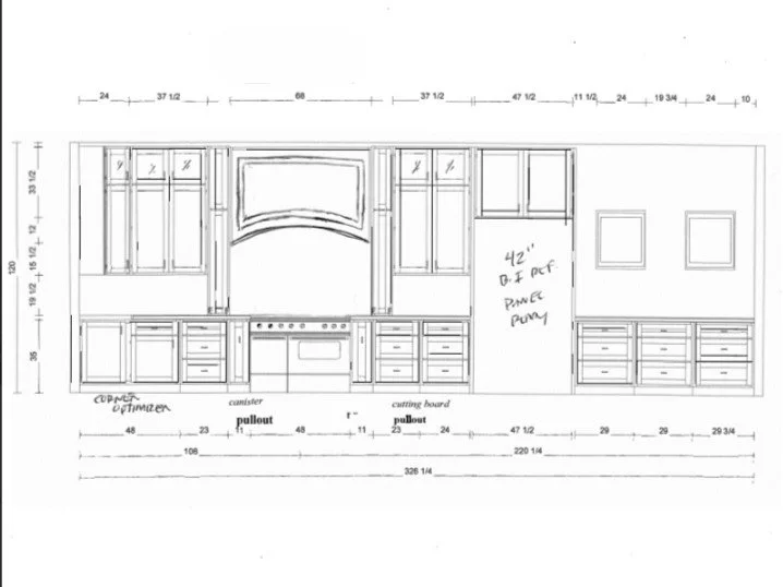
Otherwise, your uppers on this wall will have an extra cabinet on the end. You could respace all of this wall to center the range in the upper cabinet space, but it might not really be worth the time and then your lowers would not be equal on both sides of the range. Usually the upper cabinet area is the most important visually, but the cabinetry here really makes sense as it is drawn.
I would not build a corner column there. I think that corner countertop space is useful and there is some good storage there in the upper corner cabinet. These inside corners can be kind of difficult to access, even with pull-outs and lazy susan storage, but most people would prefer that to a column.
Coffee Bar
I do think that the coffee bar area is rather flat and needs some attention. Plain, long floating shelves are becoming a bit overdone, associated with a farmhouse style. People are opting for more closed storage these days and more interesting features in their kitchens.
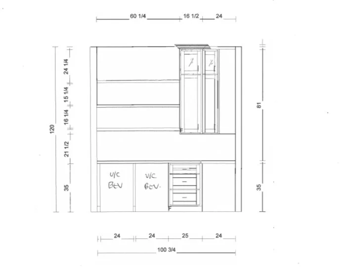
Here's how I would handle that space considering you might want some open shelving and with some more detail and design to this wall.
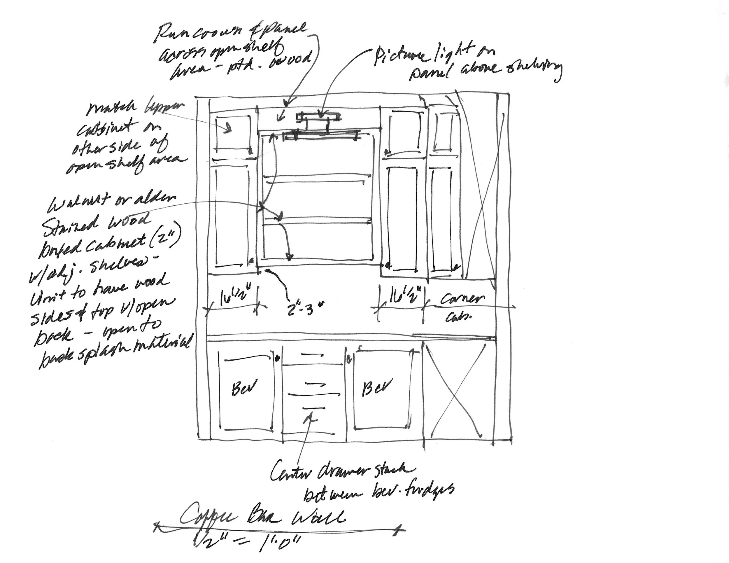
Center the drawer stack in the lower cabinetry to make this space appear more balanced.
Add a 16 1/2" wide upper cabinet to the left side on the elevation, to match the one on the right side and create a more finished look.
Add a crown and panel above the open shelving section in the painted cabinetry finish with a picture light on the panel, lighting the shelves.
Make the floating shelves more of a boxed unit with stained wood to contrast with the painted. Shelves would be adjustable wood with the sides and top in wood and the back, open to the backsplash material that will go all the way up the wall.
I feel like this will add something special to this wall and give you the type of storage you are looking for. Then use the stained wood for some detail at the plaster hood to echo the wood finish of the open shelving.
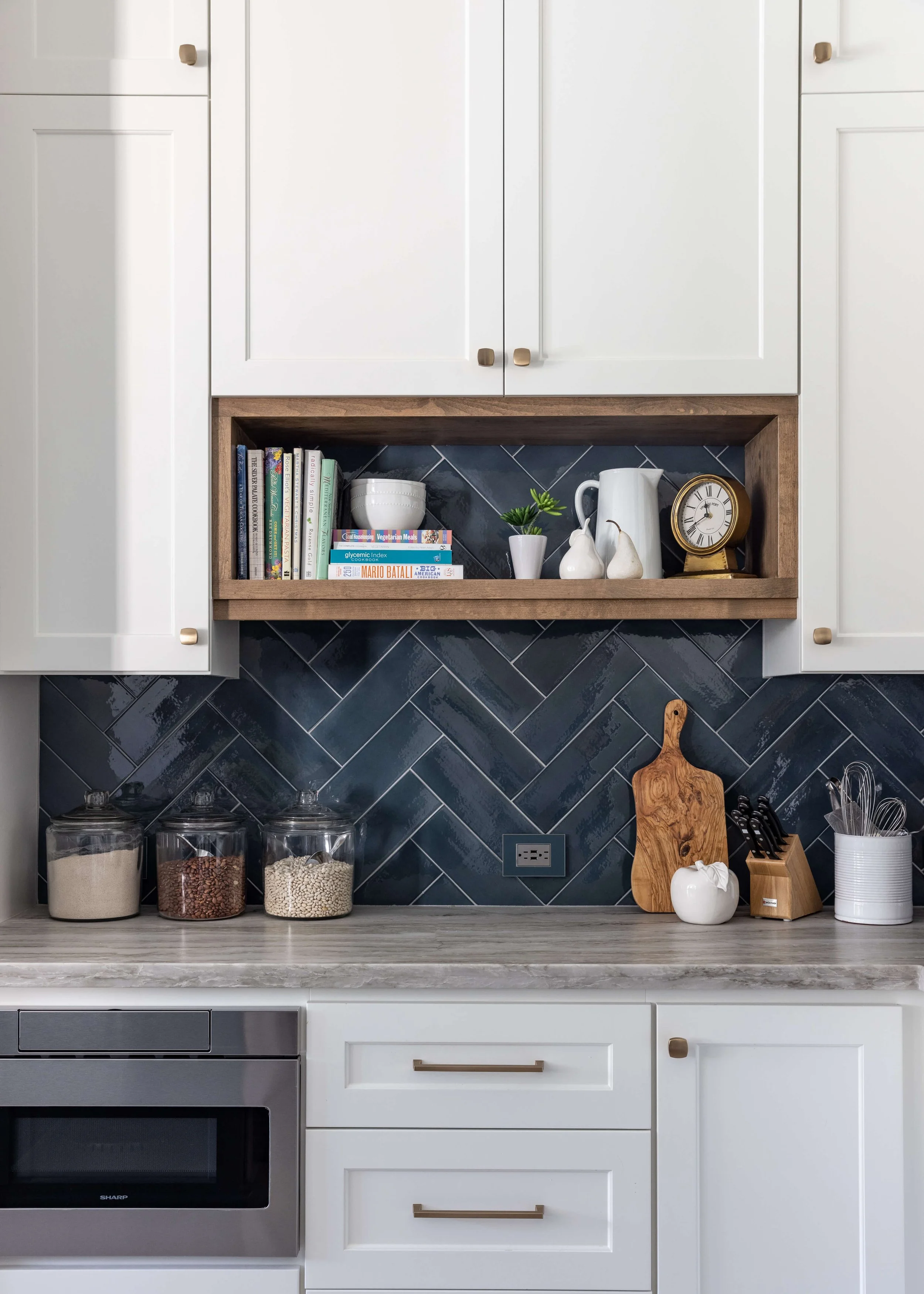
Here’s an example of a boxed in shelf unit that fits into the cabinetry.
Need some ideas on how to make a wall of boring cabinets more interesting? I’ve got some included in this post, below.
5 Ways to Make a Wall of Boring Cabinetry More Interesting
Paint Colors
She was considering SW Accessible Beige for the perimeter cabinets, SW Grays Harbor for the island, and SW Shoji White for the walls. She wanted to know if the cabinets should match the walls and if they should do color drenching. Her countertops were to be Taj Mahal.
My Response - Paint Colors
You might try Aesthetic White with Accessible Beige. They look good together and Aesthetic White is about the same value as Shoji White. I think those would be a good color tone with your countertop choice.
I would not do the same color on walls and cabinets in this instance, I think it would be nice to have lighter walls and then have the cabinets in the light warm neutral.
I do think you should color drench the off-white though, like either the Shoji White or Aesthetic White with walls/ceiling/trim. The walls will look best not having a bright white trim and ceiling.
Lighting
She wanted advice on island light fixtures and new sconces in the beverage wall area. They wondered about reducing the number of pendants from 4 to 3.
My Response - Lighting
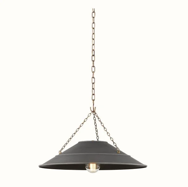
I think you need some contrast here. The plaster hood is a little more European design influenced, as opposed to your fireplace across the room, so I'm going to let that direct the lighting choice too.
Pendants - I found these and like the scale at 24" diam, and like that they aren't bulky and tall. They won't hide the hood. What I really love is the finish, a graphite, not black and not bronze, but a finish that is more like your Gray's Harbor island color. I also like the brass chain too, it would relate to a brass picture light you can do over the shelves. I think two is enough.
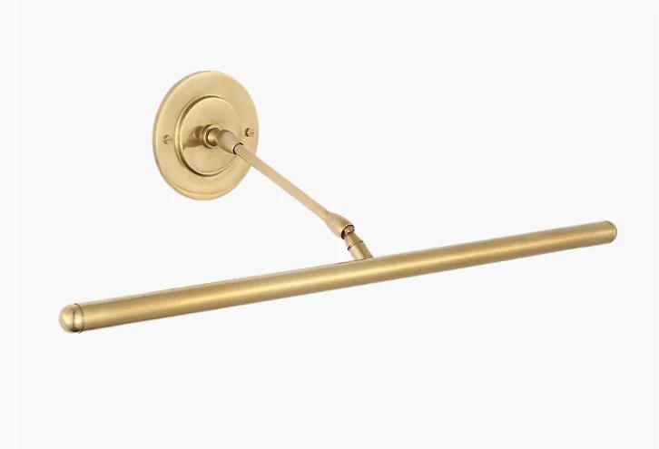
Picture light - I like a thin, long fixture that you can adjust to shine on the shelves.
Hardware
Lastly, she wanted input on knobs and pulls for the cabinets if possible. She was thinking a brushed brass. The hardware on all the doors is oil-rubbed bronze.
My Response - Hardware
Again, since your kitchen is all light, without too much contrast, I think you need to punch it up some with a contrasting cabinet pull, but not black or bronze. Black is too harsh and bronze is too brown.
I like this Ash Gray color from Top Knobs. I would use the Ascendra square knobs with these.
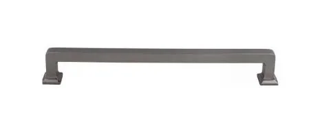
This would sort of repeat your island color, Gray's Harbor, and work with the graphite finish on the pendants.
I typically like to have pulls as long as you can afford (they get more expensive as you go longer), 6" at least and 9" if you can swing it. I typically do pulls on drawers and knobs on doors unless the doors are really tall or are a full height door, then I do pulls.
I used this finish on a SW Agreeable Gray painted kitchen as I felt it needed some contrast on the cabinets. I really liked how they helped add something to the overall look. My client liked a very plain and simple look, but this added just enough where there was some contrast on the cabinetry. (The countertop helped too.)
I also tend to like cool toned hardware on warm toned cabinetry and warm toned hardware on cool tones or white. You could do the Ash Gray finish on the perimeter and Honey Bronze on the island. :-)
Need more help on selecting cabinet hardware for your project? Check out my post below for some design direction.