“Look at the mouldings!”
Watch any HGTV House Hunters program and you’ll see home buyer after home buyer walk into a room, take a look at the mouldings, and exclaim this statement.
And then the real estate agent says: ”Look at the crown moulding.”
Sigh.
Don’t get me wrong.
Mouldings can be a beautiful thing.
However, many times they’re not.
Sometimes they’re bulky or puny, cheaply done, outside of the contextual style of the house, and really just don’t make any sense.
This fluted moulding with the “enhanced” capital is too skinny and looks cheap. | Mouldings can be a beautiful thing. However, many times they’re not.
I don’t think I would have missed having this chunk of chair rail moulding floating here on this skinny wall if it hadn’t been there.
Please...
Don’t let yourself be wowed with the whole “wood mouldings” thing. No one in the know is impressed by them being used inappropriately — well, at least, not anyone associated with the construction business.
Most professionals can look at a job with a bunch of wood mouldings and tell you right away if the stuff was slapped up there just to impress someone who doesn’t know any better, or if there was real quality built in to the job.
Odd wood moulding detail - What the heck???? Getting creative here?
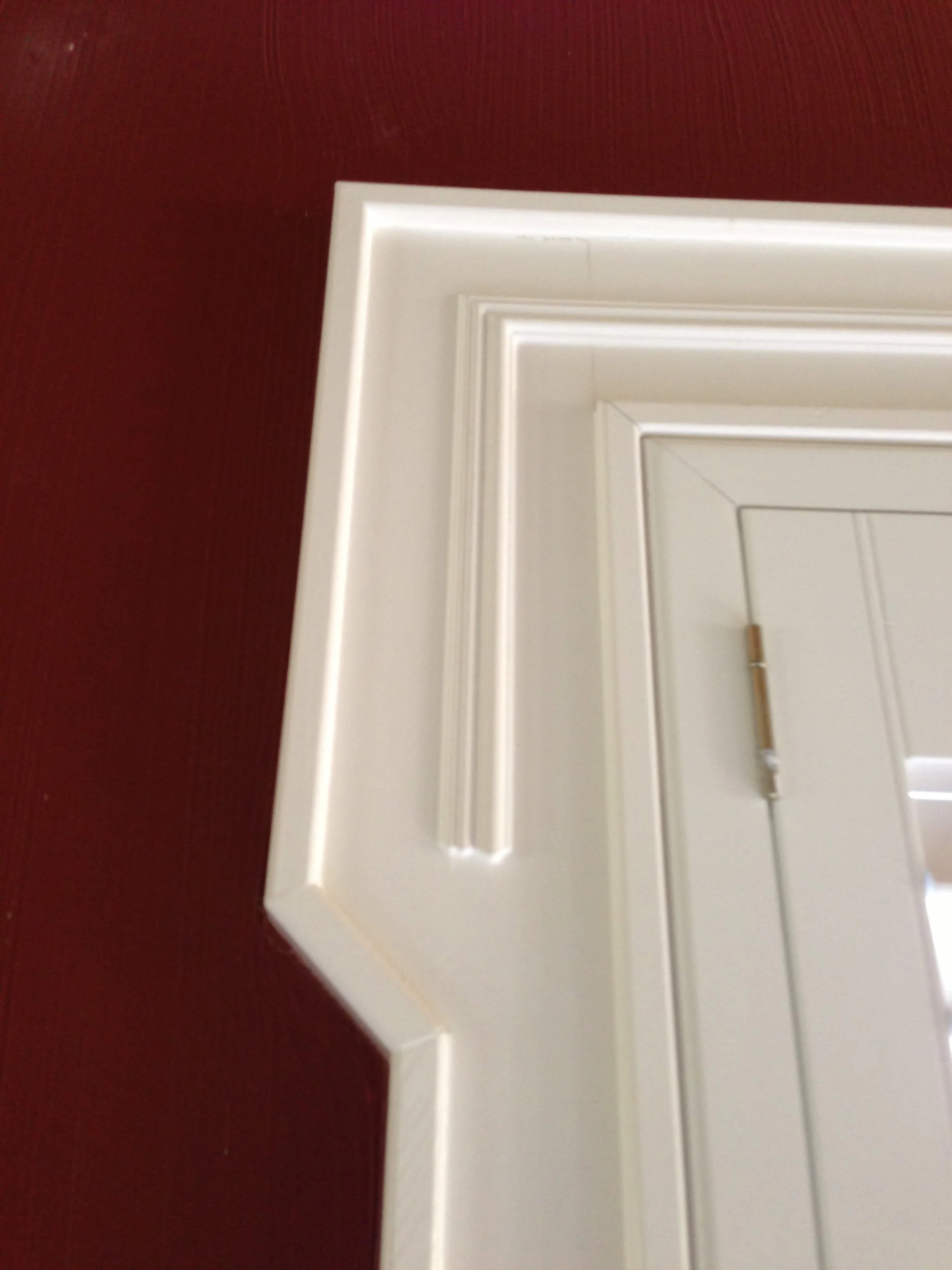
Here's an example of oversized door trim that feels overdone in a suburban home.
One dead giveaway: fluted moulding with rosette blocks
Unless you’re rebuilding Tara, or recreating the southern mansion of your dreams, I’m not sure why you would want to put these up in your home.
However, around here, they’re everywhere, usually in a version that’s a bit too skinny or too big for the house.
In these cases, it has more to do with how easy it is to do a straight cut as opposed to a neat, tidy miter, than anything else.
It also has to do with a builder trying to impress a buyer with all the mouldings. And, really, in a smaller, more run-of-the-mill suburban home, do you really want fluted mouldings and rosette blocks? Doesn’t that read a little unrealistic and over the top? Fussy? Pretentious?
How about this fireplace mantel, below?
I think this was designed on site to fit the wall, without regard to scale or how it related to the surround below.
This fireplace mantel was originally designed to fit the wall, without regard to scale or how it related to the surround below.
Here was our revised and updated version (below), scaled appropriately for the space and in consideration of all the elements on the wall. See more about this remodel project at this link.
This fireplace mantel and surround with tv cabinet above are appropriately scaled for this wall and all other elements in the space. Carla Aston, Designer | Miro Dvorscak, Photographer #mouldings #fireplacemantel #mantle
Here are some general guidelines about mouldings that I use:
Check out the huge crown in this room and then the size of the door casing on the 6’-8” high door. The base looks puny compared to the crown that has to be at least 12” high, right?
1. Scale Appropriate For Space
Don’t go too big in a small room and don’t go too small in a big space. Mouldings should scale to fit the openings and the room.
A 3” wood base moulding in a two story room is going to look chintzy.
A 9” wood base moulding in a room with 8’ ceilings is going to look heavy and bulky.
By that same token, scale the crown with the base. I often see tiny base mouldings with 12” high crowns. That doesn’t go together. A hefty crown should have a larger scaled base.
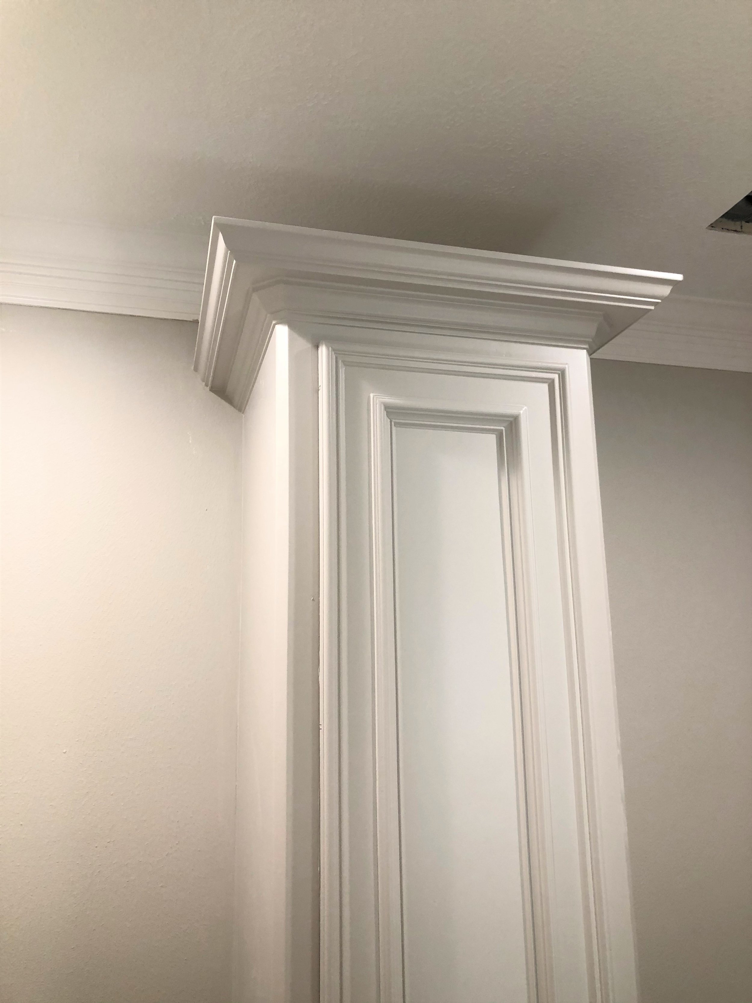
Take a look at this exceptionally heavy / wide crown on top of a tall, skinny cabinet. It just looks really out of scale. Beware of getting too heavy with mouldings on cabinetry that isn’t proportional.
2. Stop and Start Your Wood Mouldings In Logical Places | Address The Transitions
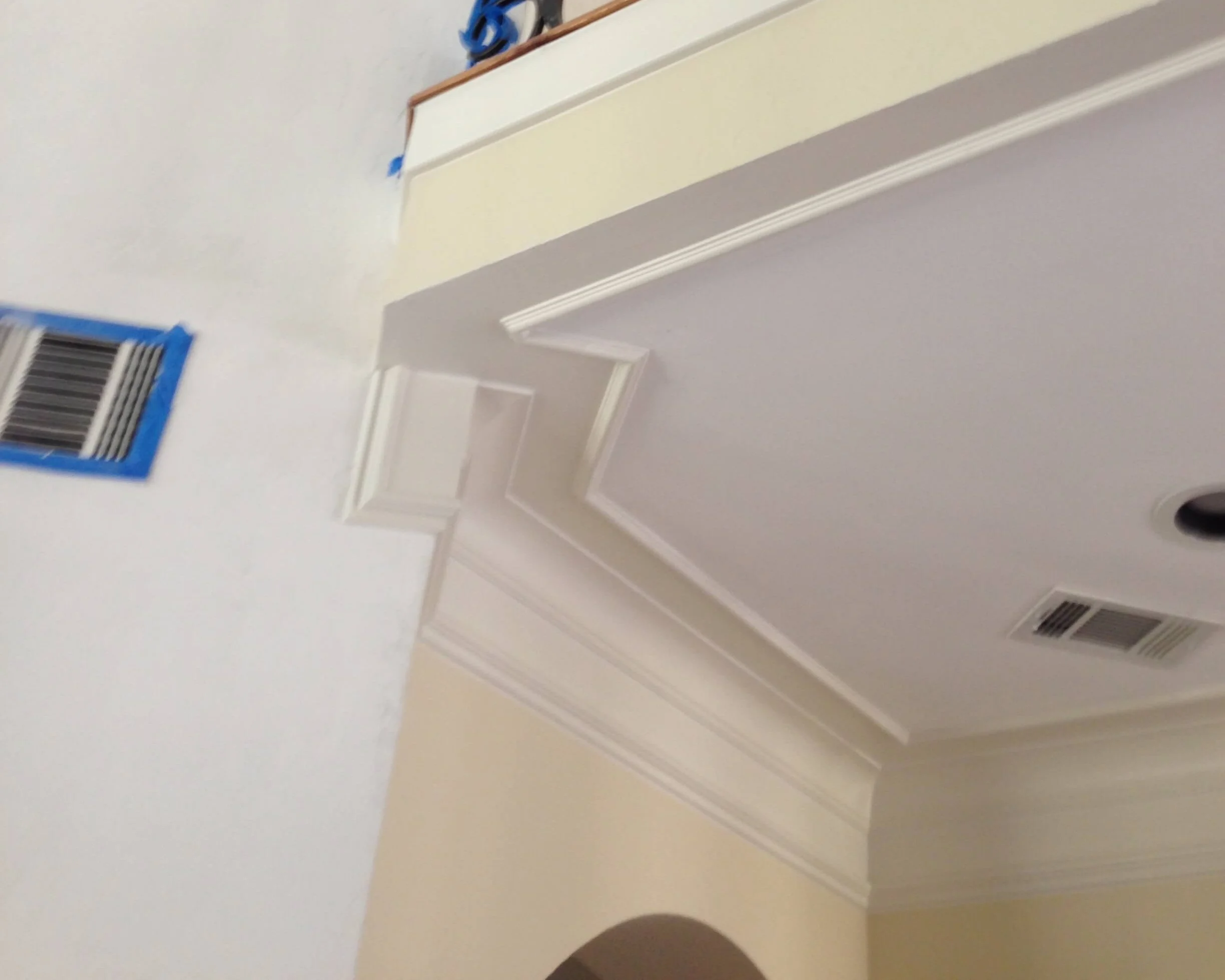
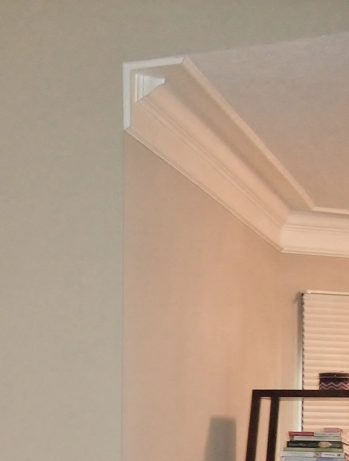
Many times crown moulding or a chair rail will run around the room up until the point the wall stops, leaving no place to die the moulding into. This causes the mouldings to just hang there in mid-air, forcing them to turn back into the wall, like the examples I show below.
If you have this situation in your home, maybe you shouldn’t be applying mouldings here at all. Instead, maybe you should rethink the need for the moulding in this situation.
Or perhaps there’s a way to make some other construction tweaks to be able to successfully stop and start your mouldings so the design looks well thought out and purposeful.
Many times crown moulding or a chair rail will run around the room up until the point the wall stops, leaving no place to die the moulding into. If chair rail was to be used in this room, trimming out the windows would have been completed the look properly.
This crown moulding had to turn back on itself for an awkward looking end to the run of moulding. Contrast in the paint colors highlights these bad details even more.
See how there was no appropriate place to stop and start this ceiling crown and trimwork? So, why create a trainwreck like this? Maybe all this excessive trim should have been reconsidered if it would entail details like this to make it work. :-( #mouldings
3. Design and style of mouldings should fit the architecture of the home
Example of Victorian home bathroom where the mouldings telegraph the style of the house.
Always keep in mind the overall style of the house. If you have a transitional style you are wanting to keep throughout the home, keep it lean and less detailed. You might want to consider no crown, a simple base, and door/window framing.
If you have a craftsman-style bungalow, then by all means go all out craftsman with layered mouldings and sharp edges. This look has a clean, crisp style and is heavy on the wood.
If you have a Victorian home, the mouldings are absolutely key here. They telegraph the style of the house.
If you are creating a traditional styled home and like some proportional wood mouldings, then some fluting might be for you. (But please...not at every single door and window casing.) The fireplace might be a good place, or the study at some bookcases, etc.
I typically keep mouldings simple and scaled appropriately with the space.
I like a clean, neat style that doesn’t make the mouldings the main feature of the room. I like to see homes that focus on the objects and people within — unless, of course, the home’s architectural style is truly enhanced with with focus on the quality mouldings.
Mouldings can be a beautiful thing. However, many times they’re not. Sometimes they’re bulky or puny, cheaply done, outside of the contextual style of the house, and really just don’t make sense. #mouldings #woodtrim
Remodel Project With Outdated Wood Mouldings And Trim
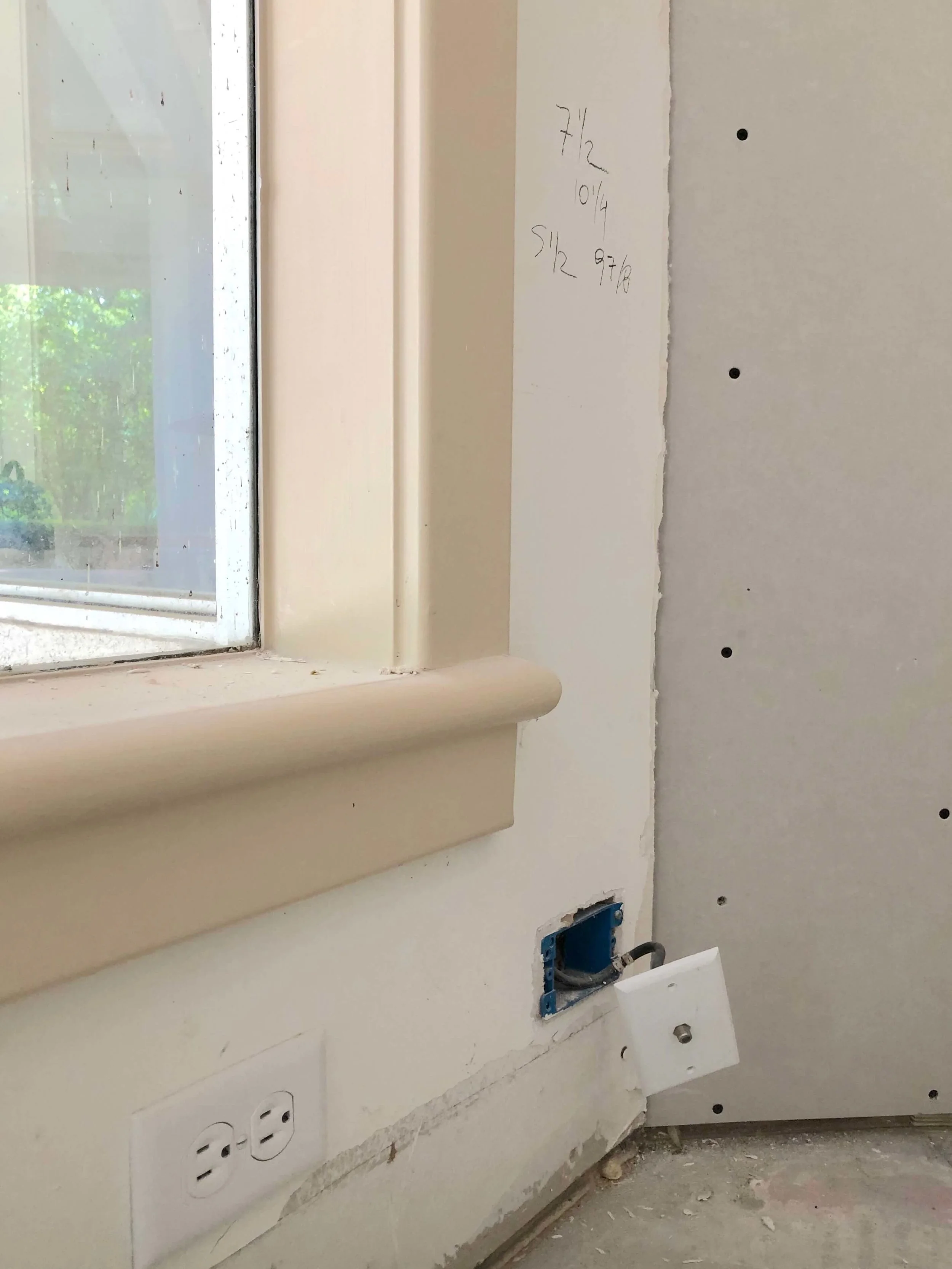
I’m working on a remodel project, under construction now, where the mouldings were just too chunky and plain. The house has a Mediterranean look, stucco with a clay tile roof and arches, but the mouldings just looked too 80’s to me.
The 1 1/2” bullnose edge window sills and the flat trimwork that had softened outer edges were just too simple, chunky and dull looking.
Chunky dull wood moulding trimwork was just too plain and simple for the house. #woodtrim #mouldings
Chunky dull wood moulding trimwork was just too plain and simple for the house. #woodtrim #mouldings
It’s a big expense to rework all the trim in a house, but in this case it was worth it to the homeowner.
One option we had was to disguise the mouldings and make them less noticeable, keeping what they had. In that case, we would paint them the color of the walls and ceiling, so that they didn’t stand out as a feature. That would have minimized the look.
However, I’m glad the homeowner moved ahead with the change. Here’s what we’re replacing them with.
New wood mouldings going in on a remodel project.
BTW, that is not fluted moulding up there, it’s just the strie of the wood grain. :-)
That sill is a much better profile and the base and door/window trim have a slight detail with sharper edges. Overall it just looks more refined and will be a good choice for this home that will have a more transitional style.
Need more tips and info on how mouldings and trimwork can help your interiors?
See the links below.
And pin this pin to Pinterest to bookmark this post for later. ;-)
This post was republished from 2019 with some new examples and updated content.




There IS a way to fill up vast amounts of wall space, add character to a room, and even dress up a big, blank ceiling. Want to find out how? Click through for more of what I'm sharing with you today.